---
title: "12 Best Dental Website Design Examples for 2026"
url: "https://www.krishaweb.com/blog/best-dental-website-designs/"
date: "2026-05-12T10:51:38+00:00"
modified: "2026-05-12T12:01:39+00:00"
author:
name: "Nisarg"
categories:
- "Web Design"
word_count: 2474
reading_time: "13 min read"
summary: "A dental website serves patients at two very different emotional states: the routine appointment booker who wants a quick, frictionless scheduling experience, and the anxious patient who is in pain..."
description: "12 of the best dental website designs in 2026, with design lessons on what makes each one effective at converting anxious visitors new patient inquiries."
keywords: "best dental website designs, Web Design"
language: "en"
schema_type: "Article"
related_posts:
- title: "12 Best Jewellery Website Designs to Check Out in 2026"
url: "https://www.krishaweb.com/blog/best-jewellery-website-designs/"
- title: "12 Best Modern Website Design Examples to Inspire You in 2026"
url: "https://www.krishaweb.com/blog/best-modern-website-designs/"
- title: "12 Best Roofing Website Design Inspirations for 2026"
url: "https://www.krishaweb.com/blog/best-roofing-website-design-inspirations/"
---
# 12 Best Dental Website Design Examples for 2026
_Published: Tuesday,May 12, 2026_
_Author: Nisarg_

A dental website serves patients at two very different emotional states: the routine appointment booker who wants a quick, frictionless scheduling experience, and the anxious patient who is in pain, nervous about cost, or embarrassed about long-neglected dental health. Both of these patients are on your website at the same time, and the design has to serve both without alienating either.
At KrishaWeb, we have built healthcare and medical practice websites that handle exactly this challenge. The dental websites that generate the most new patient bookings combine clinical credibility for patients evaluating the practice’s competence, with warmth and approachability for patients who are nervous about attending.
***KrishaWeb has designed and built dental website designs since 2008. The pattern that holds across every high-performing example: design decisions made in service of the visitor’s actual goal, not the agency’s portfolio.***
## 12 Best Dental Website Design Examples for 2026
### 1. Tend
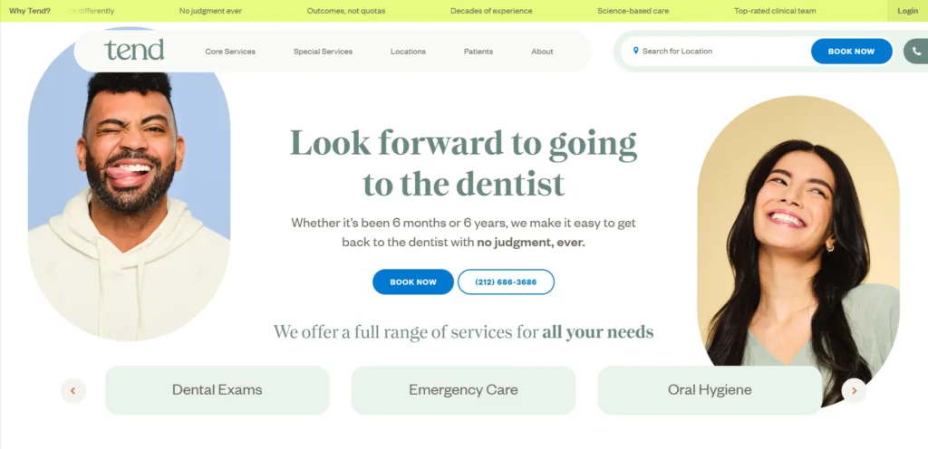[**Tend**](https://hellotend.com/) is a dental brand that has redesigned the patient experience from the ground up, and the website reflects this ambition. The visual identity is warm, modern, and deliberately different from clinical dental aesthetics. Photography shows comfortable, spa-like dental environments rather than traditional clinical settings. The booking process is prominent and simple. The brand communicates that going to the dentist is an experience you might actually not dread.
***Design lesson:** A dental brand that repositions the patient experience through its visual identity attracts patients who have avoided dental care because of anxiety. The design is doing clinical work: it is reducing fear before the patient walks through the door.*
### 2. Aspen Dental
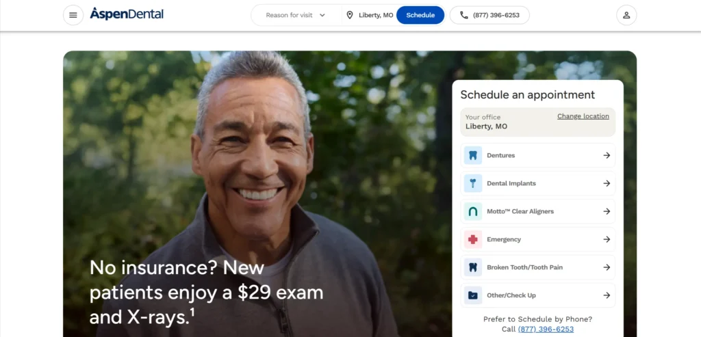[**Aspen Dental**](https://www.aspendental.com/) operates at scale, and the website reflects the operational complexity of a multi-location dental group while maintaining a clear patient journey. The location finder is prominent and fast. Pricing and financing information is displayed clearly, which removes the most common hesitation about private dental care. New patient offers are featured visibly to reduce the financial barrier to the first appointment.
***Design lesson:** Financing and payment plan information displayed on the homepage removes a major hesitation for dental patients facing treatment costs. The practice that answers the cost question proactively gets the call. The practice that makes patients ask does not.*
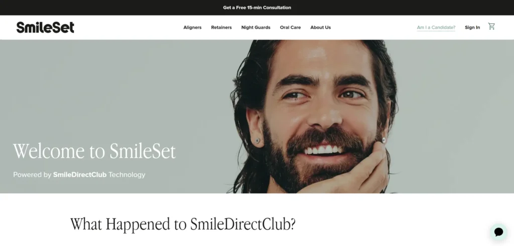
### 3. Smile Direct Club
[**Smile Direct Club’s website**](https://smiledirectclub.com/) communicates the core value proposition (straighter teeth without traditional braces) through before-and-after photography and a clear treatment process explanation. The assessment tool is prominent and converts at high rates because it offers immediate personalized information in exchange for contact details. The pricing is explicit, and the payment plan calculator is visible.
***Design lesson:** An interactive assessment or quiz on a dental website (‘Are you a candidate for Invisalign?’ ‘How much would your treatment cost?’) converts better than static treatment information because it gives visitors immediate personalized value in exchange for contact information.*
### 4. Bupa Dental
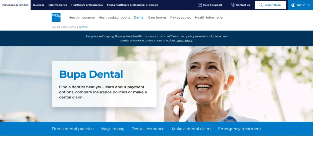[**Bupa Dental’s website**](https://www.bupa.co.uk/dental/) handles the complexity of a national dental network through clear navigation between finding a practice and understanding treatment options. The insurance integration is clean and fast. Patient information content is genuinely useful and written for patients rather than dental professionals. The emergency dental section is accessible and prominently placed for the patient in acute pain who needs immediate information.
***Design lesson:** Emergency dental access information should be the most prominently accessible content on a dental website for patients in pain. Making emergency patients navigate through the standard appointment booking flow creates frustration at the worst possible moment.*
### 5. 1-800-DENTIST
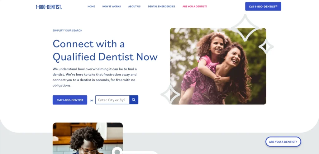[**1-800-DENTIST**](https://www.1800dentist.com/) has built an entire business around the dental patient referral moment (the patient who needs a dentist now and does not have one. The website communicates immediacy and accessibility. The phone number is the primary CTA. The location search is on the homepage. The design is functional and efficient rather than aesthetically ambitious, which is appropriate for a service used at high-urgency moments.
***Design lesson:** Dental referral and finder services should optimize every design decision for speed of access. A patient in pain who has to scroll to find the phone number is a lost conversion.*
### 6. Pacific Dental Services
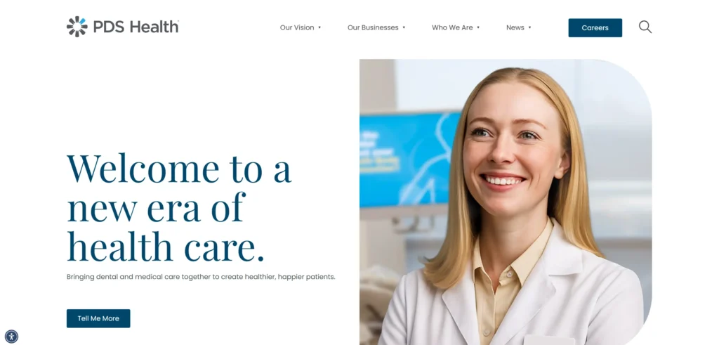[**Pacific Dental Services**](https://www.pacificdentalservices.com/) is a dental support organization, and its website is primarily a B2B tool aimed at dental practice owners considering a partnership. The design communicates professional credibility and business capability. This is an example of a dental website that correctly identifies its primary audience as practice owners rather than patients and designs accordingly.
***Design lesson:** Dental support organization websites serve a different primary audience than practice websites. Designing for the correct primary visitor (practice owners evaluating a partnership) requires completely different content and conversion architecture than a patient-facing practice site.*
### 7. Smile Generation
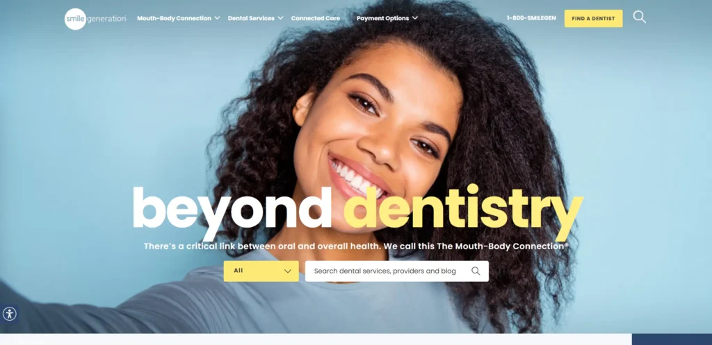[**Smile Generation’s website**](https://www.smilegeneration.com/) handles the patient experience journey comprehensively, from finding a practice to understanding treatment options to financing care. The doctor profile pages include credentials, philosophy of care, and photography that make choosing a dentist feel like choosing a person rather than a clinical service. The trust signals throughout the site address the most common patient concerns about dental care.
***Design lesson:** Dentist profile pages that communicate personal philosophy of care, not just clinical credentials, help anxious patients choose a dentist they feel comfortable with before they book. This reduces the anxiety-driven cancellations that affect dental practices significantly.*
### 8. Dental Care Alliance
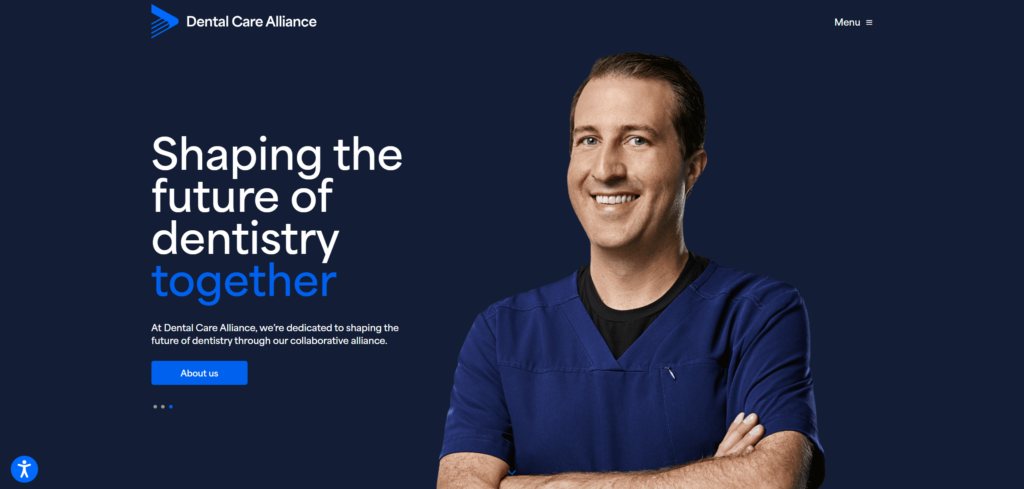[**Dental Care Alliance**](https://dentalcarealliance.com/) operates dental practices across multiple states, and its website manages this complexity through effective location and speciality filtering. The patient education content is well-organized and addresses common dental health questions that patients search for before booking. This content generates organic search traffic from patients who then book through the same site.
***Design lesson:** Patient education content that answers the specific questions patients search for (‘how much does a crown cost’, ‘what to expect at a root canal’) generates organic search traffic at the consideration stage and positions the practice as a trusted source before the patient has chosen where to book.*
### 9. Diamond Braces
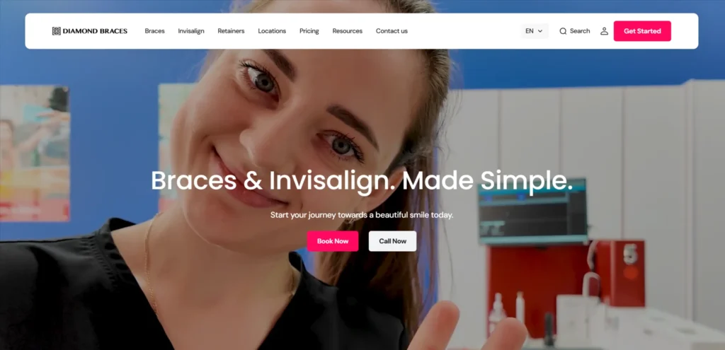[**Diamond Braces**](https://www.diamondbraces.com/) focuses on orthodontics, and the website communicates the transformation of the treatment through extensive before-and-after photography. The treatment options (traditional braces, Invisalign, clear aligners) are clearly differentiated with an honest comparison of the trade-offs. The free consultation offer is prominent, and the scheduling process is simple.
***Design lesson:** Honest comparison of treatment options on an orthodontics website builds trust with patients who are already researching alternatives. A website that presents only the most profitable option loses the trust of patients who have done their research.*
### 10. Beehive Dental
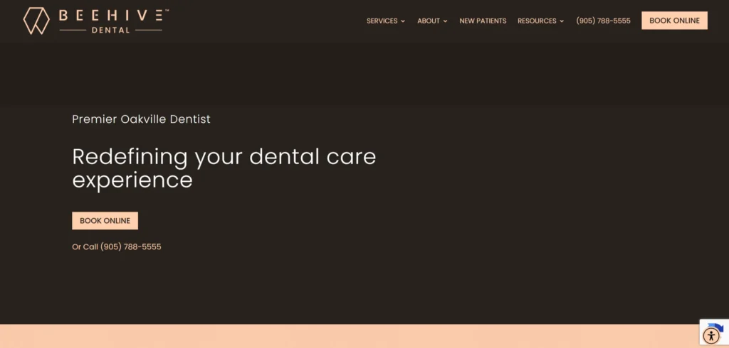Most dental practice websites look like variations of the same template. [**Beehive Dental**](https://beehivedental.com/) went a different direction. The entire site is built around the beehive concept: community, precision, and organized care. It runs through the visual design, the copy, and the office tour page. The consistency is what makes it memorable.
The practical side is just as strong. Pricing transparency is upfront, not buried. Direct insurance billing is a headline feature, not an FAQ item. The emergency dentistry section answers the questions someone in pain at 11 pm is actually asking. Real patient testimonials, before-and-after photos, and the virtual office tour all appear before the visitor has to look for them.
The phone number stays visible throughout. The booking form is never more than one click away. Same-day availability is stated on every relevant page.
***Design lesson:*** *A clear brand concept applied consistently across every page creates more trust than polished generic design. Beehive Dental competes with corporate chains not by matching their scale but by being more distinctive and more human than any of them.*
### 11. DentaQuest
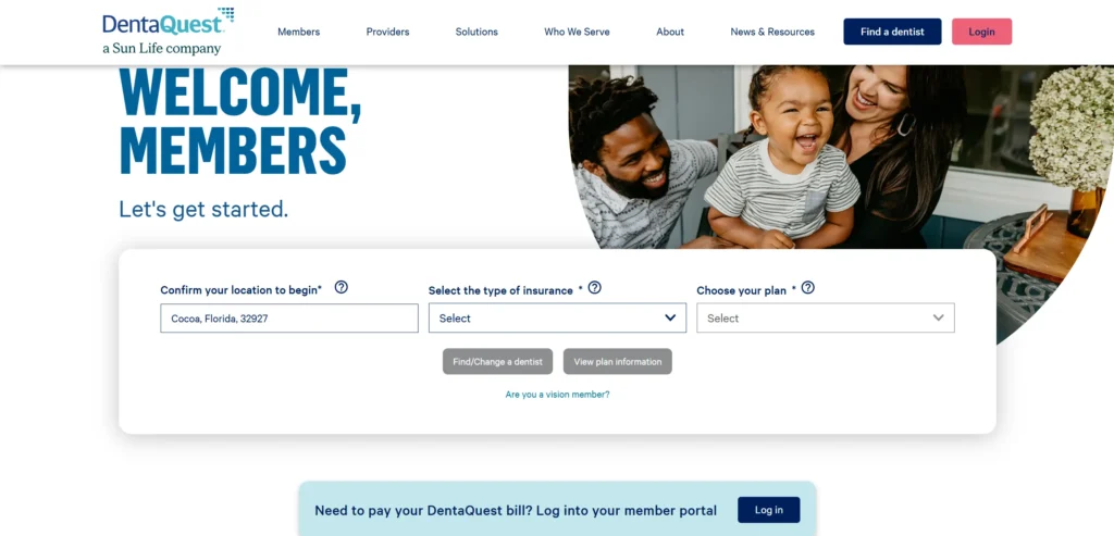[**DentaQuest**](https://dentaquest.com/) operates in the dental benefits space, and its website communicates to both patients and employers evaluating dental benefit plans. The dual audience navigation is handled clearly. Policy information is well-organized and easy to search. The patient-facing content addresses how to use dental benefits effectively.
***Design lesson:** Dental benefits and insurance websites serve both patients and employer decision-makers simultaneously. Clear navigation that separates these audiences from the first click prevents each group from having to read through content that is not relevant to their decision.*
### 12. Kois Center
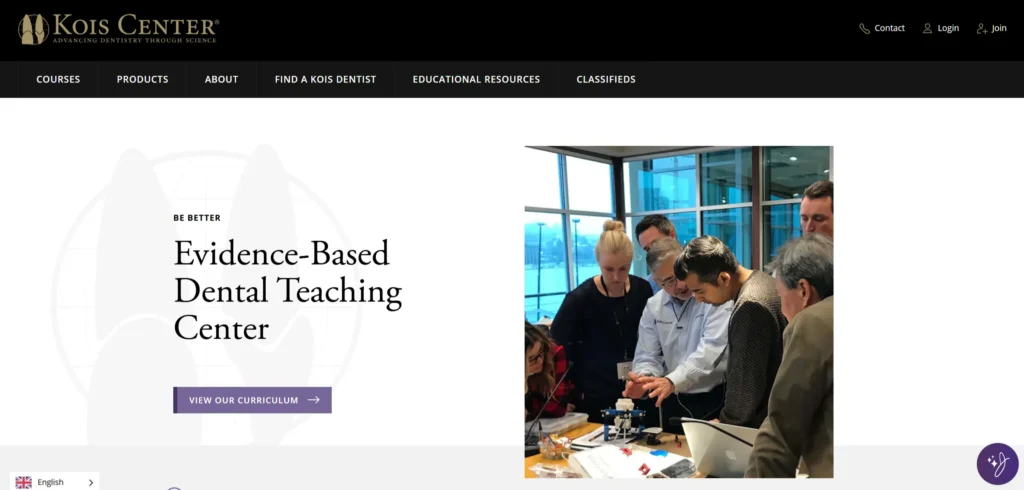[**Kois Center**](https://koiscenter.com/) is a dental education and training center whose website is aimed at dental professionals rather than patients. The program pages are detailed, and credentialing information is prominent. This is an example of a dental website that knows its audience precisely and serves them without any ambiguity about who the site is for.
***Design lesson:** Dental education and CE provider websites should prioritize clinical detail and credentialing information over patient-friendly language. The audience is dental professionals evaluating a training investment, not patients selecting a practice.*
## What These Dental Website Designs Have in Common
Looking across all 12 examples, these patterns appear consistently in the ones that work best commercially, not just aesthetically.
- Online booking is accessible with one click on the homepage
- Emergency and urgent care access information is prominent and fast to find
- Dentist profile pages that communicate personal philosophy, not just credentials
- Before-and-after photography or smile transformation galleries
- Pricing or financing information is displayed proactively to remove the most common hesitation
## 5 Design Elements Every Dental Website Design Example Needs
Whether you are building from scratch or redesigning an existing site, these five elements consistently separate high-performing examples from functional but forgettable ones.
**1. Online booking is visible and accessible from every page**
Online booking is visible and accessible from every page, not buried in the Contact section
The emergency and urgent care pathway is accessible immediately without navigation
**3. Dentist and hygienist profile pages with photo, philosophy of care, and credentials**
Dentist and hygienist profile pages with photo, philosophy of care, and credentials
**4. Before-and-after or smile transformation gallery accessible from the homepage**
Before-and-after or smile transformation gallery accessible from the homepage
**5. Pricing or financing information is displayed proactively rather than requiring a phone call to find out**
Pricing or financing information is displayed proactively, rather than requiring a phone call to find out
## AI Implementation for Dental Websites in 2026
Most dental website design articles cover design examples. Almost none address AI implementation, which is where the commercial gap is opening in 2026. The dental website design that implements these features in the next 12 months will have a measurable advantage over those that do not.
### 1. AI-Powered Treatment Eligibility Assessment
An AI assessment tool that asks patients about their dental concerns, last visit date, and primary goals (straighter teeth, whiter teeth, pain relief) and returns a personalized shortlist of relevant treatments with approximate timelines and cost ranges converts at higher rates than a static treatments page. It gives patients immediate personalized value and generates qualified inquiries with specific treatment interest for the practice to follow up.
### 2. AI Chat for Out-of-Hours Enquiries and Emergency Triage
Dental emergencies and pain-driven searches do not follow business hours. An AI chat assistant that can assess urgency, provide appropriate advice for dental pain management, and either book an emergency appointment or direct the patient to an appropriate emergency service captures high-intent visits that would otherwise go to whichever competitor answers the phone at 11pm. This is the single highest-ROI AI implementation for dental practices.
### 3. Automated Recall and Reactivation Sequences
The average dental practice has a large inactive patient list (patients who have not been in for 12 months or more. Automated reactivation email and SMS sequences that are personalized to the patient’s treatment history, last visit date, and specific dental concerns consistently outperform generic ‘time for your check-up’ broadcasts. AI-powered send time optimization further improves open and booking rates.
### 4. AI-Powered Review Generation After Appointments
Reviews are the primary trust signal in the local dental market. Automated post-appointment review request sequences sent at the right moment (the day after, not immediately) when the patient’s experience is fresh and positive, generate review volume that manual processes cannot match. Practices with consistent recent reviews outperform competitors in local search rankings, which drives a disproportionate share of new patient volume.
***KrishaWeb builds AI-integrated dental website designs on WordPress and other platforms. If your current site is not using these features, our team can assess what to implement first based on your specific conversion goals.***
##### Additional Read
- [12 Best Jewellery Website Designs to Check Out in 2026](https://www.krishaweb.com/blog/best-jewellery-website-designs/)
- [12 Best Modern Website Design Examples to Inspire You in 2026](https://www.krishaweb.com/blog/best-modern-website-designs/)
- [12 Best Roofing Website Design Inspirations for 2026](https://www.krishaweb.com/blog/best-roofing-website-design-inspirations/)
### Frequently Asked Questions
**What should a dental website include?**A dental website should include an online booking system accessible from every page, dentist and hygienist profiles with genuine personal information, treatment pages with honest cost guidance, a before-and-after gallery, patient reviews from local patients, and emergency contact information that is immediately accessible. The design should communicate warmth alongside clinical credibility.
**How important is online booking for a dental website?**Online booking is the highest-priority conversion feature on a dental website. Patients who cannot book online increasingly choose a practice that allows them to. The booking form should be accessible from every page, work well on mobile, and require a minimum of fields to complete a booking request.
**How do dental websites handle anxious patients?**The dental websites that successfully attract and retain anxious patients use warm photography of the clinical environment, personal dentist profiles that communicate approachability, patient testimonials specific to anxiety and positive experience, and content that explicitly acknowledges patient anxiety and explains what the practice does to manage it.
**Should dental websites show prices?**Yes, for standard treatments where indicative pricing is possible. The most common reason patients do not book dental appointments is uncertainty about cost. Practices that display price ranges or starting prices for common treatments, alongside clear information about payment plans, attract more inquiries and convert a higher proportion of them than practices that require a call to find out pricing.
**How can AI improve a dental website?**AI treatment eligibility assessments, out-of-hours chat for emergency triage and booking, automated patient recall and reactivation, and post-appointment review generation are the AI implementations that deliver the most measurable impact for dental practices in 2026.
### Conclusion
The 12 dental website designs on this list span different scales, budgets, and markets. What they share is not production budget or agency pedigree. It is a commitment to treating the website as a genuine commercial and brand tool rather than a digital brochure.
The design elements that matter most in this category are not complex or expensive to implement. Strong photography, a clear path to the primary conversion action, social proof specific enough to be credible, and mobile performance that matches desktop quality. These are achievable at almost any budget with the right priorities and the right [**web design service**](https://www.krishaweb.com/web-design/).
If your current dental website design is not doing these things,[ **talk to KrishaWeb’s web design team**](https://www.krishaweb.com/contact-us/) about what a focused redesign would look like for your specific goals.
***Ready to improve your website? KrishaWeb has been designing and developing conversion-focused websites since 2008. Tell us your goals, and we will tell you the right approach.***
***Disclaimer:** This article is intended for informational and inspirational purposes only. The website examples featured are owned by their respective organizations. KrishaWeb has no affiliation with any of the websites referenced unless otherwise stated. All observations, statistics, and design notes reflect research current as of April 2026 and may change over time.*

###### Nisarg Pandya
Project ManagerExperienced Project Manager and Scrum Master at KrishaWeb, delivers expertise in Scrum methodologies, Laravel, React.js, UX design, and project management, ensuring efficient project delivery and agile implementation.
 Interact With Me-
-
- [ ](mailto:)
---
_View the original post at: [https://www.krishaweb.com/blog/best-dental-website-designs/](https://www.krishaweb.com/blog/best-dental-website-designs/)_
_Served as markdown by [Third Audience](https://github.com/third-audience) v3.5.3_
_Generated: 2026-05-12 12:01:40 UTC_