---
title: "14 Best Insurance Website Designs 2026 [Examples and Best Practices]"
url: "https://www.krishaweb.com/blog/best-insurance-website-designs/"
date: "2026-04-28T13:32:40+00:00"
modified: "2026-04-28T13:35:13+00:00"
author:
name: "Nisarg"
categories:
- "Web Design"
word_count: 2630
reading_time: "14 min read"
summary: "An insurance website must accomplish something genuinely difficult in web design terms: make a product that most people would prefer not to think about, feel necessary, approachable, and worth the ..."
description: "Best Insurance Website Designs. Insurance firms need incredible UX-focused website design and a solid online & digital presence."
keywords: "best insurance website designs, Web Design"
language: "en"
schema_type: "Article"
related_posts:
- title: "22 Best Restaurant Website Design Examples in 2026"
url: "https://www.krishaweb.com/blog/best-restaurant-website-design-examples/"
- title: "14 Best Fashion Website Designs: Inspiring Examples for 2026"
url: "https://www.krishaweb.com/blog/best-fashion-website-designs/"
- title: "15 Best Bakery Website Designs for Inspiration in 2026"
url: "https://www.krishaweb.com/blog/best-bakery-website-designs/"
---
# 14 Best Insurance Website Designs 2026 [Examples and Best Practices]
_Published: Tuesday,April 28, 2026_
_Author: Nisarg_
![Best Insurance Website Designs 2026 [Examples and Best Practices]](https://d1hdtc0tbqeghx.cloudfront.net/wp-content/uploads/2023/09/28125625/Best-Insurance-Website-Designs-2026-Examples-and-Best-Practices.webp)
![Best Insurance Website Designs 2026 [Examples and Best Practices]](https://d1hdtc0tbqeghx.cloudfront.net/wp-content/uploads/2023/09/28125625/Best-Insurance-Website-Designs-2026-Examples-and-Best-Practices.webp)An insurance website must accomplish something genuinely difficult in web design terms: make a product that most people would prefer not to think about, feel necessary, approachable, and worth the time required to get a quote. Insurance is purchased under two conditions: immediate urgency (a new car, a house purchase, a business launch) or regulatory requirement (employers’ liability, professional indemnity). In neither case is the visitor enthusiastic about the purchase.
At KrishaWeb, we have built financial services and insurance websites across multiple markets. The insurance websites that generate the highest quote conversion rates share one characteristic: they reduce the friction of the quoting process to the absolute minimum while communicating exactly enough trust to make the visitor comfortable sharing their personal information.
***KrishaWeb has designed and built insurance website designs since 2008. The pattern that holds across every high-performing example: design decisions made in service of the visitor’s actual goal, not the agency’s portfolio.***
## **14 Best Insurance Website Designs 2026 [Examples and Best Practices]
### **1. Lemonade
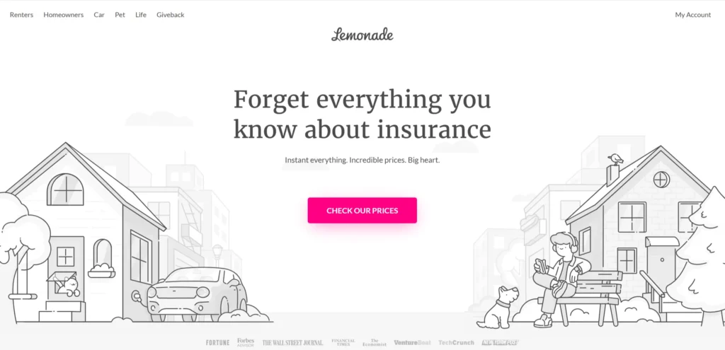[**Lemonade’s website**](https://www.lemonade.com/) is the most frequently cited example of insurance design done differently. The brand communication is honest about what insurance is and what Lemonade does differently with premiums. The design is clean and the language is plain. The quote process is genuinely fast: under two minutes for a policy. The giveback model, where unclaimed premiums go to a cause the policyholder chooses, is communicated clearly.
Design lesson: Transparency about the insurance business model (how premiums are used and what the insurer’s financial incentive is) builds trust with a customer segment that is deeply skeptical of traditional insurance. Lemonade’s honesty about their flat fee model is their most effective brand differentiator.
### **2. Oscar Health
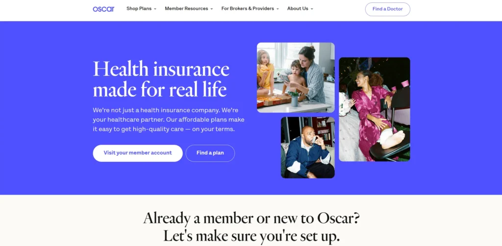**[Oscar Health](https://www.hioscar.com/)** redesigned health insurance from the customer’s perspective and the website reflects this orientation. Plain language replaces insurance jargon throughout. The member experience (the app, the care team, the telemedicine service) is presented as the product, with the insurance policy as the infrastructure behind it. The quote and enrollment process is simpler than any traditional health insurer.
Design lesson: Health insurance websites that present the customer experience as the product (the care team, the app, the telemedicine access — convert at higher rates than those that lead with policy terms and coverage tables.
### **3. Progressive
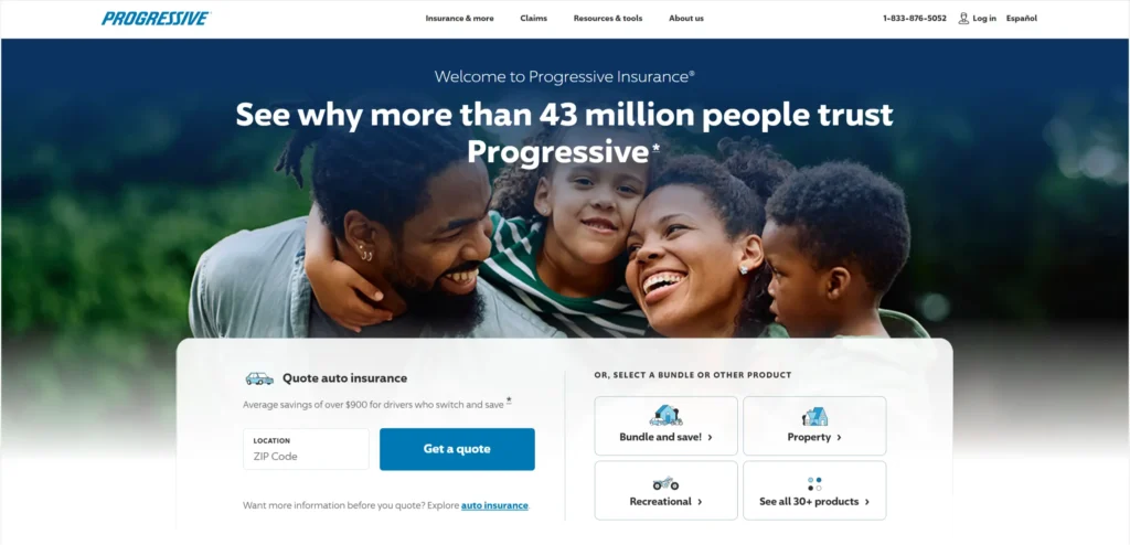**[Progressive’s website](https://www.progressive.com/)** communicates comparison shopping as a brand value: they show their competitors’ prices alongside their own because they trust their pricing to win on merit. The comparison tool is the primary conversion feature on the homepage. The Flo brand personality creates recognition and approachability in a category that is typically cold and transactional.
Design lesson: Insurance comparison as a homepage feature is a bold but commercially effective differentiator. Progressive’s willingness to show competitor pricing communicates confidence and converts visitors who would otherwise go to a comparison site.
### **4. Hippo Insurance
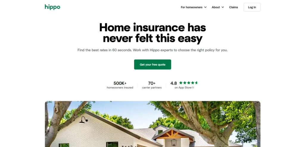**[Hippo](https://www.hippo.com/)** positions itself as modern home insurance and the website communicates this through design and language that is consistent with a technology company rather than an insurance carrier. The smart home focus is prominent. The coverage that differentiates Hippo from traditional home insurance is explained clearly and simply.
Design lesson: Insurance brands targeting younger homeowners benefit from design language that feels native to technology product experiences rather than traditional insurance aesthetics. The visual cue that this is a different kind of insurance company communicates before any copy is read.
### **5. Hiscox
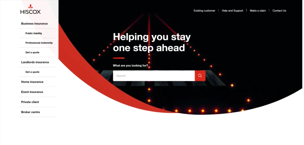**[Hiscox](https://www.hiscox.co.uk/)** focuses on small business and professional insurance and the website communicates specialism and understanding of the small business customer. Business type is the primary navigation entry point. Visitors select their business type and receive product recommendations relevant to their specific risk profile. The tone is knowledgeable and direct without being cold.
Design lesson: Business type as the primary navigation entry point on a commercial insurance website reduces the confusion that arises when visitors do not know what type of policy they need. ‘What type of business are you?’ is a better opening question than ‘what type of insurance do you need?’
### **6. Simply Business
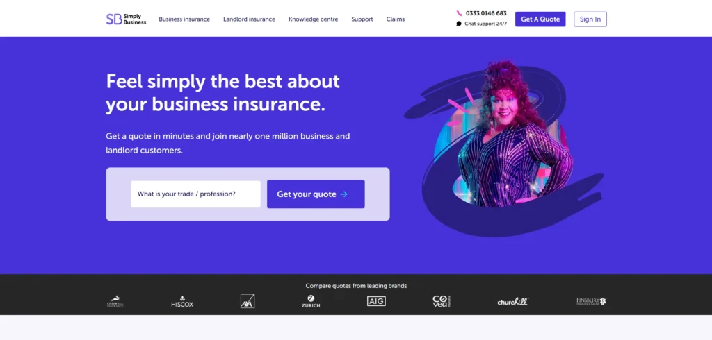**[Simply Business](https://www.simplybusiness.co.uk/)** is a business insurance broker and the website communicates the breadth of their market access and the simplicity of the process through clear product navigation and a prominent quote tool. The content marketing section covers the specific insurance questions that small business owners search for, generating significant organic traffic at the consideration stage.
Design lesson: Insurance broker websites with strong content marketing (answering the specific questions business owners search for about insurance requirements, coverage gaps, and cost expectations) generate organic search traffic that converts at higher rates than paid traffic because visitors arrive with greater product understanding.
### **7. Root Insurance
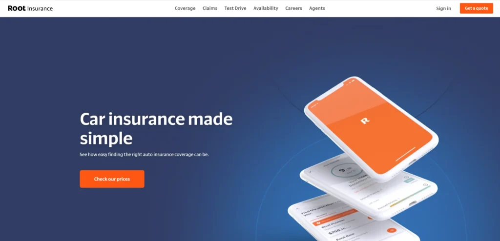**[Root](https://www.joinroot.com/)** is a telematics-based auto insurance company and the website explains this differentiation model (pricing based on how you drive, not just who you are) in plain language with a clear download-the-app CTA. The fairness framing resonates with drivers who feel they pay too much because of demographic factors rather than actual driving behavior.
Design lesson: Insurance products with genuinely differentiated pricing models need to explain the model clearly on the website. A pricing mechanism that is fairer to the customer becomes a conversion tool when it is explained simply and specifically.
### **8. Policygenius
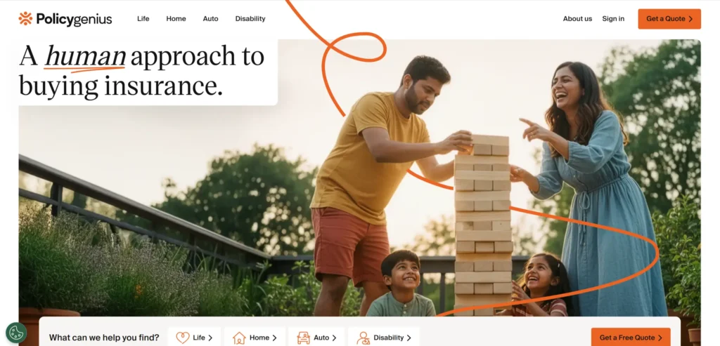**[Policygenius](https://www.policygenius.com/)** is an insurance marketplace and the website communicates the benefit of comparison shopping across multiple insurers with genuine transparency about their broker fee model. The product education content is genuinely useful, explaining the difference between term and whole life, how to calculate how much coverage you need, and converts visitors who are in the research phase of a considered purchase.
Design lesson: Insurance comparison platforms that invest in genuine product education content attract visitors who are researching a complex purchase and convert them at higher rates than platforms that only present quotes without context.
### **9. Zurich Insurance
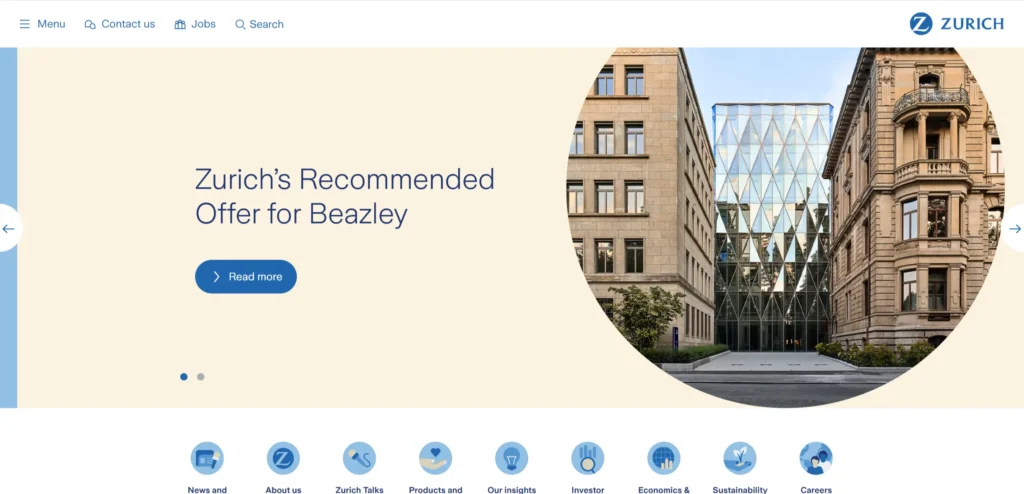**[Zurich’s website](https://www.zurich.com/)** serves both corporate clients and individuals across multiple product lines and geographies. The navigation separates commercial and personal audiences clearly. The corporate responsibility and sustainability content is substantial, which matters for the large corporate clients whose own ESG commitments require reporting on insurer practices.
Design lesson: For global insurance brands serving corporate clients, sustainability and corporate responsibility content is increasingly a procurement factor. Large corporates evaluating insurance partners consider the insurer’s own ESG standing as part of the selection criteria.
### **10. Aviva
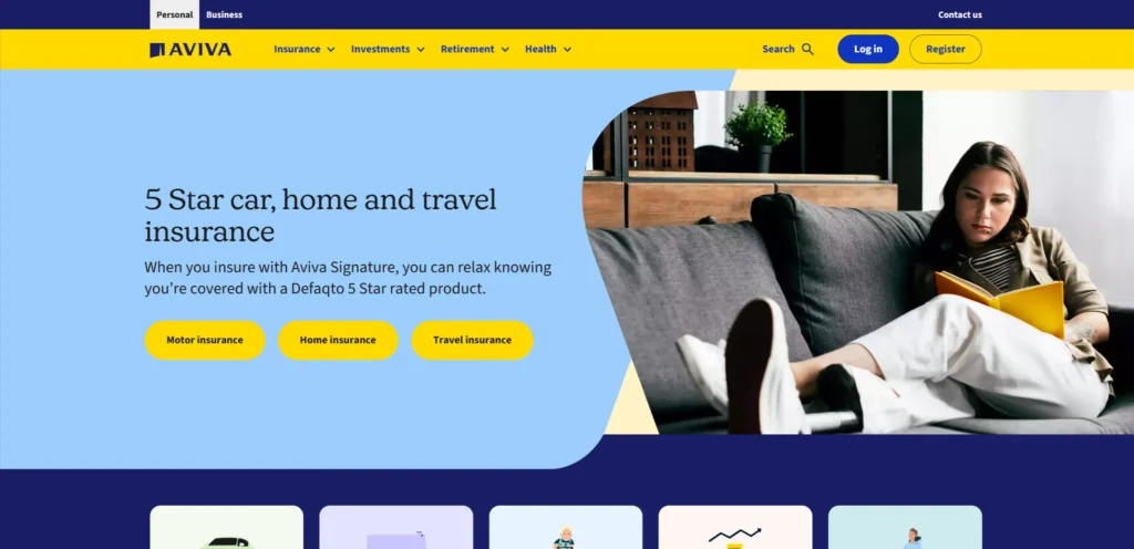**[Aviva’s website](https://www.aviva.co.uk/)** manages a comprehensive product range (home, car, life, health, pension) in a single navigation structure that is not confusing to use. The cross-sell between products for existing customers is handled through a well-designed customer portal. The live chat is genuinely responsive and handles claims and policy changes without requiring a phone call.
Design lesson: Multi-product insurance websites that allow customers to manage multiple policies, cross-purchase additional coverage, and handle service requests in a single digital environment generate higher retention rates than those that silo products.
### **11. Chubb
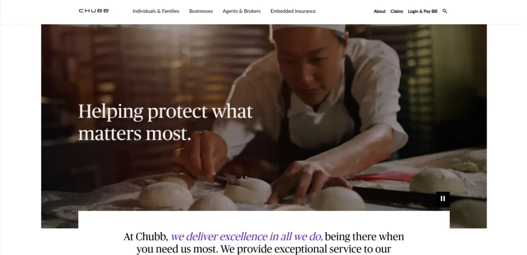**[Chubb](https://www.chubb.com/)** targets the high-net-worth individual and commercial insurance market and the website communicates this positioning through design restraint, specific product expertise content, and a tone that treats the visitor as a sophisticated buyer rather than a price-sensitive consumer. The claims service content is prominent, which addresses the primary concern of high-value clients.
Design lesson: For premium insurance brands targeting high-net-worth individuals, claims service quality and speed is often more important to the purchase decision than premium price. Featuring claims service capability prominently addresses the concern that matters most to this client segment.
### **12. Brightside
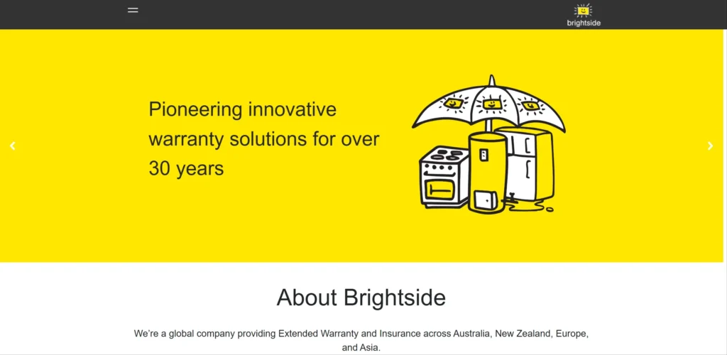**[Brightside](https://brightside.com.au/)** is an Australian car insurance brand whose website uses warm design and plain language to communicate approachability in a category that is typically clinical. The comparison tool is fast and the quote process is genuinely simple. Photography shows real people in real driving contexts rather than generic insurance imagery.
Design lesson: Insurance brands targeting first-time buyers (young drivers, new homeowners) benefit from warm, approachable visual design and plain language that reduces the intimidation factor of a category most young adults are navigating for the first time.
### **13. Bought By Many
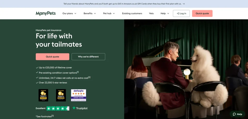**[Bought By Many](https://boughtbymany.com/)** is a specialist pet insurance brand whose website communicates genuine care for animals rather than clinical coverage terms. The brand personality is warm and specific to the pet owner’s emotional relationship with their animal. Coverage is explained in plain language. Customer reviews are specific and numerous.
Design lesson: Specialist insurance brands that have genuine empathy for the holder’s emotional relationship with what they are insuring (their pet, their classic car, their business) communicate this through design and copy in a way that commodity insurers cannot replicate.
### **14. Pie Insurance
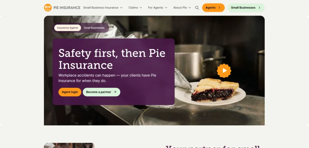[**Pie Insurance**](https://pieinsurance.com/) focuses on workers’ compensation for small businesses and the website communicates specialism and simplicity simultaneously. The quote process is genuinely fast. The explainer content is written for business owners who understand their payroll but do not understand workers’ comp requirements. The savings claim is prominent and specific.
Design lesson: B2B insurance brands that quantify their savings claim specifically. ‘Small businesses save an average of 30% with Pie’ — convert at higher rates than those that use generic cost benefit language. Specific numbers create credibility that vague claims cannot.
## **What These Insurance Website Designs Have in Common
Looking across all 14 examples, these patterns appear consistently in the ones that work best commercially, not just aesthetically.
- Quote process prominent and fast: under two minutes from landing to quote in every strong example
- Plain language throughout with insurance jargon explained or eliminated
- Trust signals — AM Best ratings, BBB accreditation, claims satisfaction scores — visible on the homepage
- Business type or coverage type as the primary navigation entry point rather than product name
- Pricing transparency or comparison that reinforces the brand’s competitive positioning
## 5 Design Elements Every Insurance Website Needs in 2026
Whether you are building from scratch or redesigning an existing site, these five elements consistently separate high-performing examples from functional but forgettable ones.
#### 1. Quote button or quote process visible in the first viewport on every page. A visitor who cannot find your quote button within three seconds will leave for a comparison site.
Quote button or quote process visible in the first viewport on every page
#### **2. Plain language used throughout
Plain language used throughout. Insurance terms should be explained when unavoidable, not assumed knowledge.
#### **3. Trust signals
Trust signals — claims rating, BBB or equivalent, financial strength rating — visible without scrolling
Coverage type or business type as the navigation entry point, not product name
#### **5. Pricing transparency or best price claim communicated immediately on the homepage
Pricing transparency or best price claim communicated immediately on the homepage
## **AI Implementation for Insurance Websites in 2026
Most insurance website designs articles cover design examples. Almost none address AI implementation, which is where the commercial gap is opening in 2026. The insurance website designs that implement these features in the next 12 months will have a measurable advantage over those that do not.
### 1. AI-Powered Quote Personalization
Insurance quoting has historically required long forms because risk is priced on many variables. AI can reduce perceived quote friction by asking questions in natural language conversation rather than presenting a multi-field form, dynamically showing only the questions relevant to the specific coverage type and business or personal profile, and pre-filling information from available data sources. Progressive and Lemonade have both demonstrated that conversational quote flows convert at higher rates than traditional form-based approaches.
### **2. AI Chat for Coverage Guidance
Most insurance buyers do not know what coverage they need. An AI chat assistant that asks about the customer’s situation (the type of business, the assets they own, the risks they face — and recommends appropriate coverage types before presenting a quote reduces the comparison paralysis that affects visitors trying to choose between policy types they do not fully understand. Simply Business uses a version of this with measurable impact on quote completion rates.
### **3. AI-Powered Claims Triage and Status
Claims experience is the moment that determines whether a customer renews. An AI claims triage system that assesses the type and urgency of a claim, routes it to the correct team with relevant documentation requests, and provides real-time status updates throughout the process creates a claims experience that traditional phone and form-based systems cannot match. Several insurers including Lemonade and GEICO have deployed AI claims assessment with reported settlement time reductions of 50% or more.
### **4. Automated Renewal Communication and Churn Prevention
Insurance policy renewal is the highest-churn moment in the customer lifecycle. AI-powered renewal communication that personalises the renewal message based on the customer’s claims history, tenure, and risk profile, rather than sending a generic renewal notice, reduces the proportion of customers who shop at renewal. Customers who feel understood by their insurer renew at higher rates than those who receive impersonal renewal communications.
KrishaWeb builds AI-integrated insurance websites on WordPress and other platforms. If your current site is not using these features, our team can assess what to implement first based on your specific conversion goals.
##### Additional Read
- [22 Best Restaurant Website Design Examples in 2026](https://www.krishaweb.com/blog/best-restaurant-website-design-examples/)
- [14 Best Fashion Website Designs: Inspiring Examples for 2026](https://www.krishaweb.com/blog/best-fashion-website-designs/)
- [15 Best Bakery Website Designs for Inspiration in 2026](https://www.krishaweb.com/blog/best-bakery-website-designs/)
### **Frequently Asked Questions
**What makes a good insurance website design?**A good insurance website reduces the friction of the quote process to the minimum while communicating exactly enough trust to make visitors comfortable sharing personal information. Plain language, a fast quote process, specific trust signals, and clear coverage explanation at the right level of detail for the audience are the consistent elements across the high-converting insurance websites on this list.
**How long should an insurance quote process take?**The highest-converting insurance quote processes on the websites in this list take under two minutes. Every additional question in the quote flow reduces completion rates by a measurable percentage. The goal is to collect the minimum information required to generate a meaningful quote rather than the maximum information required to generate a perfectly accurate one.
**How should insurance websites handle product complexity?**Product complexity in insurance should be handled through plain language explanation, not through simplified messaging that leaves customers without the information they need to make an informed decision. The distinction is in how the information is presented: straightforward language organized by the customer’s situation, not by product category or policy schedule structure.
**How important is trust for insurance websites?**Trust is the primary purchase barrier in insurance. Visitors are committing to paying for a service they hope they never need to use, and trusting the insurer to deliver when they do. AM Best ratings, financial strength indicators, claims satisfaction scores, and genuine customer reviews address this trust deficit more effectively than brand imagery and generic quality claims.
**How can AI improve an insurance website?**Conversational quote flows that reduce form completion friction, coverage guidance that recommends policy types based on customer situation, AI claims triage that reduces settlement times, and personalized renewal communication that reduces churn at the policy renewal moment are the AI implementations that deliver the most commercial impact for insurance websites in 2026.
### **Conclusion
The 14 insurance website designs on this list span different scales, budgets, and markets. What they share is not production budget or agency pedigree. It is a commitment to treating the website as a genuine commercial and brand tool rather than a digital brochure.
The design elements that matter most in this category are not complex or expensive to implement. Strong photography, a clear path to the primary conversion action, social proof specific enough to be credible, and mobile performance that matches desktop quality. These are achievable at almost any budget with the right priorities and the right **[web design service](https://www.krishaweb.com/web-design/)**.
If your current insurance website is not doing these things, talk to KrishaWeb’s web design team about whDisat a focused redesign would look like for your specific goals.
Ready to improve your website? KrishaWeb has offered conversion-focused web design service since 2008. Tell us your goals and we will tell you the right approach.
***Disclaimer:** This article is intended for informational and inspirational purposes only. The website examples featured are owned by their respective organizations. KrishaWeb has no affiliation with any of the websites referenced unless otherwise stated. All observations, statistics, and design notes reflect research current as of April 2026 and may change over time.*

###### Nisarg Pandya
Project ManagerExperienced Project Manager and Scrum Master at KrishaWeb, delivers expertise in Scrum methodologies, Laravel, React.js, UX design, and project management, ensuring efficient project delivery and agile implementation.
 Interact With Me-
-
- [ ](mailto:)
---
_View the original post at: [https://www.krishaweb.com/blog/best-insurance-website-designs/](https://www.krishaweb.com/blog/best-insurance-website-designs/)_
_Served as markdown by [Third Audience](https://github.com/third-audience) v3.5.3_
_Generated: 2026-04-28 13:35:13 UTC_