---
title: "12 Best Modern Website Design Examples to Inspire You in 2026"
url: "https://www.krishaweb.com/blog/best-modern-website-designs/"
date: "2026-05-08T13:02:37+00:00"
modified: "2026-05-08T13:02:39+00:00"
author:
name: "Nisarg"
categories:
- "Web Design"
word_count: 2401
reading_time: "13 min read"
summary: "The definition of modern website design moves every two to three years. What looked contemporary in 2021 can look dated in 2026. The websites on this list are not just visually current. They demons..."
description: "If you are looking for design ideas for your website, then this comprehensive guide brings you the best modern website designs to help you."
keywords: "best modern website designs, Web Design"
language: "en"
schema_type: "Article"
related_posts:
- title: "12 Best Roofing Website Design Inspirations for 2026"
url: "https://www.krishaweb.com/blog/best-roofing-website-design-inspirations/"
- title: "12 Best SaaS Website Designs to Take Inspiration in 2026"
url: "https://www.krishaweb.com/blog/best-saas-website-designs/"
- title: "12 Best Tutoring Website Designs for Inspiration in 2026"
url: "https://www.krishaweb.com/blog/best-tutoring-website-designs/"
---
# 12 Best Modern Website Design Examples to Inspire You in 2026
_Published: Friday,May 8, 2026_
_Author: Nisarg_

The definition of modern website design moves every two to three years. What looked contemporary in 2021 can look dated in 2026. The websites on this list are not just visually current. They demonstrate the design principles and interaction patterns that are setting the standard in 2026: purposeful motion, considered typography, fast performance, and accessibility built in from the start rather than retrofitted.
At KrishaWeb, we have been tracking what works commercially in web design since 2008. This list is not a collection of award-winning experimental sites that prioritize art over function. It is a selection of websites that are visually strong and commercially effective.
***KrishaWeb has designed and built modern website designs since 2008. The pattern that holds across every high-performing example: design decisions made in service of the visitor’s actual goal, not the agency’s portfolio.***
## 12 Best Modern Website Design Examples to Inspire You in 2026
### 1. Linear
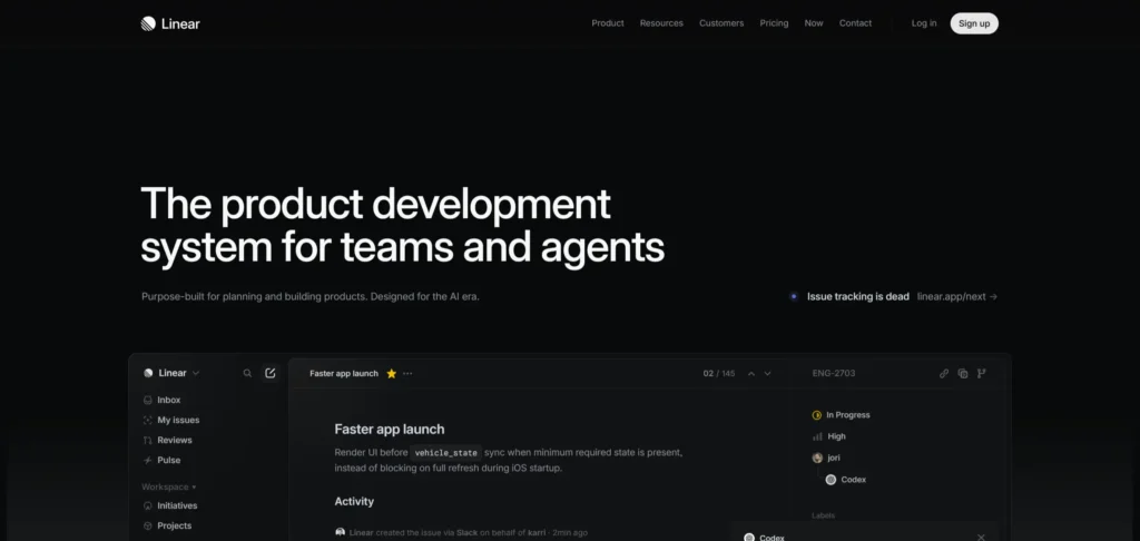[**Linear’s website**](https://linear.app/) is widely cited as one of the most influential website designs of the past three years. The dark-mode-first design, the micro-animation on UI elements, and the confident typographic hierarchy all feel deliberately considered. The product screenshots are presented at scale, which communicates confidence in the quality of the interface. Performance is exceptional: the site loads fast despite the visual richness.
***Design lesson:** Dark mode design done well requires more typographic precision than light mode because the contrast between elements is managed differently. Linear’s text hierarchy is among the clearest examples of dark mode type done correctly.*
### 2. Vercel
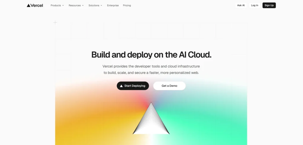[**Vercel’s website**](https://vercel.com/) reflects the technical audience it serves through density of information that would overwhelm a general audience but feels appropriate for developers evaluating a deployment platform. The code examples are presented as first-class visual elements. The animation quality is high. The design communicates speed and precision, which are exactly the product values Vercel is selling.
***Design lesson:** Website density should match audience expectations. A developer platform that presents information with the simplicity of a consumer product loses credibility with a technical audience that expects precision and depth.*
### 3. Lusion
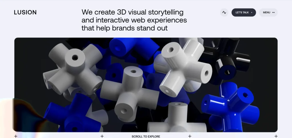[**Lusion**](https://lusion.co/) is a creative studio whose website is one of the most technically accomplished examples of WebGL-powered interactive design currently live. The 3D environment responds to mouse movement and creates an immersive experience that demonstrates the studio’s capability before you read a word. The performance is managed carefully: the effect is rich without being slow.
***Design lesson:** Technically ambitious web experiences need to perform as well as they look. A visually impressive website that loads slowly or drops below 30fps on mid-range hardware creates a worse impression than a simpler design that performs consistently.*
### 4. Resend
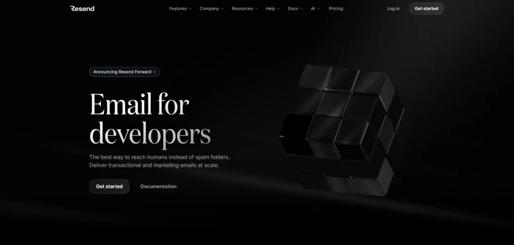[**Resend**](https://resend.com/) is a developer email API company whose website communicates technical clarity and product confidence through extreme minimalism. Dark background, a single clear value proposition, documentation prominently featured, and a sign-up CTA that requires one click. Nothing decorative. Everything functional. The design demonstrates respect for the developer audience’s time.
***Design lesson:** Minimalism in web design is not the absence of decisions. It is the result of making every decision very deliberately. Resend’s homepage looks simple because every element earns its place.*
### 5. Apple
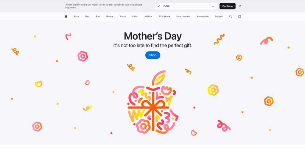[**Apple’s**](https://www.apple.com/) product presentation pages remain the benchmark for how to present physical technology products online. Full-width product photography, cinematic video, typographic scale used to create rhythm, and a scrolling experience that reveals information at a pace that feels considered rather than rushed. Every product page communicates the experience of using the product, not just its specifications.
***Design lesson:** Scroll-driven storytelling, where content is revealed progressively as the visitor scrolls, creates a narrative experience that static page layouts cannot. Apple’s product pages use scroll position as a storytelling device.*
### 6. Spotify Design
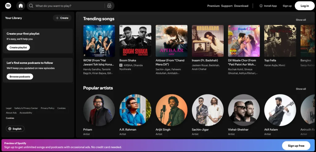[**Spotify’s design**](https://spotify.design/) blog is one of the strongest examples of how a large tech company can communicate design culture externally. The editorial layout is confident and the content is genuinely interesting rather than PR-flavoured. The visual identity borrows from the main Spotify brand while creating a distinct editorial voice.
***Design lesson:** A design-focused editorial site that publishes genuine thinking about process and culture is more effective at attracting design talent than a careers page. Spotify Design attracts designers who want to do this kind of work, not just designers who want to work at a well-known company.*
### 7. Pitch
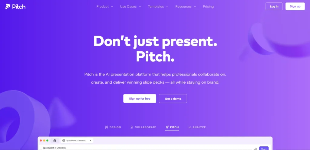[**Pitch’s website**](https://pitch.com/) communicates collaboration and visual quality in a design that is both modern and approachable. The template gallery demonstrates product capability more effectively than feature lists. The pricing is transparent. The hero section combines product screenshots with motion in a way that feels contemporary without feeling gimmicky.
***Design lesson:** The combination of real product screenshots and purposeful motion in a hero section communicates both the product’s visual quality and its dynamic nature, which is more persuasive than static screenshots alone for collaborative tools.*
### 8. Framer
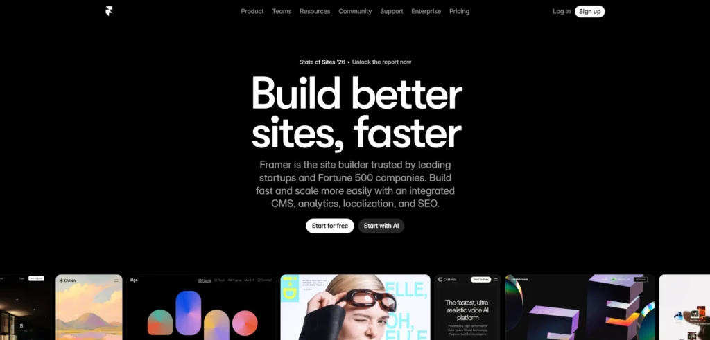[**Framer’s website**](https://www.framer.com/) has to demonstrate that a visual design tool can produce production-quality web output, and it does this by being built in Framer itself. The interactions, animations, and layout all demonstrate the tool’s capability. The community gallery of sites built in Framer is the most persuasive argument for the product that the marketing team could produce.
*Design lesson: For design tools and no-code platforms, building your marketing website in your own product is the most credible demonstration of its capability. The website is the most visible case study.*
### 9. Craft Docs
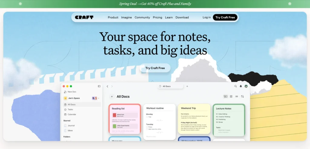[**Craft’s website**](https://www.craft.do/) communicates the quality and thoughtfulness of the product through a design that is itself thoughtful and high-quality. The typography is exceptional. The product screenshots are presented with care. The tone of the copy is human and specific. The effect is a website that feels like it was made by people who care about the details, which is exactly what Craft’s positioning promises.
***Design lesson:** The care and quality of a product website is interpreted by visitors as a signal about the care and quality of the product itself. A product that promises to help you create beautiful documents should have a beautiful website.*
### 10. Raycast
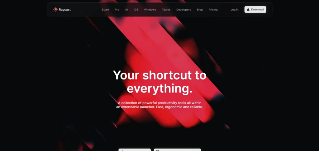[**Raycast’s website**](https://www.raycast.com/) uses a dark palette and precision typography to communicate the developer-productivity positioning of the product. The feature demonstrations are specific and visual: they show what the product does rather than describing it. The community and extension gallery content communicates ecosystem maturity in a way that a simple feature list cannot.
***Design lesson:** Extension or plugin galleries on productivity tool websites communicate ecosystem maturity to buyers who are evaluating whether a tool is worth adopting. A product with 1,000 community extensions is more likely to be adopted and retained than one with 10.*
### 11. Basement Studio
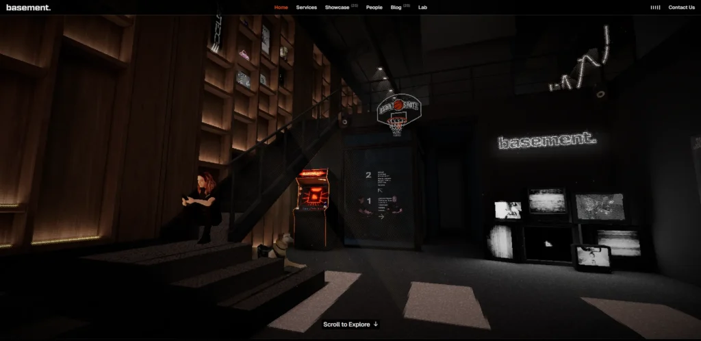[**Basement Studio**](https://basement.studio/) is a creative development agency whose website is one of the most impressive examples of CSS and WebGL work currently live. The type animations, the color transitions, and the overall visual rhythm communicate the studio’s technical and creative capability simultaneously. The portfolio is presented in a way that makes each case study feel like an event rather than a page.
***Design lesson:** For creative development studios, the website is the most important piece in the portfolio. Every technical decision (animation quality, interaction design, performance) is evaluated as evidence of capability by potential clients.*
### 12. Anthropic
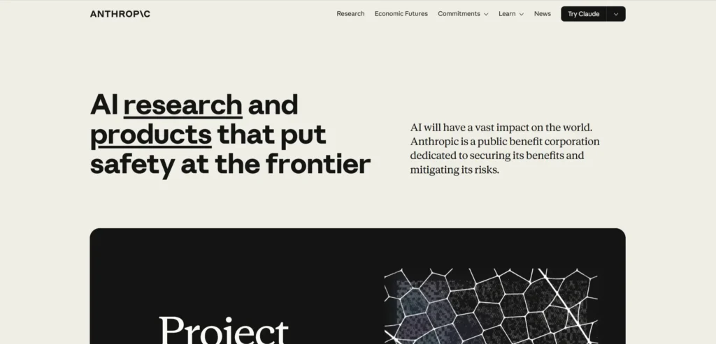[**Anthropic’s website**](https://www.anthropic.com/) communicates both technical rigour and responsible AI development through a design that is authoritative without being cold. The research content is genuinely accessible. The values and safety content is prominent and specific. The visual design is clean and considered. For a company whose product is intangible and technically complex, the website does the work of making the mission legible.
***Design lesson:** For companies working on technically complex or intangible products, the website’s job is to make the mission and values legible before explaining the product. Trust must be established before technical capability can be evaluated.*
## What These Modern Website Design Have in Common
Looking across all 12 examples, these patterns appear consistently in the ones that work best commercially, not just aesthetically.
- Performance is treated as a design requirement, not a post-launch technical concern
- Typography is used as a primary design element rather than a layout filler
- The product, the tool, or the work is shown rather than described
- Motion is purposeful: every animation communicates something about the product or brand
- Dark mode design is executed with the typographic precision it requires
## 5 Design Elements Every Modern Website Design Example Needs
Whether you are building from scratch or redesigning an existing site, these five elements consistently separate high-performing examples from functional but forgettable ones.
**1. Typography used as a primary visual element**
Typography used as a primary visual element: type scale, weight, and spacing creating rhythm rather than text simply filling containers
**2. Motion that communicates product behavior or brand personality rather than decorating the page**
Motion that communicates product behaviour or brand personality rather than decorating the page
**3. Product or work shown in context in the hero**
Product or work shown in context in the hero, not described
**4. Performance at parity with visual quality**
Performance at parity with visual quality: a site that looks rich but loads slowly is not modern design
**5. Accessibility built in from the design phase**
Accessibility built in from the design phase (color contrast, keyboard navigation, alt text) as design requirements, not post-launch fixes
## AI Implementation in Modern Website Design in 2026
Most modern website design articles cover design examples. Almost none address AI implementation, which is where the commercial gap is opening in 2026. The modern website design that implement these features in the next 12 months will have a measurable advantage over those that do not.
### 1. AI-Powered Personalization of Hero Content
Modern websites in 2026 are beginning to personalize the hero section based on visitor source, geography, and behavior. A visitor arriving from a developer community link sees different hero content than a visitor arriving from a business podcast sponsorship. Tools like Mutiny and Intellimize enable this personalization for marketing websites without custom development. The impact on conversion rate from relevant hero content versus generic content is consistently positive in controlled tests.
### 2. AI-Generated Motion and Micro-Interaction
Tools like Rive and LottieFiles now include AI-assisted animation generation that allows design teams to create high-quality motion assets without specialist animation expertise. For modern website design where purposeful motion is now expected rather than exceptional, these tools lower the production barrier for studios and in-house teams working without dedicated motion designers.
### 3. AI Accessibility Scanning and Remediation
Modern website design in 2026 treats accessibility as a build requirement rather than a compliance afterthought. AI-powered accessibility scanning tools like Deque’s axe DevTools integrate into the development pipeline and flag WCAG violations before they reach production. Alt text generation, contrast analysis, and keyboard navigation testing are now automated in the design-to-development workflow at leading studios.
### 4. AI-Powered Performance Optimization
Core Web Vitals are now a ranking factor and a conversion factor simultaneously. AI-powered performance tools like Cloudflare’s AI optimization and Vercel’s Edge Network dynamically compress, cache, and deliver assets in formats that each visitor’s device and connection can handle optimally. For visually rich modern websites, this AI layer is what makes the combination of high design quality and fast load times achievable at scale.
***KrishaWeb builds AI-integrated modern website designs on WordPress and other platforms. If your current site is not using these features, our team can assess what to implement first based on your specific conversion goals.***
##### Additional Read
- [12 Best SaaS Website Designs to Take Inspiration in 2026](https://www.krishaweb.com/blog/best-saas-website-designs/)
- [12 Best Tutoring Website Designs for Inspiration in 2026](https://www.krishaweb.com/blog/best-tutoring-website-designs/)
- [12 Best University Website Designs for Inspiration in 2026](https://www.krishaweb.com/blog/best-university-website-designs/)
### Frequently Asked Questions
**What makes a website design modern in 2026?**Modern website design in 2026 is defined by purposeful motion that communicates product behavior, typography used as a primary design element rather than a layout filler, product or work shown directly rather than described, performance treated as a design requirement, and accessibility built in from the start. Visual trends like dark mode, large typographic scale, and WebGL interactions reflect these principles in execution.
**How important is website performance for modern design?**Performance is inseparable from modern design quality. A website that looks visually rich but loads slowly on a 4G mobile connection is not a well-designed website. It is a well-rendered one. Core Web Vitals are a Google ranking factor, a conversion factor, and a user experience requirement. Modern design teams treat performance benchmarks as design constraints, not post-launch technical tasks.
**Should every website use dark mode design?**Dark mode is appropriate when it serves the brand and the content. Developer tools, creative studios, and entertainment platforms suit dark mode because it aligns with the environments where their users work and the aesthetics their audiences prefer. Healthcare, finance, and education brands typically suit light mode because it communicates clarity and trust. The decision should be driven by brand positioning and audience context, not by trend.
**How much motion is appropriate on a modern website?**Every animated element on a modern website should communicate something about the product, the brand, or the content. Animation that communicates loading state, product interaction, or transition between states is purposeful. Animation that exists to make the page look active is decorative and adds cognitive load without adding meaning. The test for any animation: if you removed it, would the visitor understand the page less well?
**How can AI be used in modern website design?**AI is being applied in modern web design for hero section personalization based on visitor source and behavior, AI-assisted motion generation, automated accessibility scanning and remediation in the development pipeline, and performance optimization at the CDN layer. These applications are becoming standard practice at leading design studios in 2026.
### Conclusion
The 12 modern website designs on this list span different scales, budgets, and markets. What they share is not production budget or agency pedigree. It is a commitment to treating the website as a genuine commercial and brand tool rather than a digital brochure.
The design elements that matter most in this category are not complex or expensive to implement. Strong photography, a clear path to the primary conversion action, social proof specific enough to be credible, and mobile performance that matches desktop quality. These are achievable at almost any budget with the right priorities.
If your current modern website design is not doing these things, [**talk to KrishaWeb’s web design team**](https://www.krishaweb.com/contact-us/) about what a focused redesign would look like for your specific goals with a professional [**web design service**](https://www.krishaweb.com/web-design/).
***Ready to improve your website? KrishaWeb has been designing and developing conversion-focused websites since 2008. Tell us your goals, and we will tell you the right approach.***
***Disclaimer:** This article is intended for informational and inspirational purposes only. The website examples featured are owned by their respective organizations. KrishaWeb has no affiliation with any of the websites referenced unless otherwise stated. All observations, statistics, and design notes reflect research current as of April 2026 and may change over time.*

###### Nisarg Pandya
Project ManagerExperienced Project Manager and Scrum Master at KrishaWeb, delivers expertise in Scrum methodologies, Laravel, React.js, UX design, and project management, ensuring efficient project delivery and agile implementation.
 Interact With Me-
-
- [ ](mailto:)
### Best Web Page Design Inspirations [52 Examples]
To provide you with a glimpse and inspiration for modern website pages, we’ve clustered 52 web page design examples from the leading industries to help you stand out in the digital landscape.
[Download Now!](https://www.krishaweb.com/download/web-page-design-examples-inspirations/) 
---
_View the original post at: [https://www.krishaweb.com/blog/best-modern-website-designs/](https://www.krishaweb.com/blog/best-modern-website-designs/)_
_Served as markdown by [Third Audience](https://github.com/third-audience) v3.5.3_
_Generated: 2026-05-08 13:02:40 UTC_