---
title: "22 Best Restaurant Website Design Examples in 2026"
url: "https://www.krishaweb.com/blog/best-restaurant-website-design-examples/"
date: "2026-04-27T13:38:33+00:00"
modified: "2026-04-27T13:40:51+00:00"
author:
name: "Nisarg"
categories:
- "Web Design"
tags:
- "best restaurant website examples"
- "best restaurant websites"
word_count: 3221
reading_time: "17 min read"
summary: "A restaurant website has three jobs, in this order: make the visitor hungry, tell them where and when they can eat, and let them book or order with minimum friction. Every restaurant website that f..."
description: "Check out the top-notch restaurant website design and attract more hungry diners to your establishment today! Explore the best examples!"
keywords: "Best Restaurant Website Design, best restaurant website examples, best restaurant websites"
language: "en"
schema_type: "Article"
---
# 22 Best Restaurant Website Design Examples in 2026
_Published: Monday,April 27, 2026_
_Author: Nisarg_
A restaurant website has three jobs, in this order: make the visitor hungry, tell them where and when they can eat, and let them book or order with minimum friction. Every restaurant website that fails commercially is failing at one of these three things, usually the third.
At KrishaWeb, we have built websites for restaurants, hospitality groups, and food brands since 2008. The restaurant websites that drive the most covers and orders consistently share one characteristic: they make the food look extraordinary before they ask for anything from the visitor.
## 22 Best Restaurant Website Design Examples in 2026
### 1. Eleven Madison Park
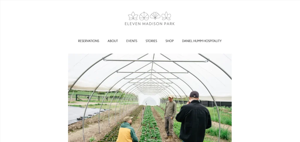[**Eleven Madison Park**](https://www.elevenmadisonpark.com/) is one of the world’s most celebrated restaurants, and the website communicates this status through restraint. Photography is cinematic and minimal. Navigation is sparse. The reservation process is clear, and the wait list function is well-implemented. Nothing on the site dilutes the sense that this is a dining experience rather than a meal.
***Design lesson:*** *For fine dining restaurants, the website should communicate the elevated nature of the experience through design restraint and photography quality rather than through description. Eleven Madison Park does not tell you it is exceptional. It demonstrates it.*
### 2. Noma
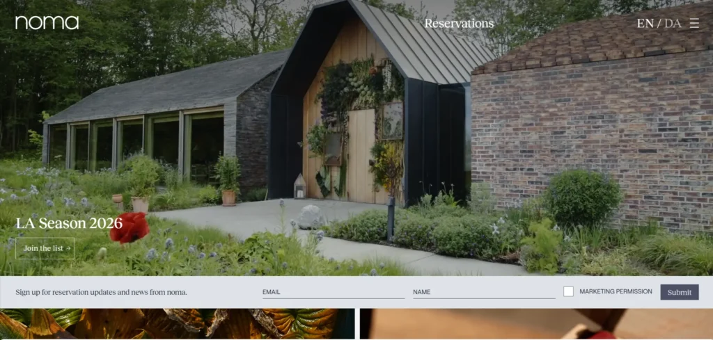[**Noma’s website**](https://www.noma.dk/) handles a restaurant that has closed and reopened as a food lab and pop-up experience by clearly communicating the new model. The photography remains exceptional. The clarity about what Noma is now, rather than what it was, is appreciated by the audience that follows the restaurant.
***Design lesson:*** *Restaurants that have changed their model need the website to communicate the change clearly rather than relying on the audience’s previous understanding. Confusion about what a restaurant is now costs reservations.*
### 3. Alinea
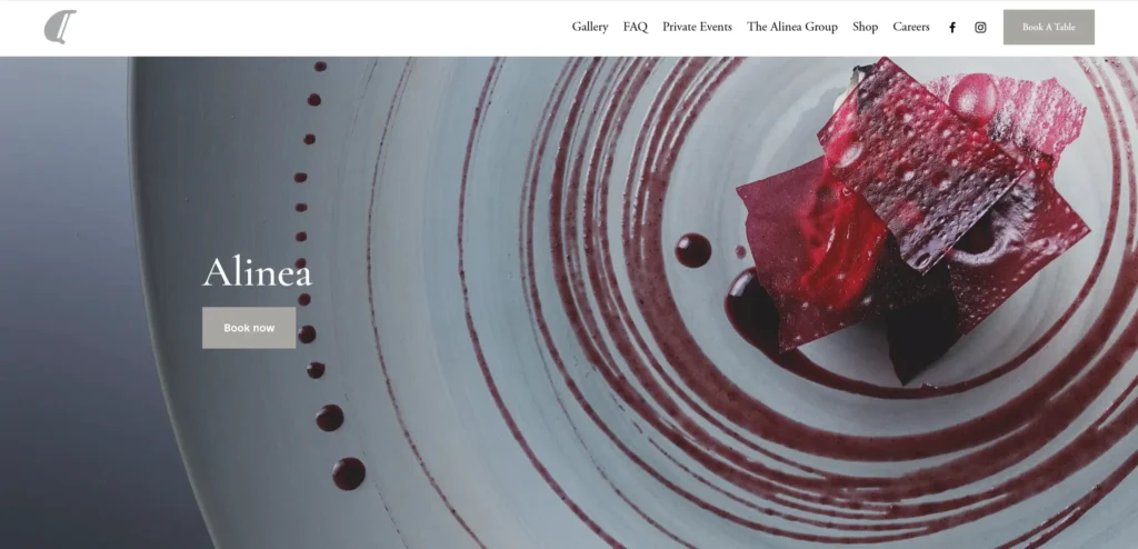[**Alinea’s website**](https://www.alinearestaurant.com/) communicates the theatrical, experimental nature of the dining experience through photography and presentation that is itself theatrical and experimental. The ticketed reservation model is explained clearly. The anti-dinner presentation of fine dining is evident in every design decision.
***Design lesson:*** *Restaurants with unusual service models, ticketed, communal, multi-course only, no-menu, these need to be communicated clearly on the website before the visitor books. Surprise at the reservation is manageable. Surprise at the table is not acceptable.*
### 4. The Fat Duck
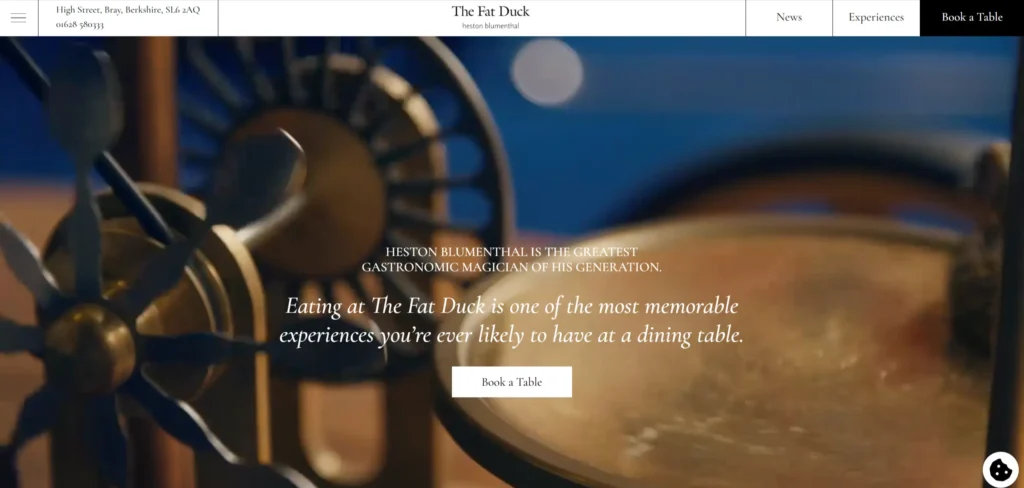[**The Fat Duck’s website**](https://www.thefatduck.co.uk/) communicates the storytelling and sensory experience of Heston Blumenthal’s cooking through visual and copy language that is literary rather than culinary. The website prepares the diner for an experience rather than informing them of a menu. The reservation process is detailed about what to expect.
***Design lesson:*** *The best fine dining websites prepare the guest for the experience emotionally and practically. A diner who arrives knowing what to expect and is prepared for the format has a better experience than one who is surprised by it.*
### 5. Carbone
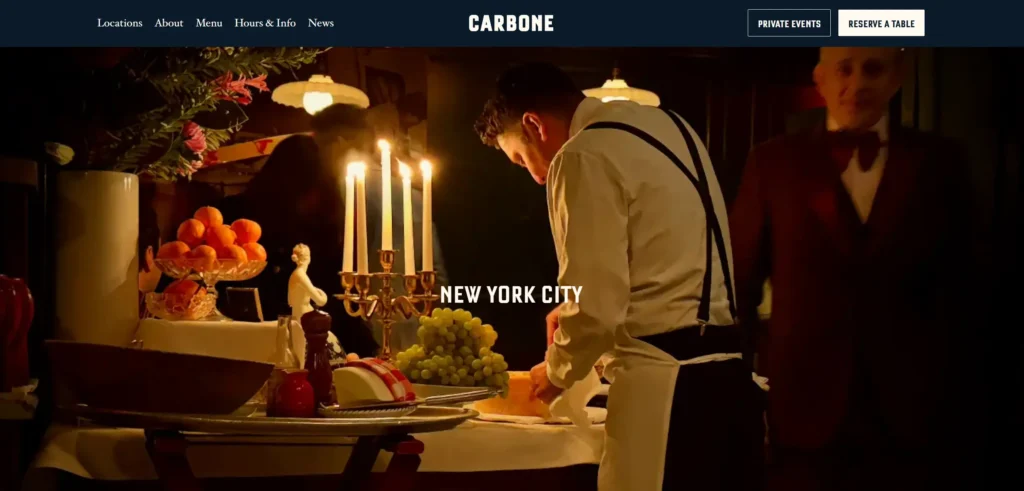[**Carbone’s website**](https://carbonenewyork.com/) communicates the specific atmosphere of the restaurant, mid-century Italian-American, theatrical service, and opulent food through photography and typography that immediately transports the visitor to the room. The reservation link is prominent. The photography shows the actual interior and food, with the visual quality the restaurant warrants.
***Design lesson:*** *Restaurant photography that communicates atmosphere, the light in the room, the weight of the silverware, and the look of the other tables sells a dining experience more effectively than close-up food photography alone.*
### 6. Salt Bae Nusr-Et
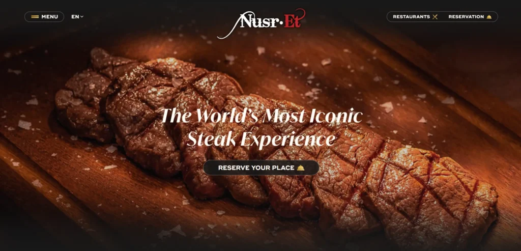[**Nusr-Et’s website**](https://nusr-et.com.tr/) leads with the brand personality that made it globally known. The photography is dramatic. Meat quality is the central focus of communication. The multi-location structure is handled through a clean location finder. The visual identity is consistent across every market the brand operates in.
***Design lesson:*** *Restaurant brands built on a specific personality or showmanship need the website to communicate that personality immediately. A brand built on spectacle needs a spectacular website.*
### 7. Shake Shack
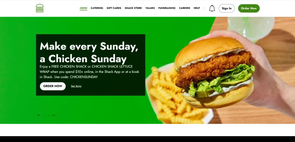[**Shake Shack’s website**](https://www.shakeshack.com/) handles the complexity of a fast-casual brand with hundreds of locations, a seasonal limited menu, and a prominent ordering and delivery operation. The menu section is clear and updated regularly. The ordering integration is prominent. The brand voice, quality ingredients, and no compromises are communicated consistently.
***Design lesson:*** *Fast-casual restaurant websites with active online ordering need the ordering function to be as prominent as the menu. A visitor who wants to order and cannot find the button within seconds will order through a third-party platform instead, at a cost to the restaurant.*
### 8. The Wolseley
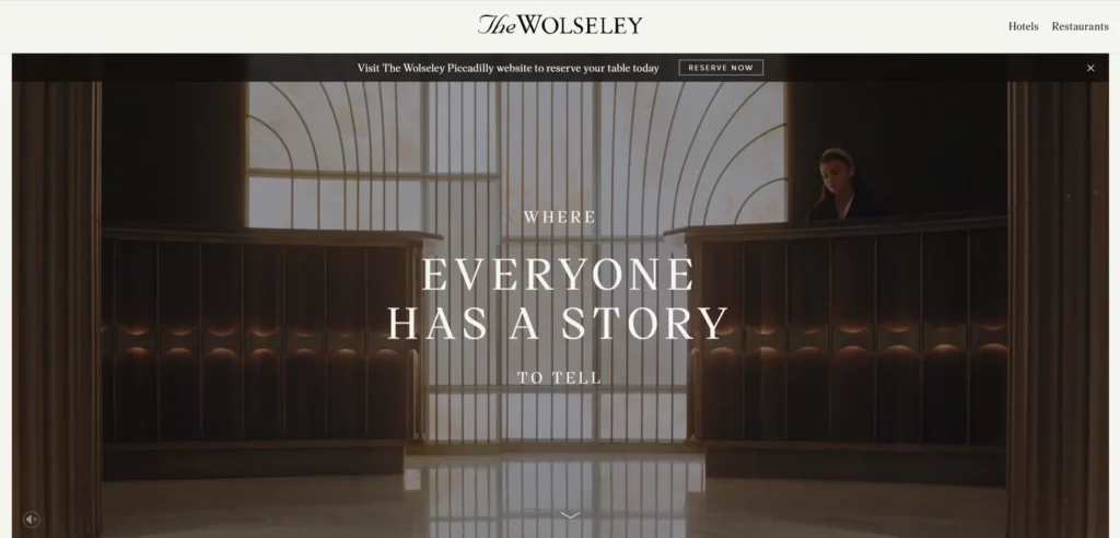[**The Wolseley**](https://www.thewolseley.com/) is a London institution, and the website communicates this through elegant simplicity. The photograph shows the grand interior. The booking function is prominent, and reservation windows are realistic. Special events and private dining are accessible from the main navigation. The design communicates that nothing at The Wolseley needs to try very hard.
***Design lesson:*** *Established restaurant institutions communicate their status most effectively through design confidence and restraint rather than promotional energy. A restaurant that has been full for 20 years does not need to shout.*
### 9. Hawksmoor
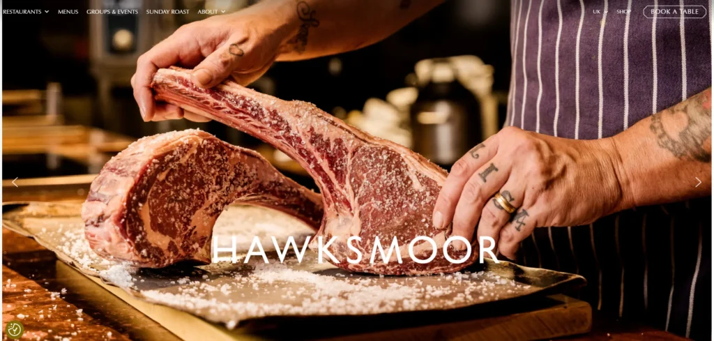[**Hawksmoor**](https://thehawksmoor.com/) is a British steakhouse whose website communicates craft and provenance with specific detail. The beef sourcing is explained specifically, and the supply chain transparency is prominent. Photography shows the quality of the raw ingredient as well as the finished dish. The bar program is given equal prominence to the food. The booking system is fast and well-integrated.
***Design lesson:*** *Restaurants whose quality proposition depends on ingredient sourcing, specific farms, specific breeds, or specific fishing methods should make this provenance content prominent and specific. Vague ‘high-quality ingredients’ claims do not convert sophisticated diners.*
### 10. Dishoom
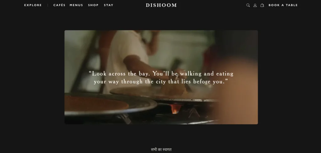[**Dishoom’s website**](https://www.dishoom.com/) communicates the brand’s Bombay cafe heritage through design, photography, and copy that is rich with cultural specificity. The story section is genuinely interesting rather than corporate. The cookbook and merchandise integration extends the brand into the home. The queue information for their most popular locations is addressed honestly.
***Design lesson:*** *Restaurant brands built around genuine cultural heritage communicate this most effectively through specific, researched content rather than generic ethnic restaurant aesthetics. The depth of the story communicates authentic knowledge.*
### 11. Nobu Restaurant
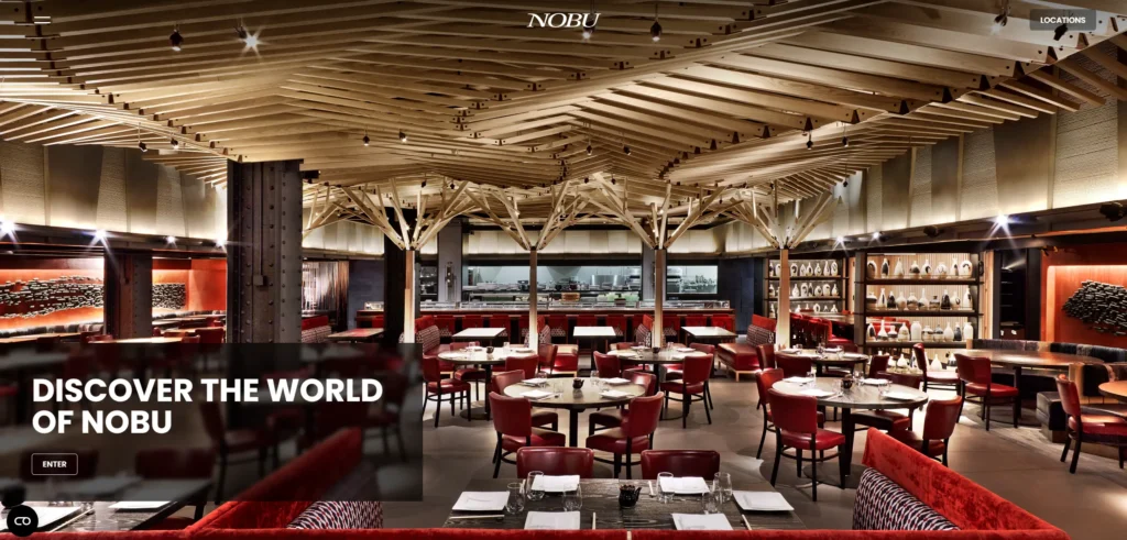[**The Nobu restaurant website**](https://www.noburestaurants.com/) is distinct from the hotel website and communicates the culinary identity of the brand through the same cinematic photography quality. The global location network is presented through an elegant interface. The menu section communicates Japanese-Peruvian fusion through photography that makes the cultural combination legible.
***Design lesson:*** *Global restaurant brands with a strong culinary identity need to communicate that identity consistently across every location page. A visitor researching the New York Nobu should have the same brand experience as one researching the London or Tokyo locations.*
### 12. Joe and The Juice
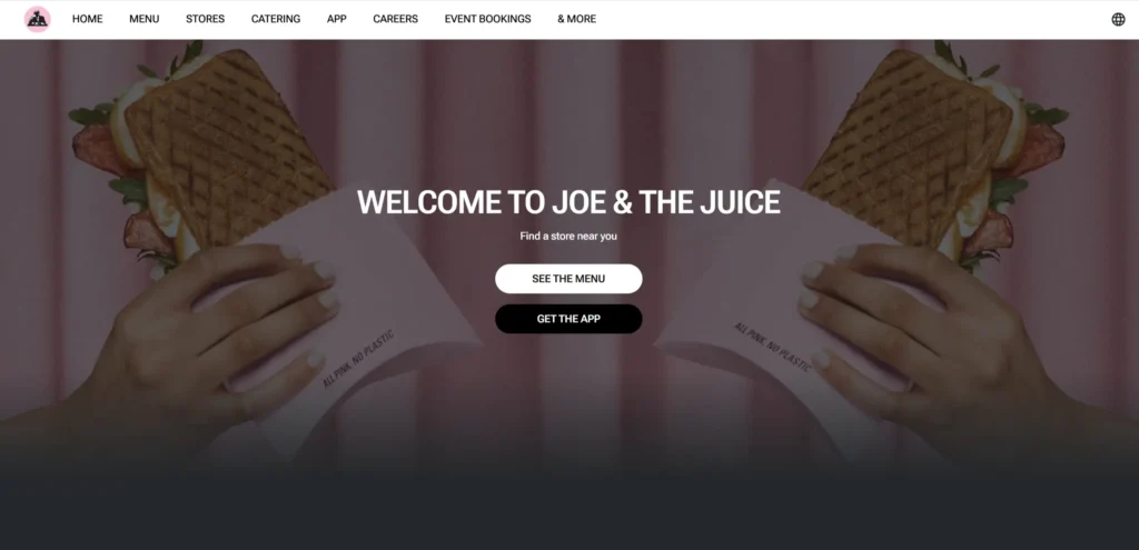[**Joe and The Juice’s website**](https://www.joejuice.com/) communicates the brand’s Danish personality and health-focused positioning through a design that is confident and contemporary without being earnest. The menu is clear, and nutritional information is present without being the dominant communication. The loyalty app is prominently featured as the primary customer relationship tool.
***Design lesson:*** *Fast casual and juice bar brands that have built a loyalty program should feature the app and loyalty program prominently on the website as the primary customer retention tool, rather than treating it as a footnote.*
### 13. Ottolenghi
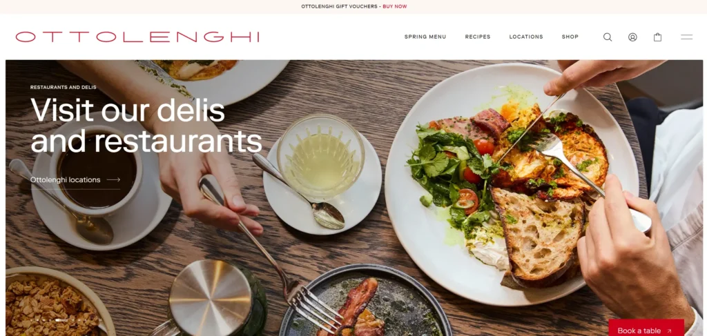[**Ottolenghi’s website**](https://ottolenghi.co.uk/) communicates the full breadth of the brand’s restaurants, delis, books, and online shop through a design that is consistent with the warmth and abundance that define the food. The eCommerce section is well integrated. The recipe content drives organic traffic. The restaurant booking sits alongside the deli and shop naturally.
***Design lesson:*** *Restaurant brands that have extended into books, products, and online retail should integrate these extensions into a single website rather than separating them. The recipe content, the shop, and the restaurant booking all serve the same customer and benefit from being in the same experience.*
### 14. Momofuku
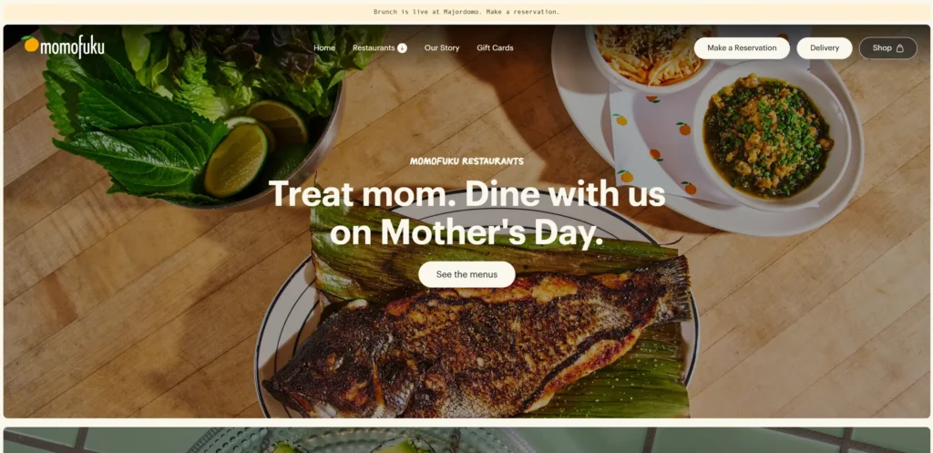[**Momofuku’s website**](https://momofuku.com/) handles a diverse portfolio, multiple restaurant concepts, a packaged goods brand, and a cookbook through clear navigation that separates the business units while sharing the brand identity. The restaurant reservation links are prominent. The Momofuku goods eCommerce section is well-presented.
***Design lesson:*** *Restaurant groups that have diversified into packaged goods need navigation that allows the restaurant guest and the grocery buyer to find what they need without encountering content that is irrelevant to their visit.*
### 15. In-N-Out Burger
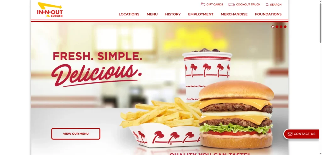[**In-N-Out’s website**](https://www.in-n-out.com/) is a study in doing exactly what the audience expects and nothing more. No ordering integration. No loyalty program. Just the menu, the locations, and the job listings that drive the brand’s word-of-mouth hiring culture. The secret menu is acknowledged without being fully disclosed. The design is nostalgic and consistent with the brand’s deliberate resistance to change.
***Design lesson:*** *For brands built on scarcity, exclusivity, and deliberate resistance to digital convenience, the website correctly reflects these values by not offering digital ordering or loyalty programs. The design choice communicates the brand’s values as clearly as the food does.*
### 16. Gordon Ramsay Restaurants
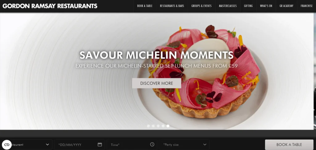[**The Gordon Ramsay restaurant website**](https://www.gordonramsayrestaurants.com/) manages a portfolio of distinct restaurant concepts without diluting the individual identity of each. Navigation separates the restaurants clearly. Photography is exceptional throughout. The book-ahead process handles the complexity of multiple venues and reservation windows in a single coherent interface.
***Design lesson:*** *Celebrity chef restaurant groups whose portfolios span multiple price points and concepts need website navigation that allows guests to find the right restaurant for their occasion without the cheaper concepts undercutting the positioning of the fine dining venues.*
### 17. Zuma Restaurant
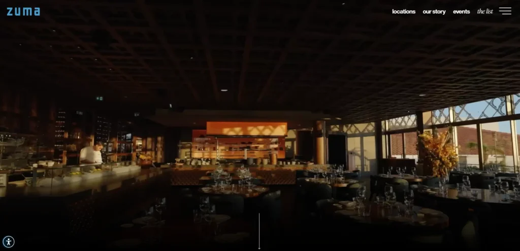[**Zuma’s website**](https://zumarestaurant.com/) communicates the energy and quality of the Japanese izakaya-inspired dining experience through photography that shows the social atmosphere of the restaurant alongside the food. The multi-city presence is handled through a location selection that maintains brand consistency across each market’s property page.
***Design lesson:*** *Social dining concepts should feature photography that communicates the social experience of groups at the table, the bar in full operation, and the atmosphere at peak service rather than food-only photography that does not communicate what makes the experience worth the price.*
### 18. Sweetgreen
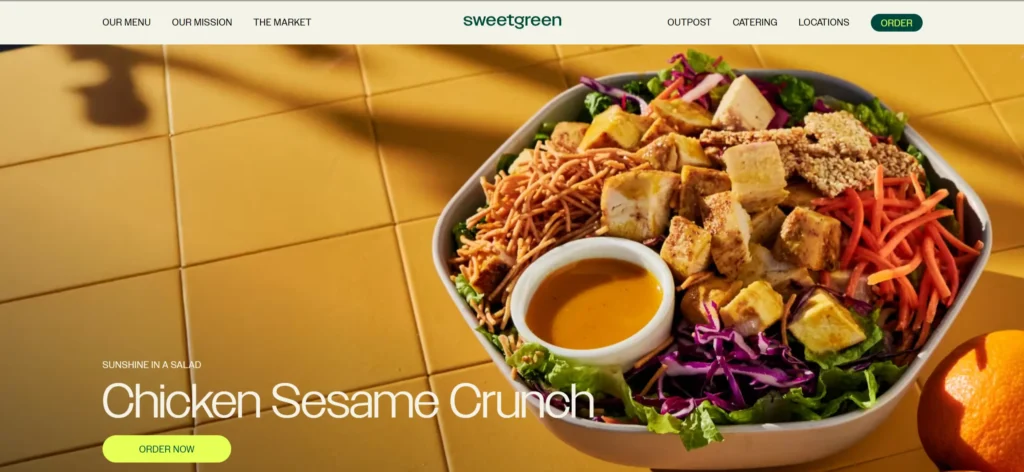[**Sweetgreen’s website**](https://www.sweetgreen.com/) is optimized for digital ordering above everything else. The menu is front and center. The seasonal and local sourcing is communicated specifically. The loyalty program is prominent. The app download is heavily featured. The brand health positioning is communicated through ingredient transparency rather than wellness claims.
***Design lesson:*** *For digital-first fast casual brands, the website is primarily an ordering and loyalty platform rather than a discovery tool. Design decisions should prioritize ordering speed and loyalty engagement over brand storytelling.*
### 19. Bun Mee
[**Bun Mee**](https://www.bunmee.com/) is a San Francisco Vietnamese sandwich restaurant whose website communicates the cuisine and culture with appropriate depth and specificity. The menu is visually appealing. The ordering integration is clean and fast. The brand story explains the Vietnamese-American context of the food without being reductive.
***Design lesson****: Restaurants serving cuisines with cultural specificity and context should use the website to educate as well as sell. Customers who understand the food they are ordering have better experiences and higher average ticket sizes.*
### 20. Tartine Bakery
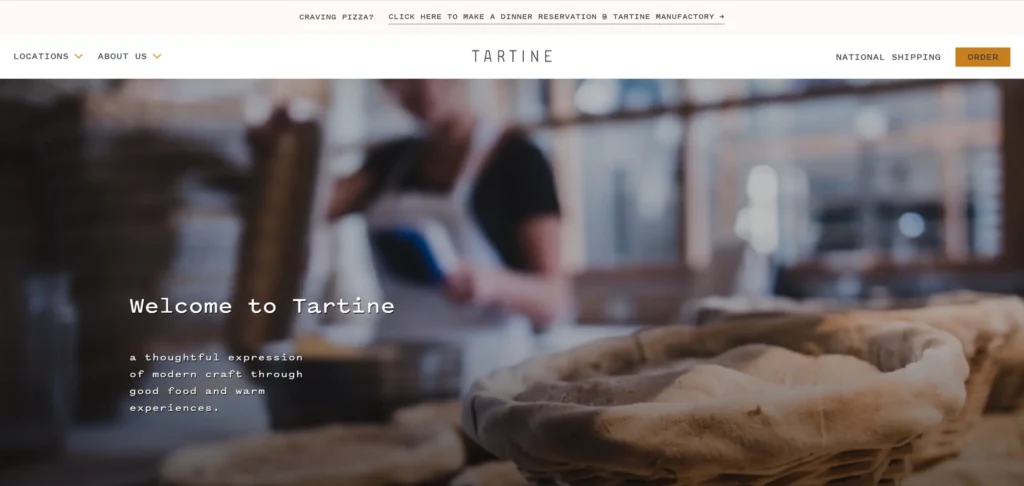[**Tartine’s website**](https://tartinebakery.com/) communicates the artisan quality and cult status of the bakery through imagery that is consistent with the analog, craft aesthetic of the brand. The online ordering section handles a limited daily production model clearly. Photography of the bread and pastry is exceptional in a way that clearly communicates why people queue.
***Design lesson:*** *Bakeries and restaurants with limited production models should communicate the scarcity and quality that justifies the difficulty of obtaining the product. Tartine’s photography explains why people set alarms to get a loaf.*
### 21. Chiltern Firehouse
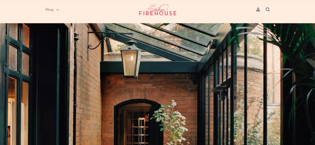[**Chiltern Firehouse’s website**](https://www.chilternfirehouse.com/) communicates the hotel-restaurant hybrid experience and the cultural cachet of one of London’s most sought-after reservations. Design is confident and elegant. Reservation availability is communicated honestly. The photography shows the room at full service in a way that creates genuine desire.
***Design lesson:*** *Restaurants with significant social cachet should communicate the atmosphere of the full room in their photography rather than showing empty dining rooms, which convey a studio quality but not the experience of eating there.*
### 22. Blue Hill at Stone Barns
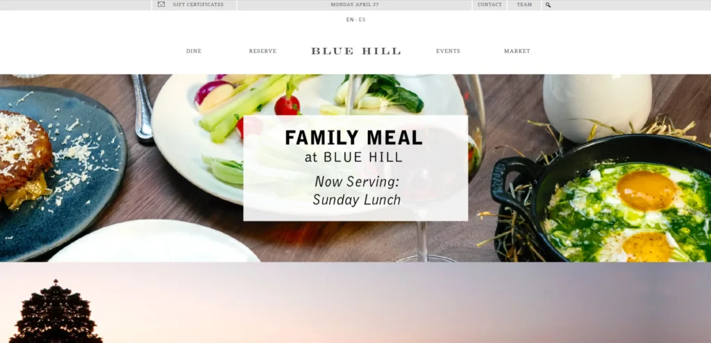[**Blue Hill at Stone Barns**](https://www.bluehillfarm.com/) communicates the farm-to-table philosophy with a depth and specificity that most restaurants claiming this positioning do not attempt. The farm is a genuine working agricultural enterprise, and the website explains the connection between the farm, the seasons, and what appears on the menu. The dining experience is presented as something more than a meal.
***Design lesson:*** *Restaurants whose menu and philosophy are genuinely shaped by their supply chain should communicate this connection with specificity. A website that names the farm, the breed, and the season communicates a depth of commitment that generic farm-to-table language does not.*
## What These Restaurant Website Designs Have in Common
Looking across all 22 examples, these patterns appear consistently in the ones that work best commercially, not just aesthetically.
- Food photography that makes the cuisine look extraordinary before any menu is presented
- Reservation or ordering is accessible with one click on the homepage from any device
- Restaurant hours, address, and contact information are visible without scrolling on every page
- Photography showing the actual restaurant atmosphere at service, not empty room shots
- The menu is updated regularly, and an outdated menu is a significant trust signal failure
## 5 Design Elements Every Restaurant Website Needs
Whether you are building from scratch or redesigning an existing site, these five elements consistently separate high-performing examples from functional but forgettable ones.
#### 1. Food photography that makes the cuisine look extraordinary
Food photography that makes the cuisine look extraordinary is non-negotiable. Every visitor decides whether to book based on whether the food looks worth the price.
Restaurant hours, address, and transport information in the footer and on a dedicated location page, visible without navigation
#### 3. Reservation or online ordering accessible within one click of the homepage on any device
Reservation or online ordering should be accessible with one click from the homepage on any device. A visitor who cannot find the booking button within seconds will leave.
The menu must be current, accessible without download, and fully readable on mobile without zooming. PDF menus cost you reservations on every device.
#### 5. Photography showing the restaurant in service
Photography should show the restaurant at service: guests, atmosphere, and the room in full operation. Empty room shots communicate studio quality, not dining experience.
##### Additional Read
- [14 Best Fashion Website Designs: Inspiring Examples for 2026](https://www.krishaweb.com/blog/best-fashion-website-designs/)
- [15 Best Bakery Website Designs for Inspiration in 2026](https://www.krishaweb.com/blog/best-bakery-website-designs/)
- [18 Best Webflow Websites That Set the Standard for Modern UX in 2026](https://www.krishaweb.com/blog/best-webflow-sites-examples/)
## AI Implementation for Restaurant Websites in 2026
Most restaurant website design articles cover design examples. Almost none address AI implementation, which is where the commercial gap is opening in 2026. The restaurant website design that implements these features in the next 12 months will have a measurable advantage over those that do not.
### 1. AI-Powered Reservation and Table Management
AI-powered reservation systems like Resy and SevenRooms now use machine learning to optimize table turn times, manage the waitlist dynamically, and personalize the reservation confirmation and pre-visit communication based on guest history. For high-demand restaurants where reservation availability directly affects revenue, AI table management produces meaningful RevPASH (revenue per available seat hour) improvements over static reservation slot management.
A guest who visits a restaurant website and has a dietary restriction, an allergy, or a preference for a specific cuisine style should be able to ask a chat assistant. What should I order?’ and receive a personalized recommendation. An AI menu chat trained on the restaurant’s actual menu, ingredient lists, and chef’s notes provides this immediately.
For restaurants with complex menus or tasting menu formats where guests prepare in advance, this feature reduces uncertainty and improves the dining experience before it begins.
### 3. AI-Powered Ordering and Upsell for Online Orders
Restaurant ordering platforms with AI-powered recommendations, such as ‘customers who ordered the short rib also added this side,’ consistently produce higher average order values than those without. Tools like Olo and Toast now include AI recommendation modules that can be integrated with the restaurant’s own website ordering system rather than requiring the restaurant to route orders through a third-party platform.
### 4. Automated Review Response and Reputation Management
Restaurants receive significant review volume across Google, TripAdvisor, Yelp, and OpenTable. AI-powered review response tools that generate personalized, brand-voice-consistent responses to both positive and negative reviews at scale maintain the review engagement that platforms reward with higher visibility, without requiring the management team to individually craft responses to every review.
*KrishaWeb builds* ***AI-integrated restaurant website designs*** *on* [*WordPress*](https://www.krishaweb.com/wordpress-development/) *and other platforms. If your current site is not using these features, our team can assess what to implement first based on your specific conversion goals.*
### Frequently Asked Questions
**What should a restaurant website include?**A restaurant website must include food photography that communicates the quality of the cuisine, the restaurant’s address and opening hours visible without navigation, a reservation or ordering link accessible from every page, and a menu that is current and readable on mobile. Anything else is secondary to these four elements.
**How important is food photography for restaurant websites?**Food photography is the primary conversion tool on a restaurant website. Visitors decide whether to book based on whether the food looks worth the price and the journey. Professional food photography that shows the actual dishes in accurate color and composition consistently outperforms amateur or stock photography, regardless of the quality of the other design elements.
**Should restaurant menus be PDFs or HTML pages?**HTML pages consistently outperform PDFs for restaurant menus. PDF menus are not readable on mobile without zooming, are not indexed by search engines, cannot be updated without re-uploading, and break the browsing experience by opening a separate viewer. HTML menus with current pricing and seasonal availability serve both the customer and the restaurant’s SEO.
**How should a restaurant website handle online ordering?**Online ordering should be accessible with one click of the homepage on any device. The ordering platform, whether the restaurant’s own system or an integrated third-party, should be fast, mobile-optimized, and complete the order in under three minutes. Restaurants that route online orders through a third-party marketplace lose 15 to 30% of order revenue to commission fees that a direct ordering integration avoids.
**How can AI improve a restaurant website?**AI reservation and table management, AI menu recommendation chat, AI-powered upsell in online ordering, and automated review response management are the AI implementations that deliver the most commercial impact for restaurant websites in 2026.
### Conclusion
The 22 restaurant website designs on this list span different scales, budgets, and markets. What they share is not production budget or agency pedigree. It is a commitment to treating the website as a genuine commercial and brand tool rather than a digital brochure.
The design elements that matter most in this category are not complex or expensive to implement. Strong photography, a clear path to the primary conversion action, credible social proof, and mobile performance that matches desktop quality—these are achievable at almost any budget with the right priorities and the right [**Web Design Services**](https://www.krishaweb.com/web-design/) supported by modern [**AI solutions**](https://www.krishaweb.com/ai-solutions-agency/).
If your current restaurant website design is not doing these things, [**talk to KrishaWeb’s web design team**](https://www.krishaweb.com/contact-us/) about what a focused redesign would look like for your specific goals.
***Ready to improve your website? KrishaWeb has been designing and developing conversion-focused websites since 2008. Tell us your goals, and we will tell you the right approach.***
***Disclaimer:** This article is intended for informational and inspirational purposes only. The website examples featured are owned by their respective organisations. KrishaWeb has no affiliation with any of the websites referenced unless otherwise stated. All observations, statistics, and design notes reflect research current as of April 2026 and may change over time.*

###### Nisarg Pandya
Project ManagerExperienced Project Manager and Scrum Master at KrishaWeb, delivers expertise in Scrum methodologies, Laravel, React.js, UX design, and project management, ensuring efficient project delivery and agile implementation.
 Interact With Me-
-
- [ ](mailto:)
---
_View the original post at: [https://www.krishaweb.com/blog/best-restaurant-website-design-examples/](https://www.krishaweb.com/blog/best-restaurant-website-design-examples/)_
_Served as markdown by [Third Audience](https://github.com/third-audience) v3.5.3_
_Generated: 2026-04-27 13:40:51 UTC_