---
title: "12 Best University Website Designs for Inspiration in 2026"
url: "https://www.krishaweb.com/blog/best-university-website-designs/"
date: "2026-05-04T11:21:47+00:00"
modified: "2026-05-04T12:26:35+00:00"
author:
name: "Nisarg"
categories:
- "Web Design"
word_count: 2425
reading_time: "13 min read"
summary: "A university website is one of the most structurally complex design challenges in the digital category. It serves first-generation students trying to understand if university is right for them, int..."
description: "12 of the best university website designs in 2026, with design lessons on what makes each one effective at serving students, researchers, and applicants."
keywords: "best university website designs, Web Design"
language: "en"
schema_type: "Article"
related_posts:
- title: "14 Best Legal Website Designs and Best Practices for 2026"
url: "https://www.krishaweb.com/blog/best-legal-website-design-examples/"
- title: "12 Best Nonprofit Website Designs in 2026 [Global Examples]"
url: "https://www.krishaweb.com/blog/best-nonprofit-website-designs/"
- title: "13 Best Hotel Website Designs You Will Love in 2026"
url: "https://www.krishaweb.com/blog/best-hotel-website-designs/"
---
# 12 Best University Website Designs for Inspiration in 2026
_Published: Monday,May 4, 2026_
_Author: Nisarg_

A university website is one of the most structurally complex design challenges in the digital category. It serves first-generation students trying to understand if university is right for them, international applicants navigating a foreign admissions process, graduate researchers looking for supervisors, alumni making donation decisions, and faculty accessing HR systems. These audiences have completely different needs and completely different levels of digital confidence.
At KrishaWeb, we have built education and institutional websites since 2008. The university websites that serve all of these audiences well, without any single group experiencing a broken journey, are not common. This list covers the ones that get closest.
***KrishaWeb has designed and built university websites since 2008. The pattern that holds across every high-performing example: design decisions made in service of the visitor’s actual goal, not the agency’s portfolio.***
## 12 Best University Website Designs for Inspiration in 2026
### 1. MIT
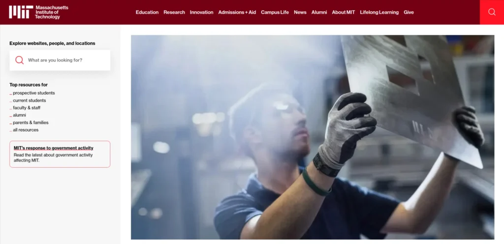[**MIT’s website**](https://www.mit.edu/) communicates the institution’s research intensity and intellectual ambition in the first viewport. The homepage cycles through research stories rather than program listings, which signals that MIT is a research institution first and a teaching institution second. Navigation is deep but organized. The admissions section is discoverable without being the sole focus of the homepage, which is appropriate for an institution where the research reputation is the primary differentiator.
***Design lesson:*** *A university homepage that leads with research stories rather than programme listings communicates institutional ambition that prospective students and faculty find compelling in ways that a course catalog cannot.*
### 2. Stanford University
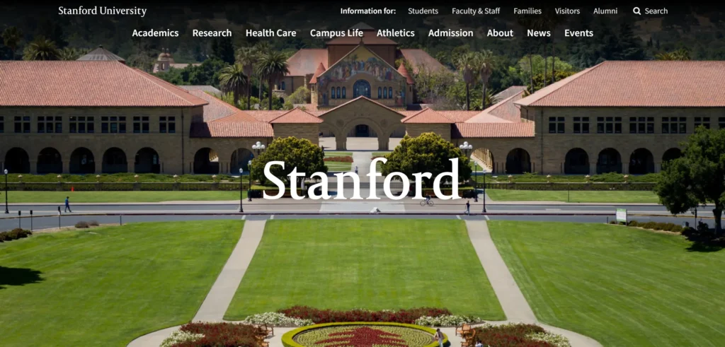[**Stanford’s website**](https://www.stanford.edu/) handles the breadth of the institution’s programs and research areas through intelligent navigation architecture. The homepage is clean and deliberately sparse, with a search function that is prominent because at Stanford’s scale, search is how most visitors will find what they need rather than clicking through menus. The visual identity is consistent and authoritative across sections.
***Design lesson:*** *For large institutions with hundreds of departments and programmes, a prominent and fast search function is more useful to visitors than a comprehensive navigation menu. Prioritizing search reduces abandonment from navigation complexity.*
### 3. University of Oxford
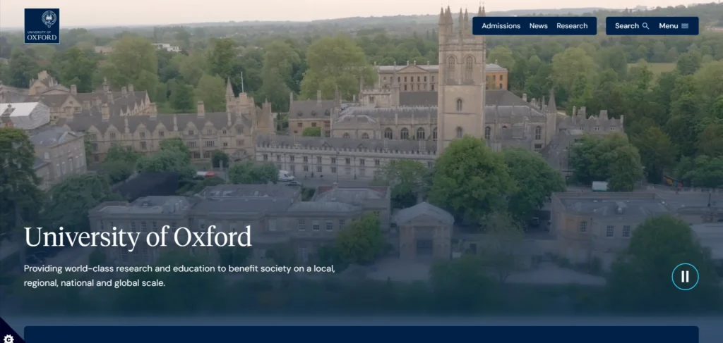[**Oxford’s website**](https://www.ox.ac.uk/) balances global prestige with accessibility for first-time visitors. The admissions journey is clearly signposted from the homepage. Research news and impact stories sit alongside practical application information. The college structure, which is unique to Oxford and confusing to international applicants, is explained clearly with dedicated pages. Photography throughout shows the city, the libraries, and the people rather than generic classroom stock imagery.
***Design lesson:*** *Explaining institution-specific structures that are unfamiliar to international applicants, directly and clearly, reduces the confusion that causes capable applicants to self-select out of the process.*
### 4. Yale University
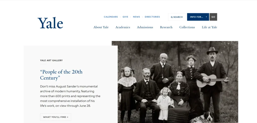[**Yale’s website**](https://www.yale.edu/) leads with the breadth of intellectual life at the institution rather than with league table positions. The homepage showcases student research, performances, and publications alongside academic programmes. The visual design is warm and confident. Navigation separates undergraduate and graduate admissions pathways clearly, which reduces the confusion that affects institutions where both journeys share the same landing points.
***Design lesson:*** *Separate undergraduate and graduate admissions navigation paths significantly reduce journey confusion for the institution’s two most commercially important visitor groups.*
### 5. Harvard University
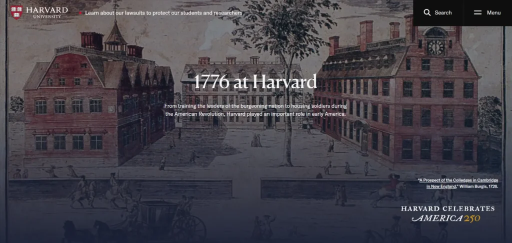[**Harvard’s website**](https://www.yale.edu/) communicates global impact through specific stories rather than abstract claims. The homepage photography features students and faculty working on problems with real-world stakes. The visual design is restrained and elegant. The admissions section is accessible but not dominating, which is appropriate for an institution where selectivity is a brand value and demand generation is not the primary website goal.
***Design lesson:*** *For highly selective institutions, the website goal is not maximizing application volume. It is attracting the right applicants. Design language that communicates intellectual rigour rather than accessibility is appropriate for this purpose.*
### 6. London School of Economics
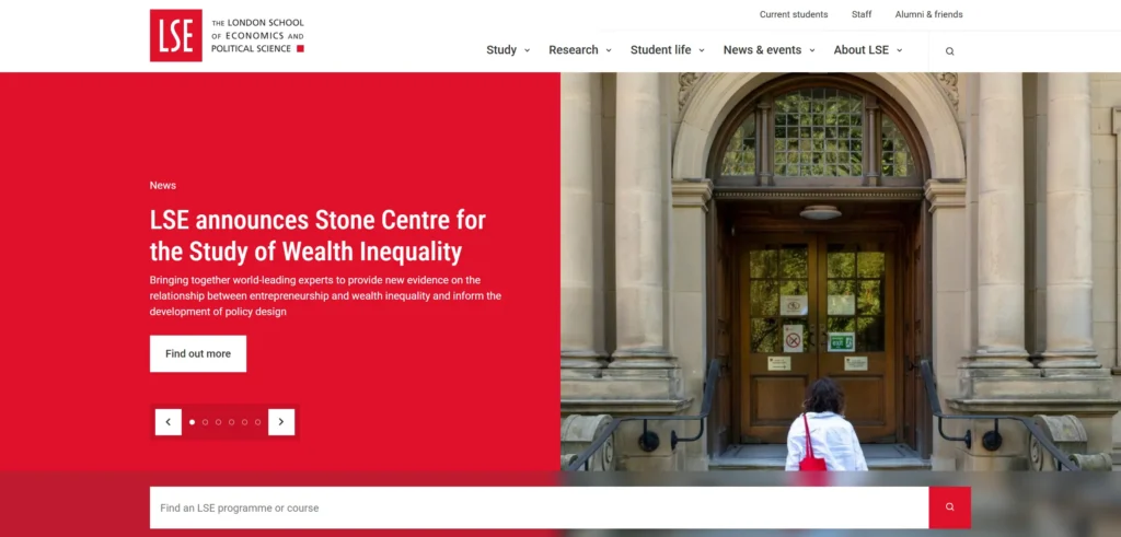[**LSE’s website**](https://www.lse.ac.uk/) serves an exceptionally international student body and the design reflects this through clear, simple language, comprehensive multilingual support signals, and a visual identity that communicates urban, professional, and socially engaged values. The student experience section is genuinely content-rich rather than a collection of marketing images. The research impact section is organized for non-academic audiences.
***Design lesson:*** *University websites serving highly international student bodies need to communicate with simplicity and clarity that is legible to visitors for whom English is a second language and who are navigating an unfamiliar admissions system.*
### 7. University of Melbourne
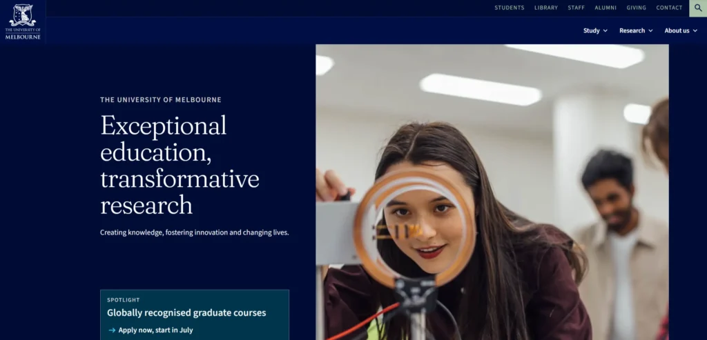[**Melbourne’s website**](https://www.unimelb.edu.au/) is one of the strongest examples in the Asia-Pacific region. The design is modern and confident, the navigation is clear, and the student experience content is genuinely useful rather than aspirational. The research section is organized around themes and impact areas rather than by faculty, which makes it navigable for visitors who do not know the institution’s internal structure.
***Design lesson:*** *Organizing research sections by impact theme rather than by faculty department makes research content navigable for external audiences (industry partners, media, and government) who do not know the institution’s internal structure.*
### 8. ETH Zurich
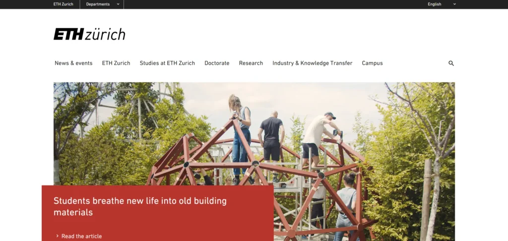[**ETH Zurich**](https://ethz.ch/en.html) serves a highly technical and international audience and the website communicates technical excellence and research rigour through the quality and specificity of its research content. The multilingual design is genuinely implemented rather than a token translation of the German-language site. Programme information is detailed and specific about entry requirements and career outcomes.
***Design lesson:*** *Genuine multilingual implementation (content written for each language audience rather than machine-translated) is distinguishable by international applicants and creates trust that a tokenistic translation undermines.*
### 9. University of Toronto
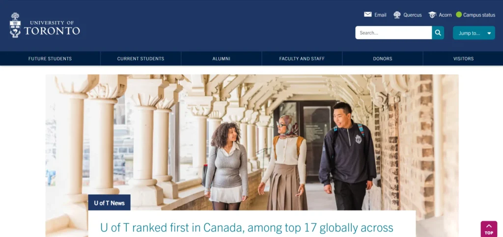[**University of Toronto**](https://www.utoronto.ca/) handles the challenge of a large, multi-campus institution through clear navigation that acknowledges campus differences without fragmenting the university’s identity. The homepage showcases research impact, student stories, and community engagement in equal measure. The international student journey has dedicated entry points that acknowledge the specific complexity of applying from outside Canada.
***Design lesson:*** *Multi-campus universities need navigation architecture that acknowledges campus differences without creating a fractured brand experience. Each campus page should feel like part of the same institution while addressing the specific student community at that location.*
### 10. Imperial College London
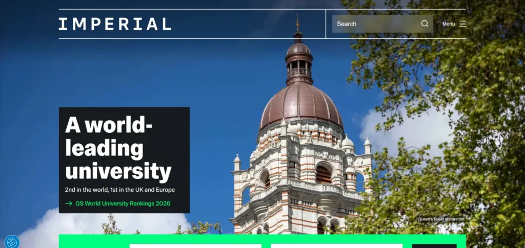[**Imperial’s website**](https://www.imperial.ac.uk/) communicates a sharp, science and technology-focused positioning that differentiates it from broader universities competing for similar students. The research excellence content is specific and current. Admissions information for both UK and international students is clearly separated. The industry collaboration section is prominent, which reflects Imperial’s strength in research commercialization.
***Design lesson:*** *For STEM-focused institutions, positioning the website around research excellence and industry connection attracts doctoral and postdoctoral candidates as well as undergraduate applicants who are making decisions based on research reputation.*
### 11. Carnegie Mellon University
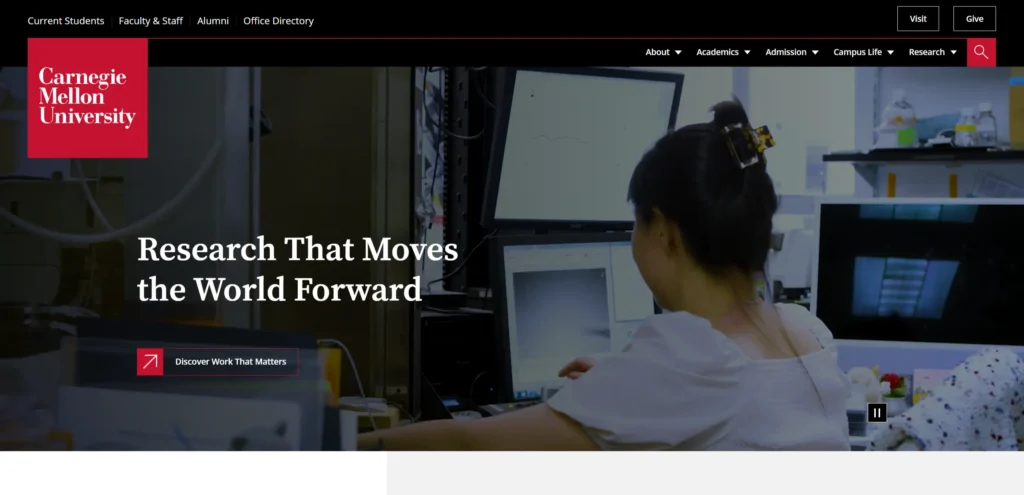[**CMU’s website**](https://www.cmu.edu/) reflects its positioning at the intersection of technology, the arts, and policy. The homepage showcases this interdisciplinarity through research stories that cross traditional faculty boundaries. The computer science and engineering sections carry specific information about facilities, research groups, and placement outcomes that technically-minded applicants use to compare institutions.
***Design lesson:*** *Publishing specific placement data, research group information, and facility details in program pages gives technically-minded applicants the comparative information they use to make final institution decisions, which most university websites omit.*
### 12. University of Edinburgh
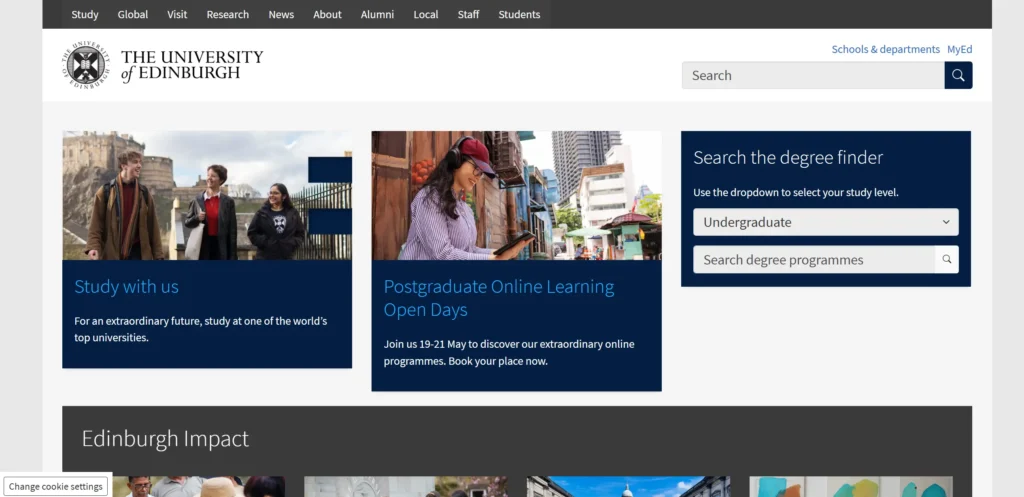[**Edinburgh’s website**](https://www.ed.ac.uk/) communicates the city and the intellectual community as intertwined: the student experience is shown as inseparable from the cultural richness of the location. This place-based positioning is distinctive in a category where most university websites show generic lecture hall images. The admissions section handles the complexity of Scottish, UK, EU, and international fee structures with clear tabbed information.
***Design lesson:*** *Place-based storytelling (showing students in the city, not just on campus) is a differentiator for universities in destinations that are genuinely part of the student experience.*
## What These University Website Designs Have in Common
Looking across all 12 examples, these patterns appear consistently in the ones that work best commercially, not just aesthetically.
- Clear separation of undergraduate and graduate admissions pathways
- Research stories on the homepage rather than programme listings as the primary content type
- Photography showing real students and specific locations rather than generic education stock imagery
- Prominent search function for large-institution navigation
- International student journey given dedicated entry points and simplified language
## 5 Design Elements Every University Website Needs
Whether you are building from scratch or redesigning an existing site, these five elements consistently separate high-performing examples from functional but forgettable ones.
Separate navigation paths for undergraduate, graduate, and international prospective students
**2. Research impact stories on the homepage rather than a program catalog. Institutions that lead with research communicate ambition. Those that lead with program listings look like every other university competing for the same applicants.**
Research impact stories on the homepage rather than a programme catalogue
**3. Photography showing real students in specific institutional locations, not stock imagery. Generic education stock photography is detectable within seconds and undermines the authentic experience signal every university claims.**
Photography showing real students in specific institutional locations, not stock imagery
Prominent and fast search functionality as the primary navigation tool for large institutions
**5. International applicant support pages that explain institution-specific processes clearly. International applicants face visa requirements, language thresholds, and fee structures that domestic applicants do not. Addressing these specifically converts inquiries at significantly higher rates.**
International applicant support pages that explain institution-specific processes clearly
## AI Implementation for University Websites in 2026
Most university website articles cover design examples. Almost none address AI implementation, which is where the commercial gap is opening in 2026. The university websites that implement these features in the next 12 months will have a measurable advantage over those that do not.
### 1. AI Admissions Assistant
The admissions process for international students involves dozens of common questions about entry requirements, English language standards, visa processes, and scholarship eligibility that repeat across thousands of inquiries every cycle. An AI admissions assistant trained on the institution’s admissions documentation can answer these questions instantly and at any hour, reducing the load on admissions teams while improving the experience for applicants in different time zones. Several universities including Arizona State and Deakin have implemented versions of this with measurable impact on enquiry-to-application conversion rates.
### 2. Personalized Program Recommendations
A prospective student who describes their interests and career goals in natural language should receive a shortlist of relevant programmes rather than being directed to a full course catalog. AI-powered program matching, based on a short intake questionnaire or natural language description, increases the relevance of the first programmes a visitor sees and reduces the overwhelming choice effect that causes prospective students to disengage from complex university websites.
### 3. AI-Powered Research Discovery
University research databases are notoriously difficult to navigate for external audiences (industry partners, media, government agencies, and potential collaborators. AI semantic search that understands queries like ‘research on urban heat islands’ or ‘immunotherapy for pancreatic cancer’ and returns relevant research groups, publications, and principal investigators makes the institution’s research outputs accessible to audiences that are currently unable to find them.
### 4. Automated Student Support Signposting
Current students visiting a university website for support information face the same navigation complexity as prospective students, with less patience for it because they are often looking for urgent help. AI-powered support navigation that identifies the type of help a student needs and routes them to the correct service (counselling, financial support, academic appeals, or disability services) and reduces the number of students who give up and do not access support they are entitled to.
***KrishaWeb builds AI-integrated university websites on WordPress and other platforms. If your current site is not using these features, our team can assess what to implement first based on your specific conversion goals.***
##### Additional Read
- [14 Best Legal Website Designs and Best Practices for 2026](https://www.krishaweb.com/blog/best-legal-website-design-examples/)
- [12 Best Nonprofit Website Designs in 2026 [Global Examples]](https://www.krishaweb.com/blog/best-nonprofit-website-designs/)
- [13 Best Hotel Website Designs You Will Love in 2026](https://www.krishaweb.com/blog/best-hotel-website-designs/)
### Frequently Asked Questions
**What should a university website include?**A university website should include clear admissions pathways for different applicant types, research and impact content that communicates the institution’s strengths, student experience content that goes beyond marketing images, and practical information about fees, support, and campus life. Search should be prominent because most visitors at a large institution cannot navigate to what they need through menus alone.
**How should a university website handle international students?**International students need dedicated entry points that acknowledge the specific complexity of applying from outside the home country (visa information, English language requirements, pathway programs, and country-specific fee structures). Generic admissions pages that do not address these specifics lose international applicants to institutions whose websites explain the process clearly.
**Why is search so important on university websites?**Large universities have hundreds of departments, thousands of courses, and dozens of different service areas. No navigation menu can surface what every visitor needs. A fast, accurate search function that understands natural language queries is the primary navigation tool for most visitors at an institution of meaningful scale.
**How should university websites present research content?**Research content should be presented through impact stories that are legible to non-academic audiences, not through lists of publications or grant totals. Organising research by theme and real-world impact rather than by faculty department makes it navigable for industry partners, government, and media who do not know the institution’s internal structure.
**How can AI improve a university website?**AI can provide 24/7 admissions assistance for international applicants in different time zones, offer personalised program recommendations based on student interests, make research databases navigable for non-academic audiences, and route current students to the correct support services efficiently.
### Conclusion
The 12 university website designs on this list span different scales, budgets, and markets. What they share is not production budget or agency pedigree. It is a commitment to treating the website as a genuine commercial and brand tool rather than a digital brochure.
The design elements that matter most in this category are not complex or expensive to implement. Strong photography, a clear path to the primary conversion action, social proof specific enough to be credible, and mobile performance that matches desktop quality. These are achievable at almost any budget with the right priorities and professional [**web design services**](https://www.krishaweb.com/web-design/).
If your current university website is not doing these things, [**talk to KrishaWeb’s web design team**](https://www.krishaweb.com/contact-us/) about what a focused redesign would look like for your specific goals.
***Ready to improve your website? KrishaWeb has been designing and developing conversion-focused websites since 2008. Tell us your goals, and we will tell you the right approach.***
***Disclaimer:** This article is intended for informational and inspirational purposes only. The website examples featured are owned by their respective organizations. KrishaWeb has no affiliation with any of the websites referenced unless otherwise stated. All observations, statistics, and design notes reflect research current as of April 2026 and may change over time.*

###### Nisarg Pandya
Project ManagerExperienced Project Manager and Scrum Master at KrishaWeb, delivers expertise in Scrum methodologies, Laravel, React.js, UX design, and project management, ensuring efficient project delivery and agile implementation.
 Interact With Me-
-
- [ ](mailto:)
---
_View the original post at: [https://www.krishaweb.com/blog/best-university-website-designs/](https://www.krishaweb.com/blog/best-university-website-designs/)_
_Served as markdown by [Third Audience](https://github.com/third-audience) v3.5.3_
_Generated: 2026-05-04 12:26:36 UTC_