Let’s face it—most landing pages don’t work as well as we hope. We launch them with great expectations… but conversions fall flat. Why?
Because design isn’t the same as persuasion.
You can have amazing animations, on-brand typography, and pixel-perfect spacing, but if your landing page doesn’t answer:
What is this?
Why should I care?
What do I do next?
…then it’s just decoration.
Whether you’re launching a free trial, collecting leads, or selling a service, your landing page needs one thing above all else: clarity.
This isn’t just another Webflow design tutorial. This is your step-by-step guide to building landing pages that convert, based on real-world campaigns, human psychology, and platform know-how.
Let’s build smarter.
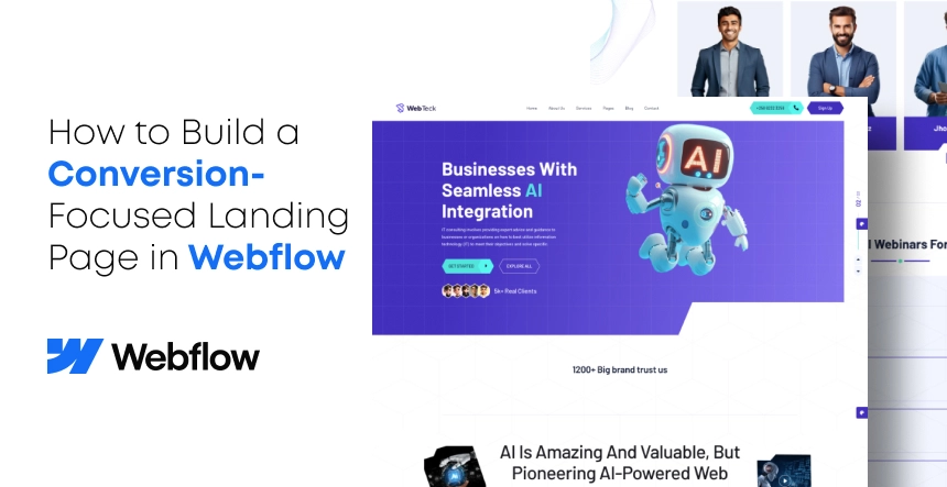
Step 1: Define Your Goal (Seriously, Only One)
You’d be surprised how many landing pages try to do too much:
“Download the ebook.”
“Subscribe to our newsletter.”
“Book a demo”
“Read our blog.”
Pick one. Just one.
A high-converting landing page is a single-track experience. No side roads. No mixed signals.
Step 2: Structure First, Style Second
Let’s be real, when you login to Webflow, it’s easy to go straight for visuals. But hold back. Fonts. Colors. Animations. Hovering buttons just so.
Wait for it. Before you concern yourself with what your landing page is going to look like, you should have an idea of what goes where and why.
Begin with Structure: Architect, Not Decorator
Suppose you wanted to build a house. You don’t begin with the curtains or the colors on the walls; you start with the blueprint: walls, rooms, doors, plumbing.
A landing page that converts highly is the same. It requires an straightforward flow of information, taking the visitor from interest to action.
This is why we always suggest beginning with a wireframe, even a simple sketch on paper or with tools like Figma or FigJam. Beauty isn’t the goal. Clarity is.
Begin with a wireframe. Plan out the essential sections:
Headline + subheadline
CTA (above the fold)
Problem + solution
How it works
Testimonials or trust indicators
Secondary CTA
FAQ (optional)
Final call to action
Use Webflow’s Section, Container, and Grid elements. Keep it clean. Remember: a confused visitor doesn’t convert.
Step 3: Write Copy That Speaks Human
Before someone clicks your CTA, they read. So your words must do more than occupy space; they must connect, persuade, and convert.
Imagining your copy as the voice of your landing page, you want it to sound like a friendly, assured human being, not a sales bot.
Below is a straightforward framework we apply across sectors:
Headline → Outcome over feature
✅ “Get Paid 2x Faster Without Chasing Clients”
❌ “Freelancer Invoicing Platform”
Subheadline → Include trust + describe briefly
“Join 15,000+ freelancers using [Brand] to send contracts, track payments, and keep their sanity.”
CTA → Simple, benefit-focused, action-oriented
“Start Free Trial”
“Book My Demo”
“Get My Proposal Template”
Don’t use unclear CTAs such as “Submit” or “Click Here”
In Short:
A good copy doesn’t merely tell. It spurs action.
Address directly what your audience needs, in plain terms, and let each word count. That’s the way you convert browsers into buyers.
Step 4: Design for Visual Hierarchy (Not Just Aesthetics)
A great landing page isn’t beautiful—it’s intentional.
Design isn’t there to make things look nice. It’s there to lead. Consider visual hierarchy as providing your visitors with a guided tour of your content, with the CTA as the ultimate destination.
When executed well, users naturally understand where to glance, what’s most important, and what comes next. That’s the distinction between a “good-looking” landing page and one that genuinely converts.
Webflow Practical Visual Hierarchy Tips:
Utilize one H1 per page. It informs both users and Google what the page is about.
Employ heading tags appropriately. Don’t simply bold text or style a paragraph to appear large—structure counts.
Create real contrast. Make your CTA button pop. It should be the most visually dominant element.
Limit the width for readability. Use max-width on sections and apply generous padding. No one enjoys reading across the entire screen.
Use white space wisely. It’s not space—it’s breathing room that makes content easier to scan.
Pro Tip: Try the “Squint Test.”
Squint your eyes while looking at your landing page.
What catches your attention? Where does your gaze immediately go?
If the CTA or your main message isn’t clear, even with poor vision, go back to your spacing, size, and contrast.
Step 5: Keep Forms Simple
Your form is where interest turns into action. But if it feels like a chore, people will bounce—fast.
Every extra field is a moment of hesitation. Every confusing label is a reason to leave. So when designing your landing page in Webflow, your goal is simple: remove the friction.
You don’t need full name, phone number, company size, and industry—not yet. Especially if the person just found you.
Keep in mind:
Ask for only what you need (Name + Email = gold standard)
Use Webflow’s built-in form components
Use meaningful button labels: “Get My Free Quote” is better than “Submit”
And always test the mobile version—fat fingers hate small fields.
Step 6: Add Social Proof (Right Where It Matters)
Your landing page should answer a silent question every visitor is asking: “Can I trust you?” Social proof answers that—without you saying a word.
Whether you’re a freelancer, SaaS brand, or agency, testimonials and trust indicators reduce hesitation and increase conversions.
Here’s what works best:
Real testimonials with names and photos Ideally, short and specific. “Saved us 12 hours a week” beats “Great service.”
Logos of clients or press features Think “As seen in” or “Trusted by,” but only include recognizable or relevant names.
Star ratings, badges, or review snippets Pull these in from G2, Capterra, or Trustpilot if available.
Hard numbers over vague praise ✅ “Used by 2,300 design teams” ❌ “Trusted by many companies”
Placement Tip:
Drop a testimonial or review cluster right before your primary CTA. That’s the moment when doubt creeps in—testimonials neutralize it. Think of them as social nudges right before the ask.
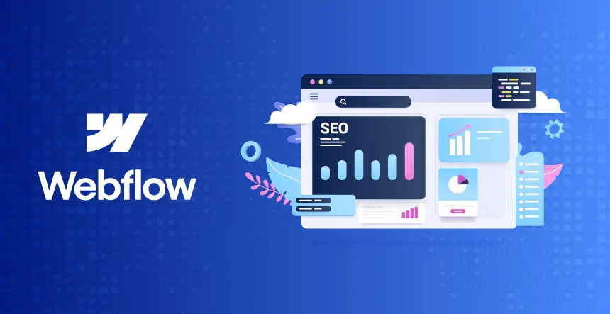
Step 7: Optimize Speed and Performance
Page speed isn’t just about load time. It’s about bounce rate, SEO, and conversion. Google found that 53% of mobile users leave if a page takes more than 3 seconds to load. That’s a deal-breaker.
Even if you’re running paid ads, don’t ignore organic search. A properly optimized landing page can capture bottom-of-funnel traffic with high purchase intent.
Webflow SEO Checklist:
Custom Title Tag & Meta Description Do this on every page under Page Settings.
Only one H1 per page Use H2s for sub-sections—not for styling.
Clean URL slugs Use descriptive URLs like /get-free-quote instead of /page-3.
Set Open Graph title + image Found under SEO settings in Webflow—controls how your link looks on social media.
Submit sitemap to Google Search Console Webflow auto-generates it at yourdomain.com/sitemap.xml.
Use canonical tags Avoid duplicate content issues if you’re running variations of the same page.
Webflow makes SEO easier than platforms like WordPress—but only if you use the built-in tools.
Step 9: Connect Analytics + Heatmaps
Guesswork doesn’t grow businesses. Data does. If you’re not tracking what users are doing on your landing page, you’re flying blind.
Add this conversion-tracking stack in Webflow:
GA4 (Google Analytics) Paste the tracking code in your Webflow Custom Code → Head section.
Hotjar or Microsoft Clarity These tools show you where users scroll, click, rage-click, or just leave.
Meta Pixel or LinkedIn Insight Tag Especially if you’re running paid campaigns, you’ll want to track conversions properly.
Bonus Tip:
Track success with a “Thank You” page. Instead of showing an in-form confirmation, redirect users to a unique thank-you page. That makes conversion tracking much easier and more reliable across platforms.
Step 10: Launch Fast. Then Test.
The best landing pages aren’t perfect—they’re optimized over time. You’ll never know what works until you put it out there and watch how real users behave.
Start lean. Launch quickly. Then iterate with data.
Real Case Example: We tested two CTA versions for a client’s services page:
Version A:“Request a Consultation”
Version B:“Get My Free Site Audit”
Version B won by 26%, simply because it offered specific value and used the word “free.”
Final Note:
A Webflow landing page is just a tool—it’s how you use it that creates results. Every headline, image, form, and layout choice should guide your visitor toward one clear action.
And when in doubt? Ship it. Test it. Improve it.
Now go build a page that converts. And when you’re ready to scale?
1. Do I need a different landing page for each campaign?
Yes, if you are concerned about conversions. Every audience has varying needs, pain points, and intent. Someone who recently found you through a blog post shouldn’t be landing on the same page as someone who clicked on a retargeting ad. Example: Cold traffic? Use more education, trust signals, and value-building. Warm leads or retargeting? Cut through the friction with a direct offer. Webflow makes this simple by allowing you to copy and modify landing pages in a snap, so no one-size-fits-all excuses.
2. Are landing pages indexed by Google?
It depends on the purpose of the page. Yes, index it if the landing page is designed with organic traffic in mind (e.g., “Top CRM Tools for Freelancers”). This allows Google to crawl and rank it. No, use noindex if the page is temporary (for example, an A/B test or paid ads-only page). You don’t want dozens of similar pages competing in search results. In Webflow, you can quickly switch indexing in Page Settings → SEO Settings.
3. Is Webflow good enough for serious marketers?
Absolutely—and here’s why. – Webflow gives marketers: – Full visual control without relying on developers – Clean, semantic code under the hood (Google likes that) – Built-in SEO features (title tags, meta descriptions, Open Graph) – CMS for dynamic pages such as blogs or campaign sites – Faster and more secure with built-in hosting + CDN It’s used by brands such as IDEO, Rakuten, and Dell’s internal teams—so yes, it’s designed for heavy-duty work.
4. How long should a landing page be?
Long enough to eliminate doubt and brief enough to remain captivating. Ask yourself: Is the offer complicated (such as a SaaS demo or financial consultation)? → Use long-form with evidence, objections, and FAQs. Is the offer straightforward (such as a free checklist or webinar)? → Short and to the point is best. Rule of thumb: Each part should address one clear user question. Once all objections have been addressed and trust has been established, stop writing.
5. What’s a good landing page conversion rate?
Conversion rates differ according to traffic type and offer. But here’s a rough rule of thumb: – Cold traffic: 2–5% – Warm leads: 10–20% – Retargeting: Up to 20-30%+ Rather than getting bogged down in averages, aim to increase your baseline. A 3% to 6% improvement might double your revenue. Tools such as Hotjar, Google Analytics, and Webflow’s integrated form tracking can reveal what works and what doesn’t.
6. Can I A/B test in Webflow?
Webflow does not support A/B testing internally, but it’s a breeze to connect tools such as: – VWO – Convert – PostHog for modern analytics You can also clone a landing page and split traffic through Google Ads or email campaigns to manually compare results.
Nisarg Pandya
Project Manager
Experienced Project Manager and Scrum Master at KrishaWeb, delivers expertise in Scrum methodologies, Laravel, React.js, UX design, and project management, ensuring efficient project delivery and agile implementation.