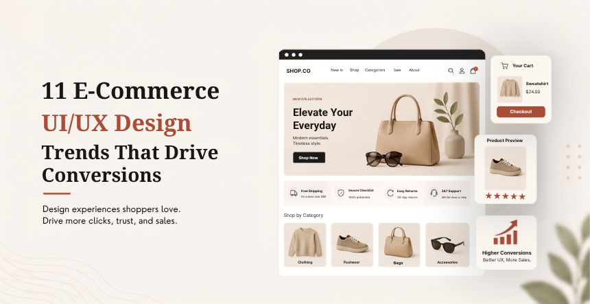
Forrester’s research puts it plainly: every dollar spent on UX returns about $100, a 9,900% ROI. Yet the average e-commerce cart abandonment rate still sits around 70%, according to Baymard Institute, meaning more than 7 out of 10 shoppers leave without buying. The gap between those two numbers is where UX design lives. Below are 11 trends shaping e-commerce experiences now, not a recycled list from a few years back, each one tied to a specific, measurable reason it matters.
11 E-Commerce UI/UX Design Trends
Table Of Contents
Table Of Contents
AI-Powered Personalization That Feels Personal
Generic “customers also bought” widgets are giving way to personalization that adjusts in real time: homepage layout, product order, even promotional messaging shifting based on what a specific shopper has browsed or bought before. McKinsey’s research puts the revenue lift from this kind of personalization at 10 to 15%, which is a meaningful number on top-line sales, not just a nice-to-have UX polish.
The shift that matters most: personalization used to mean a recommendation widget bolted onto a static page. Now it’s the page itself changing shape around the shopper.
Conversational Commerce and AI Shopping Assistants
Chat-based shopping assistants have moved well past scripted chatbots. Modern versions handle real questions, sizing, compatibility, delivery timing, in natural language, and increasingly close the sale directly inside the chat window rather than redirecting to a product page.
This works best when it removes a real decision-making bottleneck rather than adding another interface to learn. We go deeper on where AI helps checkout specifically versus where it gets in the way in our guide to improving UI/UX design for conversion.
Visual and Voice Search
Typing a product description into a search bar is no longer the default. Snap a photo of a product you saw in person, or describe what you’re picturing out loud, and modern e-commerce search tools now return matching or similar products directly. For categories like fashion and home goods, where a shopper often can’t name what they want but knows it when they see it, this closes a real gap that keyword search never handled well.
AR and Virtual Try-On, Now Mainstream Instead of Novelty
Augmented reality stopped being a gimmick once phone cameras got good enough to make it useful. Furniture placement previews, virtual try-on for glasses and makeup, and room visualization tools are now standard features on major retail apps rather than experimental add-ons. The value is straightforward: a shopper who can preview fit or scale before buying returns the product less often, which protects margin on both ends of the transaction.
One-Tap, Frictionless Checkout
Checkout is still where the most revenue quietly leaks out. Baymard Institute puts total abandoned-cart value at roughly $260 billion recoverable in the US and EU alone through better checkout design, and unexpected costs at the final step remain the single biggest reason shoppers walk away. One-tap wallets, Apple Pay, Google Pay, and similar, now convert noticeably better than traditional form-based checkout, mainly because they remove typing entirely.
We run what we call the Friction Audit on every e-commerce project: click through your own checkout on a phone, on a slow connection, as a first-time buyer with no saved information, and count every unnecessary tap. Most sites find 3 or more steps that could disappear entirely once they take a hard look.
Micro-Interactions That Guide, Not Distract
A button that subtly confirms a tap, a cart icon that briefly animates on add, a progress indicator that fills as a form gets completed, these small moments build confidence that the interface is responding to the shopper, not just sitting there. The trend now is restraint: a micro-interaction should confirm an action took effect, not perform for its own sake. Overdone animation slows a page down and actively works against the mobile speed most shoppers expect.
Mobile-First Is the Only Standard Left
This stopped being a trend and became table stakes years ago, but it’s worth restating because so many sites still treat mobile as an afterthought. Touch-friendly tap targets, thumb-reachable navigation, and a checkout that doesn’t require pinch-zooming to read the total are the baseline now, not a competitive advantage. If a site still designs desktop first and adapts down, that’s a real gap worth closing before adding any of the flashier trends above it.
Modern Trust Signals and Security UX
Shoppers look for different reassurance than they did five years ago. A padlock icon barely registers anymore. What builds trust now: visible passkey or biometric login options, clear return policy text right on the product page, and real customer photos next to reviews rather than stock imagery. Security UX has shifted from “prove this site is safe” toward “make safety invisible and automatic,” which is a harder design problem but a better outcome when it’s done right.
User-Generated Content as Primary Content
UGC used to sit in a sidebar widget labeled “customer photos.” Now it’s frequently the main event: short-form video reviews embedded directly on product pages, unboxing clips linked from social platforms, and star ratings broken down by specific attributes (fit, durability, value) rather than one blended number. Shoppers trust it more than brand copy because it visibly comes from someone with nothing to sell.
Adaptive Layouts That Shift With the Shopper
It’s not only product recommendations, but the entire page layout changes depending on who is visiting. Returning customers might get a simplified checkout process with the information already filled in, a personalized homepage hero based on categories they have browsed before or a reordered navigation menu that puts emphasis on the categories they usually shop in. More back-end complexity than a static site, but increasingly available to even mid-sized stores through platform-level personalization tools, not custom development.
Bold, Minimal Visual Branding
Visual trends cycle faster than functional ones, but the current direction is consistent: fewer competing elements per screen, stronger typographic hierarchy, and color used deliberately to direct attention rather than decorate. A single well-placed accent color on a call-to-action button still outperforms a busy, multi-color palette competing for the same attention. The goal isn’t minimalism for its own sake, it’s removing everything that doesn’t help a shopper decide.
Where to Start
You don’t need all 11 trends at once, and trying to ship them simultaneously usually produces a cluttered result instead of a better one. Run the Friction Audit on your checkout first, then layer in personalization and content improvements from there. If you want a second opinion on where your current UX is losing revenue, our e-commerce conversion rate optimization guide walks through how to audit what you already have before changing anything.
Ready to put some of these trends into your own store? Contact KrishaWeb and we’ll help you prioritize the changes that will move revenue fastest for your specific site.
Frequently Asked Questions
What’s the single highest-impact UX change for a small e-commerce store?
Fix checkout friction first. With cart abandonment sitting around 70% industry-wide, even a modest reduction in checkout steps or added payment options tends to produce a faster, more measurable return than visual redesigns or new features.
Is AI personalization worth it for a smaller store, or just enterprise brands?
Most e-commerce platforms now offer personalization tools built into the platform itself rather than requiring custom development, which puts basic personalization within reach for smaller stores. Start with post-purchase recommendations and returning-visitor homepage changes before investing in anything more complex.
Do UI/UX trends affect SEO and search visibility?
Yes, indirectly but in ways that add up. Site speed, mobile usability, and low bounce rates all factor into how search engines rank a page, and all three are UX outcomes. Our UX design process guide covers how design decisions map to those technical outcomes.
How often should an e-commerce site update its UX?
Full redesigns every 2 to 3 years are reasonable, but smaller UX audits, checkout flow, page speed, mobile usability, should happen at least twice a year. Shopper expectations and competitor standards move faster than most redesign cycles.
What UI/UX design tools are best for building these trends into a real site?
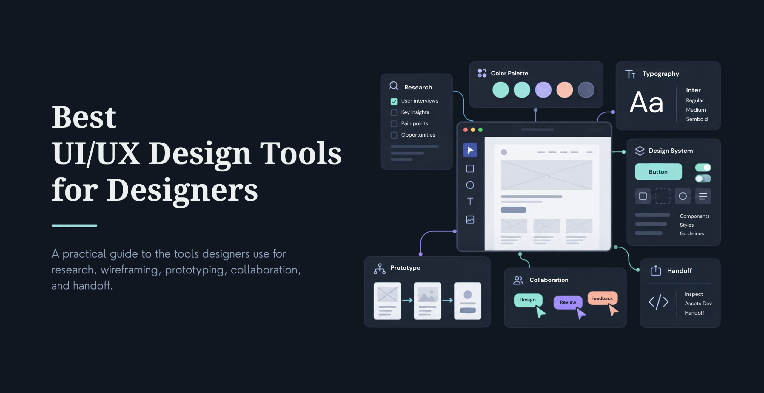
It depends on your team and platform, but our roundup of UI/UX design tools for designers covers what we use across prototyping, testing, and handoff for e-commerce projects specifically.
Does AI personalization ever hurt the shopping experience?
It can, when it’s implemented without real user research behind it. Over-personalized pages that feel like they’re guessing wrong, or AI features that add steps instead of removing them, tend to erode trust faster than a plain, static page would. The trend that works is AI that removes friction, not AI that adds a new interface for its own sake.
See Your Store's New Look, Generated by AI
Give us your store requirements and get an AI-designed landing page in a few minutes.




 KrishaLabs
 KrishaStudio
 KrishaStore