They have never changed their logo consisting overlapping circles, the comb-like intersection camel case typography, and shadowed white fonts since the last 20 years. Consistent brand is the way banks and credit card companies used to build trust with their customers. Change is a scary thing for such companies. We wondered what makes MasterCard to change its logo.
Logo change should be constant. Many modern financial institutes are changing their logos. Besides, MasterCard’s business is now beyond issuing credit cards. It’s an online payment platform, a digital wallet and a technology company, changing the logo design is a smart step to be flexible with the latest businesses.
Cindy Chastain, head of MasterCard’s customer experience and design, says, “MasterCard needs to thrive in a digital space. It’s simplified. It’s modernized and optimized for relevance in an increasingly digital world.” Changing the logo with the latest logo trends is a good way to rock the digital space. These are the changes you will notice in the new MasterCard logo that completely justify the latest logo design trends.
Flat Design
Logos of big giants like Google, Facebook have already gone flat. Flat design is clear and outspoke the clear intention of the company. Flat design gives away patterns, shadows, gradients, textures to simple lines and colors. It loads fast while browsing on different devices. It simplifies company’s logo and make them more iconic. Besides, it is also a better option for printing. Since the logo has to be printed on the cards, the flat design is the only consideration that matches best with the criteria. It seems that the designers have nailed the new logo of MasterCard with respect to flat design.
Typography
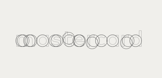
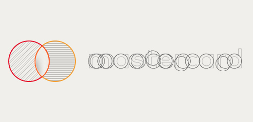
The circles represent the smooth cash flow and strong relationship with the customers. The circles are the theme for MaterCard logo. The designers of the most prominent designing company have done a unique job by providing a curve to each letter of the wordmak mastercard in the logo. Each letter contains a curve that’s a part of a circle. Even the “m” and “t”—MasterCard has always had a thing for circles. Also, they replaced the camel case typography with the simple and elegant lowercase letters.
Minimalism
Minimalism is the hot choice for designing logos this year. It emphasizes flat design by using fewer colors in an attempt to influence potential customers. It also focuses on the attention that the company wants to describe through their branding. The new MasterCard logo is the combination of minimal design, few colors and elegant typography that is enough to influence potential customers. Using simple style of two interacting circles, the designers have created a straight to the point logo that cuts down the clutter and draws customer’s attention right where it needs to be, i.e. the brand and the message.
Versatile
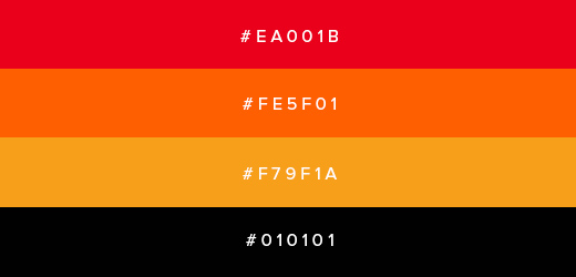
With the changing technologies, companies opt for logo that look good everywhere their customer’s encounter them like on a billboard, a laptop screen, a phone, or a smartwatch. The MasterCard logo can be seen out of the circles that is below them for small screen devices and besides them for desktop screen resolution. Moreover, the look of credit card is out of the company’s control. They have to design a logo that can work on both black and white backgrounds. The smart designers just calibrated the colors so that the yellow stood out on white and the red didn’t disappear into black.
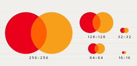
Well Balanced
Proportion is the vital element for any logo. While redesigning the logo, the company wanted to enhance the circles. The 1:1 proportion of the circles displays a larger identity system that can be rolled out across everything in MasterCard’s orbit, including credit cards, window decals, apps, printed materials, sponsorships and many other digital products. Along with the red and yellow circles, the “mastercard” wordmark has also been proportioned by giving curves to each letter. The placement of the text with respect to the symbol is well balanced too for greater effect.
Key takeaways:
To make the letters easier to read, make the font taller, condense it, and attenuate certain letters. Aside from these latest logo trends, the logo has remained more or less the same, which has strengthened customer recognition.
What’s your thought about the latest MasterCard Logo?