Icons have become a vital part of the UI design of every website or application. The icons can be used to enhance the aesthetic appeal of any website or mobile app whilst representing the main idea and intent of any product or action to the users. The main objective of using an icon is to guide the users to the correct location on a website or a mobile application. Therefore, UI designers pay close attention to the design and looks of each icon as well as to the overall feel that is delivered by each icon. For example, every web designer has to consider the usefulness of the outline or solid icons depending upon the user experience.
The main difference between these two styles of icons is not just a matter of preference, as researches [based on research study “Filled-in vs. Outline Icons: The Impact of Icon Style on Usability“] have shown the ease of recognition is not the only important factor to consider when selecting the most suitable icon for an application or website. It is equally important to consider when to use the outline or solid icons in order to make it possible for the users to quickly recognize the icons, easily navigate an app/website or to select the correct option.
Functions of Icon
Opinions of the web designers may vary with regards to the usefulness of outline or solid icons. Many web designers believe that hollow icons are harder to recognize, as the icons are made of outlines. However, it is equally true that outline icons give a feeling of ease to the users. Hence, it is essential to consider the functions of the icons along with their looks. The shape, colour and the functions of the icons also determine whether an icon is correctly recognizable or not.
The functional icons are a particular type of icons. These icons can be commonly seen in railway stations, airports, hotels, shopping malls or other public places. These icons are used to provide guidance to visitors.
Icons application began in Macintosh-1.0 and they have become one of the most common elements in UI design. These elements can be used to perform different types of actions or to provide descriptions alongside performing various other functions. The style of icons has changed since the release of Smartphone systems. The graphical interface has transformed from the ‘material’ design to ‘flat’ design and the icons have become slimmer and flatter accordingly (the readability of icons reduces due to non-flat design).
The main objective of using icons is to quickly deliver different types of information. It is possible to express any concept using text; however, it has become the latest trend to match the icons with the texts, as it becomes possible for the users to quickly receive a message with one look at the icons. The icons are considered to be user-friendly due to various other reasons.
For example, it is possible to locate an icon quicker than a text. Icons can even be used for the distinguishing of the structure or content layer of a web-page or to increase the interface rhythm.
When delivering a message, the icons and the text work hand-in-hand. It is difficult to distinguish the data present on a list of the icons are removed. The absence of icons may even create visual confusion and the users may have difficulty focusing on the options present on a line.
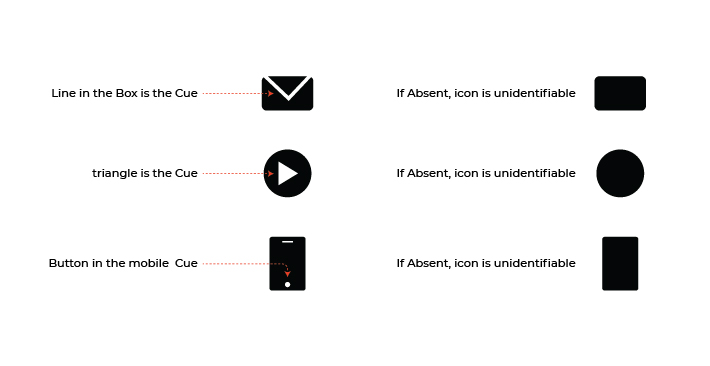
Characteristic Cues
Style of an icon has an impact on the ‘task performance’ which is measured by the speed and accuracy of recognizing and selecting the icons. In general, the solid icons are believed to be recognized easier and faster than the outline (hollow) icons. However, there may be a few exceptions to this rule. For example, the ‘Characteristic Cues’ may become an important factor when determining the usability of the icons and this is true in most scenarios.
The characteristic cues are used by the users to identify any icon. An icon may become unidentifiable if these cues are absent.
For example, it is impossible to recognize an icon for comment bubble without a tail or a lock icon without a keyhole. These cues are known as Characteristic Cues. Without a keyhole, a lock icon may look like a bag/pot/purse. On the other hand, a comment bubble icon looks like a circle without its tail.
Therefore, it is important to include all characteristic cues when creating an icon, as the users rely on these cues.
When to Use Outline Icons
It is important to ensure that the characteristic cues can be easily noticed or understood by the users and the visibility of these cues increases when used with the outline icons in some scenarios. A recent study found out that the visibility of the ‘characteristic cues’ increases when used with the outline style of the following icons.
A key icon where ‘key teeth’ are the characteristic cues
Comment bubble icon where the tail is the characteristic cue
Trashcan icon where the lid and the lid-handle are the characteristic cues
These characteristic cues are subtle. Therefore, the cues become more visible when used with the outline style. For example,
It is hard to miss the tail of the comment bubble when used on a hollow icon.
The jagged edge of the key also looks distinctive when used on the outline icons.
The lid and the lid-handle are hard to notice with solid icons and become easily noticeable on outline icons.
Therefore, it is prudent to use the ‘outline’ style of the icons if the characteristic cues are present on the edges of various icons or are subtle. The cues become more salient and easily recognizable due to this reason.
It is also important to avoid mixing the solid style with outline style and to stick to the consistent style. When creating icons with subtle cues, it is prudent to use the styles that feature characteristic cues with sharper angles or with other distinguishable styling types.
For example, the lid of the Trashcan icon is easier to notice if it is placed slightly above the trashcan. The ‘tail’ of the comment bubble icon is easily noticeable if it has a pointed edge.
When to Use Solid Icons
If you use the icons to represent the physical objects or to represent the work done by a physical object, then it is prudent to choose the ‘solid’ styling instead of ‘hollow’ styling of the icons. The solid styling makes an icon look like the silhouette of the real object which seems more realistic to the users.
Icons that represent the real-life objects do not become unrecognizable with the outline styling; however, it takes more time to recognize the icons if different parts of the outline are set closer. A recent study established that the following icons are easier to recognize when created using solid styling.
Thumb icon
Icon for Scissors
Icon for Phone
Icon for Tools
With outline styling, the aforementioned icons have narrow inner spacing on the cues and it creates visual noise. Therefore, it is prudent to use solid icons for the icons with narrow inner spacing, as the silhouette makes some shapes become more identifiable and look simpler.
When to Use Any Style of Icons
In some scenarios, the styling of the icons does not make any difference. For example, you may use either the hollow or the solid styling when creating the shopping cart icon, star icon or flag icon. If the outline of the icons has wider inner spacing or if the icons do not include subtle characteristic cues, then you may use either of the stylings on an icon. The wider inner spacing does not create a lot of noise. Hence, there is no interference with the recognition of icons.
Conclusion
Solid styling is preferred over the hollow/outline styling when creating an icon due to the belief that solid icons are more recognizable than hollow icons. This concept may be correct in some scenarios. For example, solid icons are more useful if you want a faster recognition rate, as these icons may increase the ‘task speed’ of the users. However, the ‘hollow icons’ become easily recognizable if there are subtle characteristic cues. You may need to keep the following points in mind when selecting the right style for different types of icons.
Selected styling is supposed to make the characteristic cues salient and easily identifiable.
Outline icons are more recognizable if they have wider inner spacing and subtle cues.
Solid icons can be quickly and easily recognized if the icons have narrow inner-spacing.