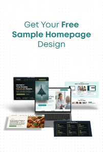
A good UI design is a lot like the storage memory of your device. When it is available, users don’t even think about it. But when it’s not, users keep seeing the ‘Storage Full’ message pop on their screen! Similarly, when you’re browsing a website and you have a flawless experience, you don’t pay much attention to the website design. It is only when you feel lost on a website or doesn’t get what you’re looking for and at that time you realize… yes, the website needs to be optimized according to the UI/UX Design Guide for effective presentation.
If you’re a website designer, you’ll know that it is best to keep the navigation of a website as simple as possible. You want users to feel that the experience of surfing a website is like a beautiful domino effect. One thing should automatically lead to another. But while a website design needs to be simple, it also needs to be customized according to the brand or individual whom the website belongs to. A customized website not only adds character to its overall look and feel, but it also gives its users a personalized experience. To put it simply, websites today are dynamic and interactive.
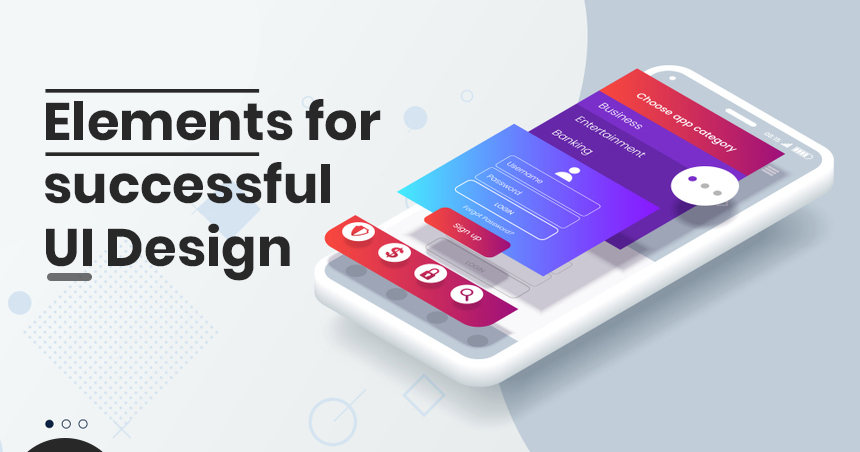
Let’s take a detailed look at what these UI elements are!
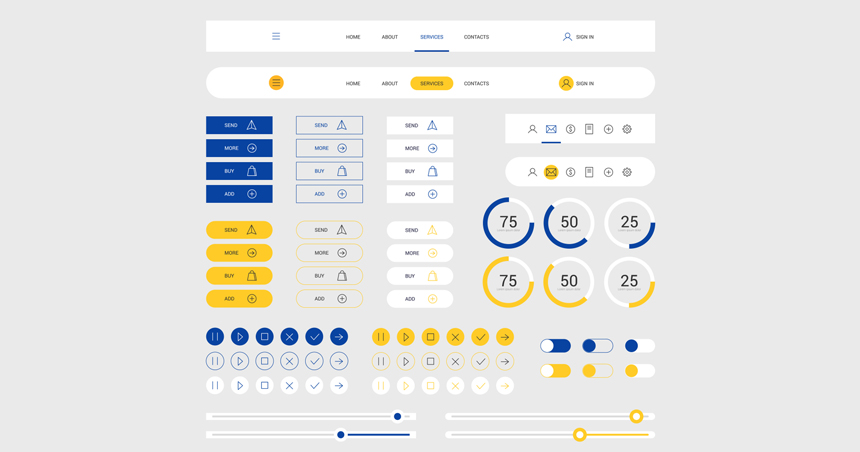
Input controls: checkboxes, dropdown lists, buttons, text fields, radio buttons, list boxes, toggles, date field
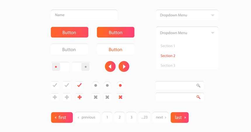
Checkboxes
You know when you’re shopping on a website and checkboxes appear on the left-hand side? These checkboxes fall under different categories. For instance, if you select ‘women’s wear’ on a fashion website, the categories that appear with checkboxes are Size, Offers, Discounts, Customer Rating, Occasion, Type, Color, Pattern, etc.
A checkbox allows users to select one or multiple options from a list. Once an option or several options are selected, the interface displays a small box with a check-in.
Dropdown list
When you hover your cursor on an item from the main menu and suddenly a list appears with its sub-categories, that list is called the dropdown list. It is an important UI element as it helps users explore the various sub-categories of the main category, so he/she can access the exact information they are looking for.
Buttons
Whether it is ‘Click Here’, ‘Buy’, ‘Submit’ or any other one-word command, buttons are traditionally displayed as shapes with a label. They allow users to perform an action.
Text fields
Websites don’t usually allow users to write something. But when you’re searching for something or you’re feeding in your email address, that place where you insert the text is called a ‘text field’. Text fields allow either a single line or multiple lines of text.
Radio buttons
Users often tend to confuse radio buttons with checkboxes. A radio button is a small and circular user interface element that lets users select one option from a list. Unlike checkboxes where users can select multiple options, users can choose only one option when it comes to radio buttons.
List boxes
List boxes are very similar to checkboxes. What sets this UI element apart is that it is more compact and can support a long list of options if needed. List boxes allow users to select multiple items at a time too.
Toggles
Think of toggles as on and off switches. A toggle button allows users to change a setting between two states. These buttons are most effective when the two states in question are visually distinct.
Date field
Date fields are predominantly viewed on travel websites. When you are making a hotel or flight booking, websites ask you to select the dates of your travel. This place, where you select the dates, is called the date field. After you’ve chosen your dates, the information is consistently formatted and displayed to you.
Informational Components: tooltips, progress bar, message boxes, icons, notifications, modal windows
Tooltips
Some websites allow you to hover over the name of a category. And when you do, you can view additional information about that category. The additional information that appears is called tooltips.
Progress bar
A progress bar lets users know the stage they are at in a series of steps. For instance, when you’ve added an item to your cart, a progress bar usually appears at the top of the screen. The progress bar includes steps like ‘add personal details’, ‘add billing details’, ‘make payment’ etc. You’ll commonly find them when a user needs to complete a purchase.
Message boxes
A message box is a small window that gives information to users and urges them to take action before they move forward.
Icons
Icons are the visual representation of a text button. They are fun and creative UI elements that make a website more appealing to look at. Traditionally, icons are hyperlinked, and they help communicate content better.
Notifications
Notifications are an important source of information. They let us know if someone has liked our post or if some error has occurred while completing an action. Usually, a notification appears in the form of a tiny red dot.
Modal windows
You must have often noticed that when you’re scrolling a website, a small box appears that contains a message. This box won’t go away until you interact with it. This small box is called a modal window. For instance, the box that asks you whether you want to confirm deleting when you’re deleting messages or photos is a modal window.
Navigational Components: breadcrumb, search field, slider, pagination, tags
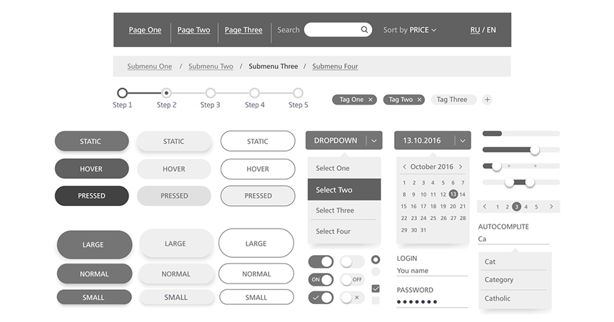
Breadcrumb
Breadcrumbs allow users to see their current location when they are browsing a website. They are little trails of links that help users figure out where they are within a website. Breadcrumbs also allow users to move between steps.
Search field
What do you do when you can’t find a product or service on a website? You go to the search field and input some keywords that will lead you to what you’re looking for. Commonly represented with a little magnifying glass inside of it, search fields allow users to input information to find within the system.
Slider
Also known as a track bar, a slider allows users to set or adjust volume or brightness. It does not alter the interface or other info on the screen.
Pagination
When you’re shopping online, you must have often come across the number of pages a product is spread over. This number of pages is mentioned at the bottom of the page. Pagination helps users skip pages or go in order through the content.
Tags
Let’s say you’re browsing through a medical website and you’re reading about heart conditions. At the side or at the bottom, you will see tags that will take you to similar content within the website. For instance, you might see tags like ‘heart disease’, ‘cardiac arrest’, ‘insurance coverage’, ‘improving care’ etc. To put it simply, tags allow users to find content in the same category. A tag is a flexible UI element. Some tagging systems allow users to apply their own tags by entering them into the system.
Containers: accordion
Accordion
By utilizing the show/hide functionality, an accordion lets users expand and collapse sections of content. It is a vertically stacked list of items. When a section is clicked, it expands showing the content within. An accordion helps users navigate material quickly and allows the UI designer to include large amounts of information in limited space. An accordion can have one or more items showing at a time and may have default states that reveal one or more sections without the user clicking.
We have covered some of the most common UI elements in this article. Have more to add to this list? We’d love to know in the comments below!
Nisarg Pandya
Project ManagerExperienced Project Manager and Scrum Master at KrishaWeb, delivers expertise in Scrum methodologies, Laravel, React.js, UX design, and project management, ensuring efficient project delivery and agile implementation.

 KrishaLabs
 KrishaStudio
 KrishaStore