An efficient website designer aims to provide a smoother user experience using evolving technology. A simplified design not only saves the users’ time; it also increases the rate of conversion. Several Internet surfers access the Internet through mobile devices and these devices own a large market share, today. Hence, the mobile-friendly websites need to satisfy the users’ demands with the addition or deletion of features. The long-scroll pages may fall into the category of deletion, as it dampens the users’ experience.
Problems of Long-scroll Pages
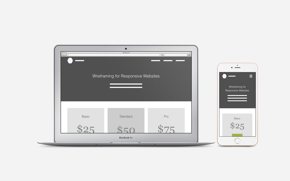
The height of a website increases on a mobile phone due to the screen’s smaller size in comparison to laptop or desktop devices. The long-scrolling feature further increases the page’s size and the horizontal elements look piled-up. These attributes may worsen the users’ experience and may compel them to move towards another website due to lack of interest.
Sluggish & Tiring Scrolling
Some websites are not developed with the necessities of a mobile device in mind. The content of desktop-friendly websites usually looks vertically clamped after adapting its size according to the needs of a mobile phone. The overall height of a web-page also increases on these phones. The users may need to scroll repetitively and it may break their attention.
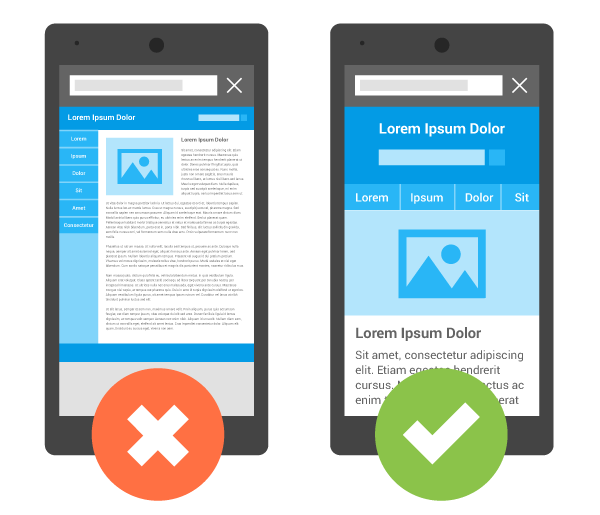
Unfriendly Navigation
It is essential to present the users with a friendlier navigational structure on both desktop and mobile-friendly websites. The long-scroll feature usually comes with the single-page websites and a deluge of information look cluttered on such web-pages. These websites look further disarranged on the smaller screen of a mobile device. It becomes harder for the users to read the jumbled-up content on a mobile screen.
Footer Elements’ Problem
The users often search for ‘footer elements’ to move to the next subject or next web-page. It becomes hard for the users to find these elements on lengthier web-pages. They may have difficulty navigating to other pages and this problem may increase the bounce rate. The bounce-rate presents the percentage of visitors accessing one web-page in one session.
The Usefulness of Long Scrolling
Long-scrolling web-pages indeed come with multiple issues and it may not be ideal for every website. However, this feature may seem suitable for a specific set of conditions.
A multi-step tutorial content or a lengthy article may benefit from the continuous structure. The long-scrolling web-pages do not divide the content into slices and it improves the user experience.
The linear structure of long-scrolling web-pages is also excellent for storytelling.
The long-scrolling structure is also ideal for any information that requires visual representation. It is impossible to divide this type of content into multiple parts. It is possible to present the content using a continuous structure of long-scrolling.
The long-scrolling also makes it possible for the users to highlight the features or qualities of a product in an article.
Optimizing Long-scroll Pages is Essential
Several consumers use search engines to perform any type of researches on mobile phones. When the viewers use the search engines to find a website, they create organic traffic towards the site. The increased organic traffic has a positive influence on the rate of conversion. The Salesforce has identified at least 68% of marketing agencies to have included a ‘mobile marketing strategy’ into their general ‘marketing strategy’. This percentage alone can emphasize the importance of appropriate mobile strategy for businesses.
The developers have no standard height to follow when creating a mobile-friendly website. According to the experts’ advice, a mobile website needs to be readable within three-to-five scrolls. Today, many mobile phones have a viewport. Hence, the developers also need to consider the viewport’s height while creating a mobile-friendly website. The developer may test the layout on screens of popular mobile phones to determine the optimal content and layout for mobile-friendly websites.
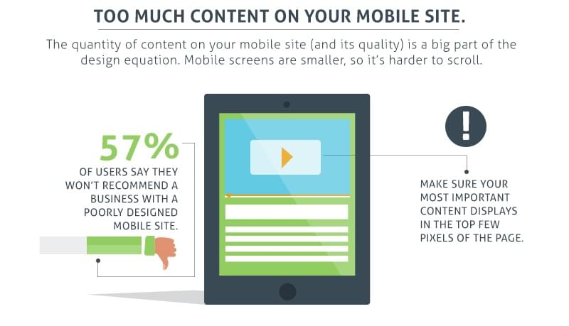
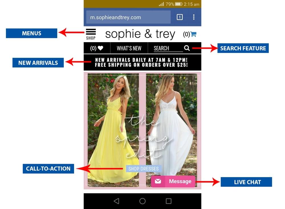
The first scrolling can determine the users’ motive when they visit any website. Therefore, it is essential to place the CTA lines or core information within the first scrolling space. This type of positioning allows website-owners to make the most out of the first scroll. The links embedded within the information also needs to be placed wisely within the first-scroll. However, it is important to avoid overstuffing the web-pages with CTA lines. The developers need to maintain a balance during the placement of important elements, such as the CTA lines, during the making of a website.
Avoid Overuse of Fancy Scrolling
The Parallax scrolling has become highly popular amongst website developers or designers. The background images move slower than foreground images in this asymmetrical scrolling technique. It offers an illusion of depth to 2D scenes. The website developers/designers love the dynamism of Parallax scrolling. However, it is essential to consider the drawbacks of this technique despite the charming appeal.
The loading-speed of a web-page decreases with the presence of Parallax scrolling. This speed decreases further on a mobile device and worsens the user experience. The reduced loading speed is also harmful to a website’s SEO ranking.
The responsive designs are somewhat incompatible with Parallax scrolling. It is harder to translate the Parallax layouts on mobile websites due to this reason.
Concealing Unimportant Desktop Elements
The mobile websites have a smaller area and it is vital to make space for important items on this compact space. The website designers need to be precise and direct when arranging products/content for a mobile website. They need to display only the primarily essential elements and keep the subsidiary items reserved for larger platforms.
Stacking Images & Products into the Gallery
The commercial websites need to display multiple products or multiple images of the same product on one web-page. The presence of multiple images increases a web-page’s overall height. The galleries/sliders can solve this problem and can be enacted in many ways and the introduction of horizontal scrolling elements seems mostly user-friendly.
Eliminate Duplicate Elements
The removal of duplicate elements can improve the usefulness of any long-scroll website. It is essential to avoid repeating the placement of navigational elements on mobile-based websites due to the screen’s smaller size. It is wiser to put these elements on the top of the web-page. This type of placement may save the users from scrolling up and down the web-pages in search of the navigational elements.
Parallax & Long Scrolling
On average, the Internet surfers have the attention span of eight seconds and the long-scrolling websites may turn them impatient. The interactive design is fundamental for any long-scrolling website due to this reason. On the other hand, the animation is the pivotal part of Parallax design. It can create a lovely scrolling experience for viewers and can keep them engaged for longer.
Parallax Scrolling Effectiveness
The entertaining visual effects of Parallax make an excellent impression on the users. It offers an enjoyable journey and it encourages the viewers to scroll. It allows the website developers to amuse visitors with the dynamic visual experience.
The merging of the Parallax effect with long-scrolling can create an immersive browsing experience. Therefore, Parallax scrolling can be used in websites requiring guided storytelling.
Parallax Scrolling Drawbacks
The scrolling experience may become fun-filled with the use of the Parallax effect. However, it is prudent to avoid the dynamism of parallax if visitors are looking for precise actions. Hence, the Parallax effect is unsuitable for e-commerce or merchant websites.
Page Performance and Parallax
The scrolling performance usually deteriorates due to Parallax effect in the majority of the websites. This performance may worsen on devices having high-pixel density. Some simple methods may improve the scrolling-performance despite a Parallax effect.
Some properties, such as opacity, scale, translate3d or rotation, are cheap for the browsers to animate. It is vital to use these properties on websites with Parallax effects.
It is essential not to animate or resize the larger images, as it is costlier to force the browser in performing these tasks.
It is equally important to avoid the animation of multiple things at the same time.
Accessibility & parallax effect
The use of animation may cause trouble for a user group. They may have trouble accessing the websites with Parallax designs. Therefore, it is prudent to offer a different way to view the content. This advice is particularly suitable for websites having lots of animation, as the alternate way is supposed to shut down the movement. The developer may put a button/toggle-switch into the website to shut it down.
Conclusion
All the brands must provide a smoother user experience through their websites. The brands capable of providing sublime user-experience can capture the interests of global customers. These days, people access websites using their Smartphones more than desktop/laptop devices. The businesses are also interested in developing websites with a mobile-first approach. However, some features of larger websites are not ideal for mobile-based websites due to the screen’s smaller size. The website developers and designers are compelled to make some adjustments in accordance with the changing needs. These pointers can help them improve the experience of users while letting them create websites capable of standing out with their distinctive features.

 KrishaLabs
 KrishaStudio
 KrishaStore
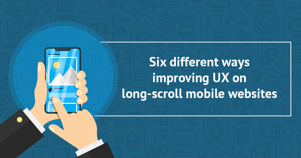


