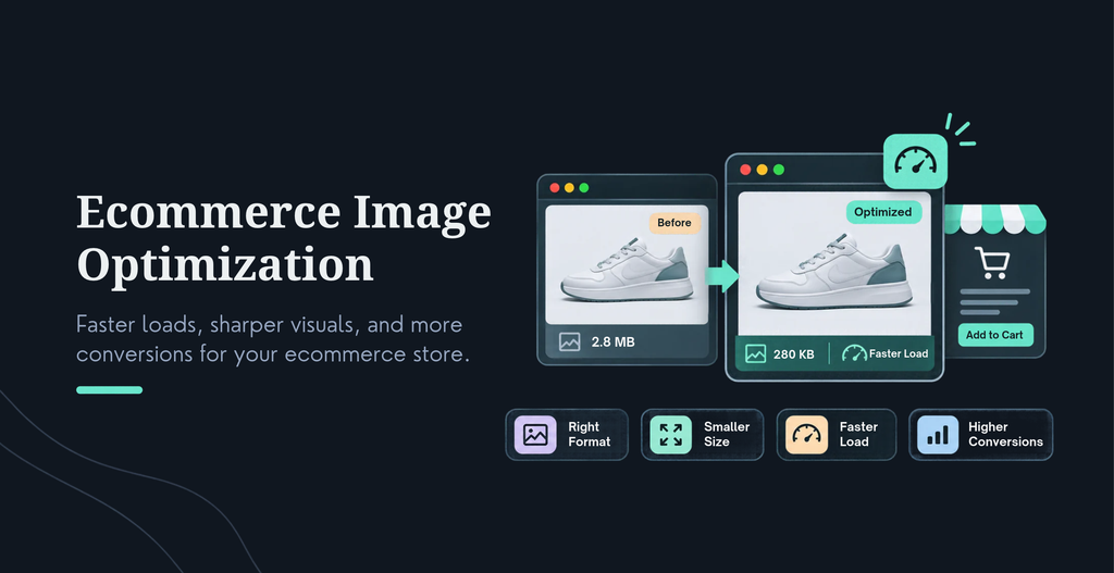
Ecommerce image optimization means getting every product image down to the smallest file that still looks right, then delivering it fast enough for shoppers and for Google. In 2026 that looks like this: use AVIF or WebP with a JPEG fallback, size each image to the space it fills, compress by eye, name files and write alt text for people, serve responsive versions, never lazy-load the first product image, and add Product structured data to the page.
I use one method when I audit a store, the Four-Role Image Budget. Every image plays one of four roles: hero, gallery, zoom or thumbnail. Each role gets its own size, format and loading rule. Sort your images by role first, and the rest of your ecommerce image optimization work gets much easier to apply.
What is ecommerce image optimization?
Ecommerce image optimization is the work of improving product image formats, dimensions, file sizes, filenames, alt text and delivery. The aim is simple. Images should load quickly, look sharp and stay readable to search engines and screen readers. It covers the photo files themselves and the way your site serves them. Done well, shoppers see the product sooner, Google understands what it is looking at, and your pages are more likely to pass the speed checks that feed into rankings. A product image is optimized when removing one more byte would start to hurt how the product looks. That is the line I teach. Stop where the shopper would notice, not where a tool score turns green.
Why does product image optimization matter for ecommerce SEO and sales?
Product image optimization matters because shoppers cannot touch what they are buying, so they inspect the photos. In Baymard Institute’s 2020 usability testing, 56% of users began by exploring the product images on arrival. The same benchmark found that 25% of ecommerce sites provide images that fall short of what shoppers need to judge a product. Low resolution and weak zoom both caused people to abandon products.
Speed is the other half. A Google-commissioned study by Deloitte and 55 followed 37 brand sites and found that a 0.1 second mobile speed improvement lifted retail conversion rates by 8.4% and average order value by 9.2%. Google also treats a Largest Contentful Paintof 2.5 seconds or less, measured at the 75th percentile of page loads, as good. On a product page, that clock usually stops on a product photo.
Shoppers judge the product by its photos. Google judges the page by how fast those photos show up.
What is the Four-Role Image Budget?
Most stores treat every image the same. One big upload gets used everywhere, so a thumbnail in a category grid ends up carrying the bytes of a hero shot. The Four-Role Image Budget is the simplest fix for product image optimization I know, because it gives each role its own rules.
Role
Where it appears
Format
Starting width
Loading rule
Hero
First image on the product page, and any large category banner
AVIF or WebP, JPEG fallback
Display width at 2x, often 800 to 1200 px
Eager, with fetchpriority high
Gallery
Other photos in the product carousel
AVIF or WebP, JPEG fallback
Same as hero
Lazy-load
Zoom
Large version opened on tap or hover
WebP or JPEG
Up to 2048 px square
Fetch only when the shopper zooms
Thumbnail
Category grids, gallery strips, related products
AVIF or WebP
300 to 600 px
Lazy-load, except the first row of a grid
Treat those widths as starting points, not rules. Check them against your theme’s real display sizes, then test. The goal is simple. No image should be bigger than the job it does.
Which image format is best for ecommerce: AVIF, WebP, JPEG, PNG or SVG?
For most catalogs, test AVIF and WebP first and keep a JPEG fallback. Both modern formats usually produce smaller files than JPEG at similar visual quality, and Google’s image guidance lists both as supported. AVIF often compresses photos further, but it can take longer to encode, so the right answer depends on your images. Run both on your own photos and compare.
Format
Best use in ecommerce
Main thing to watch
AVIF
Product photography where you want the smallest files
Larger files than AVIF or WebP at the same quality
PNG
Graphics that need lossless detail or transparency
Often much heavier than a JPEG for photos
SVG
Logos, icons and simple vector art
Not suited to ordinary product photography
Check what your platform accepts. WordPress has accepted AVIF uploads since version 6.5, as long as your server’s image library supports it. The Shopify Help Center lists formats such as JPEG, PNG, WEBP, HEIC and GIF as accepted uploads, so AVIF is not an upload option there. Shopify’s Help Center also says its Imagery service picks the best format each browser supports, so you do not convert files yourself. On Shopify, upload clean, high-quality source files and check what your theme delivers. And skip GIFs for product animation. A short MP4 or WebM file is lighter.
Here is the markup for a hero image. It offers AVIF first, WebP second and JPEG last. It sets width and height, and it carries no lazy-loading attribute.
Test AVIF and WebP on your own photos, keep whichever looks right at the smaller size, and always ship a JPEG fallback.
What size should ecommerce product images be?
Two numbers matter, and people mix them up. Image size is the dimensions in pixels. File size is the weight in kilobytes. Pick dimensions from the space the image fills on screen, then let compression decide the file size. A universal rule like “keep every image under 2 MB” is outdated, and 2 MB is far too heavy for most thumbnails.
For dimensions, start with the display width and double it for sharp screens. For zoom, go higher. The Shopify Help Center recommends 2048 by 2048 pixels for square product images and accepts files under 20 MB and up to 5000 by 5000 pixels (25 megapixels); API and CSV imports are limited to 20 megapixels. That is a source size, not a delivery size. Let your theme or CDN create the smaller versions.
Mobile adds a trap. Baymard found that mobile sites often serve lower-resolution images to save data, then fail to load a sharper version when the shopper zooms. Fetch the larger file on zoom, and only then. Responsive CSS such as max-width: 100% helps layout, but it does not make downloads smaller. The browser still fetches the full file and shrinks it on screen. CSS can shrink how an image looks. Only a smaller file can shrink what the shopper downloads
How to Compress Product Images Without Compromising Quality?
Compression is the biggest lever in ecommerce image optimization, and the easiest one to get wrong. Resize first, compress second. Export from your master file at the right dimensions, then compress. Lossy compression throws away detail you are unlikely to notice. Lossless compression keeps every pixel but saves less. For photos, lossy is usually the right call. For logos and flat graphics with sharp edges, lossless or SVG tends to look cleaner.
Judge quality at 100% zoom on the details that sell. Look at stitching, fabric texture, stone settings, print edges and soft gradients on white backgrounds. Over-compression shows up there first, as blocky patches or color banding. A free tool like Squoosh lets you compare the original and compressed versions side by side and drag the quality slider until you see a difference. Then move one step back.
Batch the work. Set one export recipe per role in the Four-Role Image Budget and apply it to every new upload. A consistent recipe beats a heroic one-off fix.
How should you name image files and write alt text for products?
Name files for people first. Use short, descriptive words separated by hyphens, such as black-leather-crossbody-bag-front.jpg. Skip camera names like IMG_4821 and skip stuffed strings of keywords. Google uses file names as a light hint about what an image shows, so a clear name helps without any trick.
Alt text exists for people who cannot see the image. Screen reader users hear it, and browsers show it if the image fails to load. Search engines read it too, which is a bonus, not the goal. Describe what is visible and useful to a buyer. Skip “image of.” Leave it empty for purely decorative images.
Image
Weak alt text
Better alt text
Main shot
bag handbag leather bag best handbag buy online
Black leather crossbody handbag with gold buckle and adjustable strap
Detail shot
handbag close up
Close-up of the gold buckle and stitched strap on a black leather handbag
Scale shot
handbag model
Model carrying the black crossbody handbag on her shoulder
Write alt text the way you would describe the photo to a friend on the phone.
How do responsive images work with srcset and sizes?
The srcset attribute gives the browser a menu of the same image at different widths. The sizes attribute tells it how wide the image will be on screen. With both, the browser picks the smallest file that still looks sharp on that device. A phone downloads a small file, and a large monitor gets a bigger one.
Most themes create srcset for you. The part that goes wrong is sizes. If a theme tells the browser an image fills the whole screen when it really fills a third of it, the browser will choose a file about three times too large. You will not see that on the page, but you will see it in the network panel.
To check yours, open Chrome DevTools, go to the Network tab, filter by Img and reload a product page. Compare each file’s pixel width with the size it displays at. If the file is much wider than what you see, fix sizes first.
Should you lazy-load product images?
Yes, but not all of them. Lazy loading holds back offscreen images until the shopper scrolls near them, which frees bandwidth for what they see first. Never apply it to the first product image or anything above the fold.Shopify’s theme documentation calls lazy-loading the LCP image one of the most common and damaging performance mistakes in themes.
Go one step further and tell the browser what matters. Adding fetchpriority=”high” to the main product image raises its download priority. In a Google Flights test published on web.dev, that change cut Largest Contentful Paint from 2.6 seconds to 1.9 seconds. Your result will differ, but the pattern holds. One image loads eagerly with high priority, and the rest wait.
Does lazy loading hurt SEO? Not when you use the native loading=”lazy” attribute on a normal image element, because the URL stays in the HTML where Google can read it. Be careful with older JavaScript lazy-load scripts that hide the real URL until scroll. Also set width and height on every image so the page does not jump as images arrive.
How do product images affect Core Web Vitals?
Images touch two of the three Core Web Vitals. Largest Contentful Paint measures how fast the biggest visible element renders. Google’s guidance says 2.5 seconds or less is good and anything over 4.0 seconds is poor, judged at the 75th percentile of real page loads. Cumulative Layout Shift measures how much the layout moves, and images without set dimensions are a classic cause.
On a product page, the LCP element is usually the main product photo. That makes it the most valuable image to fix. It should sit in the initial HTML, not be built later by a gallery script. It should be right-sized, in a modern format, eager and high priority.
Symptom
Likely image cause
Fix
Slow LCP on product pages
Hero is oversized, lazy-loaded or built by JavaScript
Right-size it, remove lazy loading, add fetchpriority high, render it in HTML
Layout jumps while loading
Images missing width and height
Set both attributes, or use CSS aspect-ratio
Fast in the lab, slow in the field
Real shoppers on slower phones get full-size files
Check srcset and sizes, then use field data in PageSpeed Insights
Category pages feel heavy
Thumbnails use gallery-size files
Give thumbnails their own role and size
Do you need an image CDN?
For a store with more than a few dozen products, it is usually worth it. A content delivery network keeps copies of your images on servers near your shoppers, so files travel a shorter distance. An image CDN goes further. It can resize images and convert formats on request, so you upload one good source file and the service creates every version. That fits the Four-Role Image Budget well, and it takes most of the manual work out of ecommerce image optimization.
Keep one SEO rule in mind. Whatever serves your images must give them stable, crawlable URLs, and your robots.txt file must not block them. Faster delivery also trims the running side of your overall ecommerce website cost, because you ship fewer bytes for the same traffic.
How do you get product images into Google Images and Google Lens?
Google can only show what it can find and understand. To optimize product images for Google, these steps matter most, based on Google’s own image and productdocumentation.
Use real image elements. Google reads images placed with HTML image elements, so do not rely on CSS backgrounds for product photos.
Put useful text next to the image. Google uses surrounding text, captions and page titles to understand what an image shows.
List your images for discovery. Image URLs in a sitemap help Google find photos it might otherwise miss.
Add Product structured data. Google says Product markup can make a page eligible for merchant listing experiences, including Google Images, and for richer results in Google Lens. On JavaScript storefronts, put the markup in the initial HTML.
Connect a Merchant Center feed. Google says providing both page markup and a feed maximizes eligibility and helps it verify your data. See Google’s merchant listing documentation.
Shoot your own photos. Manufacturer images are shared by every reseller. Unique photos on your key products give Google something other retailers cannot offer.
Set a preferred image. Google’s 2026 image guidance says og:image and schema.org image properties can help choose the thumbnail shown in Search and Discover. Pick an image that is relevant and representative of the page. Google advises avoiding generic images such as site logos, and images that contain text.
Here is a trimmed example of Product markup with several image shapes. It belongs on product pages, not on educational articles like this one.
Google can only rank an image it can find, read and connect to a product. Our ecommerce SEO services cover this markup and feed setup alongside the speed work. For the wider checklist, see our ecommerce SEO checklist.
How do product images show up in AI search?
Nobody outside the search companies can say exactly how AI systems read a product photo, so I will not pretend to. What you control is the context around the image. AI answers and Google AI Overviews draw on page text, structured data and product feeds. A clear photo with no context gives them little to quote.
Make each product page easy to extract. Name what the image shows in the nearby copy. Keep the alt text, product title and feed attributes consistent. Add Product markup. Use captions for size, scale and included accessories, because those are the questions shoppers ask. Our AEO and GEO optimization work follows the same idea: make each fact easy to find and easy to trust.
AI search can only repeat what your page makes easy to read. Extraction and citation are never guaranteed, and a faster image will not buy you a mention. It does make your page a better source.
How do you optimize product images in Shopify and WooCommerce?
Shopify
Upload square source images at 2048 by 2048 pixels, in JPEG or WebP, and keep them clean and consistent. Use your theme’s image tag so Shopify generates a responsive srcset for you. Then fix the first image. Shopify’s theme documentation says to load the LCP image eagerly and mark it with high fetch priority. Finally, audit your apps. Review widgets and badge apps often add images and scripts that slow the product page. Our Shopify developmentteam can walk through your theme with you.
WooCommerce
WordPress creates srcset and applies lazy loading by default, so much of the groundwork is already there. Since version 6.5 you can also upload AVIF files. Check support under Tools, Site Health, Info, Media Handling. Then set your WooCommerce product image sizes to match your theme, and regenerate thumbnails after any change so older products get the new sizes. Make sure your theme or caching plugin is not lazy-loading the main product photo. Our WooCommerce development team handles this kind of tuning for stores of every size. For more speed fixes, see our WooCommerce speed optimization tips.
KrishaWeb note: [Add one Shopify and one WooCommerce observation from real projects, such as the app or plugin that most often slows product pages. Owner: Nirav.]
What are the most common ecommerce image optimization mistakes?
Mistake
Why it hurts
Fix
One huge upload used everywhere
Thumbnails carry hero-size weight
Give each role its own size
Lazy-loading the main product photo
Delays Largest Contentful Paint
Load it eagerly with high priority
Over-compressing
Blocky texture makes products look cheap
Check at 100% zoom, then step back
Keyword-stuffed alt text
Poor for screen readers, no real SEO gain
Describe what is visible
Scaling with CSS only
The full file still downloads
Serve smaller files with srcset
Manufacturer photos on every product
Nothing unique to rank
Shoot your own photos for key products first
No width and height
The layout jumps as images load
Set both on every image
Ecommerce image optimization checklist
Run this ecommerce image optimization checklist before you publish a product page or a new batch of photos.
Every image has a role: hero, gallery, zoom or thumbnail.
Source files are clean, consistent and at least as large as the largest display size.
Delivery files are AVIF or WebP, with a JPEG fallback.
Each file was compressed by eye at 100% zoom.
File names are short, descriptive and hyphenated.
Alt text describes what is visible, one version per angle.
srcset and sizes are set, and the network panel confirms sensible file widths.
The first product image loads eagerly with fetchpriority high.
Below-the-fold images use native lazy loading.
Width and height are set on every image.
Product structured data is in the initial HTML, and the Merchant Center feed matches the page.
Images are in HTML image elements and not blocked by robots.txt.
How do you measure whether product image optimization worked?
Record a baseline before you change anything. In Google Search Console, export clicks, impressions and click-through rate for your product pages, and split Web from Image search. In PageSpeed Insights, save the field data for mobile and desktop. After the changes, compare equal periods once Google has had time to recrawl the pages.
Then test the shopping side. A/B test the number of images per product, the order of the angles and how many thumbnails show beside the main photo. Baymard suggests tracking the return on extra product images through A/B tests on high-traffic products. Faster and sharper only matters if shoppers buy more. For the wider picture, see our guide to search engine optimization tips.
Where should you start this week?
Ecommerce image optimization does not need a rebuild. Start with the one image that matters most: the main photo on your best-selling product page. Right-size it, convert it to a modern format, remove lazy loading, add fetchpriority=”high” and set its width and height. Measure LCP before and after. Then apply the Four-Role Image Budget across the catalog.
If you would rather hand this to a team, talk to our ecommerce development team. We can review how your store serves product images, fix the slowest pages first and set up a process so new uploads stay fast. Contact us to start the conversation.
Frequently Asked Question
What is the best image format for ecommerce?
Use WebP or AVIF for delivery, with a JPEG fallback. Test both modern formats on your own photos and keep the one that looks right at the smaller size. AVIF often compresses photos further, while WebP is a safe, widely supported default. Use PNG only where you need lossless detail or transparency, and SVG for logos and icons, not product photography.
What size should ecommerce product images be?
Match the dimensions to the space the image fills, then double the width for sharp screens. Shopify recommends 2048 by 2048 pixels for square source images, so use that as the master and create smaller versions for the page, thumbnails and zoom. Skip single rules like “keep everything under 2 MB.” Compress each image until quality starts to drop, then step back.
Does lazy loading hurt product image SEO?
Not when you use the native loading=”lazy” attribute on a normal img element, because the image URL stays in the HTML where Google can read it. The risk is lazy-loading the wrong image. Never lazy-load the main product photo or anything above the fold, since that delays Largest Contentful Paint. Be careful with older JavaScript lazy-load scripts that hide the real URL until the shopper scrolls.
How do I write alt text for product images?
Describe what is visible and useful to a buyer, in plain words. “Black leather crossbody handbag with gold buckle and adjustable strap” works. A string of keywords does not. Skip phrases like “image of,” write a different description for each angle, and leave alt text empty for purely decorative images. Alt text exists first for screen reader users, and search engines read it as a bonus.
Do image file names affect SEO?
A little. Google uses file names as a hint about what an image shows, so black-leather-crossbody-bag.jpg is better than IMG_4821.jpg. Use hyphens, keep names short and avoid stuffing keywords. File names help most when they agree with the alt text and the product title on the page.
How do I get my products into Google Lens?
Make product images crawlable with HTML img elements, add Product structured data to each product page, and connect a Google Merchant Center feed. Google says Product markup can make pages eligible for richer results in Google Images and Google Lens. Eligibility is not a guarantee of placement, so keep your data accurate and your photos clear.
Ready to Scale Your Agency?
Tell us what you are trying to deliver. Schedule a call to talk it through, or contact us with your project.




 KrishaStudio
 KrishaStore