Google mobile-first indexing, is a very important aspect that every website owner must know about. Basically, the process involves crawling mobile versions of websites prior to their desktop versions and indexing mobile pages first.
This means,“Google has prioritized the Mobile version of your website over the Desktop version of your website for a reason”.
Reason:Modern-day fact is that users today are searching more through their smartphones than their desktops. Google search is accessed more through smartphones, and mobile traffic is playing a huge role in the web commerce world.
If Google delivers results of desktop sites over mobile versions, then it’s delaying the experience of the user. For this reason, Google mobile-first indexing was considered in 2016, the year in which mobile traffic surpassed desktop traffic over the internet. At that time, Google decided to implement indexing of mobile sites over desktop sites, but the project and processes are vast, so Google took considerable time to make it happen. 26th March 2018 was when Google began implementing the process. There were many loopholes and practical hassles in the process so, the search engine giant decided to roll it over gradually.
Having said that, it does not mean that every desktop site owner will suffer due to loss of site indexing. The fact of the matter is if there is a mobile-friendly site then it would serve as a reference or guiding point for the desktop site. Google will first crawl the mobile version and then the desktop version. The biggest learning, in this case, is that every website owner should have a mobile version of the site ready to attract the Google crawl bots. This will increase their chances of getting their site indexed by Google. This will increase traffic and eventually the business by a huge margin.
Although it began in 2016, Google declared that it would delay the process of Google mobile-first indexing till March 2021. There were practical issues and concerns like lazy loading, mobile images etc. Due to all these actual hassles, Google had said, “we currently don’t have a specific final date for the move to mobile-first indexing and want to be thoughtful about the remaining bigger steps in that direction”. A word of advice to website owners is that they must create a mobile version of the site to be indexed by Google. Because the biggest search engine in the world has prioritized the mobile version of all the websites for crawling – indexing. If you want more traffic and revenue through the web, then you have only one option – a mobile-friendly website up and running.
Understanding Google’s Mobile-First Indexing for WordPress Websites:
Google’s Mobile-First Indexing means that the mobile version of a website is the primary source used for indexing web pages. This means that having a mobile-friendly website that is optimized for mobile-first indexing will not only improve your chances of ranking higher on Google, but it will also enhance the search experience of mobile users. Previously, desktop versions were predominantly used for indexing and ranking, but with the majority of users accessing Google through mobile devices, mobile versions are given priority.
How to Check if Your Website Is Using Mobile-First Indexing?
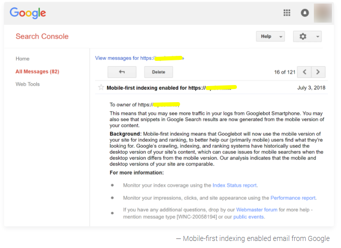
If you have a website that was created after July 1st, 2019, it has already been switched to mobile-first indexing by default. On the other hand, for older websites that existed before this date, Google will notify you via Google Search Console when your site has been switched to mobile-first indexing. You will receive an email notification containing the exact date of the switch, so make sure to keep an eye out for it. If you haven’t received any notification, your site is most likely still using desktop-first indexing. To ensure that your website is properly optimized for mobile-first indexing, it’s recommended to use Google’s mobile-friendly test tool to evaluate your site’s performance and identify areas for improvement.
How Your Website is Considered for Google Mobile-First Indexing
As per Google, any site that was built after 1st July 2019 is automatically switched to a mobile-first indexing process. For sites older than this date, the company will inform them through Google Search Console.
image-source: kinsta.com
With Google working at its best, it is the responsibility of website owners to create mobile-friendly sites at the earliest. A mobile responsive site, with dynamic content updates between mobile and desktop versions, is good to go. If you have such a site, then regular SEO optimization is enough. Site owners can check if their site is mobile-friendly or not by using Google’s Mobile-Friendly Test Tool. Or, they can even use the Responsive Design Tool.
Tips to Build Mobile-First Indexing Websites
We are listing down a few tips for sites that fit in the mobile-first indexing category and those that still need to be switched into that zone.
Focus on Giving the Same Experience on Both Versions
Google expects the companies to offer the same experience on both versions of the site. This accepts the fact that there could be little difference in the design structure. The use of the same meta robot tags will help Google bots to crawl through both versions. For this, a mobile responsive site would work wonders as it would work on all devices irrespective of the screen size.
Create Versions with the Same Content
The mobile site pages and content should be identical to the desktop site. If the pages in the mobile-friendly version are fewer, then crawlers would not be able to grab the same information as that in the desktop version. So, make sure there is the same number of pages with adequate content as per the design and styling of the site.
Proper Headings would Help
Crawler bots would grab headings that are clearly defined and easy to understand, so, ask your SEO team to work on that part.
Choose a Mobile Friendly WordPress Theme
Most WordPress themes are responsive so, your site will become mobile-friendly from the start. In case, you have an old site, then there are slim chances of it being optimized or responsive. In this case, it is better to switch to a new theme that is responsive and gets updated on regular basis. With this, you will have a WordPress mobile-first indexing site that will be easily crawled by Google bots, and you will have great chances of receiving huge traffic.
Improve the Website Loading Speed
Slow-loading websites are a big put-off for web users. Whether it’s mobile or desktop, a website that is lazy to load loses a huge amount of traffic. Imagine, people, waiting for the web page to be visible and switching to a competitor site. That is certainly the key to losing business and lacking customer retention. Following are the ways to reduce lazy loading in WordPress sites:
Regular website caching through plugins
Image optimization
Only using adequate plugins
Choosing Content Delivery Network that gives quick content
Mobile-First or Mobile-Only: Understanding Google’s Indexing System:
It is important to understand that mobile-first indexing does not mean that desktop versions of websites will no longer be indexed. Googlebot will still crawl and index pages, taking into account both desktop and mobile versions. However, having a mobile-first website is essential as it can significantly impact your rankings and overall search experience.
Google has been slowly rolling out mobile-first indexing since 2016, and it is an ongoing process. The reason for this slow adoption is to avoid potential massive drops in rankings and traffic, as well as other issues that have been found in the mobile-first indexing model. In 2020, Google announced a delay in mobile-first indexing until March 2021 due to various issues, such as problems with lazy-loading, robot meta tags on mobile versions, and mobile images and videos, among others.
In summary, while desktop versions of websites will still be indexed, it is important to prioritize having a mobile-first website to enhance your SEO and improve your chances of ranking higher on Google.
Mobile-First Indexing Best Practices for WordPress Websites
Focus on Identical Metadata
Both versions of the site should be optimized by using the same meta title, meta description, header tags and other SEO tags.
Cut Down on the Troublesome Ads
Ads on the sites should not bother the visitor or user. Otherwise, it would fall under the bad experience category and bots would not prefer such sites.
Image Optimization
Images are an important part of any website, but they can also slow down page speed if they’re not optimized properly. To improve your website’s speed, it’s important to resize and compress your images before uploading them to your WordPress site. This can be done using a variety of tools, such as Adobe Photoshop or online image compression services.
Video Content should be Optimized
Make sure that videos on both versions have the same structured data and rule out any inconsistent video URLs.
Using Responsive Design
Responsive design is an important aspect of mobile-first indexing, as it allows your website to adapt to different screen sizes and devices. This means that your website will look and function properly on desktops, laptops, tablets, and smartphones. To ensure that your website is responsive, you should use a responsive WordPress theme and test your website on multiple devices to make sure everything looks and works as intended.
Understanding Mobile-First Indexing
Mobile-first indexing means that Google will primarily use the mobile version of your website for indexing and ranking. This is because the majority of internet users now access websites from their mobile devices, and Google wants to ensure that its search results are relevant and useful to these users. By understanding mobile-first indexing and optimizing your website accordingly, you can improve your website’s visibility and attract more traffic from mobile users.
Choose Some Robots.txt Directives for Both Versions
This gives the crawlers a clear direction on which parts of the site to crawl. Therefore, the same directives for both versions would help.
Using a Cache Plugin
A cache plugin can help speed up your website by storing a static version of your pages and serving them to visitors instead of generating them from scratch every time. There are many cache plugins available for WordPress, such as WP Super Cache, W3 Total Cache, and WP Rocket. By using a cache plugin, you can improve your website’s speed and provide a better user experience for your visitors.
Understanding the Difference Between Mobile Usability and Mobile-First Indexing
It is important to note that mobile usability and mobile-first indexing are not the same things. According to Google’s Mueller, even if your content doesn’t pass the mobile usability test, it can still be moved to mobile-first indexing. The mobile usability report on Search Console showing valid URLs doesn’t necessarily mean that the pages are ready for mobile-first indexing.
While mobile usability refers to a site’s ability to function well on a mobile device, mobile-first indexing is all about indexing pages primarily based on the mobile version of a website. This means that even if a website is not mobile-friendly, it can still contain all the content needed for mobile-first indexing.
For instance, a PDF file may not be the best format for mobile usability due to its navigational difficulties. However, all the content is still present and can be indexed with mobile-first indexing.
In summary, having mobile-friendliness or a mobile-responsive layout is not mandatory for mobile-first indexing. As long as the pages are accessible and contain the necessary content, they can still be eligible for indexing.
Mobile Content And Desktop Content:
In today’s digital world, having a mobile-friendly website is no longer an option, it’s a necessity. With Google’s emphasis on mobile-first indexing, it’s essential to ensure that your mobile and desktop experiences are identical.
According to Google, having the same content and resources on both mobile and desktop sites is critical to ensuring that Googlebot can access and render your page. This means using the same meta robots tags, headings, and structured data on both sites.
Moreover, purposefully serving less content on your mobile site than your desktop site will likely result in a drop in traffic. Google warns that they won’t be able to gather as much information from your page as before, which could negatively impact your search engine rankings.
To avoid this, Google recommends that the primary content on your mobile site should be the same as on your desktop site. In fact, Google now almost entirely indexes the web using a smartphone Googlebot, which matches what users would see when they search.
In summary, to ensure your website’s success in the mobile-first world, it’s crucial to have the same experience on both mobile and desktop devices. This means having the same content, resources, headings, and structured data on both sites, ensuring that Google can access and render your page correctly. So, if you want to be found online, make sure that everything you want to have indexed is on your mobile site.
Five ways to improve your website’s performance in Google’s mobile-first index:
No.
Improvement
Description
1.
Ensure important content is on all versions
Make sure that important content, such as structured data, internal links, and images, is included on both the desktop and mobile versions of your website. Avoid having less content on your mobile site than on your desktop site to prevent traffic loss.
2.
Allow Googlebot access to your content
Use the same meta robots tags on both versions of your site and avoid lazy-loading primary content that requires user interaction. Ensure that Googlebot can crawl all of your site’s resources.
3.
Verify structured data
Check that your structured data is consistent across both versions of your site and that the URLs are correct.
4.
Improve mobile page speed
With the mobile-first index and Page Experience update, page speed is more important than ever. Identify and address speed-related factors that impact Core Web Vitals and mobile-first indexing.
5.
Monitor mobile errors
Regularly check Search Console for mobile errors and use the “mobile usability” and “Core Web Vitals” reports to identify and fix issues.
In a nutshell, it is high time to build a mobile-friendly and mobile-responsive site. If you don’t have one, then you cannot rank high on SERP pages of popular search engines like Google. This results in a loss of visitors, business and revenue. So, experts suggest building WordPress Mobile-First Indexing Sites at the earliest.
If you have a WordPress website that needs responsive or mobile-friendly design or revamping, then KrishaWeb is the one-stop solution for your WordPress Website Development needs. In case, you want to create a fresh new site with an approach for Google mobile-first indexing, then feel free to contact us. We are experts at mobile-friendly website design and development. Feel free to connect with us for more.
Girish Panchal
Technical Architect
A Technical Architect, proficient in WordPress, Drupal, Laravel, and DevOps tasks, crafts robust IT solutions with a blend of expertise and versatility in web development and infrastructure management.

 KrishaLabs
 KrishaStudio
 KrishaStore
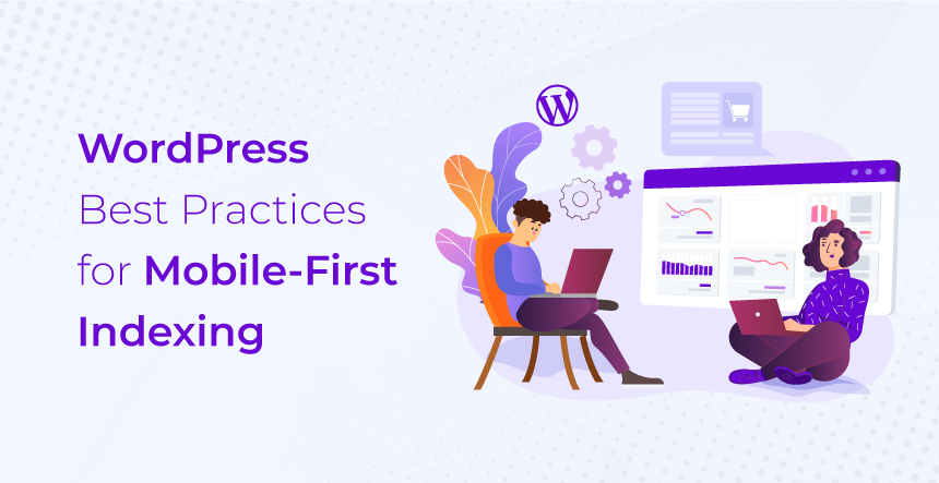

