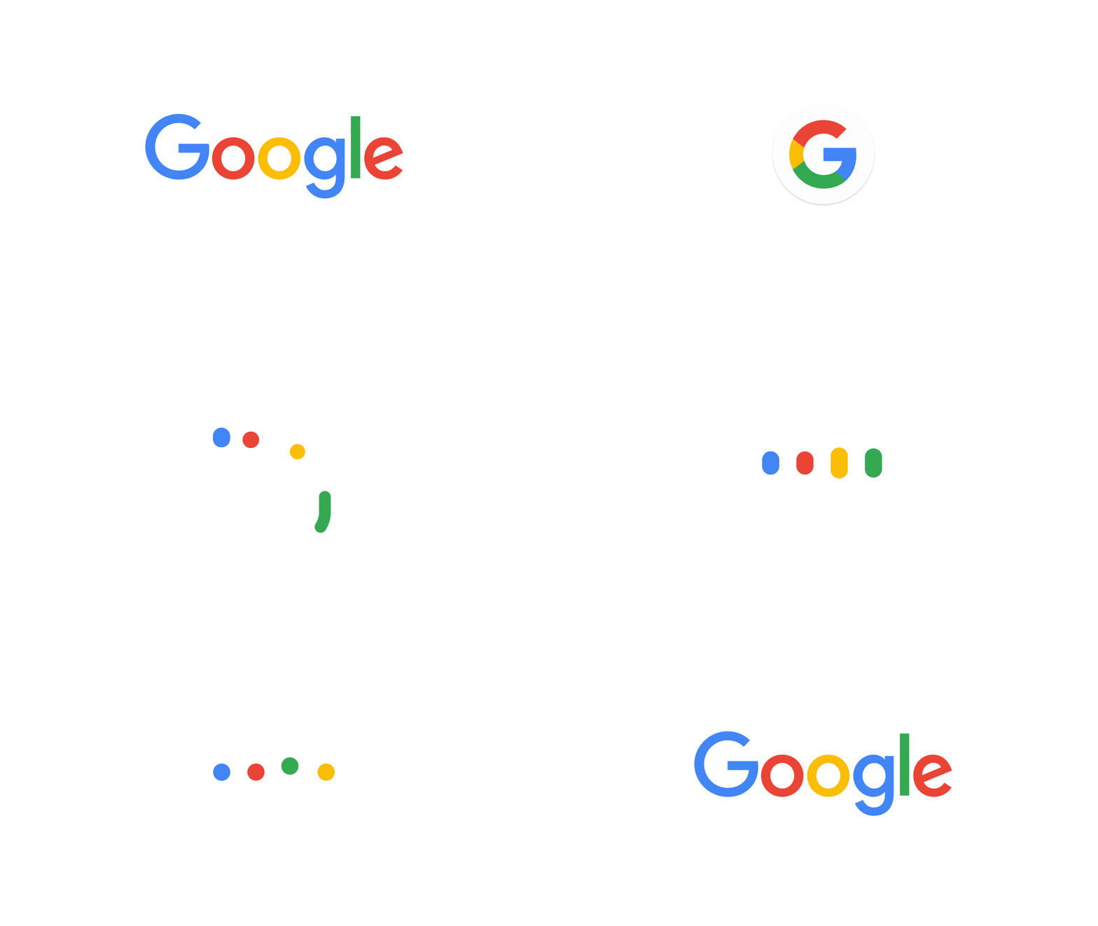
Google has announced a major design change by changing the logo on 1st September. It is the first significant change by the search giant after introducing ‘Alphabet’ as a parent company few weeks ago. Google has unveiled the new logo for its core search service. The company has made the logo easy to read on small screen with its new mobile friendly ‘G’ icon. Google had changed the logo over 17 years ago and now again the company has changed the design to provide a better look and feel across all different products from Google.

The new logo has changed font type to sans-serif from serif font typeface now that makes it look clean, modern and more playful. This new design of the logo also looks more resemble to its parent company ‘Alphabet’. This makes sense as it clearly shows that both the companies are inline with design preferences. Google still uses the same four colors, but just soften the tone of the color that makes it look more pleasing as well.
Tamar Yehoshua, (VP, Product Management & Bobby Nath, Director of User Experience) has announced in an official blog post that the company is trying to provide a seamless user experience for users while accessing through different devices. He said, “Today we’re introducing a new logo and identity family that reflects this reality and shows you when the Google magic is working for you, even on the tiniest screens. As you’ll see, we’ve taken the Google logo and branding, which were originally built for a single desktop browser page, and updated them for a world of seamless computing across an endless number of devices and different kinds of inputs.” Google is working hard to provide the optimum user experience on smallest display and low-bandwidth Internet connections. This is the reason why the company has significantly reduced the logo size from ≈14,000 bytes to only 305 bytes. Google has unveiled the change through video describing the major changes in the history of Google.
According to Google, this change will be reflected soon on all Google products like Search, Maps, Gmail, Chrome, Google Apps etc. Google has updated the visual identity after many years. I personally like this new clean and soft logo of Google. What are your views on the new design of the Google Logo?


