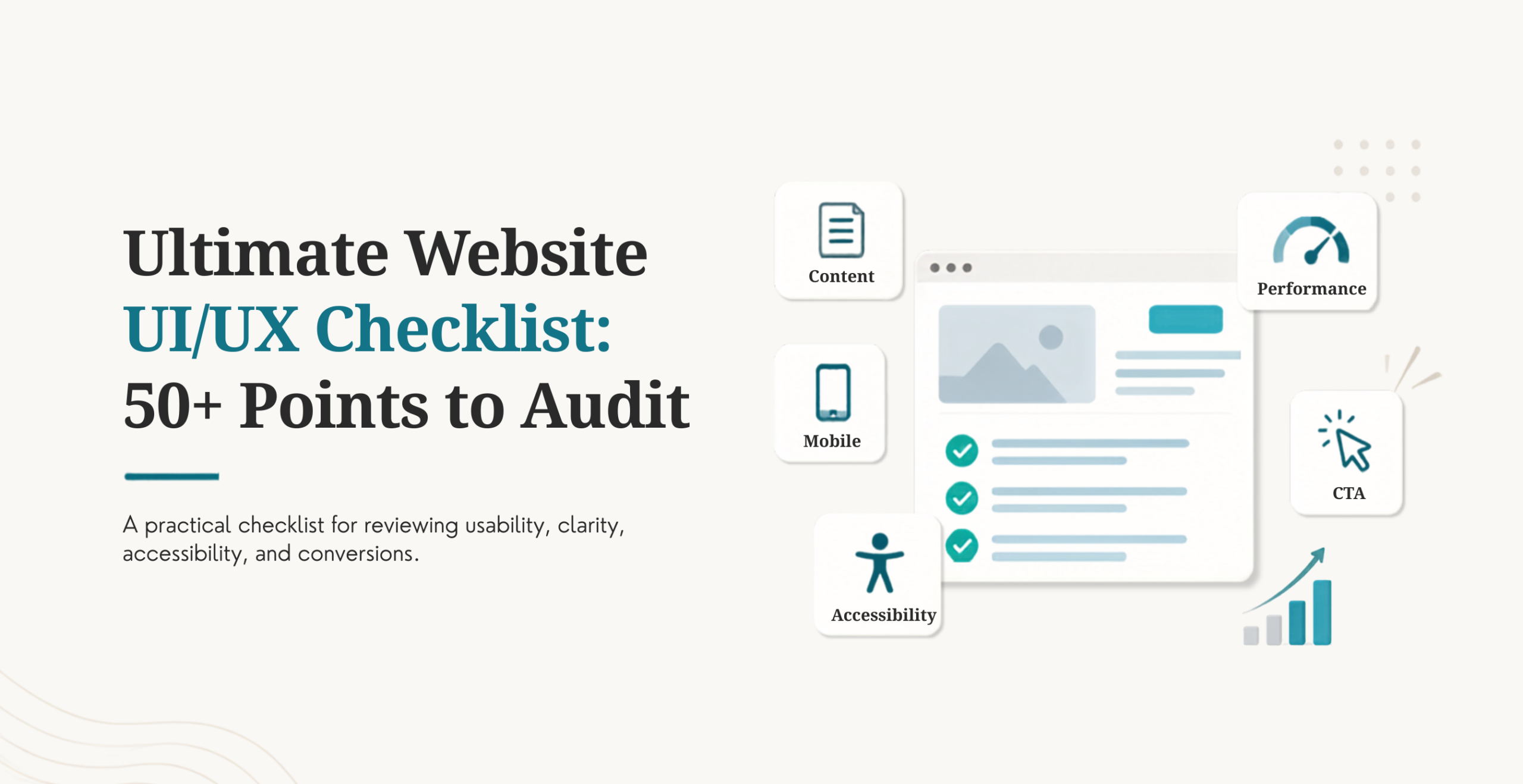
Plenty of sites look good and still lose visitors before they buy, sign up, or even scroll past the homepage. That gap is almost always UI/UX, not design taste. UI, user interface, is what a visitor sees and clicks: buttons, color, layout, type. UX, user experience, is the whole visit: whether it’s fast, clear, and easy to finish what someone came to do. By the end of this checklist, you’ll have more than 50 specific, checkable points covering both, organized so you can audit your own site section by section instead of guessing at what’s wrong.
Why a UI/UX Checklist Matters
Forrester’s research puts the return on UX investment at roughly $100 for every $1 spent, a 9,900% ROI, and that number holds up because weak UX shows up directly in bounce rate, time on site, and lost revenue. Baymard Institute’s research on cart abandonment (70.22% on average) traces most of that loss back to confusing checkout UX, not price or product. On top of the conversion impact, UX now touches SEO directly through Google’s Core Web Vitals, which measure loading speed, interactivity, and visual stability as ranking signals.
Expectations have shifted too. Visitors now expect mobile-first design, AI-driven personalization, and real accessibility as a baseline, not a bonus. A checklist that only covered visual polish five years ago misses most of what decides whether a 2026 site converts.
Introduction to User Experience Design
Know Your Users
Target audience, goals and pain points are documented, not assumed
This is research, not guessing (surveys, interviews, session recordings, analytics)
Map User Journeys
Key flows mapped: homepage to product/service, product to contact/checkout
Friction points in each flow identified and prioritized (noted and ignored)
Define Clear UX Goals
Clear objectives for each page / flow (reduce form drop-off, increase demo requests, improve task completion)
Goals are measurable, attached to an actual number, not a fuzzy sense of “better”
UI/UX Checklist for the Homepage
Clear value proposition is above the fold, no need to scroll to understand what the business does
One strong, visible, primary call-to-action, not three competing for attention
Trust signals such as client logos, review scores, or familiar testimonials
Quick page load and proper mobile rendering without delay
Clear visual hierarchy with limited distractions competing with the main message
Website Layout and Visual Design Checklist
Design and Organization
A consistent grid and spacing system is applied throughout every page, not just the homepage
Visual hierarchy (headings, sections, white space) helps the eye find what’s most important
Typography and Readability
Font sizes are readable on mobile as well as on a big desktop monitor
Only 2 or 3 font families are used throughout the site
Text contrasts sufficiently with the background so it’s comfortable to read
Color and Branding
A uniform color scheme across all pages that is consistent with your logo
Color contrast is not just an aesthetic preference, but meets accessibility guidelines
Images and Icons
Relevant, high-quality images, not generic stock filler
Optimized image file sizes so they don’t slow down the page
Consistent icon style throughout the site
Navigation and Information Architecture Checklist
Simple and logical menu structure with no more than 5 to 7 top-level items
Labels use language understood by visitors, not internal jargon
Navigation is still easy to find on long pages, sticky or otherwise reachable
Breadcrumbs are available for deeper, multi-level sites
A visible search bar is present on any content-heavy site
Large enough touch targets for mobile navigation (hamburger menu or similar)
Content and Readability Checklist
Now, the content structure has two audiences at the same time: the human reading the page, and the AI tool, like ChatGPT or Perplexity, that might just take an answer right from the page. The good news is that clear, well-structured content generally does both without any additional effort.
Content is scannable: short paragraphs, bullet points, clear subheadings
Headings follow a real H1 through H3 hierarchy, not styling chosen for looks alone
Copy is benefit-focused, answering what’s in it for the visitor, not just listing features
Tone and voice stay consistent across every page
Information is current, with no outdated offers, prices, or stats left live
Forms and Conversion Elements Checklist
Contact and Lead Forms
Forms ask only for fields that are necessary to follow up
Labels stay visible at all times, not just as placeholder text that disappears on click
Inline validation catches errors before submission, not after a failed attempt
Error messages are specific and helpful, not a generic “something went wrong”
CTAs Across the Site
CTA buttons use a color that visibly contrasts with the surrounding page
Button copy is action-oriented (“Get Your Free Audit,” not just “Submit”)
CTA placement is consistent: above the fold, end of sections, and at natural exit points
Accessibility and Inclusivity Checklist
The W3C’s Web Content Accessibility Guidelines (WCAG) are the standard most US legal claims under the ADA reference when a site gets challenged for accessibility. Beyond the legal exposure, accessible design tends to be better design for every visitor, not just those using assistive technology.
All meaningful images include descriptive alt text
The full site is navigable by keyboard alone, with visible focus states
Color is never the only way information gets conveyed
Form fields have properly associated labels, not just placeholder hints
Text meets WCAG’s minimum contrast ratio against its background
Performance and Technical UX Checklist
Google’s own Core Web Vitals guidancesets the bar most sites now get measured against: Largest Contentful Paint, Interaction to Next Paint, and Cumulative Layout Shift.
Page load lands under 2 to 3 seconds on a typical mobile connection
Images and assets are optimized (modern formats, lazy loading where appropriate)
Render-blocking scripts are minimized
Pop-ups never block content on mobile, especially on first load
Core Web Vitals pass Google’s thresholds, not just look fine to the eye
Mobile and Responsive Design Checklist
Content reads clearly without pinching or zooming
Tap targets are at least 44 pixels, sized for a thumb, not a mouse cursor
No horizontal scrolling appears anywhere on the site
Forms and buttons stay easy to use on small screens
The site has been tested on multiple real devices and both orientations
Trust, Credibility, and Social Proof Checklist
An About page shows real team or company information, not stock photos and vague copy
Testimonials, case studies, or client logos are visible, not buried
Contact information (email, phone, address where relevant) is easy to find
Privacy policy, terms, and security badges are present, especially for e-commerce
Passkey or biometric login is offered wherever the site has user accounts
Analytics, Testing, and Continuous Improvement Checklist
This is the category most checklists treat as optional and shouldn’t. A checklist run once at launch and never again stops reflecting how the site performs within a few months.
GA4 or an equivalent analytics platform is installed and regularly reviewed, not just set up
Heatmaps or session recordings are in place to see real behavior, not assumed behavior
A/B tests run regularly on key pages: headlines, CTAs, form length
This checklist gets revisited quarterly, not just once after launch
AI-assisted analytics tools flag unusual drop-off points automatically, cutting down the time spent manually reviewing session recordings
Frequently Asked Question
What is a UI/UX checklist?
A UI/UX checklist is a structured list of specific, checkable items covering how a website looks and functions, from homepage design and navigation to accessibility and page speed. It’s used to audit an existing site or guide a new build, so nothing important gets missed in the process.
How often should I audit my website’s UX?
At minimum, twice a year, and always after a major traffic or conversion shift. Search behavior, device usage, and accessibility standards all change over time, so a site that passed an audit a year ago isn’t guaranteed to still pass today.
What are the most common UX mistakes?
Burying the value proposition below the fold, cluttering the homepage with competing CTAs, and treating mobile as a secondary experience instead of the primary one are the three that show up most often. Weak accessibility and slow page speed are close behind, and both are easy to overlook until someone points them out directly.
Does UI/UX affect SEO?
Yes, both directly and indirectly. Google’s Core Web Vitals measure loading speed, interactivity, and visual stability as direct ranking factors, and all three are UX outcomes. Beyond that, strong UX reduces bounce rate and increases time on page, both signals that correlate with better search performance.
What tools can I use to test my website’s UX?
Google Analytics or GA4 for behavior data, Hotjar or Microsoft Clarity for heatmaps and session recordings, and Google’s own PageSpeed Insights for Core Web Vitals are a solid starting stack. Our roundup of UI/UX design tools for designers covers the design and prototyping side beyond testing tools specifically.
How is AI changing what belongs on a UI/UX checklist?
AI added a real, new category rather than replacing an old one: content now needs to work for AI answer engines like ChatGPT and Perplexity, not just human scanners and traditional search. Our piece on AI-driven design decisions shaping web development covers this shift in more depth.
See Your Store's New Look, Generated by AI
Give us your store requirements and get an AI-designed landing page in a few minutes.




 KrishaLabs
 KrishaStudio
 KrishaStore