

The service page serves as your online sales representative and is the most important component of any website. As an example, 47% of website visitors look at a business’s services page before visiting any other area of the website.
A service page’s ability to deliver a range of information to consumers in a single, effective manner encourages people to explore the page and take action. A well-defined website service page with all of the necessary parts can significantly enhance consumer engagement and conversion.
Are you working on a company service page and need the top service websites and examples to spark your creativity? If yes, we have compiled these modern and responsive service page design examples to save you a lot of time.
In this post, we’ll go over what a service page is, what it’s for, and what are the most important elements of service page design. We will also include the greatest examples of effective service pages from top websites, along with critical takeaways to help you create an appealing and targeted service page design.
A service page is part of a company’s website. As the name implies, it enables potential buyers to learn about a specific brand’s services or products. To put it simply, a Service Page is a page on your website that displays to potential clients what services your company provides.
The purpose of this page is to guide and persuade potential clients by carefully crafting a detailed and well-organized display of the company’s offerings. A service page can be a subpage of your company’s website or a separate page on your company’s website, depending on its design and intent.
A service page often contains information that is visually appealing and/or written with purpose and creativity to draw in customers. It serves as an online storefront for businesses, showcasing their goods and services while also trying to direct and influence users to take specific actions.
A well-crafted service page on your website plays a crucial role in attracting and converting visitors into potential customers. It not only showcases your services but also anticipates and addresses potential client concerns.
A carefully designed service page can be the key to turning a visitor into a paying client. You can significantly boost lead conversion rates by presenting your services in an engaging and visually appealing manner. This page serves as more than just a display; it subtly addresses the challenges users are facing and will guide them to choose your services.
If your business provides a range of services, diverting them to a dedicated page allows potential customers to easily browse and select the ones that interest them. Even if a customer initially visits your site for a specific service, a comprehensive service page provides them with valuable information to make informed decisions. It opens the door for them to explore and invest in additional services your business offers.
All in all, a well-structured service page is not just a showcase page but a strategic tool to connect with your audience, address their needs, and potentially expand their engagement with your business.
Having an accurate description of your services does not imply that your service page is complete. It also features additional components that encourage users to make purchases.
As a bonus, you can improve the usability of your service page by including interactive features and animations. Furthermore, intriguing images and visuals let users choose whether or not to stay on the website and take action or not.
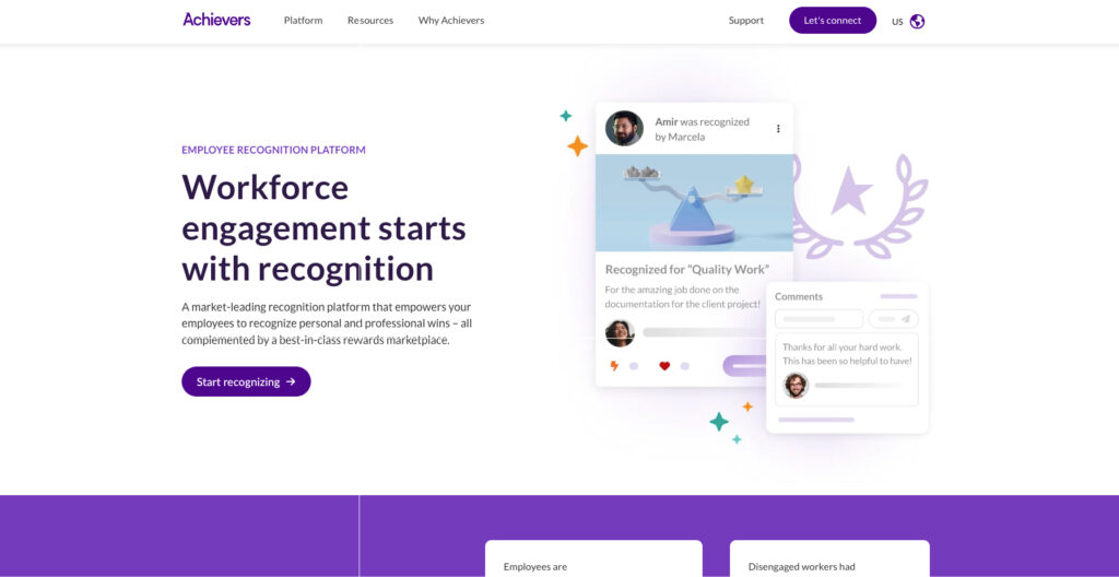
Achiever is an excellent example of a services page layout. Achievers offers a catchy image and a succinct explanation at the top of the page explaining how they can assist you in developing an effective employee appreciation program. As you browse the website, you will notice several visual components.
You’ll see a figure that highlights the average user uptake of the products they create. As you continue to scroll, one by one, symbols highlighting the benefits of their services – like increased employee retention – will load on the page. If you keep scrolling, you’ll find statistics about Achievers’ performance.
Achievers is one of the best examples of a service page web design that prioritizes clients. The services that Achievers may offer its consumers are the main focus of their service website.
You want to include things that enhance the user experience on your page in addition to keeping the user at the centre of your text. It will assist in holding leads on your page longer so they may browse your offerings and get in touch with you.
One important takeaway from this web design example for a service page is the emphasis on the user and how the entire layout and design are geared around appealing to them.
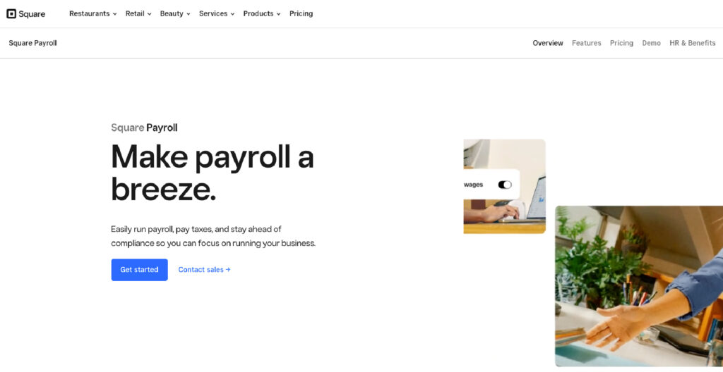
Another amazing service page layout example we have on our list is Square. It is a leading fintech company, offering a variety of finance solutions to businesses across the world. Square has designed an appealing and straightforward service page layout. A prominent CTA button appears immediately in the Hero area of the Square firm product page, inviting the customer to begin the free trial version.
The customer can immediately begin testing the application as it reroutes to the registration page. Beneath it, there’s another, smaller interactive call to action (CTA) that, when you click on it, takes us to a contact form where you may speak with the company’s sales representative.
There are a lot of interactive aspects on this page. After clicking the “+” button under the description of each service, a window with a thorough description of the service appears. CTA buttons are present in practically every section, encouraging the user to keep learning more about the company’s offerings.
Customer testimonials support the benefits of using the services, and for those who require more thorough information, a short FAQ section is offered with links that take the user to more in-depth information.
The key takeaway from this service page example is: to give you what they want(straight away) without complicating things. It should have a clear CTA and sections that communicate with the customers & guide them.
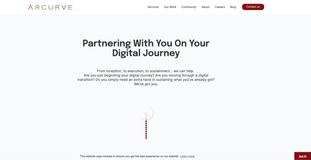
Arcurve’s service page design is quite straightforward. They have a Venn diagram that depicts their entire lifecycle of services and technologies. Instantaneously, the user can see the services that the company provides.
When a user finds a service that meets their needs, they may click on it to bring up a pop-up window with more information on what the service includes. If the service does not suit the user’s requirements, they can utilize the “X” button to return to the original service pages. Its straightforward layout makes it easy for customers to get the information they require without any unnecessary information.
If users are pleased with what they see, they can get in touch with Arcurve by using the contact icon located beneath the diagram. They make it simple and easy for consumers to locate relevant data.
The simplicity of this website makes it one of the greatest service page web design examples. It allows people to find what they need without having to search around for information.
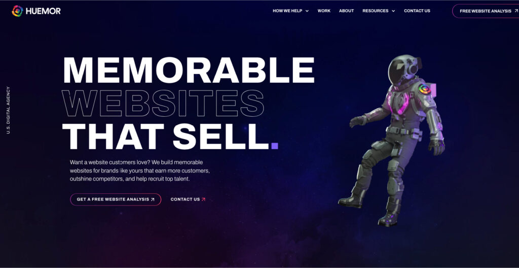
Huemor is a service-based company that assists brands in developing websites aimed at converting website visitors into paying clients. Their service page design is visually beautiful and compelling, drawing consumers in and encouraging them to take action.
The following are some of Huemor’s Service Page design’s strong points:
The headline immediately grabs your attention: “Conversion-focused Shopify Websites that make an impact.” It is catchy, brief, and clear. This headline perfectly describes the primary goal of a customer seeking to develop a Shopify website: impact and conversion.
It also includes a visual representation of the website design they developed for one of their clients. Potential clients will be able to see how their website might appear if they use Huemor’s services.
Huemor includes logos from other clients they have developed, which promotes customer trust and credibility in the service.
Furthermore, a red-coloured Call to Action is present, which is sure to draw in potential clients. Additionally, they developed a pop-up chatbot to inquire about your questions. It enables them to get in touch with website visitors who might become customers.
This service page design is spot on, with all the darts in place which piques users’ attention to take action and boost conversions.
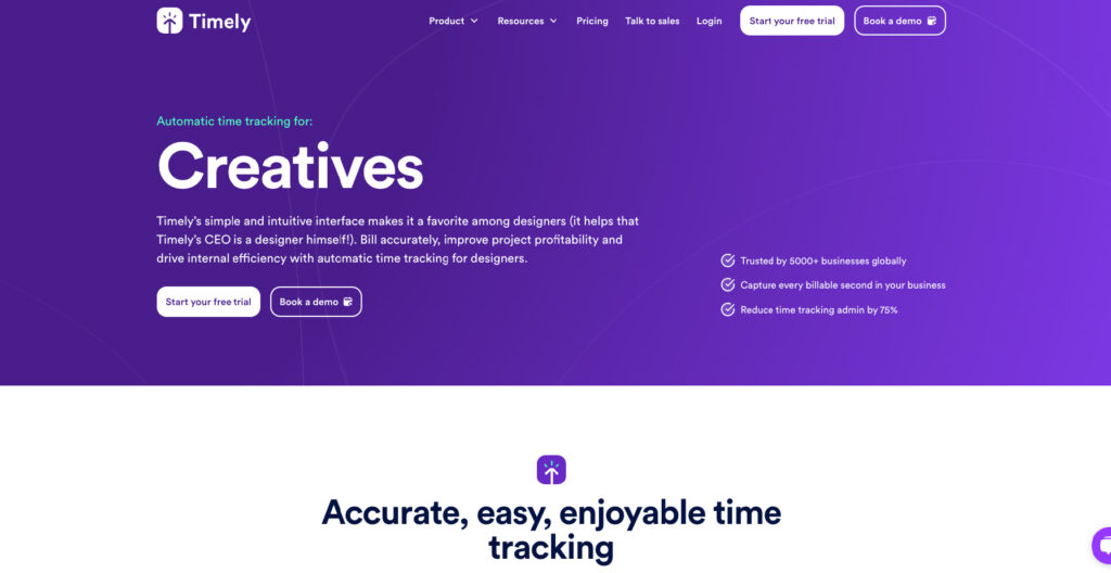
The service website for Timely, Memory’s elegantly designed product, demands special notice. The Hero section’s main tagline provides a clear explanation of the solution’s purpose (measuring working time).
The organization highlights that they genuinely utilize Timely in their everyday work in a brief description that appears after the headline and describes the product in detail. Additionally, the Hero section uses a very powerful call to action (CTA) to entice the potential consumer to act right away by mentioning the option of a free trial period.
The features and advantages of the application are listed in the right-hand column, which is accompanied by creative yet straightforward graphics. The benefits of the product are proven by feedback from delighted users. A film featuring a customer discussing how Timely has enhanced work at their organization highlights the testimonials even more.
The key takeaway from the service page layout is to highlight the benefits of your product in an appealing manner & real-life customer stories always win!
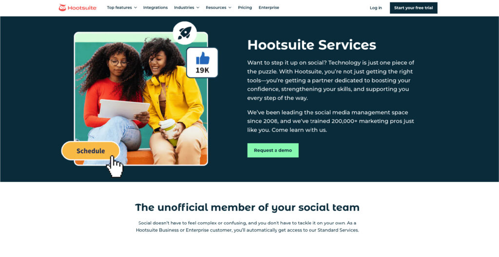
Hootsuite is one of the best examples of service page web design that you can find online. Their service website makes use of eye-catching pictures to entice visitors to discover more about what they have to offer.
There are two categories of services available on their services page: ones for users who require ongoing assistance and ones for those who are just starting started. Here’s where Hootsuite offers an excellent visual experience. Hootsuite’s color scheme creates eye-catching images that attract consumers.
Using color graphics on your page can improve viewership by 80%. People are visual learners, therefore they are drawn to stunning, vibrant imagery. They become more interested in it and are more likely to engage with your content.
Hootsuite’s selection of striking photos is effective since people like to see visual components.
Visuals are an essential component of any services page. If you want to boost your persuasiveness and encourage more people to interact with the content you provide, include vibrant visual components on your page. It will encourage visitors to stay on your page for longer.
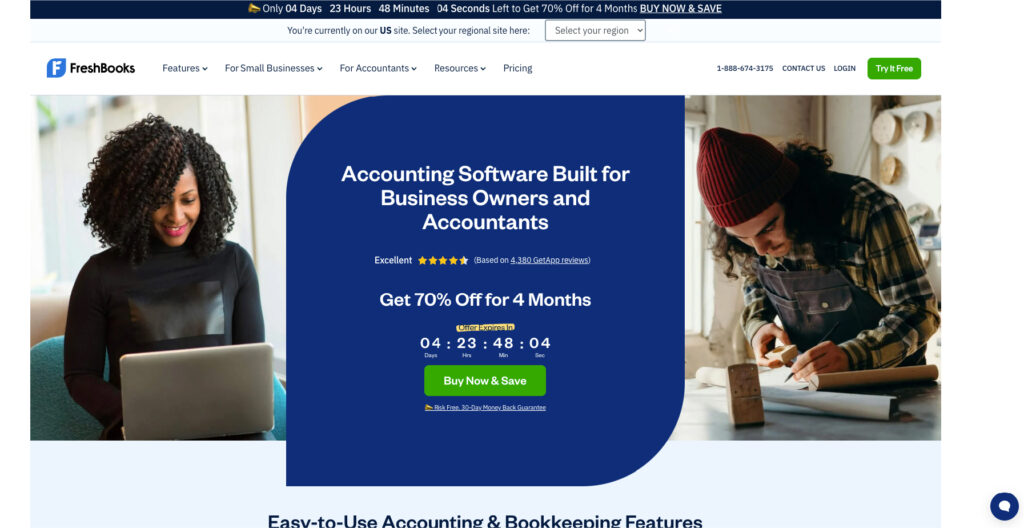
Fresh Books is accounting software that offers bookkeeping services to small and medium-sized enterprises. The following are some of their service page’s strong points:
The headline asks for your email right away and is succinct, almost like a call to action in and of itself. They also mentioned a price reduction! Therefore, this call to action has the potential to be incredibly successful, particularly when paired with the special offer that meets you on their service page.
Next, the purchaser can see from the display image how aesthetically pleasing and well-organized a book can be. Additionally, it increases client contentment and increases the future client’s demand for orders.
Fresh Books does an excellent job of anticipating what its potential customers want—order. As a result, they use a very clean design throughout their Service Page, conveying a sense of neatness and tranquillity. That is a brilliant approach, and it might be the deciding factor for prospective clients to select their service over a rival’s.
They are showcasing exactly what customers want and what users can expect from their website(appealingly and engagingly).
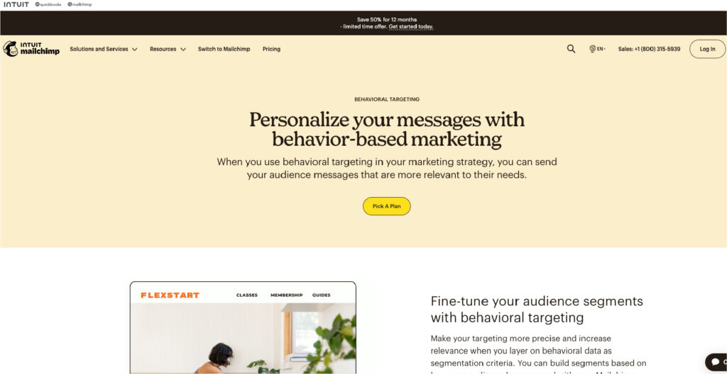
MailChimp effectively captures the attention of visitors on its Behavioral Targeting page by employing a mix of compelling CTAs and engaging graphics. The engaging opening statement and concise messaging create a captivating user experience.
Given its diverse range of services, MailChimp strategically uses internal links to seamlessly showcase related offerings, driving increased interest and generating more leads for those specific pages.
The inclusion of a well-structured FAQ section is noteworthy, as it aligns with user search intent and provides valuable information. MailChimp demonstrates a keen understanding of customer queries, offering relevant answers that contribute to a smoother user journey.
However, to further enhance the page’s impact, incorporating statistics or case studies could prove beneficial. Providing tangible examples of the value their services bring could help potential customers better grasp the practical benefits and make more informed decisions.
MailChimp’s Behavioral Targeting page stands out with its unique CTAs, relevant FAQs, and strategic use of internal links. They have also added key statistics or case studies, providing a more comprehensive understanding for prospective clients.
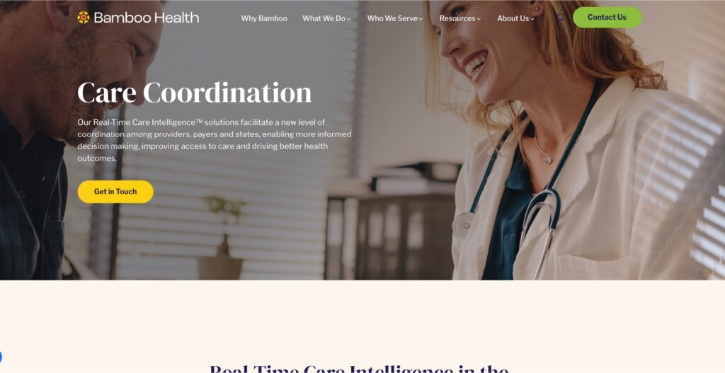
Bamboo Health’s Care Coordination service page sets a stellar example with its clean layout and effective presentation of services. They use various interactive icons that engage visitors and provide visitors with a user-friendly way to explore and determine the most suitable service.
The strategic use of long-tail keywords, concise content, and high-quality images collaboratively contribute to making this service page highly effective(from an SEO perspective as well). The clarity in descriptions allows visitors to quickly grasp the essence of each service, ensuring a smooth and informative navigation.
Bamboo Health goes a step further by incorporating case studies and statistics to showcase its reputation and highlight the tangible impact of its services. They have also added customer testimonials to showcase the genuine feedback from satisfied customers, which increases the trust and credibility of the brand.
Focus on creating a user-friendly service page with a clean design, interactive elements, and concise content. Boost trust & credibility by integrating statistics, case studies, and customer testimonials.
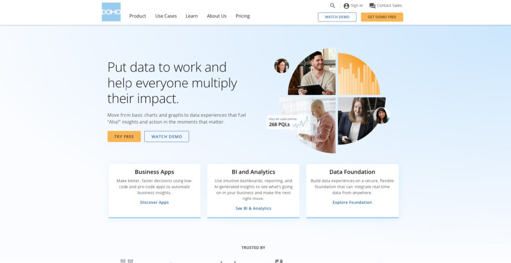
Domo is a robust business platform that serves as a great example of a high-performing services page due to its appealing design and layout. They have divided up their solutions by industry, role, and data sources to create an amazing service page. When users hover over a position, they can see a preview of the solution before clicking on it.
Customers will be able to quickly identify the best option without having to spend hours reading and searching through data to discover the answers they need. People in today’s fast-paced world want immediate responses or they will leave.
That is why an easy-to-use service page, such as Domo’s, can be an effective tool for keeping leads on the page for extended periods.
The company approaches the design in a straightforward, minimalistic manner, which is easy on the eyes. It shows that functional service pages don’t always require complicated layouts and fancy designs to entice users.
Here’s a roundup of the 10 best service page design examples you should be aware of in 2024 to help you build a stellar service page for your business. Your service page is essential for converting leads into customers. Avoid the hazards of bad design and aim to create a superb service page layout. It’s a difficult task, but if done correctly, it pays off generously(in the long run).
You have to dedicate time to creating a service page that gives useful information and keeps your audience engaged. You have the chance to show your audience how you can help them out and convert prospects into customers.
KrishaWeb can assist if you would like to learn how to build a service page. Our team of skilled designers and front-end developers will assist you in developing unique, brand-focused service pages that captivate your audience and encourage them to find out more about what you have to offer and get in touch with you.
So, what are you waiting for? Feel free to connect with us, we are just a meeting away…
Implement on-page SEO techniques by incorporating relevant keywords naturally into your content, meta tags, and headings. Use visual elements and alt text for images to improve SERP rankings. Regularly update and refresh your content to stay relevant in search engine results. You can even connect with us to help you design an SEO-friendly service page.
Our team at Krisha Web takes a collaborative approach, working closely with clients to understand their vision and goals. We prioritize customization to ensure that service page layouts resonate with your brand and effectively showcase your offerings.
No, it is not necessary to add the pricing to your service page. While it may not be feasible for every business to provide exact pricing, offering a pricing range or stating that prices are available upon request can help potential customers assess whether your services align with their budget before reaching out.
The optimal length for a service page varies based on different factors. Look for a balance between providing sufficient information and keeping it concise. It should be long enough to cover essential details but short enough to maintain user interest. Use engaging visuals and well-structured content to maintain readability.
Absolutely! We offer content creation services tailored to highlight the key features and benefits of your services. Our team ensures that the content is not only informative but also aligns with your brand voice and resonates with your target audience.
Subscribe to our newsletter and learn about the latest digital trends.