In the realm of digital marketing, landing pages are one of the most effective strategies for converting clients.
A properly created and well-designed landing page might mean the difference between a website visitor simply checking out your brand and becoming a devoted customer.
You have likely heard something similar previously. However, what exactly does it mean to be a well-thought-out and well-designed landing page, anyway? And what’s the secret ingredient that makes great marketers stand out when it comes to conversions?
While many landing pages have unique designs and employ a range of engaging techniques to entice visitors, they always have the same primary objective, which is to encourage visitors to proceed to the next phase of the buyer’s journey.
If you are willing to do so with an excellent landing page, we can assist you. In this article, we’ll provide our favourite landing page examples from major organizations, as well as discuss why they have excellent landing page examples that stand out and increase conversation rates.
Now let’s dive in and get going.
What Is a Landing Page?
A landing page is a stand-alone website designed with a marketing or advertising campaign in mind. It is intended to guide users to a certain action on the website. This might be anything from purchasing to requesting a price from your company, downloading a guide, or enrolling in a subscription.
Landing pages are frequently linked to social networking platforms, email marketing, and search engine advertising. A landing page’s objective is to turn website visitors into leads or paying clients.
Landing pages aim to increase the possibility that website visitors will take the intended action by efficiently providing the necessary information and removing any unnecessary distractions.
Landing pages are often used in online marketing campaigns such as pay-per-click (PPC) advertising, email marketing, and social media promotions, where firms try to route users to a specific page with a targeted message to increase conversions.
What is the Purpose of a Landing Page?
From a business standpoint, the only purpose of a landing page is to promote conversion, which can take the kind of product sales, email sign-ups, or event registration. Because of the highly targeted design, content, and CTAs, an excessive amount of people typically fill out forms or click on them.
According to Quicksprout, the conversion rate for generic website content can be twice as high. According to research by Unbounce, landing page conversion rates vary from 10% to 19%.
Marketing professionals frequently design landing pages that correspond with their campaigns to ensure that visitors seamlessly transition from looking to doing. This increases the likelihood that visitors will take the jump and convert.
What is a Good Landing Page Conversion Rate?
How much conversion does a landing page need to have?
According to WordStream, the top 25th percentile of landing pages achieves 5.31% or more, while the average landing page conversion rate for all industries is 2.35%.
To get your conversion rate, simply divide the number of conversions generated by the number of visitors who visited that page.
Don’t worry if your conversion rate isn’t yet around the average. Initially, nailing those percentages can be a little difficult, particularly if you get a lot of frequent page visits. Luckily, you can immediately increase your existing rate by using several straightforward conversion rate optimization tactics and by going through some of the amazing techniques
And you can even go through some of the best examples – as we will be covering in our blog. So, bear with us & keep scrolling.
What are the Key characteristics of an Effective Landing Page?
Before examining the best landing page examples, it is important to draw attention to a few characteristics that the majority of excellent landing pages have.
The following are some essential procedures for creating landing pages with high conversion rates:
Make sure your value statement is above the fold and concise so that people can quickly understand why they are on your page.
Make sure your main title corresponds with the commercial that brought the visitor to the page in the first place (such as the email CTA button).
Provide testimonials and social proof to support your statements.
Keep the entire page focused on a single offer and one main call to action (CTA).
To make your CTA stand out, use a layout that is conversion-centred (consider using whitespace, color, contrast, and directional signals).
Incorporate relevant and high-quality images or videos that support your message. Visuals can enhance the overall appeal of the page and communicate information more effectively.
Keep the content on your landing page concise and to the point. Avoid unnecessary details that might overwhelm visitors. Use bullet points and short paragraphs for easy readability.
Quick-Tip: Test new ideas using A/B testing and keep eyeing for the best results.
List of 10 Best Landing Page Examples You Should Check in 2024!
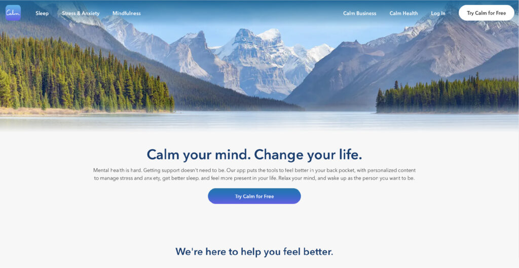
1. Calm
This landing page website example is the first thing people see when they visit the app’s website—it immediately urges them to get started and interact more deeply with Calm.
Why it is inspiring?
Short and sweet: Calm demonstrates what they preach through the design of their landing page. To prevent overloading readers with information, the copy is clear and concise. The content has a sense of harmony and peacefulness because of the headline, “Meet Calm.”
Clear purpose: Calm’s principal goal is plainly stated. (Improving sleep, reducing stress, and lowering anxiety? Count me in! The landing page invites the reader to begin their journey toward well-being, getting right to the point.
Soothing background (just like their brand): Calm’s homepage page features a visually calming and appealing background with muted colors and imagery. Everybody wants to feel peaceful, and soft hues and tones do just that! They are also easy on the eyes!
The final takeaway: No matter what you do on the internet, make sure to make it relevant to your brand – through the colors, images, logo, and other customized elements to establish a brand identity.
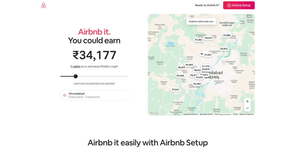
2. Airbnb
Are you curious about the possible price you may charge for your Airbnb rental? That is precisely what the company’s landing page helps you comprehend. This entertaining and dynamic landing page gives consumers an idea of how much they can make by renting out their house on Airbnb and then demonstrates how simple the process is.
Three things to remember from Airbnb’s homepage:
Dynamic webpages are a dream come true. Upon accessing Airbnb’s landing page, the content automatically adjusts to suit your current location. This delivers a highly tailored and interactive conversion experience.
You don’t have to make CTAs the main attraction. Airbnb’s call to action is hidden in the right-hand corner of the website. However, that doesn’t make it any less noticeable.
Give it an interactive feel. To see how much they could make by renting out their house for a longer period, users can experiment with the slider bar. The number increases as you slip further, making the temptation to register for an account stronger.
The key takeaway: Highlighting the benefits (especially in numbers) attracts visitors to take action.
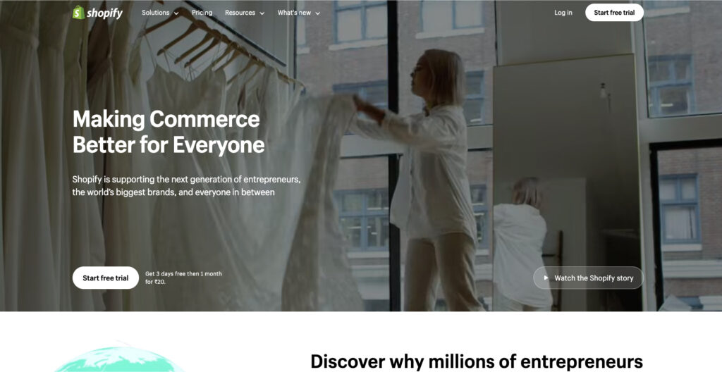
3. Shopify
Similar to numerous other landing pages in this article, Shopify’s trial landing page for vendors maintains a minimalistic design. It doesn’t have a lot of text, but it nonetheless convinces readers by highlighting a few salient features of its excellent product. Visitors leave with the knowledge that Shopify is an all-in-one platform that is simple to use and widely trusted.
Why does This Landing Page work?
Clean Interface: For instance, the page’s user-friendly header is only a few words long, and it uses straightforward images and concise content to convey the specifics and advantages of the trial.
Concise CTA: To begin, there are just a few fields that must be filled in. You can start working on the project more rapidly thanks to all of this. Multiple CTAs work together to persuade a potential customer to convert, and the color of the CTA button contrasts nicely with the rest of the page.
Key Takeaway: The key takeaway from the Shopify landing page is not to make the landing page cluttered and busy. Instead keep it clean, concise, and to the point.
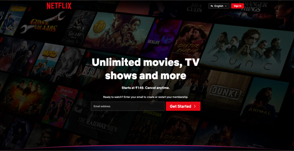
4. Netflix
This registration page design from Netflix is among the best illustrations of landing pages that convert effectively. The homepage of the massive streaming service is simple, sweet, and contains only the required information.
With this landing page instance, you are immediately presented with what they are selling and an invitation to begin entering the website. This encourages people to act swiftly by removing the friction associated with decision-making. It makes completing the page’s objective—entering their email address to begin a Netflix membership—very simple for users.
Why It Works:
Users don’t have to search far and wide for fundamental pricing information because it is provided upfront.
The benefit-driven title grabs readers’ attention right away, and the copy also reassures them that there is no danger and that they can cancel at any moment.
The Signup Form simply contains one form field, making it easy for users to sign up.
To encourage people to sign up, they have also included a second sign-up form at the bottom of the website.
Key takeaway: Provide the required information right from the start to boost conversions.
The most engaging and dynamic verbs have been included, such as: create anytime, make it then PDF it, share, paint, get inspired, enhance your abilities, take the risk, step onto the stage, watch, and learn. These words motivate users to act right away.
What makes it so great?
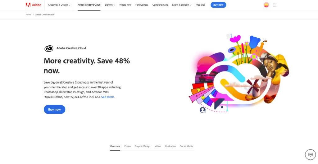
Headline: The most noticeable detail on the first page is the 60% discount for teachers and students, which is also consistent with the headline of the advertisement that came before it.
Price reduction: By displaying the product’s previous, higher price, you can increase its perceived worth and increase the appeal of the bargain.
Section FAQ: The best method to add more information to the page without making it too cluttered is through the accordion-style FAQs at the bottom. This works well if your landing page has been indexed and you want it to rank.
The key takeaway: Leveraging the right pricing strategies and highlighting them on the landing page boost conversions.
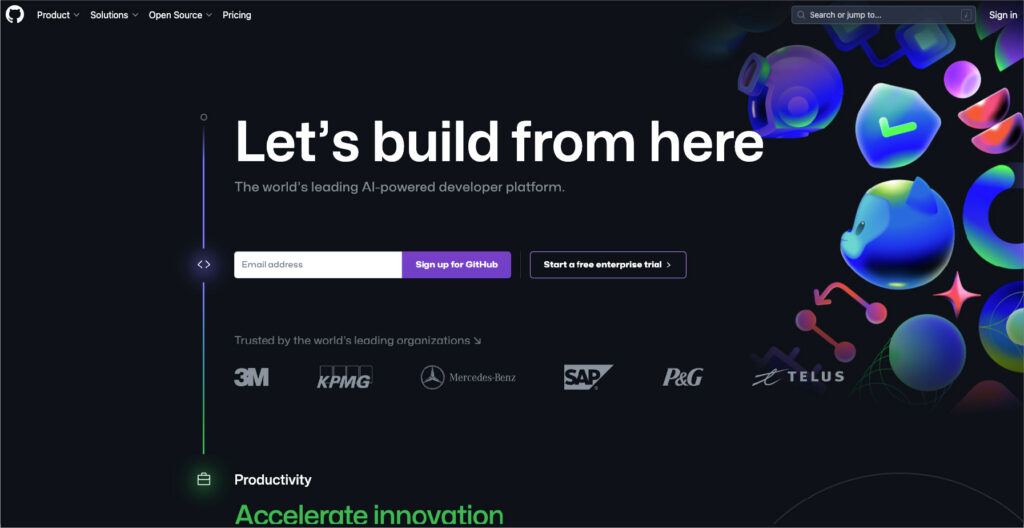
6. GitHub
GitHub is a web-based platform that lets developers “build, scale, and deliver secure software,” so it’s not surprising that the company understands how to create a beautiful website and landing pages.
Its “GitHub for enterprises” landing page is an excellent illustration of a visually striking landing page that is also very successful, including as much information as possible to encourage the user to convert.
Why it works?
Strong graphics with a black background and large, prominent white writing.
The copy above the fold is concise and intended to highlight the features that consumers are most likely to care about.
Proof points are used throughout, such as customer logos and quotes, to increase customer trust and credibility, which boosts conversions.
Two CTAs target two categories of visitors: those who want to start a free trial and those who want to contact Sales for further information.
The key takeaway: Add all the right information to your business landing page to drive conversions.
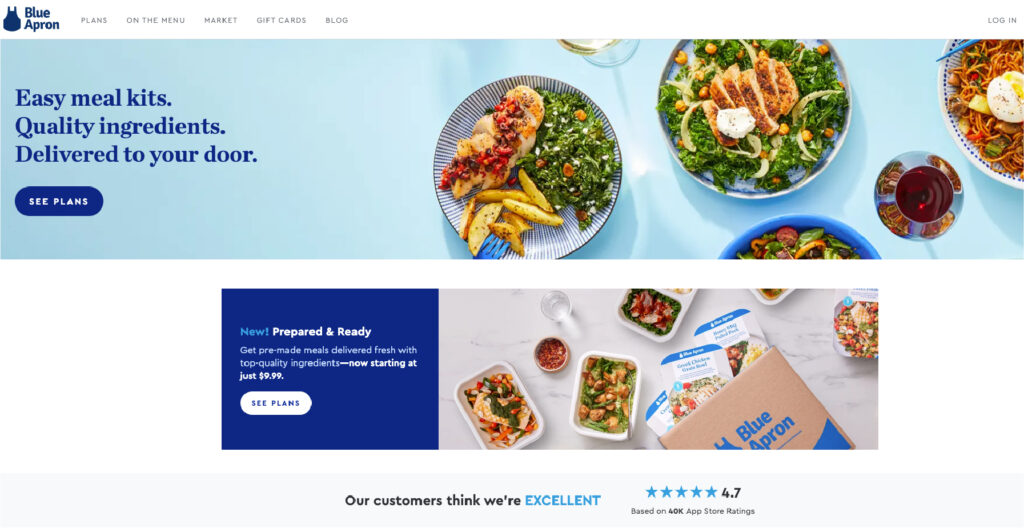
7. Blue Apron
Blue Apron is a home meal planning and delivery service that provides its clients with a range of subscription options.
The purpose of this landing page is to entice visitors to study the plans to determine which one best meets their needs, and it accomplishes so quite effectively.
Why it works?
It showcases its product with high-quality photos and has a clean, bright aesthetic.
Their landing page content effectively conveys the brand’s extensive menu options and ability to accommodate a wide range of consumer tastes and lifestyles. It reiterates the key value propositions of value and ease.
The same call to action is repeated throughout the page, encouraging visitors to click through.
The landing effectively highlights essential brand and product qualities clearly and concisely.
The key takeaway: The visuals are so important in a website. And not just visuals but high-quality visuals – attract customers to land, stay, and take action.
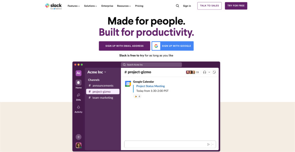
8. Slack
When it comes to designing some of the greatest landing pages, Slack consistently scores highly. They are continually optimizing for conversions, which is the most effective technique to find a good landing page. The messaging on Slack’s home page is what sets it unique. The firm wants you to consider Slack as more than just a chat app. These days, it’s much more than that, and this landing page aims to convey that.
Why does it stand out?
Your navigation bar should be simple. On this landing page, Slack has just included the most crucial components in the menu bar: allowing current users to log in and allowing potential members to interact with sales.
Show the distinction between free and premium. Use your landing page as an opportunity to highlight the benefits of upgrading for users who are still using your well-liked free version.
Offer a discount to them. For new users, money off can be a powerful selling point and the kind of offer that can persuade them to become subscribers.
The key takeaway: Don’t forget that the actual goal of landing pages is conversions. So, stick to the goal and consistently try to achieve it.
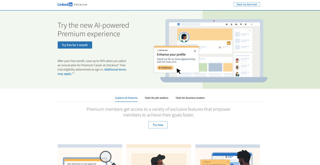
9. LinkedIn
Most people these days have a LinkedIn profile, but only those who are committed to growing in their professions have purchased LinkedIn Premium. For job searchers who want to make a lasting impression on the hiring community, this landing page emphasizes the advantages of upgrading your account.
Why it is the best?
Display customers & products: Customers and products are displayed together on LinkedIn, prioritizing people over products. LinkedIn is combining 3D visuals showcasing Premium features with unique pictures of happy job seekers. Truly, the finest of both worlds.
Jump links: Anchor links at the top of the page might be useful for lengthy landing pages, such as this one. In this manner, readers can jump to the sections that most interest them.
Powerful statistics: The LinkedIn landing pages use stats to boost conversions.
The key takeaway: When you can’t choose between the two best options, go for both. You don’t need to make a choice(always).
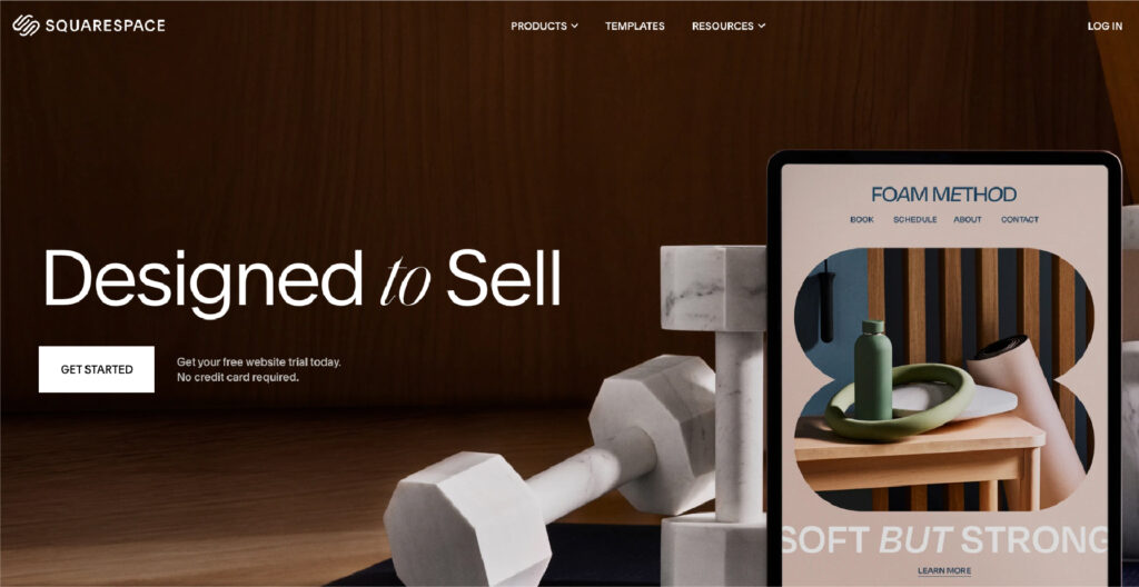
10. Squarespace
Squarespace is a competitor for the shortest landing page ever. There isn’t much more to it. Yet that does not imply that it is ineffective.
Squarespace wants you to look at the templates instead of trying to get you to register for an account. They must be aware that once you see how user-friendly the platform is and how well-designed the templates are, you’ll be hooked.
Three things to remember from Squarespace’s homepage:
It’s okay to be short. A large landing page is not necessary to persuade visitors to take action.
It doesn’t take much color. It’s well-known that users may express emotions through color. However, it’s not necessary(all the time). It’s also not used because it’s not consistent with Squarespace’s brand.
The three-rule. Squarespace leverages the magic number of three in marketing to highlight its key differentiators.
The key takeaway: There are different rules in marketing for a reason. And, when you get a chance – apply them to get the most out of it.
Ready to Build Your Landing Page?
Creating an amazing landing page involves creative design, strategic thinking, and persuasive copywriting.
You can create an excellent landing page that drives success in your digital marketing campaigns by drawing inspiration from examples like the ones above and applying effective design principles and data about your target demographic. We hope that these top landing page examples will provide you with ideas for designing a landing page that converts well. To maximize the effectiveness of your landing page, be sure to:
Determine the issues that your top clients face most frequently, then use a brief and understandable headline to address these issues.
Add videos and customer testimonials(when required)
Add your brand colors, font, and logo to further enhance your brand presence.
Clearly state your objectives on the page: is it to obtain their phone number or email address?
Make use of concise, understandable calls to action.
Lastly, make sure your landing pages are optimized at all times.
If you are looking to create a specific goal-oriented landing page for your business needs, feel free to reach out to KrishaWeb. We are a leading design and development company – that can help you with the best digital solutions.
FAQs on Best Landing Page Examples
1. Are landing pages effective in the real world?
Absolutely! One of the best marketing strategies available is landing pages. Landing pages, in contrast to a website’s homepage, are optimized for a single campaign or offer and have an exclusive focus. Landing pages may greatly raise conversion rates by removing distractions and offering relevant data.
2. What distinguishes a website from a landing page?
A website has many pages and is intended to give visitors information about your business, your goods, and services. In contrast, a landing page is only one page with a more concentrated design and purpose.
3. What to avoid on the landing page?
Here are some of the things you should avoid on any landing page: Unnecessary information: Your landing page should only provide information that is necessary to achieve your aim. Thus, try not to include any unnecessary data. Distractions: Anything that could potentially divert visitors from taking behavior, such as flashing visuals, pop-ups, and excessive content, should be eliminated on your landing page. Complex Jargon: Make sure you define any jargon you use in your writing. You don’t want guests to be perplexed about what you’re discussing.
4. Does my landing page need to be mobile-responsive?
Indeed. Your landing page must be mobile-friendly due to the rise in the usage of mobile devices for web browsing. This guarantees that users of any device can navigate and perform the specified action with ease.
5. Who needs a landing page?
Any business with a website should have a landing page that encourages readers to take a specific action, such as booking a demo, phoning for a price, or signing up for an email list.
Nisarg Pandya
Project Manager
Experienced Project Manager and Scrum Master at KrishaWeb, delivers expertise in Scrum methodologies, Laravel, React.js, UX design, and project management, ensuring efficient project delivery and agile implementation.