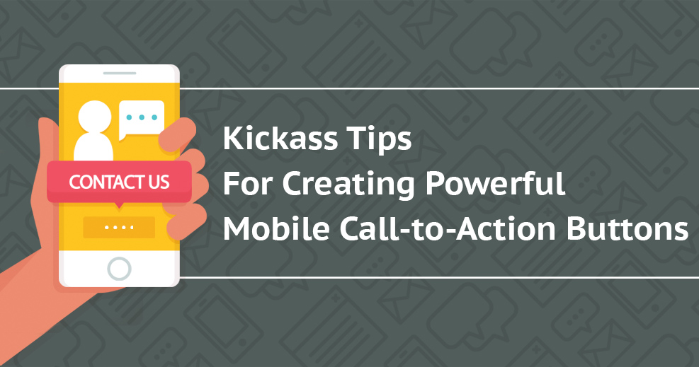
Learn the importance of CTAs and how placing them in the right direction can help you gain traffic and recognition.
Today, there are 2 billion smartphone users, worldwide. Even if you have a powerful website that can tap into the tiniest fraction of the global users there is still significant proportion of audience whom you are not reaching out.
According to the latest research, smartphone users on an average of 87 hours every month access the internet. Now that’s a huge statistics! Your smartphone audience is surfing the Web for three hours, daily. Now you have to think about converting those smartphone users. To increase your site’s viewership, you can optimize the mobile call-to-action (CTA) buttons.

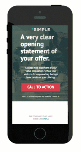
Has there been times when you found a page was cluttered with different texts, images and other design elements. Due to the cluttered design, you tried to hit a button and accidentally clicked on a link or button close by? If you wish to convert users then you must ensure that you give clean and neat user interface to your audience. Do not lose your visitors interest due to shoddy features and designs in your website that will make then run away.
Don’t clutter your web pages with text. Sometimes keeping the copy light works wonders. Unless your website involves some text heavy business, you should be only keeping the needed info on it. For example, do your customers need to find the store’s hour of operation or they need a quick product lookup? Keeping messages and content brief helps get to the point easily and it is especially true for mobile CTA as well as the descriptive text around it.

Appeal to your visitors tastes. If you have a food ordering site, display images of the treats your customers can order based on their location, without them making an effort to search. This helps in building attention and ensuring that your visitor sticks around. Try to use action words that will tell them exactly what they can do and what will happen if they do it. Always try to appeal to your visitors’ current emotional state.
Spend time on Google Analytics. This will help you to create super effective CTAs by studying the keywords from both the site’s search bar and the mobile search. This will help you to see which keywords your visitors want first and you can plan accordingly.
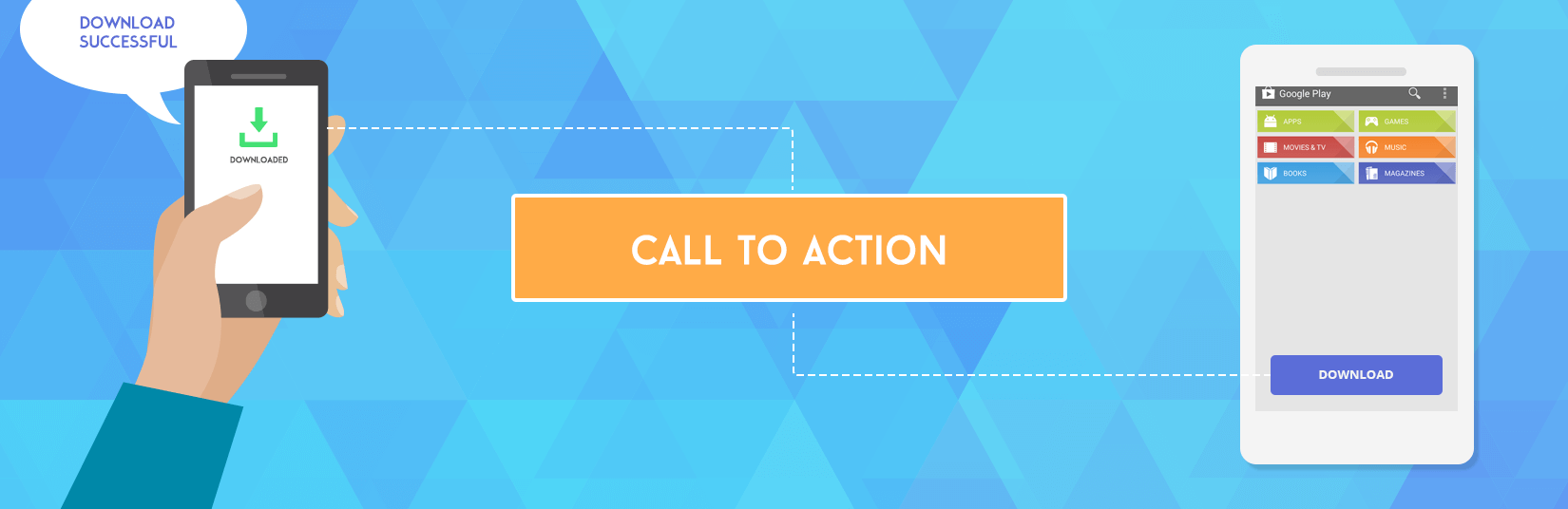
Designing striking CTA is good but you also must ensure that the reward is with it. For instance, your customers are delighted about the free downloads, but what are they going to do with it? Suppose the download is a PDF what will they do with it on their phone? Instead of them wondering, ensure that you direct them to take an action, like give them another option like an email.
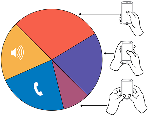
When you are holding your phone isn’t it easier to reach the lower belt of the screen? That is called the thumb zone and is one of the most effective places for placing your CTAs. Since the spots are easy to reach you can be sure that there will be more clicks if the CTAs are placed in such a position. Though you can’t use all three of the thumb position at once, using one of them is a great choice nevertheless.
You don’t really need to keep myriad of choices for your visitor on your site. If you have, too many options you will make it much harder to make a concert a choice. Keeping it to one CTA within any given space is a good idea. Do not complicate the decision making process for your visitors unnecessarily.

Avoid pop ups as much as you can, unless you absolutely have to include a targeted pop up. You can also ensure that the CTA is placed at the bottom of the screen so even if the visitor is scrolling down the button will stay on the page and within the thumb zone.

Include a good amount of white space around your CTA so that the visitor’s attention is drawn to it. De-clutter the area and ensure that the buttons are properly spaced.
Any color you use for your CTA is fine, however; different colors have different psychological impact. It is a good idea to understand the meaning of colors before you use it for the CTA button.
Read the placement guidelines of a button on your website to know the optimized position to put your CTAs. Pay attention to not only desktop vs. mobile observations but others as well. Factors like top vs. bottom and right vs. left must be considered, too.
If you are wondering about the size of the CTAs then Apple has provided a valid answer for it. The minimum CTA sizing Apple recommends for touch screen conversations is 44 x 44 pixels. These are just the minimum parameters you need to follow, and you can always change the sizing according to your needs.

When designing your CTA’s you need to think about how blatant you can be with the display. If you can stretch through the bottom of your screen then there is no way for your visitor to miss it. Get creative with the width of your CTAs and you will see the difference in results.
Having properly put CTAs on your site will ensure that your visitors do not have to go through the entire content to know what steps they should take next. If you see that the percentage of visitors are growing and want to push them through the conversion process then these recommendations will work great. By deploying the right CTA, sit back and enjoy your website’s conversions growth.

Browse some of our latest articles...
Subscribe to our newsletter and learn about the latest digital trends.