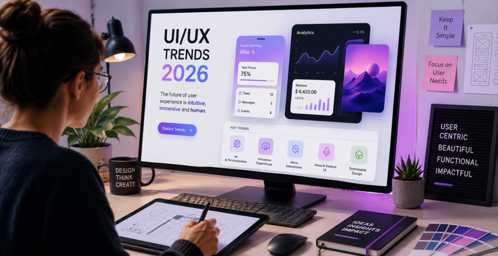
In 2026, three main forces will shape the future of UI/UX: AI creates adaptive & generative interfaces, users will increasingly demand personalized experiences with less friction than before, and accessibility will have gone from being something optional to being a basic expectation. The trends that matter this year are not visual preferences. They are responses to real behavioral shifts in how people interact with digital products. This guide covers what is actually changing, why it matters for product teams, and what to prioritize versus what to watch from a distance.
Table Of Contents
Table Of Contents
Generative UI: Interfaces That Rebuild Themselves
For most of the web’s history, every user of a product navigated the same layout. A beginner and a power user both saw the same dashboard, the same menu structure, the same information density. The interface was fixed. The user adapted to it.
Generative UI inverts that. AI rebuilds the interface in real time based on what a specific user is doing, how experienced they are, and what they are trying to accomplish right now. A first-time user of a SaaS analytics platform sees simplified views and guided prompts. The same product for a senior data analyst shows full data views, keyboard shortcuts, and advanced configuration options automatically, without either user touching a settings page (Source: Agency Partner Interactive).
This is not theoretical. It is production-grade and being deployed in enterprise software, developer tools, and increasingly in marketing sites with enough traffic to generate meaningful behavioral data. The tooling to implement it has crossed the accessibility threshold for teams that are not building at the FAANG scale.
For product managers, the design implication is significant. Generative UI is not a single screen or flow decision. It requires designing systems that can adapt rather than designing fixed states. That means investing earlier in behavioral data infrastructure, thinking in terms of user segments and intent levels rather than a single “user,” and building design systems flexible enough to serve multiple layouts from the same component base. Teams that treat it as a feature to ship will struggle. Teams that treat it as a new design paradigm will be positioned well.
AI-Driven Personalization Beyond “You Might Also Like”
Product recommendation carousels are where most people think personalization lives. In 2026, that is the least interesting version of it. The meaningful shift is personalization at the interface level: adaptive menus that surface the actions most relevant to a specific user’s current context, content that reorganizes itself based on role or usage patterns, and onboarding flows that skip steps for users who have demonstrated prior knowledge.
The distinction that matters here is between personalization that saves the user time and personalization that removes their agency. The version that saves time learns user patterns, surfaces frequently used features, and reduces navigation to the actions that are actually relevant. The version that removes agency starts filtering what users can see or reach based on algorithmic assumptions, creating a narrowing experience that breeds frustration the moment the algorithm is wrong.
Product teams navigate through a design philosophy that personalization must always be perceived as a shortcut and not as a barrier. Therefore, if a consumer chooses to take an alternative route to the algorithmically predicted route, they should be given a clear, consistent transition experience. Adaptive interfaces can cause consumers to experience a lack of control through eliminated predictability vs. improved efficiency (Source: CorgenX). The teams getting personalization right in 2026 are the ones treating it as a preference system the user can see and override, not a black box that silently reshapes their environment.
Motion Design: From Entertainment to Communication
Motion in digital interfaces had a rough decade. The era of animations that slid everything in from the left, bounced on entry, and faded out decoratively produced visually noisy products that were slower to use and harder to navigate. Users learned to associate animation with delay.
That era is over. Motion in 2026 is making a disciplined comeback for a specific reason: it communicates. Not entertains. Communicates. An animation that confirms a form was submitted gives the user certainty that something happened. Visually animating the movement of an item from one area into a cover illustrates how they relate to one another without having to use any words; whereas, a loading indicator can reduce your anxiety about the progress of an operation even more efficiently than a spinner which provides only a generic indication of “something” taking place. Micro-interactions and motion design will have an increasing amount of impact on the designs created in 2026 according to 23% of designers; and 50% of designers are now using these two design methods in their current design work (Source: Agency Partner Interactive).
The test for any animation in a product: does removing it make the interaction harder to understand? If yes, the motion is earning its place. If no, it is visual overhead.
There is also a performance consideration. Heavy animations affect Core Web Vitals, particularly Cumulative Layout Shift, which affects both SEO rankings and user experience on lower-powered devices. 3D elements, complex parallax effects, and unoptimized motion are direct contributors to performance degradation. The discipline of 2026 motion design is not minimalism for aesthetic reasons. It is minimalism because purposeful and fast is better than expressive and slow.
Accessibility-First Design: No Longer a Phase at the End
The phrase “we will add accessibility at the end” describes a design process that produces more rework, higher compliance risk, and a worse product than building it in from the start. In 2026, accessibility-first designs are the baseline for all competitive markets and not an addition or improvement.
The legal pressure on designers has increased substantially. The April 2026 deadline established by the DOJ Title II and WCAG 2.1 Level AA as the minimum required standard for all US government websites. The European Accessibility Act is also now in effect and will be enforced in all member states of the European Union, as of June 2025.
Both frameworks are explicitly referenced in an increasing number of private sector procurement requirements. Enterprises buying SaaS products are including accessibility compliance in procurement checklists. If your product cannot demonstrate WCAG 2.1 AA compliance, you may not make the shortlist.
Beyond the legal layer, the design case is straightforward. Accessible design makes products better for everyone. Readable font sizes and strong contrast benefit users on mobile screens in daylight, users with mild vision impairments, and users in a hurry equally. Keyboard navigation benefits power users and screen reader users alike. Logical information hierarchy serves users with cognitive differences and users who are simply busy and skimming. The improvements are additive. Making a product accessible does not compromise the experience for users who do not need those accommodations. It raises the baseline for everyone.
The operational shift this requires is earlier integration of accessibility into design workflows. WCAG compliance is significantly cheaper and faster when it is built into wireframes than when it is retrofitted onto a shipped product. Designers with accessibility tooling in Figma, developers with automated accessibility scanning in their CI/CD pipeline, and product managers who include accessibility acceptance criteria in user stories are producing better products at lower remediation cost than teams that treat it as a QA phase.
Minimalism with Intention: The Retreat from Visual Theatrics
2024 and 2025 saw a meaningful overcorrection in product design. Glassmorphism, maximalist color palettes, heavy gradients, layered transparencies, and expressive typography stacked on every surface were everywhere. Some of it was beautiful. Most of it made products harder to use and slower to load.
The 2026 counter-movement is not a return to flat design or to corporate blandness. It is minimalism driven by purpose rather than aesthetics: remove everything that is not earning its place in the user’s task completion. That means a visual hierarchy that guides rather than decorates. Typography is chosen for readability on screens of all sizes before it is chosen for personality. Whitespace is used to create breathing room around decision-relevant elements. Color is used to communicate state and hierarchy rather than to express brand vibrancy.
The practical test for product teams: can a user complete the primary action on any given screen without being distracted by elements that are not related to that action? If the answer is no, the visual load is working against usability. Reducing it is not a creative concession. It is a product decision with a measurable conversion outcome.
Voice and Conversational Interfaces: Moving Past the Chatbot
For most of the past decade, conversational UI meant a chat bubble in the bottom right corner, usually underpowered and often ignored. In 2026, conversational and voice interfaces have become primary interaction patterns in specific product categories, not add-ons.
The driver is large language model capability. AI assistants embedded in productivity tools, design platforms, and developer environments now handle complex, multi-step tasks through natural language. “Summarize the last two weeks of user feedback and highlight the three most common friction points” is a valid interaction in a product analytics tool. “Resize this component for mobile and update the spacing to match the design system” is a valid interaction in a design tool. These are not chatbot FAQ lookups. They are functional interfaces.
For product managers, the design question this raises is about the scope of these interactions. Voice and conversational UI excel at task execution when the task is known and the system’s capabilities are clear. They fail when the user does not know what is possible, when the interface provides no guidance on what it can do, or when it responds to natural language with structured-form-style refusals. The design investment is in discoverability: helping users understand what the conversational layer can do before they have to figure it out by failing.
Zero UI, the broader category that includes voice, haptics, and ambient computing, requires design competencies that are genuinely different from screen-based UI. Teams building these interactions need gesture design, haptic feedback patterns, voice response tone and cadence, and the design of error recovery in non-visual contexts. These are not yet common skills in most product teams, which is part of why adoption of truly zero-UI patterns has been slower than the hype predicted.
Dark Mode and Adaptive Theming: Beyond the Toggle
Dark mode is no longer a feature. It is an expectation. But the 2026 conversation has moved on from whether to support it to how adaptive the theming layer should be.
The next version of adaptive theming responds not just to a system preference toggle but to time of day, ambient light conditions, user activity patterns, and accessibility settings. An interface that reads device ambient light sensors and adjusts contrast automatically is providing genuine accessibility value, not just a design option. Typography that scales with system font size preferences without breaking layouts is removing a barrier for users with visual impairments.
The design system implication is the one most teams are wrestling with: adaptive theming requires a token-based design system rather than hardcoded color values. If your design system stores colors as hex codes rather than semantic tokens, supporting adaptive theming means touching every component. Teams investing in token-based architecture now are building a foundation that makes every future adaptation, accessibility improvement, and brand update faster and more consistent.
Design Systems as Governance, Not Documentation
Design systems have been a product design best practice for a decade. Most teams have one. The shift in 2026 is from systems that exist as documentation to systems that function as active governance platforms.
The pressure driving this is AI-generated UI. As more interface components are generated rather than manually designed, the design system becomes the rule set the AI works within. A design system that lacks solid governance can generate AI-generated designs that, while still using components correctly, do not follow established spacing rules, have a variety of different hierarchies, and fail to follow accessibility standards. A design system that implements active governance, employs semantic tokens, clearly identifies and contracts components, and automates compliance checks keeps AI-generated designs consistently on-brand and compliant from the beginning.
For product teams, this means investing in design system tooling beyond Figma documentation. Storybook integration that tests component behavior, automated accessibility scanning connected to CI/CD, and design tokens managed as code rather than as a separate Figma library are the infrastructure that makes a modern design system function as governance rather than reference material.
Privacy UX: Consent Design That Builds Trust
GDPR has been in effect since 2018. CCPA since 2020. And yet the most common implementation of consent in digital products is still a cookie banner that requires three taps to dismiss, uses dark patterns to steer users toward the default-accept option, and provides no ongoing control over previously given consent. Users have noticed. Trust in digital products on data handling has declined consistently across every survey measuring it.
Privacy UX in 2026 is the design discipline of making consent and data control a positive product experience rather than a compliance obligation minimized to the smallest possible footprint. This means consent flows are designed with the same rigor as core onboarding. Data control dashboards that are actually findable and usable. Transparent language about what data is collected, how it is used, and who it is shared with. Opt-out paths that do not require five clicks and a confirmation email.
Teams that design privacy as a product feature rather than a legal requirement are building differentiated trust with users in an environment where trust is genuinely scarce. The business case is not just compliance risk reduction. It is the conversion impact of a user who trusts that your product handles their data responsibly.
What Product Managers Should Actually Prioritize
Not every trend on this list deserves immediate investment. The prioritization question for a product manager is always the same: what will produce the most measurable improvement in user experience and business outcomes for my specific product and user base?
Accessibility-first design belongs at the top for almost every team. The legal baseline is moving fast, the procurement scrutiny is real, and the design investment produces improvements that benefit every user. There is no good argument for deferring it.
Purposeful motion and minimalism are low-cost, high-impact improvements that most products can implement incrementally without a full redesign cycle. Audit your current motion inventory. Remove animations that are not communicating anything functional. Reduce visual weight on screens where users are completing tasks. These are changes a design team can execute in sprints without a platform migration.
AI-driven personalization and generative UI are genuine opportunities for teams with sufficient user volume and behavioral data infrastructure. They are not worth a significant investment for early-stage products without the data to drive them. The personalization loop only works when there is enough signal to learn from.
Voice and conversational UI matter immediately for teams in productivity software, developer tools, or any product where task execution through natural language is naturally faster than clicking through a UI. For most marketing websites and eCommerce experiences, the practical opportunity is more limited in the near term.
Key Takeaways
Generative UI adapts the interface to the user’s context and experience level in real time. It requires designing systems, not screens, and investing in behavioral data infrastructure before the interface layer.
AI personalization that saves time is a product feature. AI personalization that removes agency is a trust problem. The design principle: every adaptive behavior should be visible and overridable.
Motion in 2026 is communication, not entertainment. If removing an animation makes the interaction harder to understand, it belongs. If removing it changes only the visual appeal, it is friction.
Accessibility is now a legal baseline, a procurement requirement, and a design practice that improves usability for everyone. Building it in from wireframes is cheaper and faster than retrofitting it after ship.
Design systems are becoming governance platforms, not documentation libraries. In a world of AI-generated UI, the design system is the rule set that keeps outputs consistent and compliant.
Privacy UX is a product differentiator in 2026. Consent and data control designed with the same rigor as core flows builds trust that converts and retains users.
Frequently Asked Questions
What are the most important UI/UX design trends in 2026?
The top product trends in 2026 will be accessibility-first design, intentional motion/micro-interactions, AI-based personalized interface experiences, and privacy-focused UI/UX. While generative UIs and conversational interfaces have a large impact, they generally require an existing platform and volume of users, and therefore will not impact the maximum number of teams until later than 2026. Minimalist visuals that are purposeful rather than decorative will continue across almost all products – regardless of category.
How is AI changing UX design in 2026?
At three levels. First, AI is changing how designers work: generating UI components, suggesting layout variations, and automating accessibility checks. Second, AI is changing what products do: adapting interfaces to individual users in real time based on behavioral signals. Third, AI is changing what design systems need to be: governance platforms that constrain AI-generated outputs to compliant, consistent results rather than documentation that humans reference manually.
Should I redesign my product based on UI/UX trends?
Redesigning purely to adopt a trend is rarely the right reason. The better question is whether a specific trend addresses a real problem your users are having. When you have high bounce rates and session recordings of people’s confusion navigating your site, it’s essential to identify whether they’ve encountered issues because of outdated navigation or poor user experience; if so, your intent-based navigation redesign based on what’s being done best in 2026 will provide significant value. However, if all users are satisfied and your KPI’s indicate healthy conversion rates, the only upside to performing a visual refresh (to incorporate modern aesthetics) will be minimal.
How do micro-interactions improve UX?
Micro-interactions reduce uncertainty during key interactive moments, giving users clear feedback about what just happened. By altering the button upon being pressed, a complete action is confirmed. Validating the form field in real-time also eliminates the possibility of doing an action only to have it fail (“submit-and-fail” cycles). Spatially transitioning between two related elements provides an understanding of how those two elements relate to each other, without requiring documentation. The end result is a decrease in cognitive load; users will exert less effort trying to determine if the product has received their input and what has happened.
What does accessibility-first design mean in practice?
It means designing for WCAG 2.1 Level AA compliance from the wireframe stage rather than as a QA retrofit. In practice: color contrast ratios built into the design system, not checked after visual design is finalized. Keyboard navigation paths designed alongside click paths. Screen reader labeling included in component specifications. Meaningful alt text requirements part of content guidelines. Accessibility acceptance criteria included in every user story. The output is a product that meets legal requirements, passes procurement audits, and works better for every user.
Conclusion
The UI/UX trends reshaping products in 2026 are not a trend list to check off. They are a description of what users increasingly expect from digital products: interfaces that adapt to them, motion that clarifies rather than distracts, accessibility that is not an afterthought, and privacy they can actually understand and control. Product teams that treat these as aesthetic preferences to optionally incorporate will fall behind teams that treat them as the new baseline.
KrishaWeb’sweb design anddevelopment services approach UI/UX with conversion and usability as the primary goals, and accessibility built in from the start. Our CRO services use behavioral data and structured testing to identify where your current design is creating friction, and what specific changes move the metrics that matter. OurAI consulting team helps product teams implement personalization and adaptive UI capabilities connected to the data infrastructure that makes them work.
The Free UX Audit gives you a specific, page-level assessment of where your current design is costing you engagement and conversions, benchmarked against 2026 best practices, with a prioritized action plan delivered within 5 business days.




 KrishaLabs
 KrishaStudio
 KrishaStore