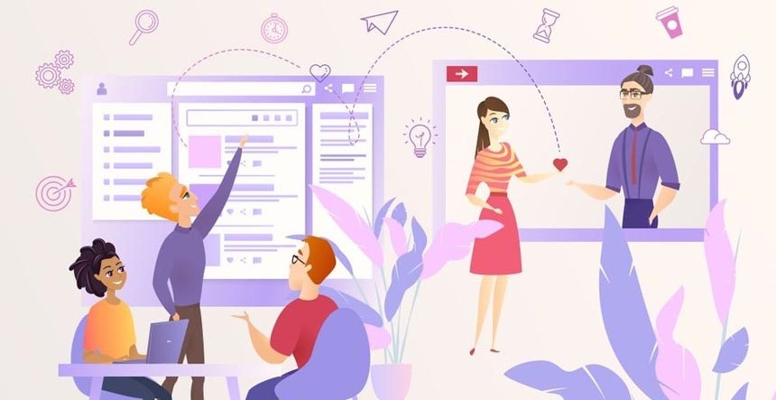
Over the past two years, many businesses have shifted their operations online. This has led to the growth of the eCommerce industry in a short time. As the competition increases, businesses need to focus on engaging their target customer with good visual design. One of the first things that people are likely to visit is the website or eCommerce platform. So, you need to invest in web design elements that represent your brand closely and provide a smooth user experience as well.
According to a survey, 94 % of visitors base their first impression of a web page on its design. This means that the layout or structure, imagery, and content can influence people’s purchasing decisions. With impressive web design, you can convince potential customers to browse through the pages or sign up for a free trial or newsletter. It’s important to focus on creating a responsive and interactive website that boosts conversions quickly.
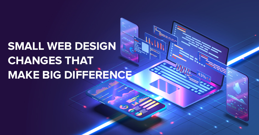
If you are about to launch your eCommerce business or looking to revamp the web page, then you may want to make some little changes to the design. To make this easier for you, here are a few changes that can make a big difference to your website.
12 Amazing Web Design Changes That Will Outstand Your Website
1. Flat Designs
This is an important factor to consider for web design. Flat icons or images can work well on a modern website or eCommerce platform. They can improve the loading speed of the page and create a minimalist appearance as well. If you opt for a flat design, you can easily convey your message without adding a lot of elements or clutter to the page. This is a good way to increase the responsiveness of the website as well.
Flat designs can work well for logos, shapes, or objects that may take up a lot of space within the layout. They can help you maintain the quality of the visuals and reduce the file size too. In the end, you can design a website that is easily accessible on different devices and ranks highly on search engine result pages. For visual branding, you can also consider a semi-flat icon to include in the mobile version of the website or the app.
It is important to create a versatile business logo for wider brand recognition and engagement. This way, you don’t have to worry about making changes or upgrading the icons for digital mediums. Before you start working on the website, create a plan for the structure or layout. It can simplify the design process and help you add flat icons in the right places.
2. Mobile-First Layout
Today, many people search for websites, products or services on their smartphones and tablets. To attract more visitors, designers and business owners need to focus on a mobile-first design. This means that the platform should load instantly on smaller devices without any disruptions or lags. Sometimes, you may visit a few websites that take a long time to appear on mobile screens. If this happens, people tend to move on to other options quickly.
According to a report, around 74% of consumers in the United States can leave mobile websites that take longer than five seconds to load. This is what you should avoid from the beginning. Compress the images and add ample white space to the layout to reduce clutter. By doing so, you can create a mobile-friendly website that adapts to different resolutions and screen sizes quickly.
When working on the design, it’s a good idea to test how people may interact with the platform as well. Once you have an idea of the elements that attract the highest engagement, you can focus on incorporating those graphics or animations. This can help you design a clean and attractive website that requires minimal upgrades over time.
3. Hero or Background Images
One of the first things that can keep people on the page is an appealing hero image. It can be placed above the fold and highlight important information about the product or service. Many modern websites have a hero or background image that shows what the business has to offer to potential customers. This makes it easier for people to make a purchasing decision, too. With an engaging image or animation, you can also convince first-time visitors to act.
Now, it can be slightly tricky to add a hero image or large background visual to the web design. It can require a lot of space and could slow down the website too. But they are still popularly used by designers to engage the audience instantly. A hero image can draw attention to your products and tell people to ‘buy now or ‘get a free trial. It usually has such calls to action, so visitors can explore the eCommerce platform or website before leaving the page.
For the web design, it’s a good idea to make sure that hero images are responsive and can fit vertically for smartphones as well. This way, you can avoid confusing the audience and stick to one or two high-quality visuals to grab their attention.
4. Vertical Navigation Bar
When it comes to making little changes that’ll make a huge difference to the web design, this is another important one to keep in mind. Since consumers can look through a range of options today, you need to make your website stand out from the first look. Easy navigation can help you provide a good user experience and make a lasting impression on visitors. The menu is a design element that can simplify the navigation on the web page. With a vertical navigation bar, you could make the website interactive and remove additional elements as well.
One popular style that you may see on modern websites right now is the hamburger menu. It appears as a button or icon that features three stacked lines that look like a hamburger. The navigation can work very well for mobile devices and tablets. You can incorporate a vertical menu in your business website to increase space for visuals or bold headlines too. This way, you could easily add a large hero image above the fold or even a video that engages visitors immediately.
By creating an easy-to-navigate platform, you can also boost its visibility. Search engines like Google will show such websites in the first page results. This could help you attract higher traffic in a short time and compete with established eCommerce businesses too.
5. Ghost or Transparent Buttons
Now, you may not be familiar with this design element as yet. Ghost buttons are used on many websites for visual appeal. They are almost transparent and might not be visible at first look. The buttons appear on large images or with text below the fold. Since they merge with the background, visitors may only see them when scrolling up or down. Some ghost buttons can have a light border that appears with movement.
These are different from CTAs and can be featured next to them. The call-to-action convinces people to check out the product or service and make a purchase as well. Ghost or transparent buttons can be used to display information that is not urgent. For instance, you can include one with a CTA that encourages people to ‘request a demo’ or watch a tutorial. This way, you might keep people on the page for a longer time and add bright CTAs too.
It is important to understand this difference, as a call-to-action needs to grab attention immediately. Users may have to look through the home or landing pages closely to locate the ghost buttons. So you need to place them carefully to make sure that people interact with them as well.
6. Card Layout Design
This is a great way to convey the right message and information to visitors without overwhelming them. You may see a few websites with a card layout design that displays chunks of text and visuals prominently. It is a web design element that can help you organize the data on the website in an appealing way. So, the header image or product visuals could be displayed in cards to catch the eye of potential customers.
The layout or structure can help you create a minimalist website and include more details on the home page as well. You can easily divide the areas until the end and add graphics or text that gives an insight into the brand. With cards, you can also draw attention to testimonials or show real people using the product. Mostly, this layout works well for eCommerce websites to display product categories.
To create a unique and attractive website, consider using card styles for visual content. It could make the platform more responsive and allow you to showcase your brand colours too.
7. Introduction Videos
Many websites today prefer adding videos to give people an idea of their bestselling product or service. It can also help brands tell their stories and convince people to explore the website for more information. Video content is also preferred by a lot of people in this day and age. According to a report by Cisco, 82% of users across the world will be likely to visit websites or pages from videos in 2022. This means that such content is already quite popular among the audience. To make a positive impression on your target customer, you should add a short introduction video on the home page.
This can be an animated one or show how your business can help people solve a problem. You can feature one of the products in the video and highlight its features as well. It is a good way to introduce people to the brand and generate interest among first-time visitors, too. Introduction videos are mostly short and different from a tutorial or explainers. If you want, you can also include a large short video above the fold with a CTA. This is just one way that you can add one to your website.
Make sure that it’s high-quality and looks professional. You can use editing or video-making tools to create content that engages people from the beginning. Introduction videos can also showcase the unique factor of a business and help consumers make a purchasing decision. This is also a good way to create a website that is different from the competitors and can stay in memory.
8. Optimized Product Visuals
This is also a good search engine optimization technique that can improve the ranking of the page in a short time. When incorporating visuals across the website, you need to focus on optimizing them to provide a smooth user experience. Choose a relevant name or title for the image and add Alt text that describes it accurately. This way, you can make it easier for the search engine to understand what the website or eCommerce platform has to offer.
Optimizing product visuals can also allow the page to be accessible on multiple devices. Focus on using the right size and format, so the image can maintain its quality as well. Sometimes, large visuals may not load completely on smartphones or smaller screens. Make sure that you research the image guidelines for a search engine like Google extensively.
This could help you update the website easily and prevent any issues with optimization as well. You can also get feedback from a focus group or your team members to get a clear idea of how the product images appear on various devices.
9. Social Proof on the Home Page
While it’s a little change that you should make to the web design, it can make a huge difference in the results. By adding social proof from experts or real customers, you could draw more visitors to the page. Add this on the home page to break the sections or towards the end. You can include awards, statistics or reviews by industry leaders to make a good impression on visitors.
Social proof needs to be prominently visible and convincing for potential customers. It’s a good idea to include testimonials from previous clients or customers to highlight their experience with the brand. This is a good way to establish credibility and show that the business is trustworthy. You can incorporate data that conveys how people can benefit from the products or services as well.
For instance, an email marketing agency can include social proof from clients that have converted more leads with successful campaigns. This helps people make the right decision and interact with the website as well.
10. Colorful CTAs
The CTAs are an important web design factor that can help boost the conversion rate. Before launching the website, you should run tests to see which colors and words are getting more engagement. It’s a good idea to use a bright combination to highlight calls to action across the platform. You can also incorporate your brand colors to match the scheme of the website. Colorful CTAs are likely to grab attention instantly and bring out positive feelings as well.
Many websites use hues of blue, green, yellow and orange against neutral backgrounds to make the CTAs stand out on the pages. This can work very well as the colors are associated with trust, reliability and happiness. They also create excitement within the viewer and encourage them to find out more information.
11. Engaging Website Content
This includes both visual content and text that conveys what the business is all about. With a bold and engaging headline, you can immediately hook the visitors and keep them interested in a long time. It is important to send the right message from the beginning. Add a short description of the brand or a bestselling product and convince people to try out the product or service.
Similarly, focus on adding visuals such as attractive thumbnails for product categories. With attractive imagery, you can build brand recognition and create familiarity with a wider audience as well. The content of your website needs to be engaging and valuable. This can help you with optimization and make it easier to include relevant keywords or titles that improve the ranking of the page.
12. Faster Loading Speed
Websites or e-commerce platforms need to load within seconds. Today, most people have short attention spans and may not prefer to wait a long time to access a website. To gain an edge over your competitors, you should focus on removing or adding elements that increase its loading speed. If the page is available instantly, people might check out the product or service and even purchase before leaving.
With faster speed, you may convince visitors to return and build a loyal customer base in a short time. Focus on a minimalist design and keep the pages clutter-free.
The Bottom Line
These are some little changes that’ll make a big difference in the web design. If you are looking to launch your eCommerce platform or business page, or just thinking about redesigning your website, keep a few of the above factors in mind.
To create an impactful impression, you can think of hiring a professional web design agency with experience in redesigning sites. KrishaWeb can be your next tech partner for creating a new website or revamping the existing one. Feel free to give us a shout-out, we are just a call away!

While creating a website, many owners focus on its design and multimedia. Little do they know that even many well-designed websites can easily lose the majority of their visitors because of poor navigation. Website navigation is considered to be one of the most important features that affect user experience to a greater extent.
So, if you want your website to flourish, you should have a solid navigation system in place. It will maintain high user retention rates and reduce your bounce rates.
And to make your task a bit easier and faster for you, we have compiled a list of some of the best practices in this blog. All these practices will help you improve user experience through website navigation. So, keep reading!
How Does Navigation Affect the User Experience on a Website?
Navigation plays a very significant role in how your user is going to perceive your website. Yes, the designs and other advanced features do matter for sure, but if the visitors are not able to freely move from one page to another easily, then designs are of no use.
So, solid website navigation has a positive relationship with user experience. You will automatically have a better user experience if you have a solid navigation system and vice versa.
That means if the users are easily getting the solution to their problems, they are more likely to visit again which in the future results in more qualified leads leading to better sales and revenues altogether.
What Are Common Types of Website Navigation?
Types of navigation give your website the flexibility to be user-friendly and efficient. They are mostly categorized into four types:
1. Scrolling or clicking
Scrolling or clicking is one of the easiest and most comfortable ways to search for the information you are looking for on a website. Website owners are advised to map out their content in a similar manner because the visitors want the data to be scannable and easy to access.
2. Menus and Sub-Menus
Menus and submenus are yet another among the most popular ways to structure your website. They are used to provide a proper format for the navigation of content. Some of the most used menus are Top and side menus, drop-downs, carousel, side-scrolling content, thumb zone, and others. You should choose the ideal ones as per your business website requirements.
3. Icons, images, and buttons
Icons, images, and buttons are used to make your website attractive, eye-catching, and user-friendly. The various blogs include some clickable images to make them look more informative and professional.
Buttons are a way for your visitors to easily surf around the website and collect the information they need – seamlessly. A website has various advanced features and tools which can be accessed using icons that act as a CTA (Call to action) which allows users to take an action instantly.
4. Linked text
Let’s suppose you are reading a blog on a website. You liked the content and want to read more blogs like this. And then you instantly saw a relevant blog link below the article or even between the blog.
You will be more likely to the client on that particle piece of content. So, this is how linked text navigation works in favor of both website owners and visitors.
There are a variety of pages you can redirect your users to. This type of navigation also includes a table of contents and links within the primary landing page copy, service pages, blogs, and relevant resources.
10 Best Tips to Improve User Experience on Website Navigation
1. Design Navigation That Matches Your User’s likes
You should navigate your website in such a way that it can easily address the needs and wants of the user. You can use AI-powered techniques and web analytics to know what your visitors usually search for.
When you are constantly reviewing user sessions and thoroughly analyzing the analytics, the process of understanding the activities of your visitors becomes quite effortless.
When you have perfectly mapped out your website’s navigation, do not try to unnecessarily change it now and then. This may confuse the users and your website’s engagement rate may decrease (which is something you surely don’t want).
Take a quick scan of your site to see if everything is working properly or not. If there are any issues, fix them before any user complaints about the same to offer a consistent, better user experience.
Ask people to give a review of their experience on your website. By doing this, you will be able to see through your mistakes and drawbacks and make changes accordingly.
2. Design for good discoverability
All your navigation options must be easily discoverable because hiding them will negatively affect your user’s experience. Every page on your website should be easily accessible to your visitors because hiding them will affect your website’s discoverability.
Menu – Your menu should be distinctive and eye-catching with some amazing visuals. Additionally, we also recommend you to use much white space and color contrast so that the menu stands out from the rest of the page – which helps in increasing page viewability, and as a result, visitors spend more time on your website.
Icons – Use icons to amplify the meaning of the labels so that the users can know what to opt for without even reading the texts. This will save time and make the website design more interesting.
Do use icons but never replace them for text labels because there is a slight possibility that some users may not understand the icon and may need text help. So both icons and text work in tandem to offer a comparatively better experience.
Menu bar – Situate your menu bar in a place where they already expect it to be. It can either be at the top of the page or on the left side of the panel – plus add it in the footer as well.
3. Incorporate enticing Calls-To-Action
Call to action (CTAs) is an amazing trick to amaze your visitors and appeal to them to take action. The action could be buying a product, subscribing to a newsletter, booking a free call, downloading an eBook, downloading an application, or anything else.
CTAs are an efficient way to increase conversion rates and boost the website’s overall performance.
CTAs are nothing but some catchy phrases through which the visitors feel either inspired or entertained. Whatever be the reason, it’s valid until and unless you are getting more sales, building a brand, having more email sign-ups, or getting lots of shares on your online content.
But, to get there you need some amazing CTAs in place which make the user click on it.
4. Limit the number of menu options
We all know that complexity is the enemy of comfort. Yet we somehow make our websites so complex that it becomes difficult for the users to understand.
So, make all the efforts to make your website navigation and UI/UX as simple as you can.
Here are a few tips from our side –
- The menu options on your website should not exceed the limit of 7-8 categories.
- The content has to be simple & limited so that you don’t get the visitors all confused and irritated.
- Don’t make it cluttered, use white spaces and make it visually appealing
The complexity will make the user feel like they have to put a lot of effort into figuring out the website and knowing it. Due to this, they will simply skip and never visit again, which may result in a great loss for you.
5. Make Hypertext obvious
The hyperlinks on your websites should be distinctive and attention-grabbing so that designs do not get in the way of usability.
People should know a hyperlink just by looking at it and if that’s not happening, then there is a problem with both your design and navigation (which you need to solve for sure)
Making your hyperlinks visible is not rocket science. All you have to do is either make the link bold, italic, change the color or simply underline it and you will be good to go. Links can also be converted into buttons if you want. This will simply make the header navigation more fun and visible.
Additional Read
13 Result-Driven Responsive Web Design Tips and Best Practices
6. Make efforts to blend in your sidebar
The sidebars should stand out for the website to blend in. Yes, that’s right! If you want to improve user experience, you must keep things simple yet classy.
Sidebars must be separated for the overall enhancement of the website. Some developers do it by coloring it differently, whereas some may want a different body copy. Nobody has their demands, all of them are working according to the needs and wants of their users (and you should also do the same).
You should not miss the sidebars with elements, spaces, and other unnecessary items. Everything should be neat and there should be a proper space between the elements and sidebar.
7. Streamline your navigation bar
Effectively organizing your navigation bar is the key to making your website look more professional and efficient.
Many websites have been making this mistake of either having way too many links or very few links in their header navigation bar. The owners put the links according to their convenience, completely ignoring what their users want.
It is advised to declutter the bar and use proper analytics to know the requirements of the user and then make the web improvements.
8. Design for fast Scalability
The labels should be short, crisp, and shouldn’t include many words because the users avoid reading bigger and boring sentences. The words written in the list should not be repeated because it does not look good and also affects scalability to a greater extent.
- Try to write the list items in the left-to-right format.
- You should not write menu items in the list in all-caps if the words are 3 or more than that.
- Navigation options should be limited because too many elements make the bar cluttered.
The order in which we put the items in the bar should be considered because the serial-position effect says that the person remembers the first and last item pretty well as compared to others.
9. Create a sticky navigation bar or a back-to-top button
Sticky navigation bars or back-to-top buttons are ways to return to the key content that was at the beginning of the page.
In simple words, it can be said that when a website page becomes way too long, then it is recommended to use a sticky navigation bar that will be visible even after we have scrolled down.
The same goes with the back-to-top button. While scrolling down the page, if you click on this button, you will be automatically sent back to the start of the page.
10. Don’t underestimate the footer navigation bar
We should place the footer navigation bar at the end of the website page. Owners tend to ignore this bar because they don’t think it’s important enough to be considered. But little do they know that the footer bar can retain customers and get conversions, just like the navigation bar.
If someone has scrolled down the footer bar, they need more information about your business. So, you should add some extra information and links to the footer for the same which hooks your customers, and then wait for a while.
Conclusion
So, that’s a wrap on some of the most crucial things you should keep in mind for designing a stellar website that considers user experience and navigation of a website as a whole.
We hope you found this blog helpful and it will guide you a bit in nurturing your website, which results in favorable outcomes as per your business requirements.
If you still have any queries, you can reach out to us and we would be more than happy to help.
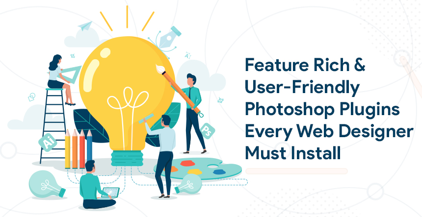
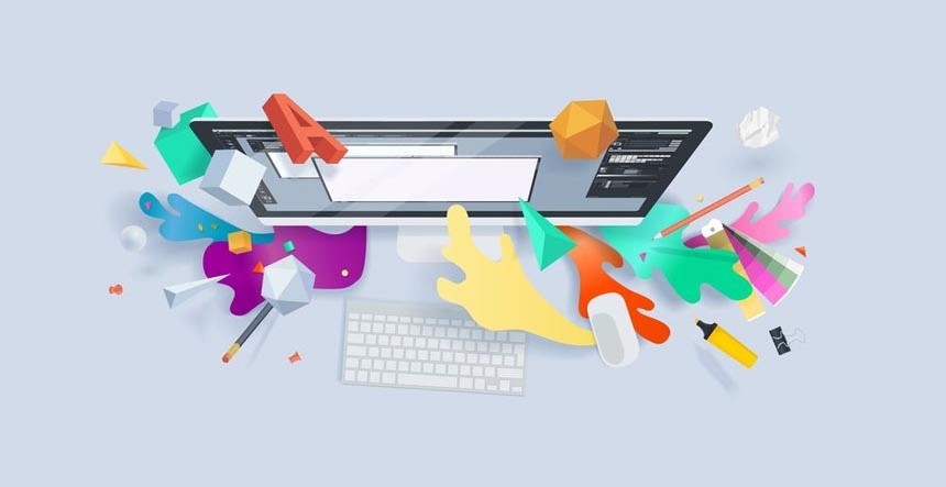
There is no doubt about the capabilities of Adobe Photoshop CC. This image editing software application is fitted with various useful features enabling the users to easily apply a diverse array of effects for engaging and consistent results. However, Adobe Photoshop CC has its limitations despite having outstanding features. In this scenario, you may use the best free Photoshop plugins to avail the features or capabilities that are unavailable through Adobe Photoshop. You may use the following plugins if your business or work depends upon having access to a wide range of effects.
ON1 Effects
With ON1 Effects, you can easily create an HDR effect on Photoshop without requiring the complex steps. This one-click panel on Photoshop may even work as a standalone app and works as a useful alternative to the collection of graphic design software solutions of Adobe. This plugin contains a diverse array of filters and enables you to add outstanding effects to the images. This plug-in also enables you to include adjustable contrasts to the images.
Pexels Photoshop Plugin
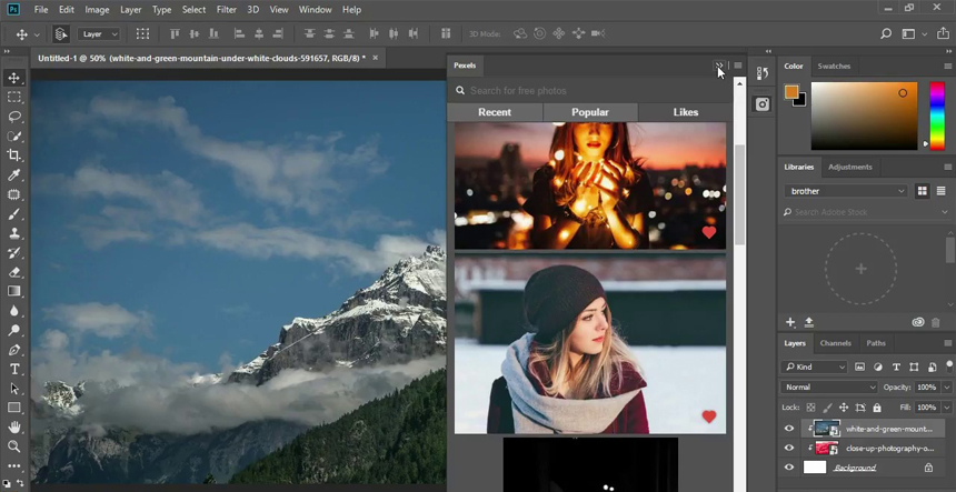
The designers may need a large stock of and diverse collection of royalty-free images to add textures, to enhance the background or to experiment when creating something unique for the clients. You can get access to a diverse collection of free stock images through Pexels.com. The Pexels Photoshop plugin enables you to access the photo library without requiring you to download the selected or preferred images or to open any new window.
Fontself Maker for Photoshop CC
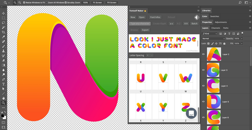
This Photoshop font plugin lets the designers or the clients choose a unique typeface for a project. The Fontself Maker for Photoshop CC plugin is excellent for the designers who want to create a font-style according to their unique preferences or unique requirements of their clients. IT works with the Illustrator CC as efficient as the Photoshop. This plug-in allows the designers to convert the lettering into OpenType fonts and is fitted with the drag-and-drop layers.
Nik Collection
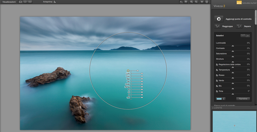
It is one of the must-have Photoshop plugins in today’s design industry. It is fitted with seven feature-rich Photoshop and Lightroom plugins that work independently. DxO is the current owner of Nik Collection. It includes the collection of following Photoshop plug-ins.
- Viveza
- Color Efex Pro
- HDR Efex Pro
- Dfine
- Analog Efex Pro
- Silver Efex Pro
- Sharpener Pro
Size Marks PS
Size Marks is a useful Photoshop script that benefits both front-end engineers and web designers. Using this script, you can convert the landscape marquee in the horizontal mark, the rectangular marquee into labelled measurement mark and portrait/square marquee into the vertical mark.
Layrs Control 2
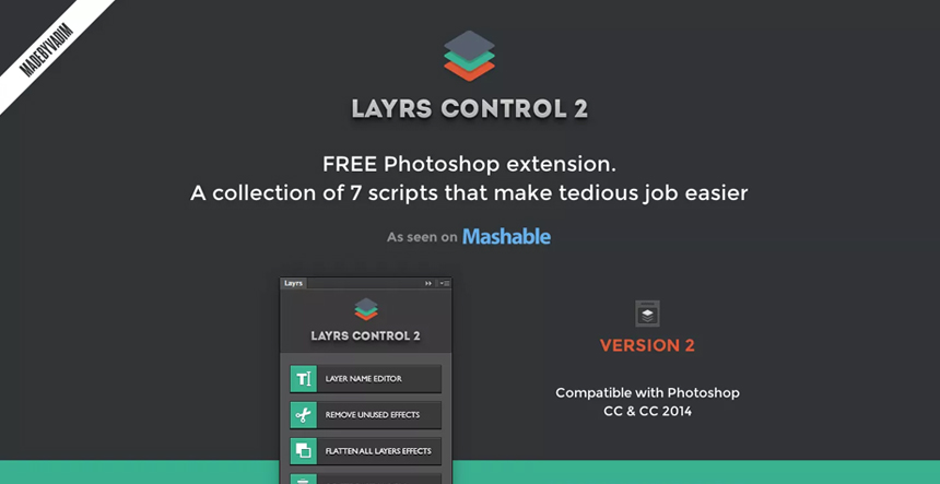
The layers play a vital role in the designing process using Photoshop. However, it may become difficult for a web-designer to organize the layers in order if he/she creates multiple layers. The Layrs Control 2 plug-in enables you to easily organize and manage the layers through a chain of actions. You may access these actions through a simple panel. The following features are available through this plug-in and can greatly improve your efficiency.
- Flattening of layers
- Layering name editor
- Rasterize the smart objects
- Deleting the empty layers
- Removing the unused effects
- Finding similar folders/files
- Converting the smart objects
CSS3Ps
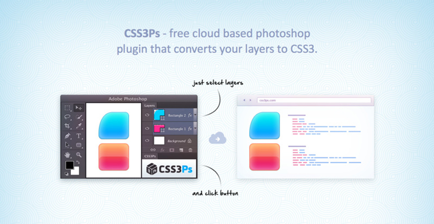
This feature-rich Photoshop CSS plugin is ideal for web-developers. Using this plugin, the web-developers can translate each Photoshop layer into the CSS code. Alongside offering the basic feature, the CSS3Ps plug-in also has the ability to provide SASS and SCSS codes. It also improves the efficiency of the web developers, as they can work faster even when handling complicated designs.
Other than Adobe Photoshop, there is availability of UI UX Design Tools which will help you incorporate variety of effects in your designs
Font Awesome PS
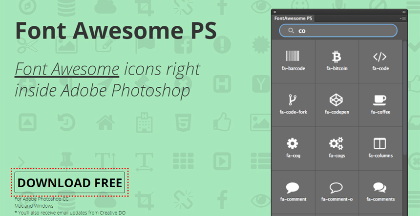
Utilizing the power of CSS, this plugin gives scalable vector icons to the web-designers letting them customized the colour, size, drop-shadow and other features of the image files. Font Awesome PS brings all the vector icons inside a user-friendly Photoshop panel which is an additional benefit.
Long Shadow Generator 2
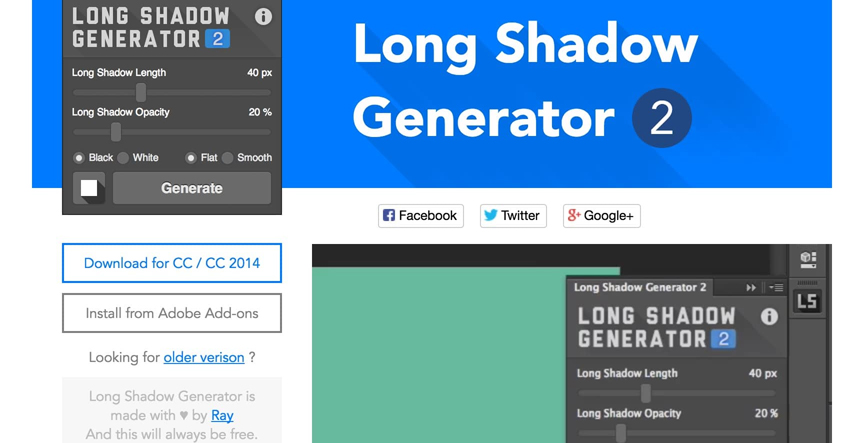
Adding long-shadow effects to the images is a popular practice in online designing. This free plugin enables the web-designers to effortlessly create the long-shadow effects in a single click using easily manoeuvrable tools. This plugin is compatible with Photoshop CC and CS6.
GuideGuide
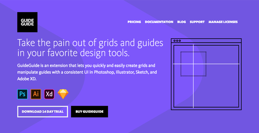
Using this plugin, you can create custom guides and grids depending upon a project’s selected part or upon an entire project. You may use the ‘grid notation’ to adjust the margins or to create the tables. GuideGuide can calculate the majority of the dimensions when developing the grids. You may save the creations as Sets/templates and may use them in the future. It is possible to create a grid inside a grid using this plugin with one click of the mouse.
Swatchy
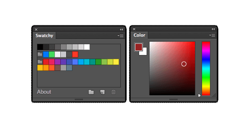
This useful plugin makes it possible for the web-designers to correctly organize the colour swatches into folders. It enables you to save the colours that you commonly use or have a preview of such colours. You may even use Swatchy to easily access the colour schemes. It works on Windows and OS-X.
Random User Generator
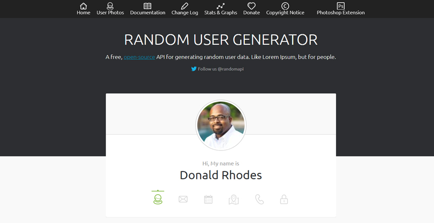
This free Photoshop extension enables the designers to create random user profiles with one click. It also gives you the opportunity to effortlessly drag and drop the random users into the PSD files. This useful Photoshop plugin functions through the RandomUser API.
Composer
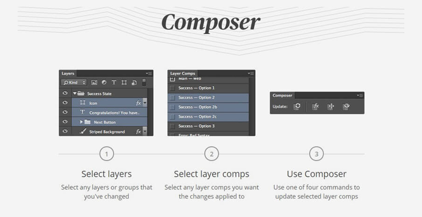
This powerful plugin enables the web-designers to simultaneously perform a similar operation on multiple layers. It enables you to edit/update/manage multiple layers with just one click. You may use this plugin to change a design layer, such as changing its position or visibility, without affecting other design layers. The web experts may use a few commands, such as Update Position, Update Layer Style, Update Visibility or Update All when changing the layers.
Ink
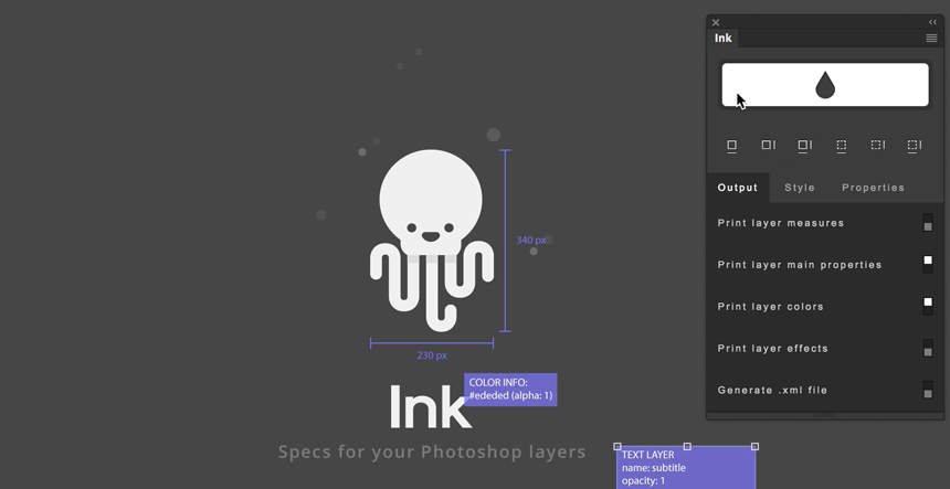
This is one of the popular Photoshop plugins for the designer. The web-designers may use the Ink to create user interfaces or useful mockups making it possible for the web developers to understand the design elements within the coding framework. The web-designers may use this plugin to generate layer styles, text formatting or dimensions. Hence, it becomes easier for the web-designers to communicate their designs using this plugin which is essential if a designer wants a web-developer to accurately interpret the design.
Fluid Mask 3
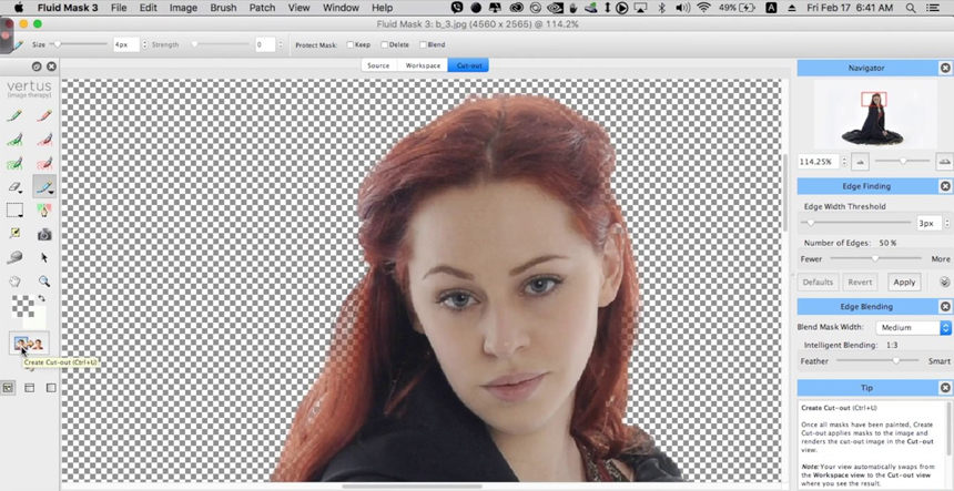
The web-designers may use this Photoshop plugin to remove an image file’s background or for cutouts. Masking is a difficult process which is used to make one part of a design-layer invisible. Using Fluid Mask 3, you can easily perform this delicate process and can have a clean and flawless mask. It can simplify the complicated tasks, such as masking the fur/hair. This plugin also has the capacity to blend the design layers or to detect the edges.
Conclusion
With the availability of numerous graphic design plugins, the top branding agencies are not limited to using only the Photoshop tools for creating effective visual presence. The aforementioned plugins enable the web-experts to easily perform an array of tasks and to create desired effects according to the varying requirements of the clients. But for sure these Photoshop Plugins can increase the efficiency and productivity of any web-designer whilst ensure the best result with advanced features.
In this digital world, having a website to run the business is mandatory. Just creating a website does not ensure huge traffic or leads. The user experience here plays a greater role. A good UX helps in getting a good flow of traffic and ensure quality spent time on your website. This blog will let you know the steps which help in creating a successful UX to gain competitive advantages.
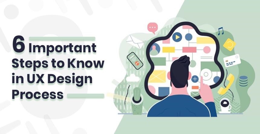
Following are the 6 Important Steps in UX Design Process
Creating a strong digital presence is now truly matters to business growth. No matter which business type you have, you have to come online and meet people online if you want to grow in this fast-paced world. Just creating a website with average design does not mean that you will get more and more traffic. Your website is offering a better user experience or not that you have to be sure in the first place. Within a mobile application or on the web, your website is looking fine and running in a user-friendly manner that’s the ultimate goal.
Having a website with stunning UX design always helps in cutting down the development costs. It helps in comprehensive user research, wireframing, user testing, prototyping, information architecture design along with final implementation. Here the designers spend hours to ensure perfect user experience through redesigning and polishing a business app.
It is proven that with better UX, a lot of companies keep their users satisfied as well as loyal to the business. Without a proper UX design, managing good traffic is really hard rather than not possible at all. UX Design Process can differ from one business to another.
Generally, there are some steps to follow one by one to create a successful UX design, let’s know them in the below-
Do Direct Research from the Users instead of Google Research

The entire process starts with research. In the first place, you have to think about your users. Who they are and their places, their needs, and from where you can find them- all these you have to think first. Here you can make a list that will enlist all the requirements and here you can also list the questions or matters you have still doubt in. if everything seems perfect, you can offer it to your users. There are a lot of tools available in the market for survey works and these will help you in collecting good ideas from the users. It is not that you will always get the average quality ideas but you can get some stunning ideas from your users. According to the expert Professional UX Designers, this is the best and unlimited source of ideas.
Craft User Persona

Generally, personas are imaginary characters and they are here to represent the different types of users. The main aim of these personas is to offer realistic and reliable representations of the key audience segment for reference. So, after creating persona you have some first data about your target users and it can reveal what they need and expect. All the business organizations create their products and services depending on these personas. UX design personas are here to aim at the user goals, present customer behavior, and even on the pain points. It mainly depends on the real people and field research.
Build a Scenario Map or User Stories

Now you have user insights and personas. Generally, user stories are little examples of people’s lives. From here, designers get some ideas to empathize with a user create a way to get fit in a user’s life. Different media can present different user stories. Writing a perfect user story is not an easy job yet its format is straight forward.
Generally, these are not tasks. In other words, it can be said that a single story may need a lot of nearly hundreds of single tasks. User stories are about definition where tasks focus on implementation. Here you need to maintain the clarity about your services and products.
Stories need to be simple and solid with a standard level. It helps the stakeholders. You also need to think from a user’s point otherwise creating a good story is not possible. To make it a little more catchy and standard, you can introduce epic here.
Craft Wireframes and Interaction Prototypes
According to the UX designers, this is the fun part for them. Here everyone gets the first visual impression of the service and product. Here you will get little conflicts as some users to believe in high fidelity wireframes and some in lo-fi for the first place. Go for lo-fi has a benefit and that is with it you do not have to waste a lot of time on drawing rather you can focus on exploring the designs. Wireframes can help you here. Without worrying about the pixels, you have to keep exploring to get the best solution. To get some help you can help with pro tools that offer high-quality results.
Visual Design, User Interface, and Deliver
After completing wireframes and prototypes, now it is the cup of tea of UI professionals. This part is a little complicated and some experts think that the reason behind is less effort on the beta release. But after a period, both UX and UI need to stay closer. UI is all about beauty. Here you need to be strict and sure on spacing, colors, font size, and padding. In order to maintain a good UX design, human effort is needed on UI to improve time to time and maintain. After all these, you need to deliver it to the developers but before that, you can use a reliable tool that plays between designers and developers.
Proper Metrics Analysis

After completing the first version of the application now it comes to the most important part of the work. Here you need to validate the design. Here you can easily use the market available analytic tools. Analytic tools help in tracking how the users use your products, how they prefer to interact or they are getting exactly that what you want to let them get.
KrishaWeb has its own UI UX Design Guide for Websites. By following that design experts can do these jobs perfectly.
KrishaWeb always works to satisfy its clients at the best level. To satisfy you we can repeat from the very first step so that you can get a doubt-free UX design which helps you to get revenue. In order to Improve UI UX of Website, a lot of people have contacted us and we happily performed on that and ensured their satisfaction. This time, we are waiting for you. For any kind of query or guidance, you can directly contact us; our executives will get back to you as soon as possible.
Your site may have the most impactful content, but that won’t be enough until it is visually appealing and if you want to drive visitors to your site, you need to get innovative. Aesthetics are the prime factor of visual design. If it is not appealing enough and abides by the motto of your site, people would not take seconds to jump on the next site in the line. Here are some tips and techniques that would help you in keeping your visitors intrigued to your website.
Visuals Directly Link to Your Brain
The one asset that humans have is their sight. And this is what you need to catch when you are designing your site. Visuals are the first thing a visitor will notice on your website. If you want them to stay on your site, ensure that the visuals of your site are compelling enough and help in passing the message to them. When the visuals are pleasing to the eye, the visitor is more relaxed and takes actions quickly. You should make use of white spaces and every other aspect properly to ensure that the visuals of your site stick with your visitor.
Cues are Important
Navigation on your website should be easy and reflexive. If you want to have a good response from your user and ensure that they for the call to action, you need to provide them with the right cues. Interactive sights are important but do not overdo this aspect of your site and make things complex for the user. Keep it simple and direct them towards the call to action so that they can make the right decision and participate, buy or use the services of your site.
Logic Drives Humans
Consistency matters at every place and for websites too. You have put the right visuals on your site but if there are no proper patterns and regularity followed on the designs of your page, this will add to the confusion of your visitor and they would leave the site. If you want to get the profit from your website, you need to understand that your prospective customers are humans and they only work on logic when it comes to taking an action. Ensure that your site is consistent and offers a smooth way for your visitor to make any decision.
Minimum Functionalism
When you are done with the right kind of interactive and innovative design, you need to give your visitors the right kind of functions. When you are setting up various functions for your visitor on your site, there are few points you need to keep in mind. The most important one of them is functional minimalism. This is the concept, which big websites have been using for their sites. When you are putting up tasks for your visitors, the last thing you want is your visitors getting overwhelmed with the amount of task they have to fulfil on your site to obtain simple information. So, keep this at the basic and you won’t have problems in luring in customers.
Touch is the New Technology
Gone are the days when people were stuck with a mouse. Touch is the new technology and everyone is either using a touch-enabled phone, tablet or even a desktop. With this technology raging the Internet, you need to ensure that your site has the right call to action which is responsive to the touch facility. Otherwise, you will end up losing a lot of visitors.
If you are looking for a web designing company, make sure you hire the one that has enough experience in this field and is up-to-date with the latest technology and features that makes their website stand out. In this advanced age of Internet usage, where mobile compatible browsing is in high demand, your web designer should know about all the modern tools available that could be incorporated into your website to make it user-friendly.
Let Us Look At The Top 10 Tools That Every Qualified Web Designer Should Know About:
960 Grid System
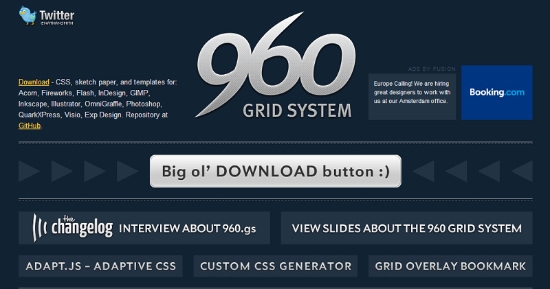
To monitor the intricate details of a website’s coding, web designers can try this tool to be able to make customized changes, wherever necessary.
Golden Grid System
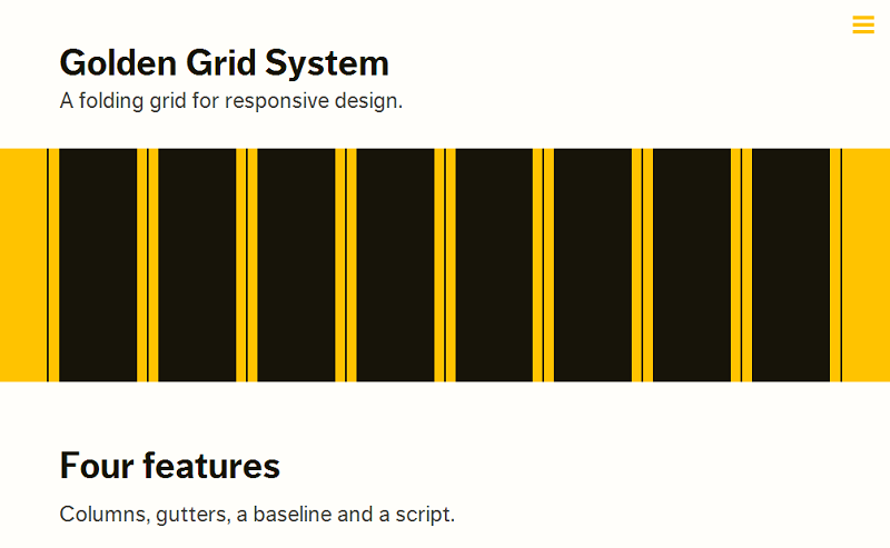
If a web designer has prior experience in making responsive websites, then he or she will surely be aware of this particular tool. With the help of the golden grid system, the designer can break the screen into 18 columns.
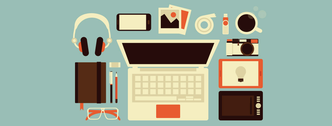
Photo Editing Software
If you choose to use digital pictures on your website, the designer would need suitable software to edit the pictures such that he can crop the picture as per his choice, resize it and add a special effect to the pictures. Digital image software will enable the designer to create loadable graphics onto the website. There is various software for using the digital picture, starting with basic features to the advanced ones. It is up to the choice of the web designer to use any software that would suit his skills the best.
Sketch Sheets Tool
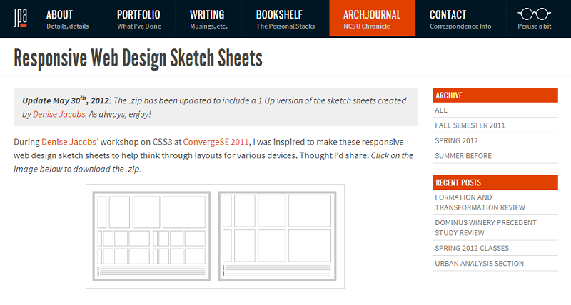
To map the different elements of a web page and strategically place them for the best results, the responsive sketch sheets tool is the ideal option. With the help of this tool, you can position different elements anywhere you wish to on the screen, with different sizes and different resolution.
Bootstrap
This web designing tool can be used to simplify a web designer’s job because it enables the user to customize different elements of a responsive web page, download a complete version of a CSS, plugins and other features that help in easing the complicated work.
JS Fiddle
With the help of this tool, any web designer can create Javascript, HTML and CSS. Also, the programmer can create widgets for the user interface that can be reused multiple times. Because of these features, this web-based application is popular among many programmers and web designers.
Gridpak
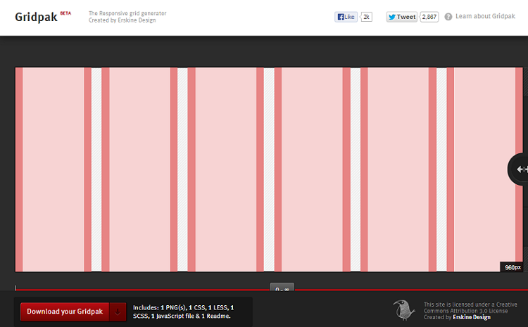
This is a free tool for web designers, with the help of which he can create online grids. The web designer, using this tool can make use of the PNG templates according to the design of his website. It is a simple to use tool where the user just needs to mention the desired gutter and columns.
Fit Text
This tool allows the web programmer to resize the text according to the device where it is viewed on. This is a jQuery plugin.
Responsinator
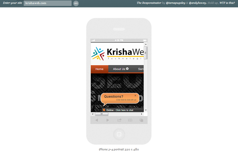
This tool lets you see how your web page loads on to gadgets like Smartphone, tablets etc. The users just have to put in the website link and the detailed report on the website display on mobile display will be shown.
FlexNav
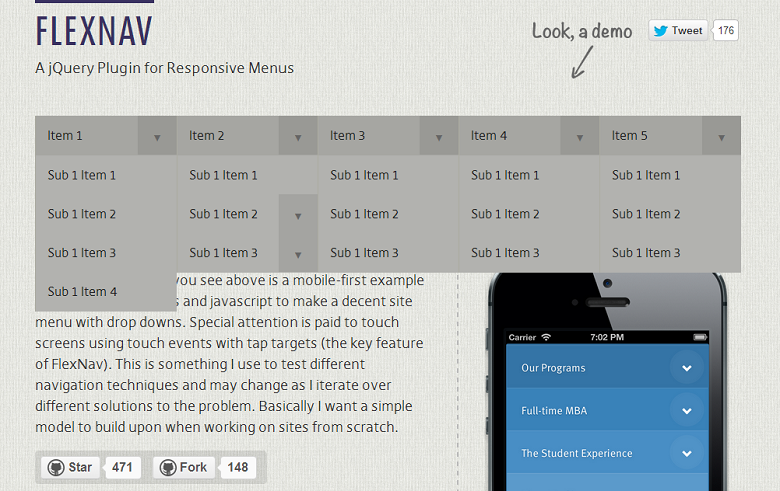
This jQuery plugin helps in creating drop-down menus for mobile devices, using media queries as well as JavaScript. This tool helps in developing sub-menus best suited for touch screen view.
These days, the web design trend is towards creating responsive design, especially for mobile device usage. Keeping this in mind, you must hire a web designer, who is well versed in using tools like the ones mentioned above, to be able to create a navigation friendly and carefully structured website for you.