Google has made the first major design change in last 17 years. Google has redesigned the logo to make the cleaner, softer and more playful. Google has also slightly changed the color tone and shades. The new logo colors resemble Microsoft logo colors. But it’s actually not the same colors. An analysis has been made between primary colors of two giants, Google and Microsoft. The results were amazing after comparing these two brands. Let’s have a look what are some common aspects of both brand’s color selection.
From the very beginning, both Google and Microsoft somehow use exact same colors that are blue, green, yellow and red. But still there is a minor gap between the shades in colors. Both yellows look exactly same, but a closer look says that there is a minor difference in the shade that cannot be recognized easily. A deep analysis gives an interesting result that Microsoft colors are more saturated (Colorful) compare to Google.
Google in their Material Design signifies reality. It’s about real world material so it’s likely to use real life colors that makes their color less saturated like the real world. Comparing it with Microsoft a digital brand, they use more bright and saturated colors. Microsoft is more related to the digital world than real world hence using colors of the digital world.
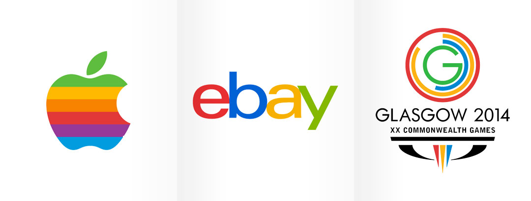
Blue, Red, Green, and Yellow are the four primary colors used by the big brands. Google and Microsoft are not the only brands, which come in this rainbow style color palette. Apple, eBay and Commonwealth Games also use same color style. According to standard color psychology, a colorful palette creates a sense of openness, diversity and optimism that is essential for the global brands. Blue, Red, Green, and Yellow are colors that entirely complement each other that is the reason why these are the first choice of the many brands having a multicolored logo.
So, now we know that though brand colors of Google and Microsoft look same, but there are still differences in the color tones. The reason for using bright colors in the logo is to give a universal touch to the logo that stand out from the others.