On a webpage, the footer remains at the bottom of every page and below the main body of content. This term has come from the print world; however, it has a different meaning in the digital world. In the printing industry, a ‘footer’ is a consistent design element that is seen across all the pages of a document. However, in the digital world, the footer contains different types of information.
In yesteryears, the footers were either used as the utility areas containing succinct data on a subject (tiny and nearly intelligible texts) or used as a location for different types of links. However, the importance of footers has changed over the years and they work as a crucial reference point for the people. Therefore, the footer is used to perform a variety of tasks these days.
“Do you know?
A good interactive design of your web page footer can increase website conversions by nearly 23.77%”
UX designers pay more attention to the design of the elements located above the fold of a webpage, as the majority of the users spend more time reading or viewing the top of any web page. However, the importance of the footer has changed over the years and this element can be used to include additional information or navigation options at the bottom of a web page. Therefore, it is important to consider the usefulness or the application of the footer on a particular web page before considering its design.
In a recent study, Chartbeat tested around 25 million website visits. It shows that many visitors are willing to scroll down the long pages (through thousands of pixels) in order to see what is in the footer. Therefore, the footers are no longer overlooked on a web page.
4 Reasons Why Users Scroll Down to the Footer
Footer can be used to convince the users with additional information if they cannot find it in the main body of the content. For example,
A user may like a brand for its products; however, he/she may need more information before becoming a customer. In this scenario, the footer can be used to remind or inform potential customers about the exclusive offerings of a company or business.
The footer may even be used as a place for the data that are hard to find. For example, someone may be visiting a website due to being interested in a job within a particular industry. In this scenario, the footer can be used to provide some additional and relevant information with regard to the queries.
Some types of data are commonly included in the footer, such as details about a company, contact information, social media posts/links, or related content. A user may scroll down to the footer in search of this type of information.
The footer may even be used for navigation to other web pages or to a different part of a web page. For example, it can be used to give users an opportunity to reach the top of a web page without scrolling.
In any of the aforementioned scenarios, it is essential to ensure that the design of the footer remains consistent with the design of a web page alongside being predictable and easily discoverable. It is important to consider the main objective of a website along with the main application of the footer before considering the type of content that is supposed to be included in the footer.
Include the Following Details in the Footer of the Website
HTML Sitemap: To help search engines find useful data, the footer may feature a link connecting to the HTML version of the sitemap.
Copyright Symbol: To protect a website from infringement of copyright, the copyright symbol along with the foundation year of a business can be included in the footer.
Terms of Use: The ‘terms of use’ describe the points that a visitor agrees to whenever visiting a website. The text used in the ‘terms of use’ can be included in the footer for the websites in highly regulated industries.
Link to Map/Direction along with Address: The inclusion of the address of a business or a company along with the map and directions is not just useful to the users. Google may use these data to learn about the location of your business enabling potential customers to find your business.
Privacy Policy: The privacy policy explains what type of data is collected and how the data are stored or used by a website. The ‘Privacy Policy’ is one of the common elements used in the footer.
Contact Information: You may include a ‘contact’ link in the bottom right of a web page alongside the top right of a web page. However, this link is supposed to lead to the contact page which includes a contact form instead of being an e-mail link due to the following reasons.
It is easier to track the form submissions.
Many visitors use computers for e-mails and they may not be using them at the time of visiting a web page.
Forms send visitors to auto-response emails and forward them to thank-you web pages. It enables you to provide more messages to visitors and to feature more CTA buttons. Many visitors use computers for e-mails and they may not be using them at the time of visiting a web page.
Forms can be used to ask specific questions and to route the submissions to different individuals or departments according to the answers.
Forms can save submissions into a database and can connect to software platforms or technologies.
Phone/Fax Number: Putting a phone number or fax number in the footer proves to Google that it is a local business.
Navigation Option: The footer may include some links that are found in the dropdown menu of the header navigation.
Social Media Icons and Widgets: A recent study revealed that many marketing websites (72% of the top marketing websites) use the footer to include social media icons. Some websites include social media widgets in the footer in order to feature the latest posts from a social media platform on a web page.
Log-in Area: The footer can be used as the tog-in area which can be used by the individuals associated with a company, such as affiliates, employees, resellers, or partners.
Email Sign-up: The web page footer can be used in order to encourage visitors to subscribe or sign-up to a website, as a visitor can determine whether to sign up or not after browsing through a website.
Site Search Tool: A Site Search tool will be a valued addition to the web page footer if it has been correctly designed.
Press-Link: The footer can be used to include a press link, as this link may be useful to a handful of people.
Images/Branding: If you want to add some character to your website, then you may add an image to the web page footer. This simple change enables you to personalize the looks of your website. The images, used in the footer, may even be used for branding. You may use this opportunity to use the logo of your business in a different manner.
Mini-gallery: You may even use a gallery of images in the footer to keep the visitors informed about various events.
Values/Mission: The footer can be used to tell the visitors about your values or your mission with regard to the business.
Certification, Awards & Membership Logos: If you want to increase the reliability of your business or your service, then you may feature the awards or certification logos in the footer. You may even feature the logos for association membership if you want to instill trust in visitors’ minds or increase the value of your business. The type of logo depends upon the type of business. For example,
You may feature the logos of security certificates for eCommerce sites.
The Adwords certification is for digital marketing businesses.
B-Corp certification is for environmentally and socially conscious services.
SEO Keywords: The text that is featured in the footer is featured on every page of a website. It is an excellent opportunity to include the key phrase for your business in the footer through the text that explains your values and objective or through the ‘About Us’ blurb.
Latest articles: You may include the latest articles (on a topic that is relevant to your business) in the footer if you are active in content marketing.
Testimonials: You may use the footer to feature the testimonials of satisfied customers. These testimonials can show that you live up to the values or standards featured on your website.
Video/Audio: To create an unforgettable impression in visitors’ minds, you may include a video or audio file to the footer. The video/audio files can be used to deliver the primary message of your brand, your vision, latest offers or to explain the procedure of a particular task. The type of featured video/audio depends upon your choice or type of business.
Upcoming Events: You may use the footer to promote the latest events if you organize or host a lot of events.
CTA Texts: The importance of CTA texts cannot be overstated for any type of website, especially for commercial sites. You may add the CTA text in the footer of a website’s marketing page.
“Think about it…
Why should you invest time in your website footer?
Reason: The footer of your website is an essential part of every page at the end. So you should conclude it with the best information on your website.”
How you want to feature the footer on a web page depends upon your discretion, as there are many options.
Infinite Scroll & Mini footer
Infinite scrolling is a method of web designing and the content being featured on a web page is continuously loaded with the help of this technique. Hence, there is no option to use the conventional form of the footer on this type of web page. In this scenario, you may feature the content of the footer in the right rail (right-side column) or in wider Global navigation.
This type of footer is known as a ‘mini footer’ and this type of footer becomes easier to use when used in the right-side column (right rail) of a web page instead of on the global navigation, as the footer stays in one place and does not move below the fold whenever a visitor scrolls down a web-page.
For Example –
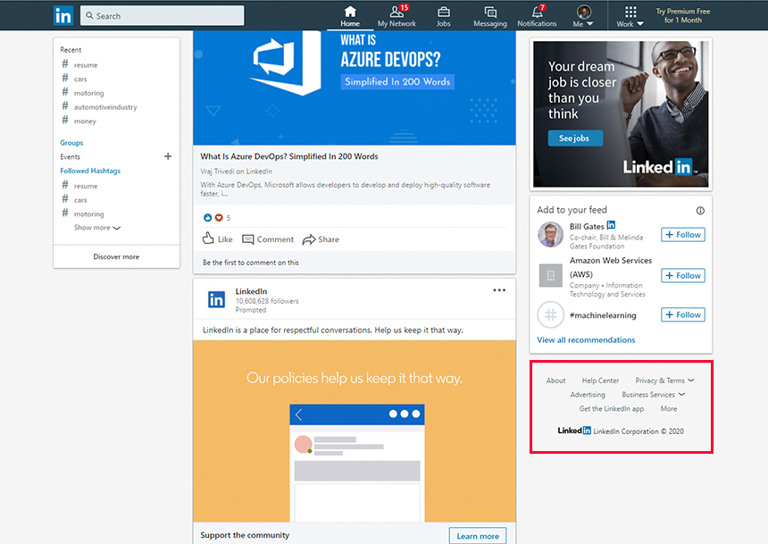
LinkedIn.com usually features the footer content at the bottom of the right rail.
Source: LinkedIn.com
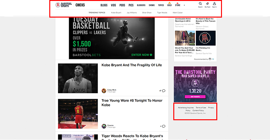
BarstoolSports.com features the footer content within the global navigation.
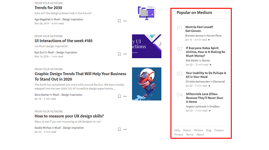
The footer’s content usually remains the same across all pages of a website. However, it is useful to customize the content of the footer according to the type of a web-page in some scenarios. These footers are known as ‘contextual’ footers. This type of footer can be ideal for websites receiving multiple visitors or different types of users. You may use the contextual footer to feature some vital pieces of information (relevant to a particular web page) if you were unable to feature these data on global navigation.
For Example –
The contextual footer of Medium.com includes some link-related posts
Source: Medium.com
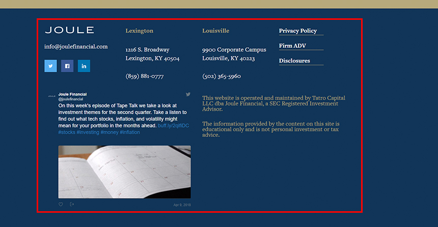
Fat Footer
The most viewed part of a web page has always been below the fold or top portion of a web page. However, in recent years, a change has been noticed in this pattern of users’ behavior, as many users have been found to engage more with the bottom of a web page in comparison to the top of that web page. These users are known as the most-engaged users who view the bottom of a web page three times longer than the top of a web page. The fat footers are ideal for such visitors, as these footers contain a plethora of data and various elements.
For Example –
Joulefinancial.com offers a great deal of information via the footer
Source: Joulefinancial.com
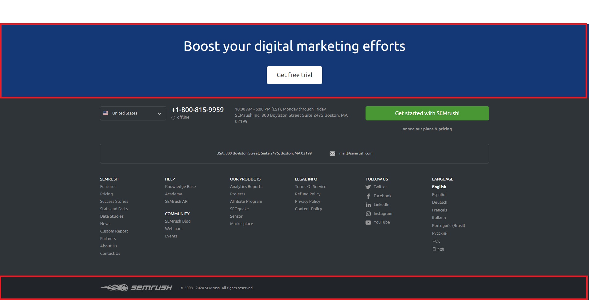
Sub-Footer
You can add an additional level to the web page footer when using sub-footers. These footers are useful if there is a particular type of information that you want to feature in a different way on your website. For example, you may add the subscribe buttons, social media icons, or copyright below the useful website links or other important data like the “Get a Free Trial” CTA or any giveaway above the main footer. See one of the best examples of SEMRush footer having a sub-footer above the main footer.
Source: SEMRush.com
CTA Focused Footer
These footers are used to suggest some type of action to the users, such as ‘Give Us a Shout’, ‘Hire Us’, or ‘Join Free Weekly Newsletter’. There are various other examples of CTA-focused footers and these footers are always followed by the phone number and e-mail address of a business.
Example –
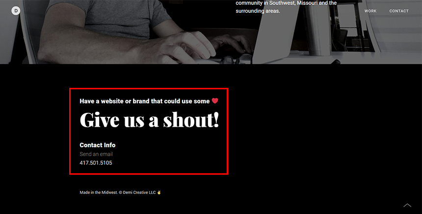
Demicreative.com or Bluestag.co.uk feature CTA-focused footers followed by the contact details.
Source: Demicreative.com
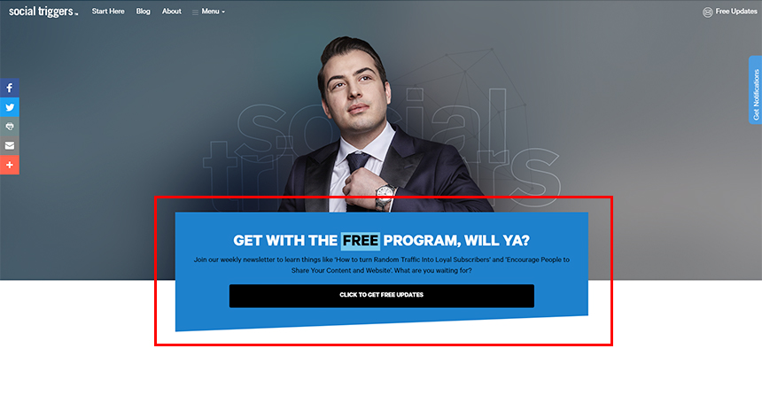
Socialtriggers.com has a traditional CTA-focused footer that features no contact details.
Source: Socialtriggers.com
Product Based Footer
On some websites, a list of different types of services or products is mentioned in the footer. These services or products are usually linked to various pages of a website and a user may get to these web pages by clicking on the services/products mentioned in the footer.
For Example –
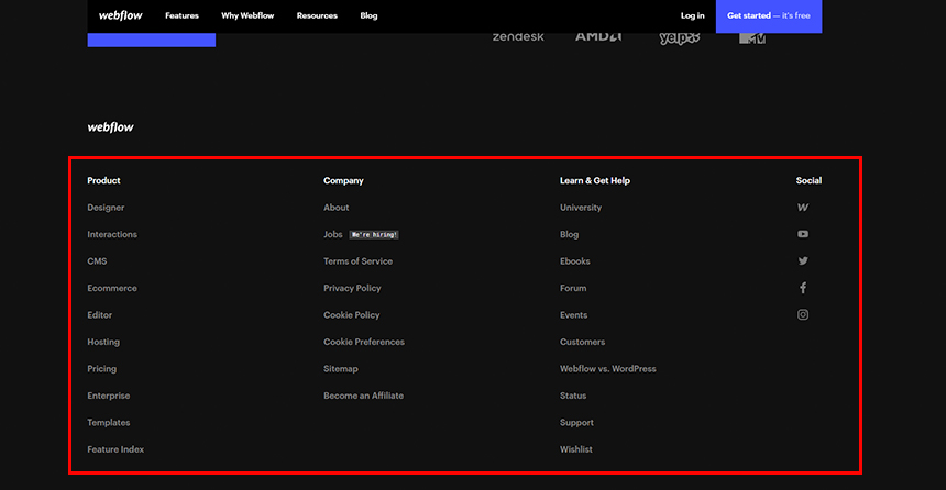
Webflow.com lists various products/services that can be used for the designing of eCommerce platforms.
Source: Webflow.com
Contact Focused Footer
As the name suggests, this type of footer includes different types of contact information for a business, such as an office address, map with Geolocation, phone number, and e-mail address. A contact-focused footer may even include the address of different branches if a company has offices in more than one location.
For Example –
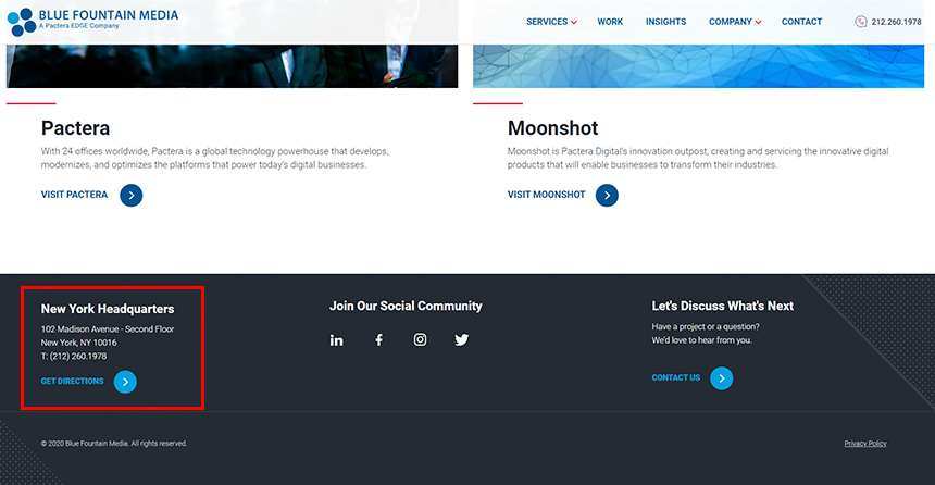
The footer of Bluefountainmedia.com is filled with the contact information
Source: BlueFountainMedia.com
To get an idea of how well a footer design works on your website, Wireframing can be a quick and cost-saving solution to try out different combinations.
What the Website Footer May Consist? [Basic Footer Elements]
The content of the footer or the type of elements present in the footer depends upon the demands of a business or the user’s goals (the final states that users want to reach). The web designers select different types of footer elements due to this reason and some common examples of footer elements have been listed below.
Utility Links/Contact Information
Most websites include utility navigation or utility links in the footer. These links point to the following details of a business.
Contact information (address, phone number as well as a link to live web chatting)
Privacy policy
Customer-service information
Terms of use
It is prudent to use the aforementioned links at the footer even if you have mentioned these details at the top of a web page, as many users search for contact information or the details associated with customer support at the footer.
Main (Global) Navigation/Quick Links
The main navigation can be included in the footer along with the header of a web page. This feature is extremely useful for long web pages, as it enables a user to move to different sections of a website without scrolling to the top in order to reach the main navigation.
Secondary-Task Links
If you want to help the visitors to your website find additional content that is not directly related to the website’s main objective, then you may include the secondary task links to the footer. The following list may give you an example of the secondary tasks to include in the links and these tasks are not usually added to the global navigation or utility navigation.
Primary tasks for the content creators
Evaluating the investor information
Applying for a job with the company
Accessing Media Kit (a document that contains details of a business, products or events ) along with other PR information
Locating specifications of a product or documentation of a service
Locating affiliates of the company
Site Map
A site map provides a list of pages on a website. Therefore, the style-map-styled footer features the components of global navigation along with the web pages that are absent in global navigation. This type of footer exposes the lower-level subcategories of the main categories and is useful in the following scenarios.
To expose the underlying topics that are not obvious at the global navigation level
To increase awareness regarding a website’s primary content
To remind users regarding the primary offerings of a company
It is important to remember that the Site-map footer component may not include all the web pages unless there are fewer than 26 pages on a website. In this scenario, you may feature a complete site map on a separate web page and provide a link to this web page at the footer. A large website with multiple levels of domain or information benefits from this type of footer component.
Awards & Recognitions
It is a proven fact that businesses with awards and positive testimonials can quickly instill credibility into visitors’ minds. Therefore, it is a sensible decision to feature the awards and testimonies in the footer if you want to win the trust of the users and want to build authority.
However, it is important to remember that featuring numerous testimonials or awards may deliver the wrong message to the visitors of your website. They may believe that a company is featuring multiple testimonials or awards because it does not have enough maturity or stability.
Therefore, it is prudent to run a usability test or A/B test with the target audience in order to determine if this strategy is suitable for the target customer or to determine the number of testimonials to be featured at the footer without delivering a wrong message to the users.
Other Brands of the Same Business Organization
A large business organization may own multiple brands or may preside over numerous smaller companies. These businesses generally use Universal navigation to connect child companies to the parent company.
Universal navigation provides a link to a website’s homepage from the Subsites (subordinate sites), Microsites (individual web pages), or various other sections of a website.
These businesses may equally benefit from including a list of brands/subsidiaries in the footer in order to underpin the awareness of other companies/brands within a company’s portfolio.
Email Newsletters & Social Media
The web page footer may even be used to increase customers’ engagement, as most users scroll down to the footer in order to find information regarding promotional offers or coupons or to stay updated with regards to the product releases or sales of a business. Hence, the footer may include prompts for mailing list sign-ups, social-media links or links to a company’s social media accounts.
E-mail newsletters are one type of e-mail communication sent to the audience in order to deliver the latest news, tips, or updates regarding a company or its products and services. The e-mail newsletters keep the subscribers engaged, connected, and informed regarding what is new with an organization or business and you may include the e-mail newsletters in the footer to increase users’ engagement.
The links to social media accounts can be equally useful in increasing the engagement of the users. However, it is important to consider how frequently you post on social media platforms before embedding a widget for social-media feed into the footer. You need not embed this widget if you have a less active social media account. However, there is no negative effect on your business if you feature links to social media accounts in the footer.
The importance of web page footers may have changed since its introduction in the 1990s and the design concept has also undergone changes accordingly. However, a few problems with the footer still persist and the following tips may help you avoid/resolve these issues.
Problem 1: Multiple Levels of Hierarchy
It is important to include only important information in the footer. For example, it is not essential to include an entire site map of large websites with multiple web pages in the footer.
Solution
It is essential to prioritize the content and to display the links to the first-level or second-level categories in the Information Architecture (IA). You may feature the link to a lower-level web page if this page is important instead of showing all the levels of the information hierarchy.
Problem 2: Unclear Information Hierarchy
If a link on a website has no relation to the secondary tasks or global navigation, then it is called an orphan link. In many websites, the footer includes ‘orphan links’ along with or devoid of other links. The users may not spend a lot of time looking at the footer if it has no pattern of organization.
Solution
In this scenario, it is prudent to use visual-design patterns in order to indicate the visual hierarchy, as it conveys the information hierarchy of the items at the footer with clarity to the users.
Problem 3: Unclear Link Names
In many scenarios, the Resources link on footers sometimes represents the conventional footers with different names. It may lead to confusion and make it difficult for users to understand the purpose of the link.
Solution
It is important to stick to conventional and easily understandable terms in order to resolve this problem. A usability test may help you find out the terms that are confusing to the users.
Conclusion
It all depends on the purpose of your site and the needs of your visitors (Give space to what your business offers to the audience).
Are you a big eCommerce site? Lots of links may help to occupy the footer space.
Is customer service busy? Add that info down there.
Just ask yourself, do your visitors have an important question that isn’t answered in the header or in the rest part of your website?
If so, add it to the footer.
Let’s wrap up here…
You can share your thoughts and experiences on more footer examples, in below comment box… Thank You!
Nisarg Pandya
Project Manager
Experienced Project Manager and Scrum Master at KrishaWeb, delivers expertise in Scrum methodologies, Laravel, React.js, UX design, and project management, ensuring efficient project delivery and agile implementation.