A SaaS website has a conversion goal that is both simple and ruthlessly demanding: get the visitor from landing to trial or demo request in the fewest possible steps. The product is invisible. Visitors cannot touch it, smell it, or see it on their body. The website has to do the entire job of making an intangible software product feel worth paying for, worth trusting, and worth the friction of adopting.
At KrishaWeb, we have built websites for SaaS companies, product-led platforms, and B2B software businesses since 2008. The pattern that holds across every high-converting SaaS website: a clear problem statement in the hero, immediate evidence that the product solves it, and a friction-minimised path to trial.
KrishaWeb has designed and built saas website designs since 2008. The pattern that holds across every high-performing example: design decisions made in service of the visitor’s actual goal, not the agency’s portfolio.
Table Of Contents
Table Of Contents
12 Best SaaS Website Designs to Take Inspiration in 2026
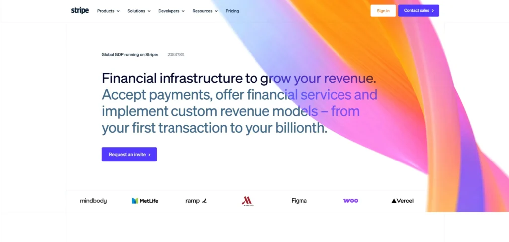
1. Stripe
Stripe’s website is the most studied example in SaaS web design for a reason. The hero states the product category and the primary benefit in one sentence. The documentation is prominently linked from the homepage, signalling that Stripe respects the intelligence of its developer audience. Code examples appear in the hero section, communicating technical quality before the visitor reaches a product page.
Design lesson: In SaaS, showing the product in the hero section (a screenshot, a code snippet, or an interface demo) is more persuasive than describing it. Stripe shows code. That is the argument for developers.
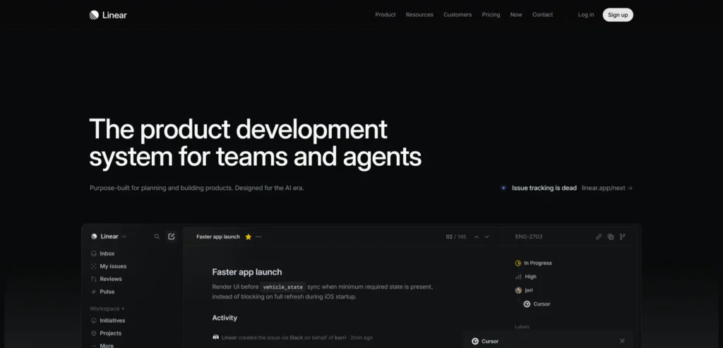
2. Linear
Linear’s website is a masterclass in product-led SaaS marketing. The homepage uses the product interface itself as the primary visual (the actual application, not a marketing representation of it. The copy is spare and specific. The value proposition is communicated through the product’s visual quality rather than through claims about it.
Design lesson: Showing the actual product interface in the hero section, rather than an abstract representation of it, builds trust and sets accurate expectations. Visitors who have seen the real interface before they sign up have lower churn rates because the product matches what they expected.
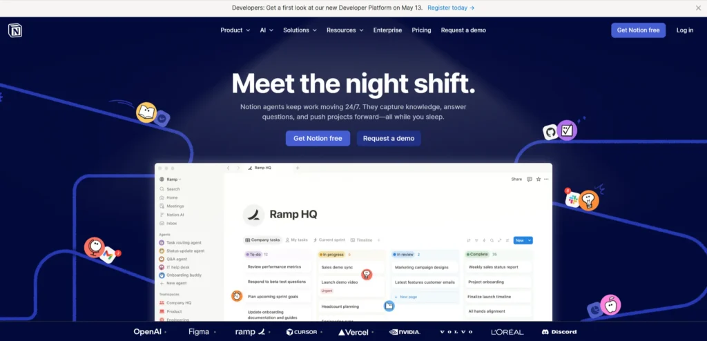
3. Notion
Notion’s website has evolved to reflect the product’s positioning as a workspace that replaces multiple tools. The homepage showcases templates and use cases rather than feature lists, which mirrors how Notion users actually think about the product. Social proof is specific: named companies with recognizable logos rather than generic enterprise testimonials.
Design lesson: Use cases and templates are more persuasive than feature lists for horizontal SaaS products that can serve multiple job functions. Showing what visitors can do with the product, not what the product can do, converts at higher rates.
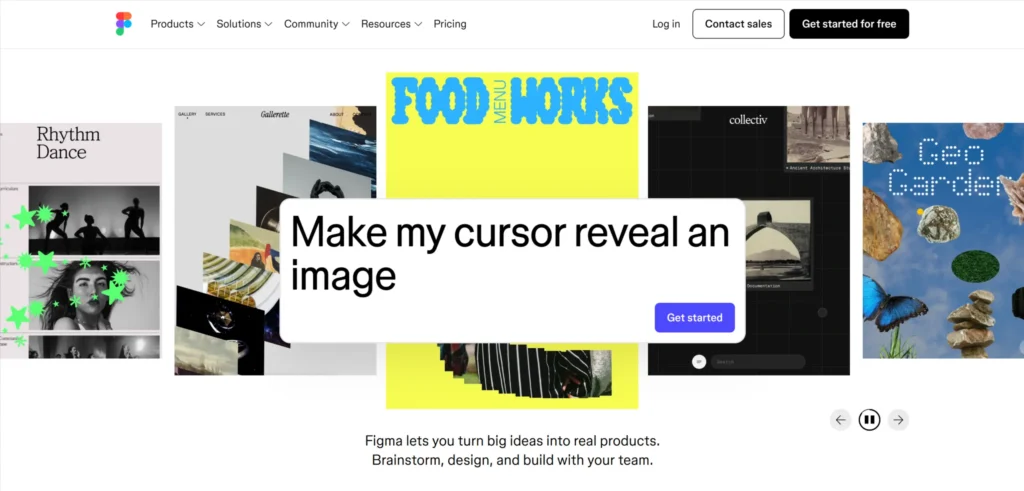
4. Figma
Figma’s website leads with collaboration as the primary product differentiation, not design functionality. The homepage demonstrates real-time multiplayer design in a way that communicates something competitors cannot match through copy. The community content (plugins, templates, and design inspiration) is prominently featured, showing that Figma is a platform with an ecosystem rather than a standalone tool.
Design lesson: For collaborative SaaS products, demonstrating the collaboration in the hero (not describing it) is the most effective differentiation. What a competitor can describe is not differentiated. What they cannot show is.
5. Webflow
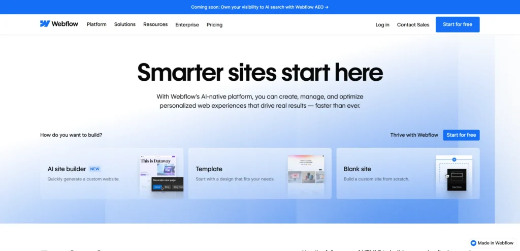
Webflow’s website has to serve two audiences with different motivations — designers who want visual development tools, and businesses looking for a CMS and hosting solution. The homepage navigation separates these audiences clearly. Showcase content featuring sites built in Webflow demonstrates capability more persuasively than feature descriptions. The community and marketplace content signals ecosystem maturity.
Design lesson: SaaS products serving multiple buyer personas need homepage navigation that separates journeys clearly. Showing visitors content relevant to their role earlier in the journey reduces the drop-off that comes from feeling like the product is not quite right for them.
6. Intercom
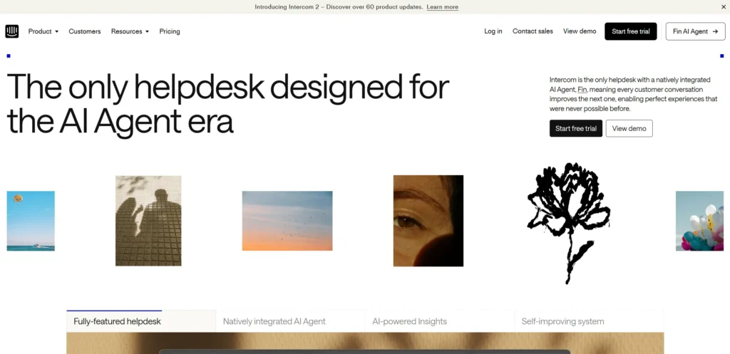
Intercom’s website communicates the breadth of their customer communication platform through organized product pages that each address a specific use case — support, marketing, engagement. The pricing page is detailed and allows visitors to self-select the plan that matches their team size and feature requirements. Social proof is from recognizable technology companies rather than generic business logos.
Design lesson: For multi-feature SaaS platforms, organising the product around use cases rather than feature lists reduces the cognitive load of evaluating whether the platform is right for a specific job.
7. Slack
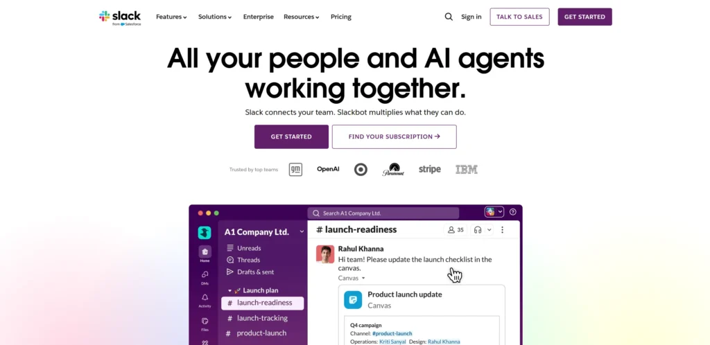
Slack’s website has matured to reflect enterprise positioning while maintaining the approachable brand personality that made it successful at SMB scale. The homepage balances productivity claims with the human side of team communication. Security and compliance content is accessible from the navigation, which matters for enterprise buyers whose procurement process requires it.
Design lesson: SaaS products that have grown from SMB to enterprise need website navigation that serves both the individual buyer who can sign up immediately and the enterprise procurement team that needs compliance documentation.
8. Loom
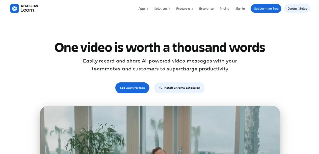
Loom’s website leads with the problem — meetings that could be recordings — before presenting the product as the solution. This problem-first framing creates immediate resonance with visitors who have experienced exactly this frustration. The product demo video on the homepage is short and shows the core value proposition in under 90 seconds.
Design lesson: A hero section that names the problem before presenting the product creates resonance with visitors who have experienced that problem. ‘Problem, solution’ framing consistently outperforms ‘product, features’ framing on SaaS landing pages.
9. Airtable
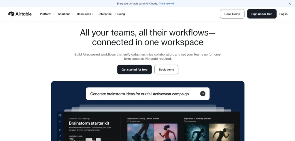
Airtable’s website communicates the product’s flexibility — a database that adapts to any workflow — through a template gallery that shows it configured for dozens of different use cases. This approach handles the ‘what is it for’ question that confuses first-time visitors to horizontally flexible products by answering it with concrete examples rather than abstract descriptions.
Design lesson: For flexible SaaS products that can be applied to many use cases, a template gallery on the homepage is one of the most effective ways to communicate applicability without overwhelming the visitor with feature explanations.
10. Calendly
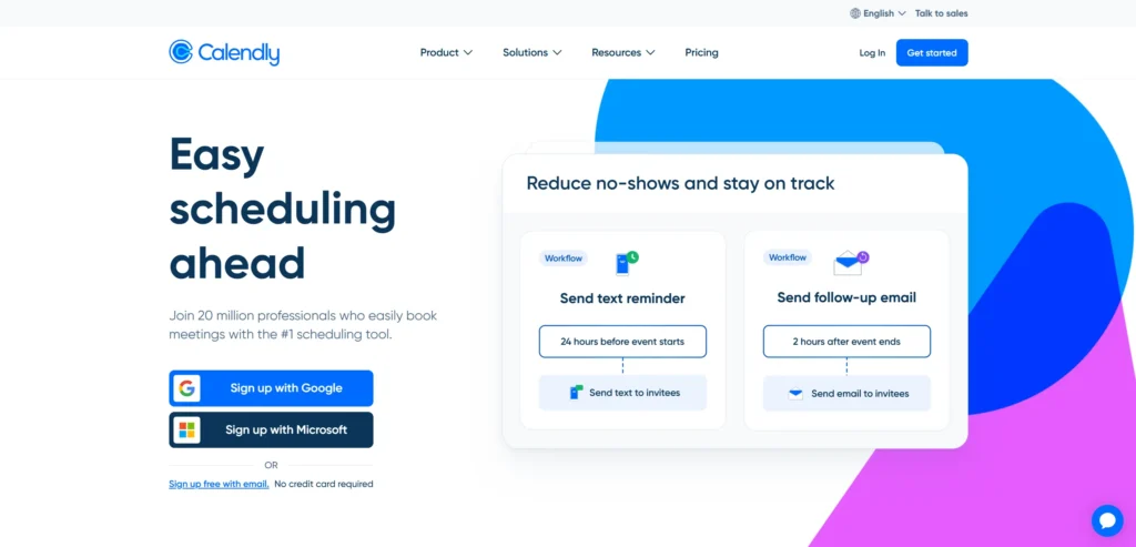
Calendly’s website communicates a single value proposition — scheduling without back-and-forth email — with extreme clarity and specificity. The homepage does not try to expand the product’s positioning beyond what it does. The sign-up CTA is prominent, and the first step is genuinely one click. Pricing is transparent, and the free tier is clearly communicated.
Design lesson: SaaS products with a single clear value proposition should resist the temptation to expand the positioning on the homepage. Clarity converts at higher rates than breadth. Calendly’s homepage has not changed its core message significantly in several years because that clarity is what drives its conversion rate.
11. HubSpot
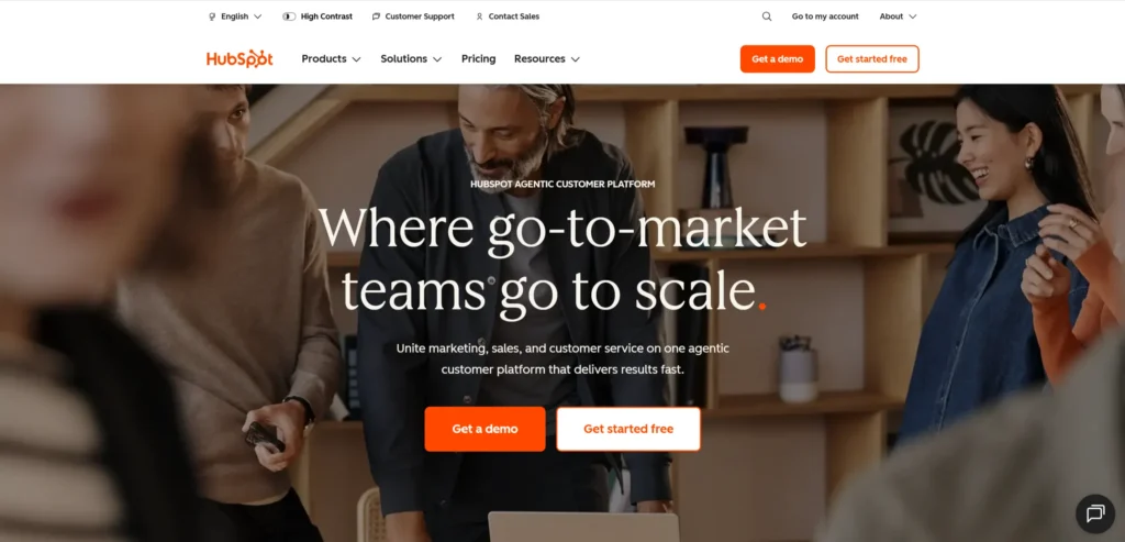
HubSpot’s website manages the complexity of a full CRM platform through hub-specific navigation — Marketing Hub, Sales Hub, Service Hub — that routes each visitor to the relevant product before presenting pricing or demos. The content marketing heritage of the company shows in the depth and quality of the resource section, which drives significant organic traffic from buyers at every stage of the consideration process.
Design lesson: For large SaaS platforms with multiple products, hub-based navigation that routes visitors to the relevant product section before they encounter pricing converts better than presenting the full platform breadth on a single homepage.
12. Miro
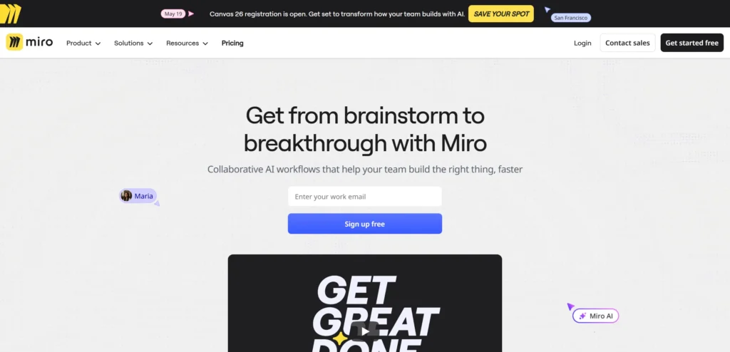
Miro’s website communicates collaborative visual thinking through the visual quality of its own design. The template gallery is prominent and comprehensive. Use case navigation separates engineering, design, and business audiences. The enterprise security content is accessible and detailed. The free tier and pricing page are transparent and allow self-service evaluation.
Design lesson: Template galleries work particularly well for visual collaboration tools because they show the product in use for real work rather than in an abstract product screenshot. The template is the demo.
What These SaaS Website Designs Have in Common
Looking across all 12 examples, these patterns appear consistently in the ones that work best commercially, not just aesthetically.
Product interface or demo shown in the hero section, not described
Problem-first hero framing before the product is presented
Use cases and templates rather than feature lists as the primary navigation mode
Transparent pricing that allows self-service evaluation
Social proof from recognizable named companies rather than anonymous testimonials
5 Design Elements Every SaaS Website Designs to Meet Needs
Whether you are building from scratch or redesigning an existing site, these five elements consistently separate high-performing examples from functional but forgettable ones.
1. A hero section that names a specific problem before presenting the product as the solution
A hero section that names a specific problem before presenting the product as the solution
2. The actual product interface shown in the hero or immediately below it, not a marketing illustration of it
The actual product interface is shown in the hero or immediately below it, not a marketing illustration of it
3. Use case navigation that routes different buyer personas to relevant product content
Use case navigation that routes different buyer personas to relevant product content
4. Transparent pricing that allows self-service evaluation without requiring a sales conversation
Transparent pricing that allows self-service evaluation without requiring a sales conversation
5. Social proof from named companies with recognisable logos, not anonymous testimonials
Social proof from named companies with recognisable logos, not anonymous testimonials
AI Implementation for SaaS Websites in 2026
Most saas website design articles cover design examples. Almost none address AI implementation, which is where the commercial gap is opening in 2026. The saas website designs that implement these features in the next 12 months will have a measurable advantage over those that do not.
1. AI-Powered Demo and Onboarding Personalization
A B2B SaaS visitor who tells the website their role, team size, and primary use case should see a personalised product tour or demo tailored to their situation rather than a generic overview. AI intake flows that personalize the demo or trial onboarding experience based on visitor-provided context reduce time-to-value and improve trial-to-paid conversion rates. Several leading SaaS companies, including Intercom and HubSpot have implemented versions of this with measurable impact on activation rates.
2. AI Chat for Pre-Sales Technical Qualification
SaaS buyers — particularly at the B2B mid-market — have technical questions about integration, security, compliance, and data residency that generic marketing content does not answer. An AI chat assistant trained on technical documentation, security whitepapers, and integration capabilities can answer these questions instantly rather than queuing them for a sales development rep. This is particularly valuable for SaaS products with complex compliance requirements where the buyer’s IT team is part of the evaluation.
3. Predictive Pricing Page Personalisation
SaaS pricing pages have high exit rates because visitors at different stages of evaluation respond to pricing information differently. An early-stage visitor overwhelmed by a complex pricing table will exit. A late-stage buyer who cannot find the enterprise pricing page will exit in frustration. AI-powered pricing page personalization that adapts the information density and emphasis based on visitor behavior signals serves both audiences better than a static pricing page.
4. AI-Powered Content Recommendation for the Resource Hub
SaaS companies with content marketing archives of hundreds of articles, guides, and templates generate significant organic traffic but convert a small percentage of that traffic into trials or demos. AI-powered content recommendations that identify a visitor’s job-to-be-done from their reading pattern and surface the most relevant case study or trial offer at the right point in their reading session improve content-to-trial conversion rates without additional content production.
KrishaWeb builds AI-integrated SaaS websites on WordPress and other platforms. If your current site is not using these features, our team can assess what to implement first based on your specific conversion goals.
A good SaaS website communicates a specific problem, shows the product solving it, and provides a path to trial or demo that requires minimal friction. The three most common failures on SaaS websites are: a hero section that describes the product rather than showing it, a feature list in place of use cases, and a trial or demo CTA that requires too many steps to reach.
How important is the pricing page on a SaaS website?
Very important. SaaS buyers use pricing pages to self-qualify and to understand whether the product is financially within range before investing time in an evaluation. A pricing page that hides pricing or requires a sales call to access pricing information loses a significant proportion of self-service buyers. Transparent pricing with clear tier differentiation converts the self-service segment and lets the sales team focus on enterprise deals that genuinely require configuration.
Should a SaaS website use a product demo video?
A short, specific product demo video — under two minutes — that shows the core value proposition being used to solve the problem stated in the hero converts well when placed on the homepage. Long product tour videos and webinar-style demos convert poorly from homepage placement. The homepage video’s job is to create confidence that the product works as claimed, not to teach the product.
How should a SaaS website handle multiple buyer personas?
Persona-based navigation that separates engineering, design, and business audiences into different content journeys converts better than a single homepage that tries to speak to all three. Use case-based navigation achieves the same result by routing visitors to the content relevant to their specific job to be done rather than requiring them to read through content intended for other buyer types.
How can AI improve a SaaS website?
Personalised demo onboarding, pre-sales technical qualification chat, adaptive pricing page presentation, and content recommendation that identifies a visitor’s stage and surfaces the most relevant trial offer are the AI implementations that deliver the most measurable impact on SaaS website conversion rates in 2026.
Conclusion
The 12 saas website designs on this list span different scales, budgets, and markets. What they share is not production budget or agency pedigree. It is a commitment to treating the website as a genuine commercial and brand tool rather than a digital brochure.
The design elements that matter most in this category are not complex or expensive to implement. Strong photography, a clear path to the primary conversion action, social proof specific enough to be credible, and mobile performance that matches desktop quality — these are achievable at almost any budget with the right priorities and the right Web design service.
If your current SaaS website is not doing these things, talk to KrishaWeb’s web design team about what a focused redesign would look like for your specific goals.
Ready to improve your website? KrishaWeb has been designing and developing conversion-focused websites since 2008. Tell us your goals, and we will tell you the right approach.
Disclaimer: This article is intended for informational and inspirational purposes only. The website examples featured are owned by their respective organizations. KrishaWeb has no affiliation with any of the websites referenced unless otherwise stated. All observations, statistics, and design notes reflect research current as of April 2026 and may change over time.
Nisarg Pandya
Project Manager
Experienced Project Manager and Scrum Master at KrishaWeb, delivers expertise in Scrum methodologies, Laravel, React.js, UX design, and project management, ensuring efficient project delivery and agile implementation.




 KrishaLabs
 KrishaStudio
 KrishaStore