A bakery website has one job before everything else: make visitors hungry. The moment someone lands on your homepage, the photography, typography, and layout should do to them what the smell of fresh bread does when they walk past your door. Most bakery websites do not do that. They are functional but forgettable, which in a category where emotion drives the purchase decision is a commercial problem.
At KrishaWeb, we have designed and built websites for food service businesses, eCommerce bakeries, and artisan food brands since 2008. The pattern we see across every bakery website that actually converts: strong photography first, a clear path to ordering second, and a brand voice that makes the bakery feel like somewhere you already want to go.
This article covers 15 of the best bakery website designs currently live in 2026, what each one does well, and what specific design decisions you can take from each one into your own bakery website project.
KrishaWeb note: 60 to 70% of bakery website traffic comes from mobile. Every example on this list is fully responsive. If your current bakery website is not, that is the highest-priority fix before anything else in your design.
Table Of Contents
Table Of Contents
What Makes a Bakery Website Actually Work in 2026
Before looking at specific examples, it helps to understand what separates bakery websites that drive orders from ones that just display information. There are four factors that matter consistently across successful bakery web designs.
Photography that does the selling before the copy does
Bakery products are visual purchases. Visitors decide in the first few seconds whether your products look worth buying. That decision is made almost entirely by the quality and composition of the photography on your homepage and product pages. Poor-quality or small images are the single most common reason bakery websites underperform. Real food photography, properly lit with accurate colors, consistently outperforms stock imagery and outperforms smartphone snapshots regardless of how good the phone camera is.
A clear and short path to ordering
The most common navigation failure on bakery websites is burying the ordering option. Visitors who want to place an order should reach the order form or product listing in one click from the homepage. Every additional step between landing and checkout loses a percentage of visitors who would have ordered. The best bakery websites in this list make the order path impossible to miss.
Brand identity that creates a feeling before you read anything
Color palette, typography, and visual style work together to establish what kind of bakery you are before a visitor reads a word of copy. An artisan sourdough bakery and a celebration cake studio are selling different products and attract different customers. A bakery website that does not have a clear visual identity fails to create the emotional pull that turns a browsing visitor into a paying customer.
Mobile-first layout and fast load times
With 60 to 70% of bakery traffic coming from mobile devices, a website that looks good on desktop but awkward on a phone is losing more than half its visitors to a poor experience. Fast load times matter doubly on mobile because bakery customers are often checking your website while they are already nearby. A site that takes four seconds to load on a 4G connection loses customers who would have walked in.
15 Best Bakery Website Designs in 2026
1. King Arthur Baking Company
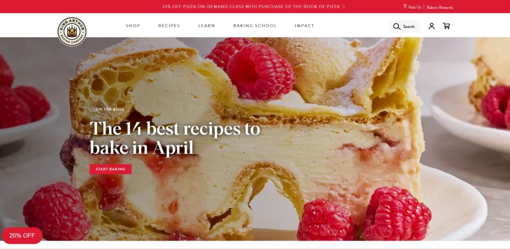
King Arthur is one of the most recognized baking brands in the US, and their website reflects that brand authority at every touchpoint. The homepage leads with high-resolution photography of finished baked goods alongside the ingredients that made them, which reinforces both product quality and the educational positioning that makes King Arthur different from a standard bakery brand.
The navigation is deep without feeling complicated. Recipes, products, and professional baker resources each live in clearly delineated sections. The warm cream and red color palette appears consistently across every page, making the entire experience feel cohesive rather than patched together across site updates.
Design lesson: A content strategy that serves both home bakers and professional customers is unusual in this category. The breadth of their navigation reflects genuine audience research rather than a default bakery template.
2. Magnolia Bakery
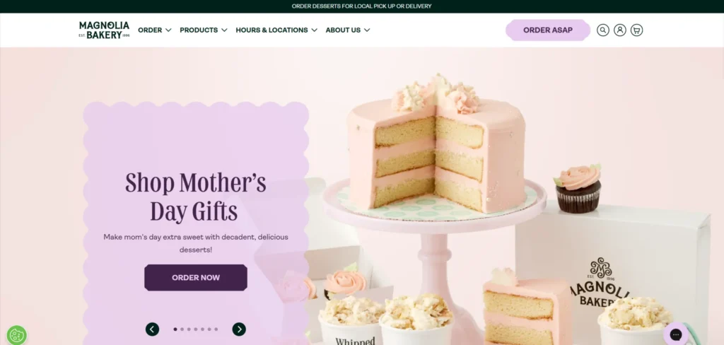
Magnolia Bakery’s website is a masterclass in turning brand personality into visual language. Pastel color blocking, product photography that leans into the nostalgic and celebratory nature of their products, and a navigation structure that organises products by occasion rather than by product type. If you are buying a birthday cake versus a wedding cake versus a seasonal item, the site routes you to the right place without you having to think about it.
The eCommerce structure is clean. Product pages include prominent CTAs, clear size and flavour options, and pricing that does not require you to request a quote for anything in the standard range. The GIFs used in product sections add personality without slowing the page down noticeably.
Design lesson: Organising products by occasion rather than product type is a conversion optimization that most bakery websites miss. It mirrors how customers actually think when they are making a purchase decision.
3. Levain Bakery
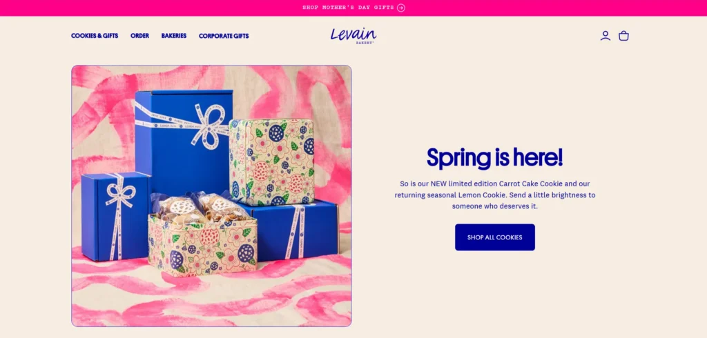
Levain is best known for its thick, oversized cookies, and the website makes this product identity impossible to miss from the first scroll. Large-format product photography dominates the homepage. The color palette is warm and neutral with dark chocolate and caramel tones that feel true to the product. Every page on the site reinforces the same brand positioning: this is a product that is extraordinary, and worth seeking out.
The online ordering system is location-aware, routing customers to the delivery options available for their area without requiring them to navigate a separate section. This is particularly well implemented given the brand’s multi-city physical presence alongside nationwide shipping.
Design lesson: When your product has a clear physical distinction, let the photography be the hero section. Levain does not lead with copy. It leads with a close-up of a cookie that fills the viewport. That is the right call.
4. Tiff’s Treats
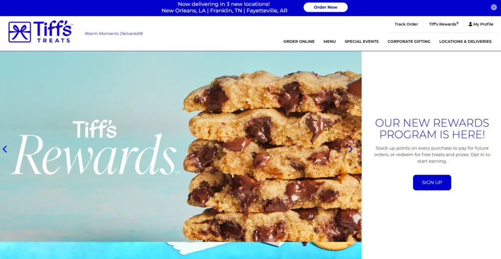
Tiff’s Treats built their business around warm cookie delivery, and the website communicates that positioning with speed and clarity. The homepage makes three things clear within two seconds of loading: what they sell, that it can be delivered warm, and how to order. The color scheme is energetic without being garish. Illustrations and animations add character without replacing the product photography that does the actual selling.
The order customisation flow deserves specific attention. Customers can build custom cookie boxes, choose add-ons, and schedule delivery in a process that feels more like a gift-building experience than a checkout flow. That framing increases average order value by positioning the purchase as something worth doing thoughtfully.
Design lesson: Structuring the ordering process as an experience rather than a transaction increases both conversion rate and average order value. The checkout becomes part of the enjoyment of buying.
5. Fabrique Bakery
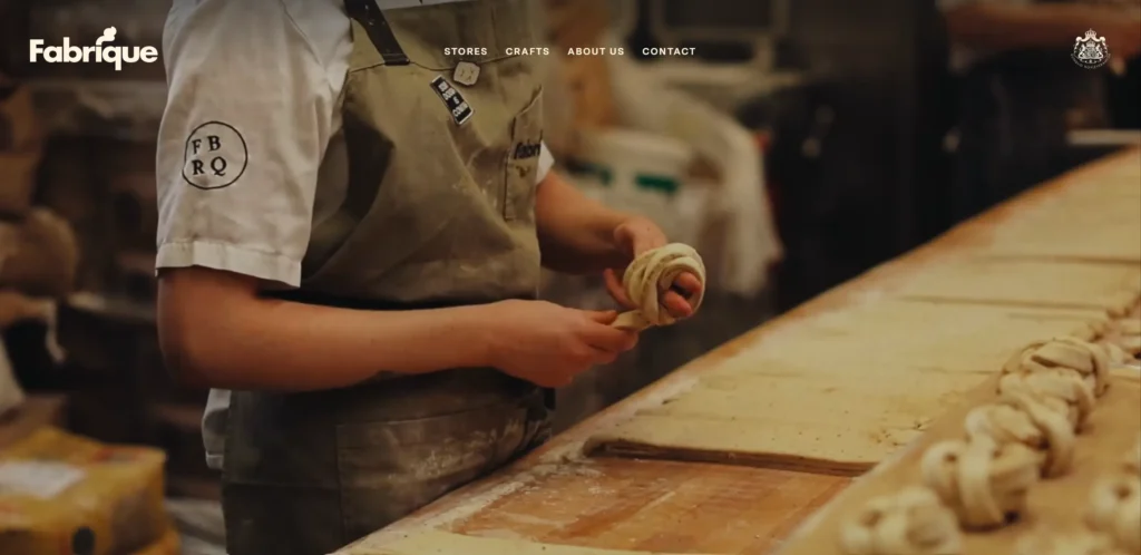
Fabrique is a Swedish artisan bakery chain with a website that communicates craft and quality through restraint rather than decoration. Full-width imagery, minimal text, and a color palette of off-white and dark natural tones create a browsing experience that feels like walking into a bakery where the quality speaks for itself. No promotional banners. No discount pop-ups. Just the product and the story behind it.
The multi-location structure is handled cleanly. Each location is given equal prominence in the navigation, and location-specific pages carry the same design quality as the homepage. This is unusually well executed for a multi-site bakery brand, where consistency across locations is typically the first thing that deteriorates.
Design lesson: Premium positioning requires design restraint. The more you add to a bakery website, the less premium it feels. Fabrique removes almost everything that is not the product and the story.
6. Flour Bakery and Cafe
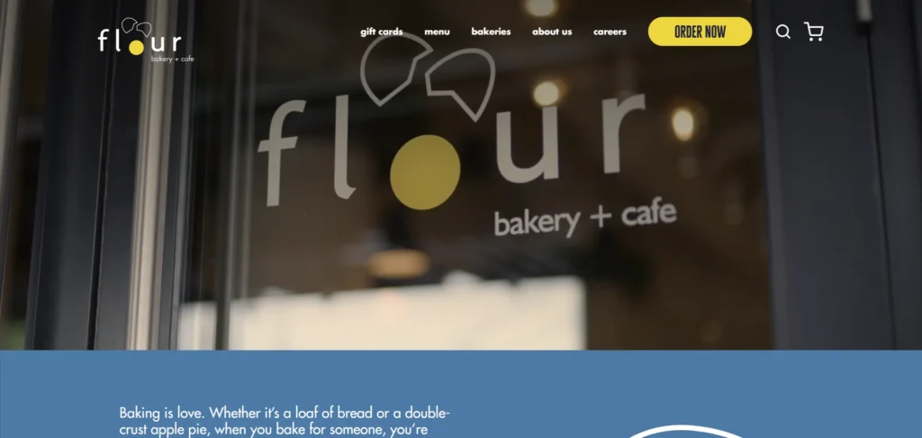
Flour is one of the few bakery websites that successfully integrates an eCommerce store with a content strategy. Recipe posts, behind-the-scenes content, and product pages all live within a coherent site architecture where each section reinforces the others. The photography throughout is consistent in quality and style, which gives the site a magazine-level finish despite being an independent bakery.
The online shop is built on Shopify and is exceptionally well configured. Clear product categories, good mobile performance, and a checkout process that requires minimal friction. The integration of blog and shop within a single navigation structure also generates organic search traffic that a shop-only site would not capture.
Design lesson: A bakery website with a content strategy outperforms one without on organic search and on brand trust. Flour’s recipe content drives visitors who would not have found the site through product searches.
7. Boudin Bakery
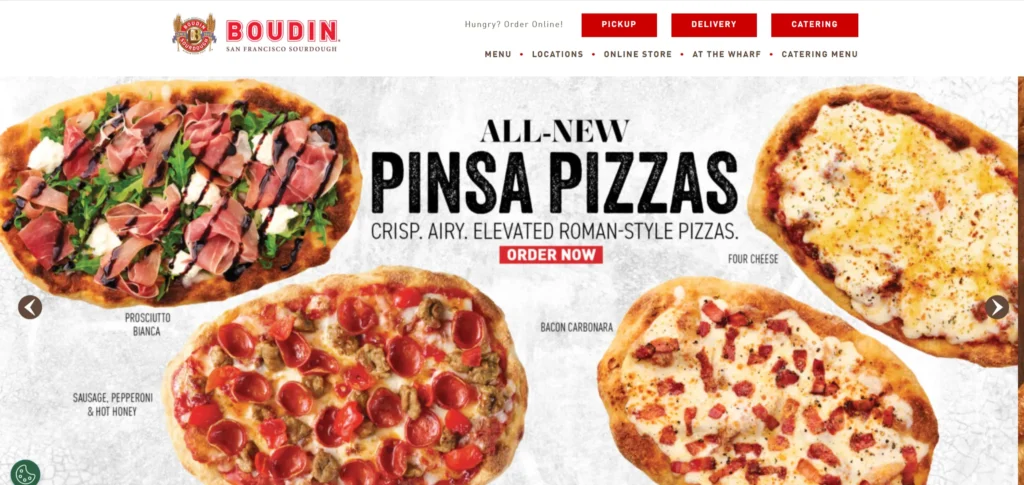
Boudin is San Francisco’s oldest bakery and their website treats that heritage as the primary asset rather than something to be mentioned in an About section. The homepage opens with their sourdough story, the imagery is atmospheric rather than purely promotional, and the tone of the copy communicates that this is a place with genuine history worth caring about.
The design uses subtle scroll-based animations to create a sense of movement through the brand story. Navigation is clean and the digital ordering section is well separated from the heritage content so visitors who are there to order find what they need without being forced through the storytelling first.
Design lesson: Heritage is a differentiator in the bakery category. If your bakery has a story worth telling, the website should lead with it rather than treating it as an afterthought.
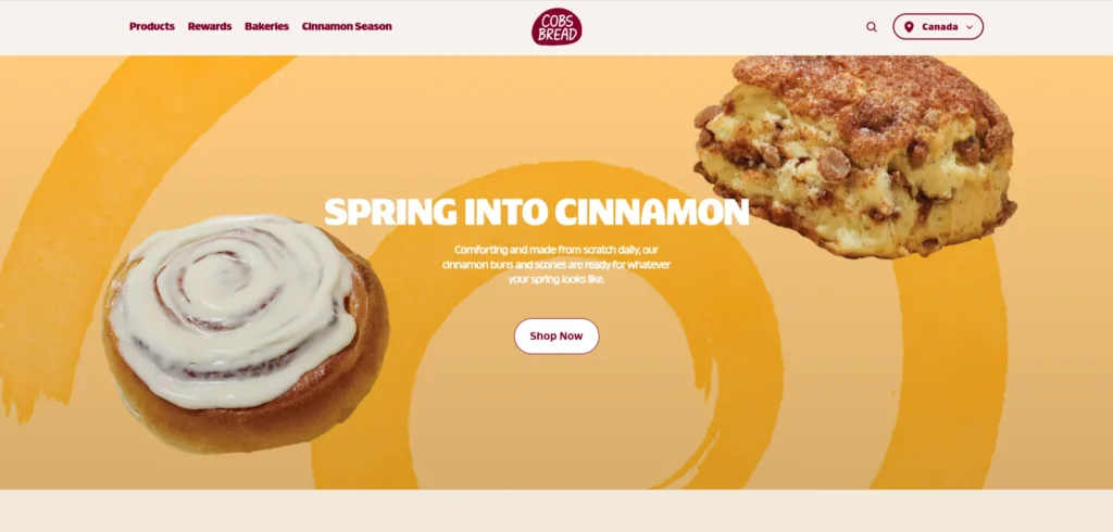
8. Cobs Bread
Cobs Bread operates as a franchise bakery chain, and its website reflects the challenge of communicating both corporate brand standards and local warmth at scale. They resolve this by leading with product photography that is genuinely appetising and structuring the site around practical customer needs: find a location, browse products, learn about ingredients.
The promotional section of the site is updated regularly, which keeps the homepage feeling current rather than static. The location finder is fast and mobile-friendly, which matters significantly for a business that relies on customers finding their nearest store quickly.
Design lesson: For multi-location bakery chains, the location finder is a conversion-critical feature. It should load instantly, work on mobile without requiring the customer to type a full address, and return results with practical information.
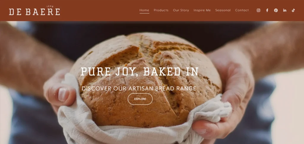
9. Debaere Bakery
Debaereis a UK artisan bakery whose homepage states its positioning in five words: Pure Joy, Baked In. That headline does the work most bakery websites spend three paragraphs attempting. The design earns it — warm, moody food photography shot against dark backgrounds creates a richness that feels indulgent rather than clinical, and the vintage-influenced typography communicates craft without signalling that the site was built on a free theme.
The navigation is clean — Products, Our Story, Inspire Me, Seasonal, Contact — and the Inspire Me section is a deliberately unconventional name for what is effectively a recipe and styling content section. It communicates that Debaere thinks about how their products are used, not just how they are made. The Seasonal section keeps the site current without requiring a full content overhaul for each period. Social proof comes through Instagram-embedded product photography that shows the bakes in real settings, adding credibility without the formality of a testimonials section.
Design lesson: A five-word brand headline that communicates the emotional experience of the product is more persuasive than a paragraph of copy describing it. Debaere’s Pure Joy, Baked In does more positioning work than most bakery About pages achieve in 500 words.
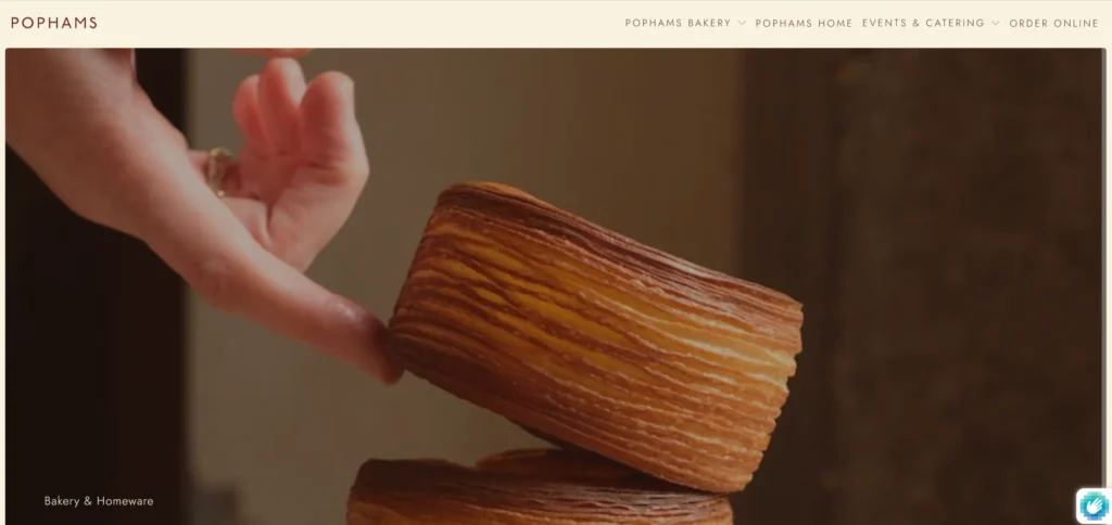
10. Pophams Bakery
Pophamsstarted as a single bakery in Islington in 2017 and has grown into a London lifestyle brand, three bakeries, a pasta restaurant, a homeware shop, and a workshop space, and the website communicates this evolution without losing its bakery identity. The homepage positions Pophams not as a place to buy bread but as a brand rooted in community and craftsmanship: traditional viennoiserie techniques, innovative flavors, and a commitment to local creative community that extends well beyond the baking.
The design is minimalist and confident. Product photography is shot in a consistent natural-light style across all three bakeries. The navigation integrates the homeware and gift card sections without making the site feel like two different businesses sharing a domain. What Pophams has achieved is rare for an artisan bakery website: the site communicates the brand’s ambition and growth without sacrificing the warmth that made people queue for the pastries in the first place.
Design lesson: Bakery brands that have grown beyond a single product category — into homeware, events, or retail — need a website architecture that integrates these extensions without diluting the core identity. Pophams does this by keeping the bakery as the anchor and treating everything else as extensions of the same lifestyle brand.
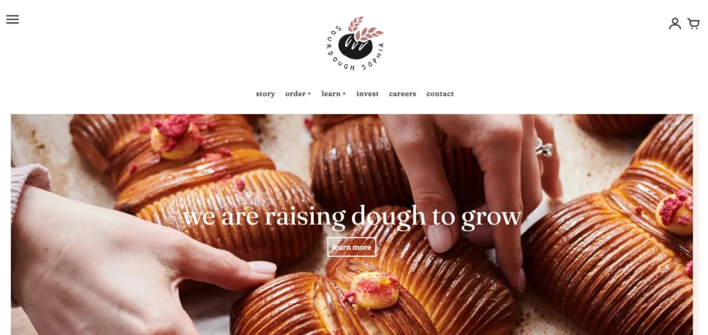
11. Sourdough Sophia
Sourdough Sophia was born during the 2020 lockdown in a home kitchen in Crouch End, North London, and the website carries the conviction of that origin story directly into its positioning. The brand promise, “real bread made of flour, water and salt, nothing else,” is the homepage headline, not a hidden values statement. This clarity communicates the product in one sentence more effectively than most artisan bakery websites manage in a full About page.
The website navigation reflects how the business has grown from a single bakery into a multi-strand operation: Bakery, Gift Cards, Courses, Online Courses, Invest, and Contact all sit in the top navigation, making the full commercial scope of the business immediately visible. The online ordering system is a separate integrated platform. The courses section handles both in-person workshops and digital content in a single navigation section. For a micro bakery that has grown into a community education business with an investor program, the website architecture is managing real complexity without feeling complicated to navigate.
Design lesson: Artisan bakeries with a loyal following should use the website to deepen that relationship through content and storytelling, not just to process orders.
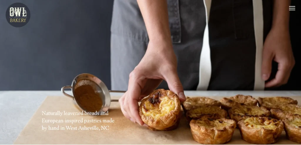
12. Owl Bakery
Owl Bakery’s website creates a coherent world from the first element you see. The illustrated owls and woodland motifs establish a visual identity that is immediately distinctive and memorable, which matters in a category where most bakery websites look broadly similar. The soft color palette creates warmth without the saccharine quality that affects many bakery site designs.
Navigation is clean with clearly marked sections for the menu, online ordering, and events. The events section is worth noting specifically: bakeries that host events or classes use this as both a revenue stream and a brand-building tool, and the website supports it with a page that handles the logistics without losing the visual character of the rest of the site.
Design lesson: A distinctive illustration-based visual identity creates brand recall that photography-only sites cannot match. If your brand has a character or story, illustration is worth considering as a primary design element.
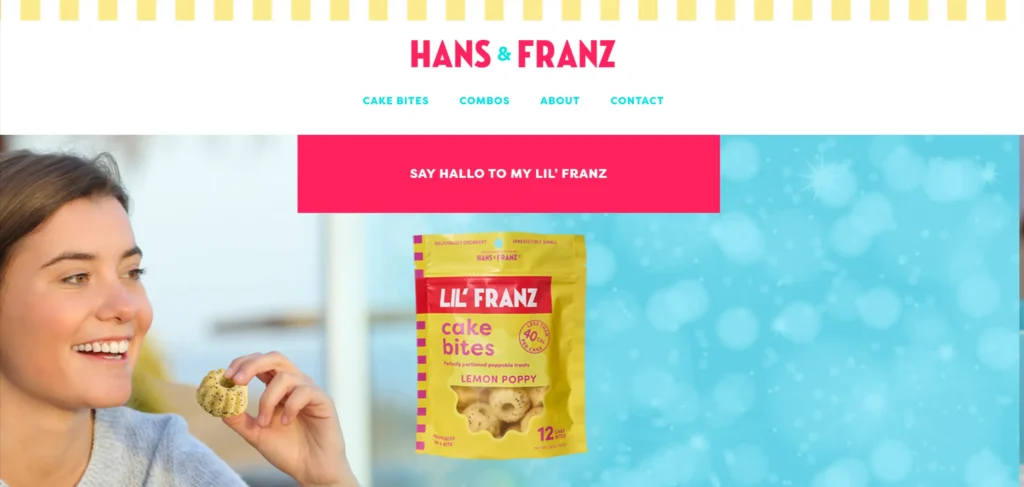
13. Hans and Franz Bakery
Hans and Franz is a bakery built on the tension between tradition and contemporary craft, and their website communicates this through a design that pairs handcraft imagery with modern layout conventions. The slideshow of handcrafted bread and pastry on the homepage is photographed and sequenced to feel like a gallery rather than a product listing.
The clear navigation sections covering menu, online ordering, and events serve different customer types without confusing the hierarchy. The warm color palette and cosiness of the design make the site feel like the bakery itself: somewhere you would want to spend time as well as somewhere you want to order from.
Design lesson: When your brand straddles tradition and modernity, the design system should do the same. Using traditional warmth in color and texture with contemporary layout conventions resolves this tension without compromising either.
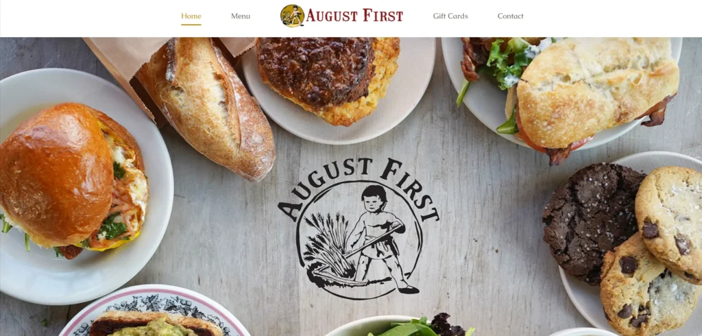
14. August First Bakery
August First is a Vermont bakery whose website design earns its place on this list through the quality of its photography and the clarity of its layout. High-resolution images of the baked goods appear throughout the site in a consistent warm-light style that makes every product look exactly like something you would drive across town to buy. The navigation is minimal and the information architecture is clean.
The site serves information about the menu, catering services, and location without any of those sections competing with the others for visual dominance. This restrained hierarchy keeps the photography as the primary communication tool, which is the right decision when the photography is this good.
Design lesson: When you have excellent food photography, the design’s job is to stay out of the way. A minimal layout that lets the photography lead consistently outperforms a visually complex design that competes with the product images.
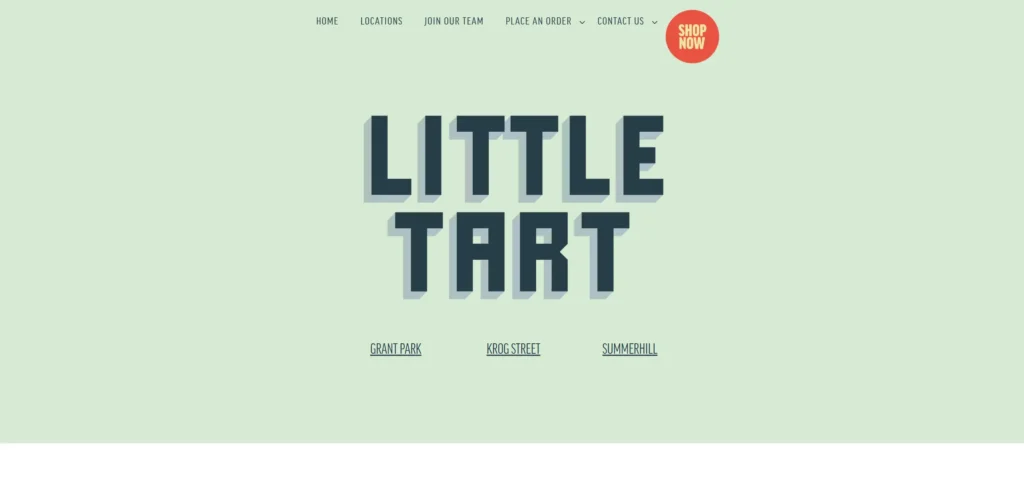
15. Little Tart Bakeshop
Little Tart is an Atlanta bakeshop focused on quality ingredients and honest pastry, and the website design reflects those values through its simplicity and visual restraint. Ample white space, clean typography, and photography that focuses on texture and composition rather than saturated color create a premium, artisanal feel without the bakery needing to tell you it is premium.
The multi-location navigation is well handled, with each location linking to its own page covering address, hours, and any location-specific menu items. The blog section is genuinely useful content rather than an SEO placeholder, covering topics that the bakery’s audience actually cares about.
Design lesson: White space is not empty space. It is the visual equivalent of silence between notes. Bakery websites that use white space confidently communicate a premium positioning that a crowded design cannot achieve regardless of how good the photography is.
What These Bakery Websites Have in Common
Looking across all 15 of these bakery website designs, five patterns appear consistently in the ones that work best commercially, not just aesthetically.
Photography is treated as the primary design element, not a supporting one
Every site on this list treats photography as the most important design decision, not an asset to be placed within a pre-existing layout. The photography is shot specifically for the website in most cases, and the layout is built around it rather than the other way around. Sites that use stock imagery or low-quality smartphone photography regardless of their layout quality do not achieve the same commercial result.
The ordering path is never more than two clicks from the homepage
Without exception, every bakery website on this list puts the path to ordering within one to two clicks of the homepage. The specific mechanism varies: some use a prominent hero CTA button, some use a top-level navigation item, and some use a sticky ordering bar. What does not vary is the priority. Ordering is never buried in a sub-menu or reachable only after scrolling through multiple sections of brand content.
Brand identity is expressed visually before it is stated in copy
Each of these bakeries has a distinct character, and that character is communicated through color, typography, and layout before any copy appears. The warmth, the craftsmanship, the heritage, the playfulness, or the restraint that defines each bakery is legible from the first viewport. This is the difference between a bakery website that has a brand and one that has branding applied to a generic template.
Mobile experience matches the desktop experience in quality
Every site on this list was designed with mobile as a genuine consideration rather than an afterthought. Navigation collapses cleanly on small screens, product images retain their quality, and the ordering process works without requiring desktop-level precision. For bakeries where customers frequently check the website while they are nearby and deciding whether to walk in, the mobile experience is commercially more important than the desktop experience.
Social proof is present and specific
The strongest examples on this list use reviews, testimonials, or press mentions that are specific enough to be credible. Generic five-star ratings without context carry almost no conversion weight. Reviews that describe the experience of a specific product, the freshness, the texture, or the occasion the customer bought for, carry significantly more weight because they give undecided visitors the specific information they were looking for.
5 Design Elements Every Bakery Website Needs
Whether you are building a new bakery website or redesigning an existing one, these five elements consistently separate high-performing bakery websites from functional but forgettable ones.
1. A hero section that makes visitors hungry before they read anything
The hero section is the most valuable real estate on your bakery website. Use it for a full-width, high-quality photograph or short video of your best product, lit correctly and photographed by someone who knows food photography. Add one headline that states what you are and one CTA button that leads to ordering. Do not use the hero section for a welcome message, a value proposition, or promotional information. Use it to make people want what you sell.
2. Product pages with enough visual and descriptive detail to replace the in-store experience
When customers cannot smell or touch your products, the product page has to do that work. Each product page needs multiple photography angles, a description that covers flavour, texture, and what occasions or moments the product suits, clear size and quantity options, and visible pricing. Missing any of these creates hesitation that loses sales. The bakeries on this list that sell online successfully all have product pages that are detailed enough to buy from confidently.
3. An ordering process that takes fewer than three minutes to complete
Time-to-order is one of the most measurable conversion factors on a bakery website. Every additional step, every required account creation, every unclear delivery option loses a percentage of customers who were ready to buy. Map your current ordering flow and remove every step that is not necessary to complete the purchase. If you are asking customers to create an account before they can check out, you are losing orders you should not be losing.
4. A mobile layout that works as well as the desktop version
Test your current bakery website on a real mobile phone, not a browser developer tools simulation. Navigate from the homepage to a product page to the checkout. Time how long it takes. If it takes more than 90 seconds to complete an order on mobile, that is a conversion problem. If any images are not loading correctly, any buttons require too much precision to tap reliably, or any text is too small to read without zooming, those are fixes that should take priority over any visual design improvements.
5. Social proof that is specific enough to be credible
A row of five-star ratings is decorative. A review that says ‘I ordered the celebration cake for my son’s birthday and it was the best cake we have had in 10 years, the lemon curd filling was extraordinary’ is a sales tool. Collect reviews that include product-specific detail and occasion context. Display them on product pages and on the homepage. If you have press coverage or awards, include those in a format that is visible without scrolling to the footer.
Building or redesigning a bakery website? KrishaWeb has designed and developed websites for food service businesses, artisan brands, and eCommerce bakeries since 2008. We build on WordPress and Shopify with mobile-first layouts, professional photography integration, and conversion-focused design. If your bakery website is not turning visitors into customers, talk to our web design team.
Every bakery website on this list does the fundamentals well. What almost none of them do yet is use AI in ways that are now practical and affordable for independent and mid-size bakeries. This is the content gap in most bakery website inspiration articles, and it is worth addressing directly because the bakeries that implement these features in the next 12 months will have a measurable commercial advantage over the ones that do not.
At KrishaWeb, we have started integrating AI features into food service and eCommerce websites for clients who were previously losing orders to friction in the customer journey. The pattern is consistent: AI does not replace the warmth and craft that makes a bakery brand worth caring about. It removes the operational friction that prevents customers from completing the purchase they already want to make.
AI Feature 1: AI-Powered Product Recommendations
A returning customer who bought a birthday cake last year should not see the same homepage as someone visiting your site for the first time. AI-powered recommendation engines can surface products based on a visitor’s previous purchase history, the occasion they last ordered for, and seasonal relevance. For a bakery selling custom cakes, this means showing the customer a personalized product selection before they have to navigate your catalog.
On Shopify, tools like LimeSpot and Rebuy implement this without custom development. On WordPress WooCommerce, plugins like WooCommerce Product Recommendations and Personizely handle the same function. The commercial result is a higher average order value and a shorter path to purchase for repeat customers, both of which are measurable within weeks of implementation.
AI Feature 2: AI Chat for Custom Order Enquiries
Custom orders are the highest-margin product category for most bakeries, and they are also the most frequently abandoned because the enquiry process is slow. A customer who wants a custom wedding cake visits the website, cannot find immediate answers to their questions about lead times, dietary options, or pricing tiers, and either sends an email that may not be answered for 24 hours or leaves and finds a competitor whose process is clearer.
An AI chat assistant trained on your bakery’s specific products, pricing structure, lead times, and ingredient information can answer these questions instantly at any hour. It can qualify the enquiry, capture the customer’s requirements, and trigger a notification to your team for follow-up. One In one reported bakery chatbot implementation, a custom order assistant engaged 250% more users in a single month than a static FAQ page achieved in over a year, with direct increases in custom order conversions. (Source: vendor case study — verify with your implementation partner before citing publicly.)
For implementation: Tidio and Intercom both offer AI chat products that can be trained on your bakery content without custom development. DocsBot AI is specifically designed for businesses that want a chatbot trained on their own documentation and product catalog. All three integrate with Shopify and WordPress.
AI Feature 3: AI-Generated Alt Text for Product Photography
Most bakery websites have dozens or hundreds of product images with missing or inadequate alt text. This is both an accessibility compliance risk and an SEO gap, because alt text is one of the primary signals search engines use to understand what product images depict. A bakery with 200 product images that all carry descriptive, keyword-relevant alt text is outperforming one with the same products and no alt text, purely through this one technical detail.
AI tools can now generate accurate, descriptive alt text for product photography at scale. Shopify’s native AI feature generates alt text suggestions for every product image. On WordPress, plugins like Imagify and Assistive include AI-generated alt text functionality. The output still needs human review for accuracy and brand tone, but it removes most of the manual labor from a task that most bakery websites have never completed.
AI Feature 4: Smart Search That Understands What Customers Actually Mean
A customer who types “something for my mum’s birthday” into a standard bakery website search gets no results or irrelevant ones, because the search is matching keywords rather than intent. An AI-powered semantic search understands that this customer wants a celebratory product suitable for a parent and surfaces your birthday cakes, personalized biscuit boxes, or afternoon tea options accordingly.
For bakeries with large product catalogs or multiple product categories, AI-powered search dramatically reduces the friction between a visitor arriving and finding the product they want. Searchanise and Boost Commerce both offer AI-powered search for Shopify. SearchWP with AI integration handles this on WordPress WooCommerce stores.
AI Feature 5: Automated Personalized Email Follow-Up
A customer who ordered a Christmas cake last December should receive a reminder email in late October. A customer who bought a birthday cake in April should receive a follow-up email in March next year. A customer who abandoned a custom cake enquiry should receive a personalized follow-up within 24 hours. None of these require manual management. AI-driven email automation handles all three based on purchase history and behavior, and the conversion rates on occasion-triggered emails for bakeries are significantly higher than broadcast promotional emails.
Klaviyo handles this on both Shopify and WooCommerce with AI-powered send time optimization and predictive segmentation. For bakeries that are not yet on an email marketing platform, this is the highest-ROI first step. The data required to run these automations is already being collected on every eCommerce bakery website. The AI layer turns that data into revenue.
KrishaWeb note: The bakeries that will pull ahead commercially in the next two years are not necessarily the ones with the best designs. They are the ones that combine a strong visual identity with AI-driven personalization, automation, and intelligent search. The design sets the first impression. The AI features drive the repeat purchase.
Frequently Asked Questions
What makes a good bakery website design?
A good bakery website design makes visitors want to buy before they have read a word of copy. That means high-quality photography of your actual products, a clear and short path to ordering, a visual identity that communicates your brand’s character, and a mobile experience that works as well as the desktop version. The most common failure point is photography: a bakery website with mediocre images of good products will underperform a bakery website with excellent images of the same products.
What platform should I use to build a bakery website?
WordPress with WooCommerce is the most flexible option for bakeries that want full control over their design and eCommerce configuration. Shopify is the stronger choice for bakeries focused primarily on online sales with a simpler content management requirement. Both platforms support the photography-led design and conversion-optimized checkout that bakery websites need in 2026. The choice depends on your technical resource and how much ongoing customisation your business will require.
How much does a bakery website cost to build?
A well-designed custom bakery website on WordPress or Shopify with professional photography integration, mobile-responsive layout, and an eCommerce ordering system typically ranges from $5,000 to $20,000 depending on the number of pages, the complexity of the ordering flow, and whether custom design work is required. Template-based bakery websites using pre-built themes cost significantly less but sacrifice the brand differentiation that drives the commercial results shown in the examples on this list. The lower end of the custom range typically covers a template-based build with custom photography integration and a standard ordering flow; the upper end covers fully custom design, complex multi-location or subscription ordering, or large product catalogs requiring custom filtering.
How important is photography for a bakery website?
Photography is the single most important element of a bakery website. More important than the color scheme. More important than the navigation structure. More important than the copy. Visitors make a purchase decision based primarily on whether the product looks worth buying, and that decision is made in the first two seconds. Investing in a professional food photographer who understands product lighting and composition consistently produces the biggest return on investment of any bakery website design decision.
Should a bakery website have a blog?
Yes, if you have the resource to maintain it with genuine content. A bakery blog that covers seasonal menus, behind-the-scenes baking processes, ingredient sourcing, and occasion-specific ordering guides generates organic search traffic that a shop-only site does not capture. It also builds brand trust with customers who are evaluating you against competitors. A blog that has not been updated in 12 months is worse than no blog, because it signals to visitors that the business is not actively maintained online.
Conclusion
The 15 bakery websites on this list span independent artisan operations, regional chains, and national brands. What they share is not budget or scale. It is a commitment to treating the website as a genuine brand and commercial tool rather than a digital business card.
The common thread in every high-performing bakery website design is photography that makes the products impossible to resist, an ordering path that removes friction rather than creating it, and a visual identity that makes the bakery feel like somewhere worth choosing over the dozens of other options available to the customer. Those three things are achievable at almost any budget with the right design decisions.
If your current bakery website is not doing those three things, the problem is rarely the platform and rarely the budget. It is almost always the photography, the conversion architecture, or both. Fix those first and everything else follows.
Ready to build a bakery website that turns visitors into customers? KrishaWeb designs and develops food service websites on WordPress and Shopify. Talk to our web design team about your bakery project.
Disclaimer: This article is intended for informational and inspirational purposes only. The website examples featured are owned by their respective organisations. KrishaWeb has no affiliation with any of the websites referenced unless otherwise stated. All observations, statistics, and design notes reflect research current as of April 2026 and may change over time.
Nisarg Pandya
Project Manager
Experienced Project Manager and Scrum Master at KrishaWeb, delivers expertise in Scrum methodologies, Laravel, React.js, UX design, and project management, ensuring efficient project delivery and agile implementation.




 KrishaLabs
 KrishaStudio
 KrishaStore