A law firm website has one primary conversion goal: get the visitor to book a consultation. Every design decision should serve this goal. The visitor is typically in one of two states: research mode (trying to understand whether this firm handles their type of case) or decision mode (comparing two or three firms they have already shortlisted).
At KrishaWeb, we have built professional services websites, including law firms, financial advisors, and consulting practices across multiple markets. The legal websites that generate the most consultation bookings combine authoritative positioning that communicates expertise in the visitor’s specific legal matter with an immediate, simple, low-risk consultation path.
KrishaWeb has designed and built legal websites since 2008. The pattern that holds across every high-performing example: design decisions made in service of the visitor’s actual goal, not the agency’s portfolio.
Table Of Contents
Table Of Contents
14 Best Legal Website Designs and Best Practices for 2026
1. Skadden
Skadden’s website reflects the firm’s position as one of the most respected corporate law firms globally. The design is authoritative and restrained. The practice area navigation is comprehensive and well-structured. Attorney profiles include genuine biographical depth. The insights and publications section is substantial and demonstrates intellectual leadership in the firm’s practice areas.
Design lesson: For elite corporate law firms, the primary conversion goal is not a consultation booking. It is demonstrating the intellectual quality of the firm to sophisticated clients who evaluate legal expertise through published thinking, deal experience, and attorney credentials.
2. Morgan Lewis
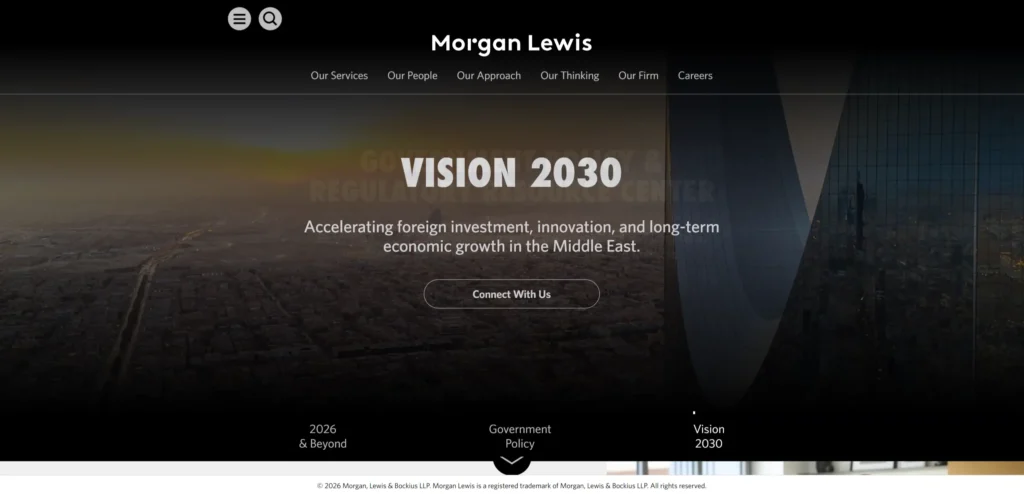
Morgan Lewis handles the complexity of a global firm with multiple practice areas, offices, and industries through a comprehensive navigation architecture without being overwhelming. The search function is fast and returns relevant results for specific legal matters. Attorney search by practice area, jurisdiction, and language handles the international client needs efficiently.
Design lesson: For large global law firms, an attorney search that filters by practice area, jurisdiction, and language is more valuable to clients than any other navigation feature. Clients looking for a specific type of attorney in a specific location should be able to find one in under 30 seconds.
3. WilmerHale
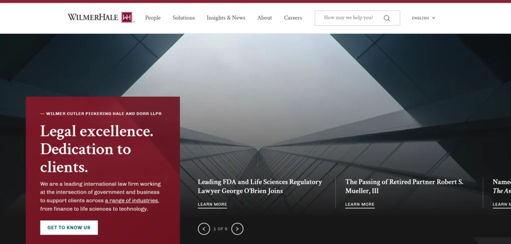
WilmerHale’s website communicates depth of government enforcement experience and regulatory capability through a well-structured insights section and detailed practice area pages. The attorney profiles are thorough. The client industries section routes visitors from their sector to relevant practice areas, which is a navigation pattern that serves sophisticated B2B legal clients well.
Design lesson: Industry-to-practice navigation, where visitors can enter the site from their industry sector and be routed to relevant practice areas and attorneys, serves B2B legal clients who define their need by their industry rather than by legal discipline.
4. Quinn Emanuel
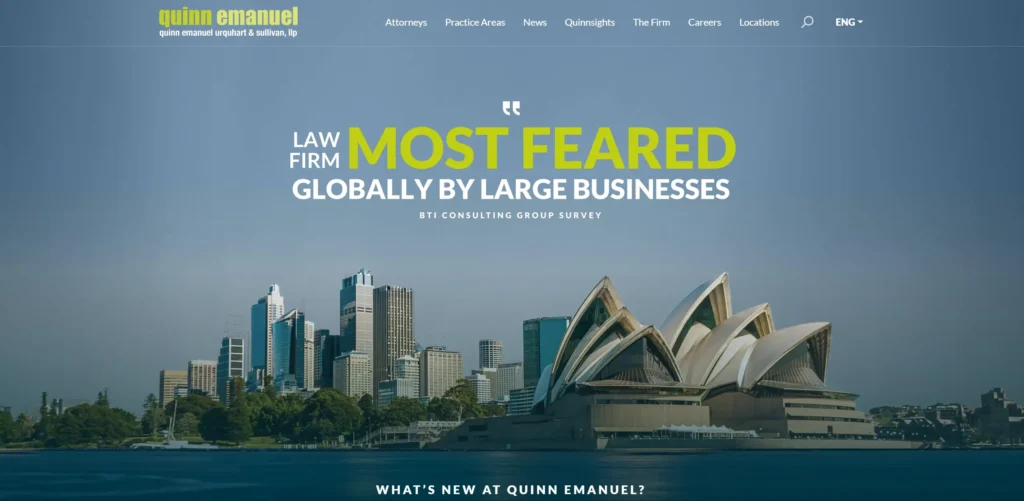
Quinn Emanuel is primarily a litigation firm and the website communicates this specialism with remarkable clarity. The case results section is specific and regularly updated. The firm’s positioning as a litigation specialist is stated unambiguously. The attorney profiles include trial experience and case outcomes, which are the credentials that matter most to clients evaluating litigation representation.
Design lesson: Case results and trial outcomes on a litigation firm’s website are the most persuasive content for clients evaluating whether to hire the firm. Most law firm websites omit this information. Quinn Emanuel leads with it.
5. Freshfields
Freshfields is a magic circle firm whose website communicates global reach, sector depth, and deal capability. The design is clean and modern. The insights section is substantial and the content quality reflects the firm’s standing. Graduate recruitment is well-integrated into the main navigation, reflecting the importance of talent acquisition to the firm’s brand.
Design lesson: Graduate recruitment content integrated into the main website navigation rather than segregated to a separate careers domain signals that the firm treats talent acquisition as part of its brand rather than a separate operational function.
6. Linklaters
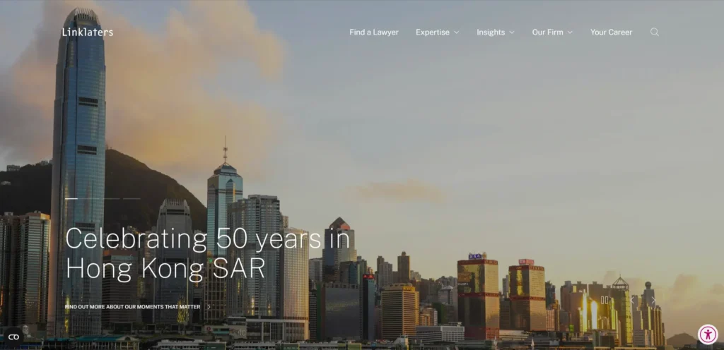
Linklaters handles multi-jurisdictional legal matters and the website communicates this capability through office network and practice area pages that are specific about jurisdictional capability rather than generic about global presence. Language switching is implemented cleanly. The client industry navigation is comprehensive.
Design lesson: For international law firms, specificity about jurisdictional capability (exactly what matters you can handle in exactly which jurisdictions) is more persuasive to sophisticated clients than generic claims of global presence.
7. Marsh McLennan Legal
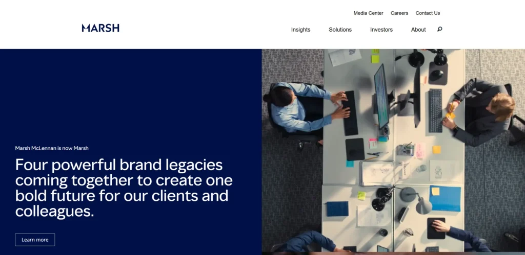
Marsh McLennan Legal is an example of in-house legal team communication rather than a law firm client-facing site, included here as an example of how large corporate legal functions communicate externally. The structure and clarity of the content demonstrates that legal communication does not have to be dense and inaccessible.
Design lesson: Legal content written for non-lawyer audiences (clients, business stakeholders, and general visitors) requires plain language editing that most law firm website copy does not receive. The firms that write for their clients rather than for other lawyers consistently generate more inquiries.
8. Irwin Mitchell
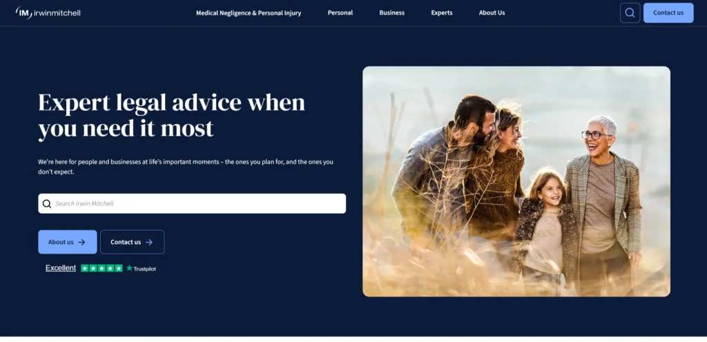
Irwin Mitchell is a UK full-service firm whose website handles the complete breadth of personal injury, clinical negligence, family law, and commercial services in a single coherent navigation structure. The personal injury section addresses the specific emotional state of accident victims (confused, in pain, uncertain about their rights) with clear, reassuring language and a simple free consultation booking.
Design lesson: Personal injury and medical negligence law firm websites must address the specific emotional state of their visitors (often traumatized, confused about their rights, and worried about cost) with language and design that communicates approachability before it communicates legal expertise.
9. Slater and Gordon
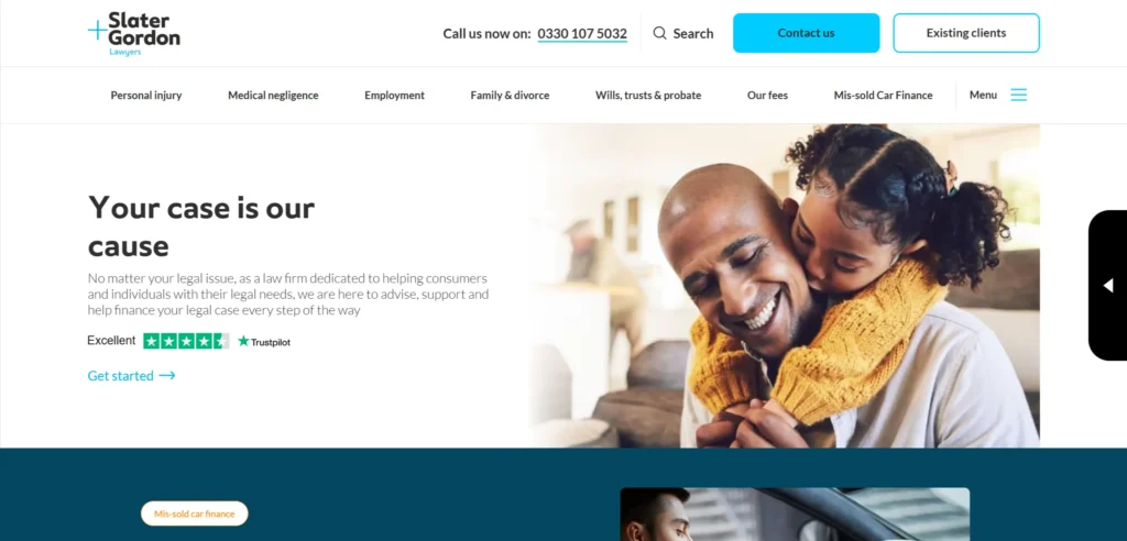
Slater and Gordon positions itself as the law firm for individuals rather than corporations, and every design and copy decision reflects this. The language is plain. The fee structures are transparent: no win no fee is explained clearly. The consultation booking is prominent and the process is explained step by step to remove uncertainty for clients who have never dealt with a solicitor before.
Design lesson: Law firm websites aimed at private individuals who are engaging with legal services for the first time should prioritize plain language, fee transparency, and a clear explanation of the consultation process over traditional legal authority markers that experienced commercial clients look for.
10. DLA Piper
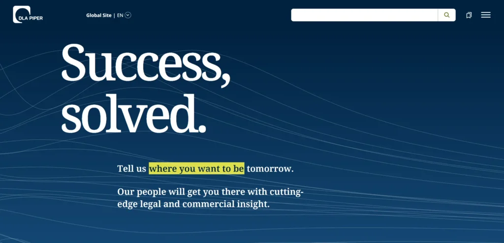
DLA Piper is one of the largest global law firms and the website manages this scale through effective sector and practice area navigation. The attorney search is fast and comprehensive. The insights content is substantial. The geographic reach is communicated through an interactive office map rather than a list of city names.
Design lesson: An interactive global office map communicates geographic reach more effectively to potential clients than a text list of office locations. It creates a visual impression of scale that a list cannot.
11. Cooley
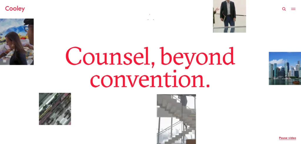
Cooley focuses on technology, life sciences, and venture capital, and the website communicates this specialism clearly from the first viewport. The client experience content is specific to technology company needs. The startup and emerging company section is well-developed, addressing the specific concerns of early-stage companies that may not yet need a full-service law firm but will need Cooley’s specialism as they grow.
Design lesson: Law firms with a clear sector specialism should lead their website with that specialism rather than presenting a full-service capability list. Clients looking for technology company representation respond to firms that clearly understand their world.
12. Clifford Chance
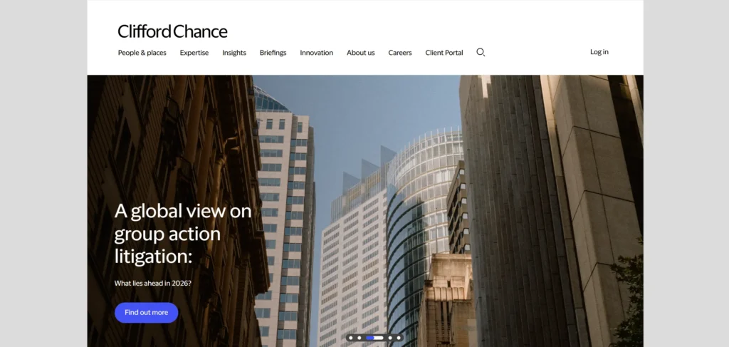
Clifford Chance’s website communicates the firm’s commitment to ESG and responsible business alongside deal capability and legal expertise. The sustainability and pro bono content is detailed and specific. For a growing segment of corporate clients whose own ESG commitments influence their choice of professional advisors, this content is a differentiator.
Design lesson: For large law firms, ESG and responsible business content on the website is increasingly a client acquisition factor as corporate clients whose own ESG programmes require them to demonstrate responsible supplier choices.
13. Freeths
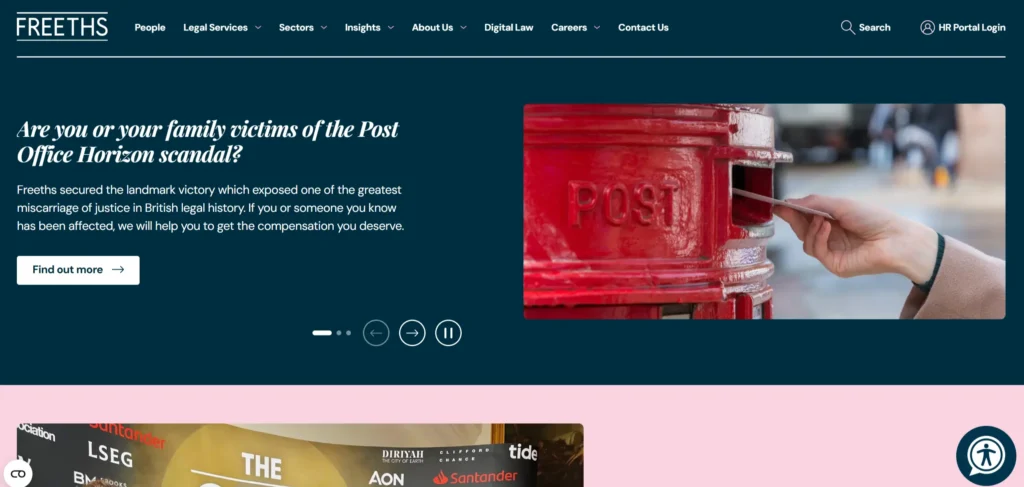
Freeths is a UK regional and national firm whose website communicates approachability for private clients alongside capability for commercial matters. The client testimonials are specific and named. The team pages communicate genuine character alongside credentials. The consultation process is explained simply.
Design lesson: Regional law firms competing with national firms can differentiate through genuine client relationships communicated through specific named testimonials and team pages that feel like real people rather than legal CVs.
14. Osborne Clarke
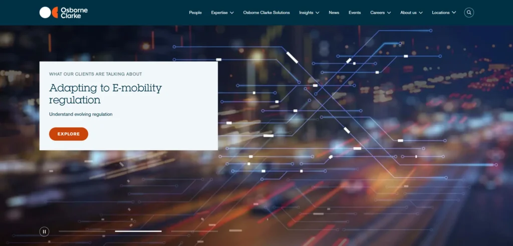
Osborne Clarke focuses on technology, energy, and real estate sectors and the website communicates this through deep sector content. The tech focus is clear from the homepage. The insights content demonstrates real sector knowledge. The international capability is communicated through specific cross-border experience rather than a generic global presence claim.
Design lesson: Sector-focused firms that publish detailed sector insights attract clients from that sector who are evaluating the firm’s understanding of their business environment, not just their legal capability.
What These Legal Website Designs Have in Common
Looking across all 14 examples, these patterns appear consistently in the ones that work best commercially, not just aesthetically.
Practice area and attorney search accessible and fast from every page
Case results, deal experience, or sector outcomes displayed specifically rather than generically
Plain language copy on pages aimed at individual clients
Free consultation or initial inquiry made low-risk and prominently visible
Insights and publications section demonstrating genuine intellectual leadership
5 Design Elements Every Legal Website Needs
Whether you are building from scratch or redesigning an existing site, these five elements consistently separate high-performing examples from functional but forgettable ones.
1. Practice area navigation that is findable in under 10 seconds from the homepage. Visitors who cannot quickly identify whether the firm handles their type of matter leave within seconds.
Practice area navigation that is findable in under 10 seconds from the homepage
2. Attorney profiles with genuine depth
Attorney profiles with genuine depth (experience, outcomes, and sector knowledge, not just credentials). Profiles that lead with client-relevant experience generate significantly more direct inquiries than those that list qualifications chronologically.
3. Free consultation or initial inquiry booking made simple and low-risk, not hidden in a general contact form. Law firms that make the booking prominent and low-friction outperform those that bury it.
Free consultation or initial enquiry booking made simple and low-risk, not hidden in a contact form
4. Case results or deal highlights specific enough to communicate actual outcomes. Generic claims of expertise are less persuasive than specific examples of matters handled and results achieved.
Case results or deal highlights specific enough to communicate actual outcomes
5. Plain language copy on all pages aimed at individual clients rather than legal professionals. Most law firm copy is written for other lawyers. The firms that write for their clients consistently generate more inquiries.
Plain language copy on all pages aimed at individual clients rather than legal professionals
AI Implementation for Legal Websites in 2026
Most legal website articles cover design examples. Almost none address AI implementation, which is where the commercial gap is opening in 2026. The legal websites that implement these features in the next 12 months will have a measurable advantage over those that do not.
1. AI-Powered Practice Area Matching
A prospective client who arrives at a law firm website with ‘my employer has made me redundant, what are my rights?’ should be matched to the employment law team, not left to navigate a practice area menu. AI intake chat that understands natural language descriptions of legal situations and routes visitors to the relevant practice area and attorney reduces the drop-off that happens when visitors cannot quickly find whether the firm handles their specific matter.
2. AI Chat for Initial Consultation Qualification
Law firms lose a significant proportion of consultation requests to poor lead quality (matters outside the firm’s practice areas, geographic scope, or fee levels). An AI chat assistant that qualifies the matter type, jurisdiction, and approximate value before booking a consultation time reduces wasted consultation capacity and ensures the fee earner is spending consultation time on relevant matters.
3. AI-Assisted Legal Content and Insights Generation
Legal insights and publications are the primary content marketing tool for law firms. AI-assisted drafting that allows practice area attorneys to produce first-draft commentary on regulatory developments, case outcomes, and legislative changes more quickly makes the insights output that drives organic search traffic and demonstrates intellectual leadership more sustainable for firms that cannot dedicate specialist content resource to this.
4. AI-Powered Client Portal and Document Interaction
For law firms with client portal functionality on their website, AI document analysis that allows clients to upload documents and receive an initial assessment of their situation before the first consultation is an emerging feature that several progressive firms are deploying. It reduces the consultation preparation time for both client and attorney and demonstrates technological sophistication that influences client retention decisions.
KrishaWeb builds AI-integrated legal websites on WordPress and other platforms. If your current site is not using these features, our team can assess what to implement first based on your specific conversion goals.
A law firm website should include clear practice area navigation, attorney profiles with genuine depth and experience detail, a simple consultation booking or inquiry form, case results or deal highlights that demonstrate outcomes, and client testimonials or references that are specific rather than generic. The design should communicate both expertise and approachability appropriate to the type of clients the firm serves.
How important is SEO for law firm websites?
SEO is the highest-volume source of new client enquiries for most law firms in the personal injury, family law, and consumer legal services segments. The specific legal questions that potential clients search for (such as ‘what are my rights if I was redundant’ or ‘how do I contest a will’) should be answered specifically on practice area pages and in the firm’s blog content to attract this search traffic.
Should law firm websites show fees?
For consumer-facing law firms, fee transparency is a competitive differentiator. Individual clients who are evaluating whether legal action is financially viable need to understand the fee structure (no win no fee, fixed fees, or hourly rates) before committing to a consultation. For corporate and commercial firms, deal-by-deal pricing means publishing indicative fees is less appropriate, but publishing the firm’s pricing philosophy and minimum matter values helps pre-qualify inquiries.
How should law firm attorney profiles be structured?
Attorney profiles that perform well for conversion include a professional photograph, a plain language biography that explains the type of matters the attorney handles and for what type of clients, relevant case outcomes or deal highlights, and a direct contact or consultation booking link. Profiles that list qualifications chronologically without explaining what the attorney actually does for clients generate fewer direct inquiries than profiles that lead with client-relevant experience.
How can AI improve a law firm website?
AI can match visitors to the relevant practice area and attorney based on natural language descriptions of their legal matter, qualify consultation requests to reduce wasted capacity, assist attorneys with drafting insights and commentary content, and support client portal functionality including initial document analysis before consultations.
Conclusion
The 14 legal website designs on this list span different scales, budgets, and markets. What they share is not production budget or agency pedigree. It is a commitment to treating the website as a genuine commercial and brand tool rather than a digital brochure.
The design elements that matter most in this category are not complex or expensive to implement. Strong photography, a clear path to the primary conversion action, social proof specific enough to be credible, and mobile performance that matches desktop quality. These are achievable at almost any budget with the right priorities and the right Web design services.
If your current legal website design is not doing these things, talk to KrishaWeb’s web design team about what a focused redesign would look like for your specific goals.
Ready to improve your website? KrishaWeb has been designing and developing conversion-focused websites since 2008. Tell us your goals, and we will tell you the right approach.
Disclaimer: This article is intended for informational and inspirational purposes only. The website examples featured are owned by their respective organizations. KrishaWeb has no affiliation with any of the websites referenced unless otherwise stated. All observations, statistics, and design notes reflect research current as of April 2026 and may change over time.
Nisarg Pandya
Project Manager
Experienced Project Manager and Scrum Master at KrishaWeb, delivers expertise in Scrum methodologies, Laravel, React.js, UX design, and project management, ensuring efficient project delivery and agile implementation.




 KrishaLabs
 KrishaStudio
 KrishaStore