Representing a residential or commercial property on the Web is a great responsibility because a brand’s image and authenticity are at risk, while it seeks to attract genuine buyers, quickly. Thus, displaying authentic property photographs, agents’ bio, videos on locality, social proof, and blogs sharing relevant information to the audience for an educated purchase decision is a delicate task. Creating a lightweight website that quickly transforms the user experience requires hard work and inspiration. If you are struggling to put your best foot forward to gain prospective buyers, this article will assist you with creating a functional yet picturesque website that demands immediate attention from potential buyers with a few examples of the best real estate website design.
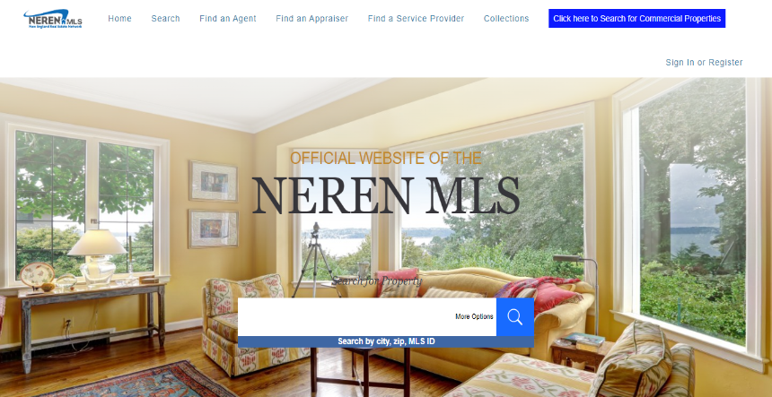
New England Real Estate Network (NEREN) powered by User Way utilizes widgets to customize the user experience. Their website contains an “Accessibility” button that allows users to adjust the text size and spacing, contrast, pause animations, highlight links, and make the content dyslexia friendly.
The company serves different regions and hence the information on the homepage is well organized for users to quickly find relevant content. Thus, the page includes search bar options to find houses by top cities, median price range, and top waterfront property listings. Lastly, the background photograph of New England Lake as seen through the bay windows adds to the appeal of the website.
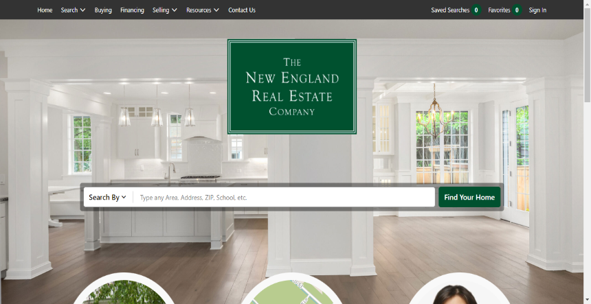
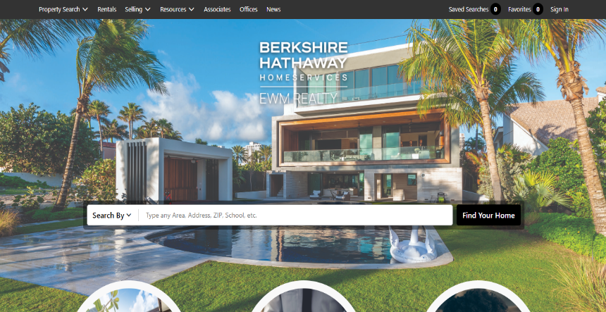
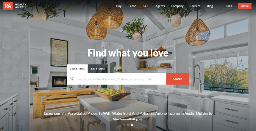
The search bar centred in the hero space and the drop-down menu containing search options via zip code, district, neighbourhood, city, and school assist visitors in quickly finding a property that matches their requirements and budget. The CTAs facilitate focused and quick searches, while the light, bright, and airy background image adds to the appeal of the website.
Understanding emotions for migrating to new locations is important for a real estate company to be successful. Thus, the video on the company’s website captures warm and cosy moments such as, a woman relaxing in her living room, and a family cooking together.
A target audience-oriented real estate firm requires to enhance its game by displaying valuable insights that help visitors make informed purchase decisions in a hassle-free way. Thus, when servicing a specific clientele such as families, the website should focus on displaying schools and suburbs than waterfront properties.
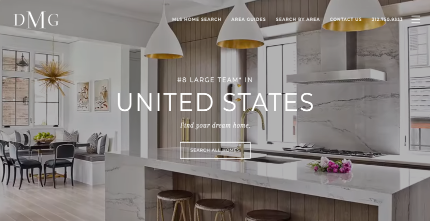
Thus, the company’s website offers a great appeal among its targeted audience through sleek Montserrat font, grey and white color scheme, chef’s kitchen with the integrated refrigerator, and the double oven, and dramatic visuals that enhance the luxury appeal for interested buyers.
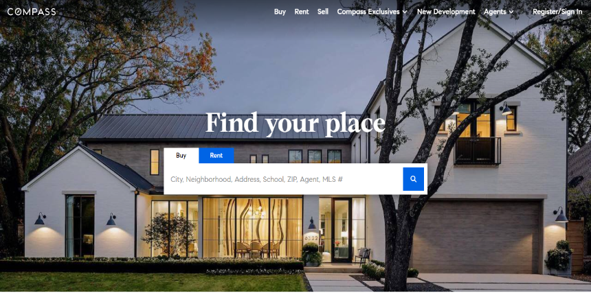
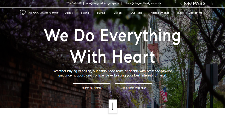
Your website should coordinate with your marketing efforts to create a memorable brand experience. Consequently, the Compass website with its black and white color scheme, focus on geometric design, and yard sign smartly advertises its brand among its online audience.
The simple web layout makes navigation and scrolling a seamless interaction. Visitors via the navigation bar can effortlessly browse property photographs and their details, while the “Featured Community” section offers them a glimpse into the niche markets the firm services and that includes housing data for that specific locality.
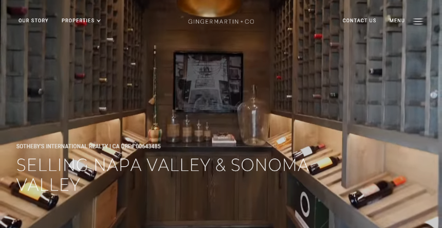
This California-based real estate brokerage firm offers a simple and effective website for its visitors. With buying and selling value or check-out buttons, users can get information on listed properties in Napa and Sonoma Valley. Further, blogs and resources assist visitors with valuable insights to make an informed decision.
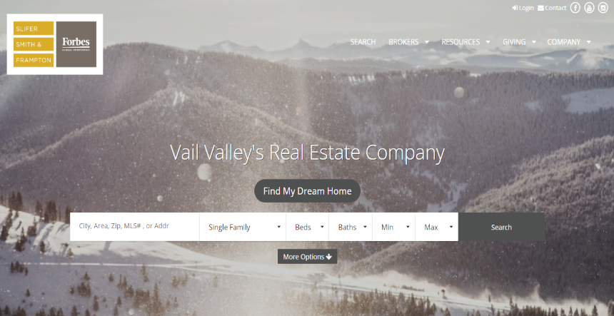
The homepage contains alluring images of the Vail Valley and Colorado area in a combination of widgets for local housing market analysis, information on moving services, a property alert sign-up, and videos describing the local lifestyle – all these remarkable features make buying, selling, or renting in the region a seamless experience for visitors. A map indicating the agency’s office location adds the final touch of dependability.
Full-bleed images offer a sleek website aesthetic and are a popular method to display property listings. EWM takes advantage of this new method to showcase the interiors and exteriors of its properties to captivate visitors.
Further, the homepage contains other important features such as social sharing buttons, marketing collateral, blog post link, and open house information for their target audience.
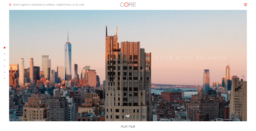
Social proof is a guaranteed way to gain traction from visitors and hook them to a website. This New York–based real estate brokerage firm instils trust in its audience through a symmetrical and easy navigation layout. Further, the use of white space on the website allows for a neat display of features on the website.
Displaying property listings and agents’ bios is a powerful way of creating a real estate website that makes sales easy. This website displays social proof through photographs of buyers and agents. The content on the homepage is well-balanced and spaced out which makes browsing and navigation a good user experience.
For creating a fine-looking website, three components make a difference- navigation, search, and content. This website perfectly balances these components by placing a search function in the middle of the homepage, a detailed bio on agents, and widgets that link to other pages on the site. Further, information on local and luxury rentals, blogs, and press releases adds to the value of the brand.
The homepage is search engine optimized with crisp business detail, while the navigation and logo are displayed atop. On the right of the page, a promotional video featuring different neighbourhoods strikes a pose. While the social proof reinforces the publicity.
With testimonials, blogs, business information, and search functionality creates a stellar web design layout for this real estate firm. Further, a unique user experience is offered through a professional-looking font style and a complimenting soft color palette. All these remarkable features boost the lead conversion rate.
A technology savvy, comprehensive, and relatability property listings gain traction from qualified buyers and sellers. Thus, the white-and-orange aesthetic of the web layout, testimonials, and clickable agent photographs that instantly display the bio, strongly builds and strengthens the brand’s image and objective.
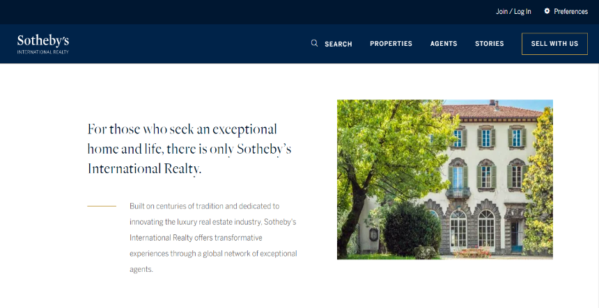
Sotheby’s focus is on connecting easily with potential clients. Thus, they use a chatbot on their webpage that allows visitors to schedule an appointment to view their choicest properties, as they browse through the plethora of options available on the website.
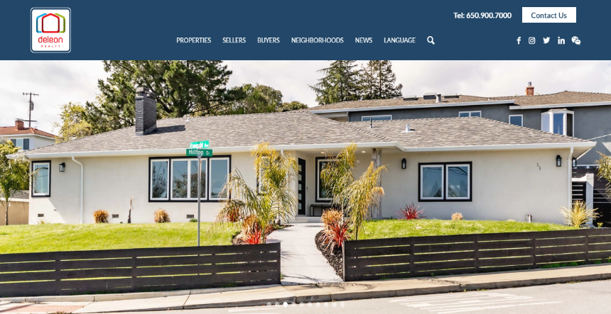
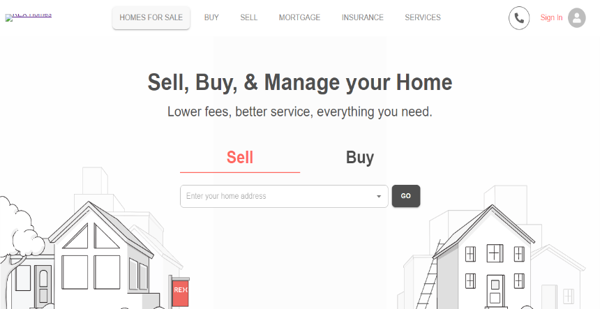
User experience is the key factor for this real estate company. Thus, the hero banner image contains a well-lit and spacious family house for 4-5 members (their target audience).
The headline displays sections – Buy with Rex, Sell with Rex, and Homes for Sale – with their contact details. The CTA “See If You Qualify” pops up with a quick mouse movement. A bright orange button allows visitors to send them messages. Further, the site displays several Facebook page visitors that generate social trust.
Their mobile version hosts these features for easy thumb clicks.
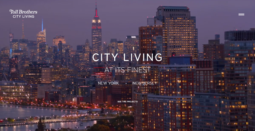
The website welcomes you to the bustling New York City with a chopper-view video displaying the skyline. For seamless user interaction, the website contains bar hover-sensitive navigation buttons launched into a hamburger menu. Further, the short and crisp heads and sub-heads against the skyline enhance the aesthetics that compels the visitors to explore the “SEE THE PROJECTS” section.
The hero banner displays a neighbourhood in Florida, which is used as a background for placing all the content. The page contains a search field to find agents for selling your house. Further, the buttons in the top fold contain drop-down menus that contribute to the simple and clutter-free design layout.
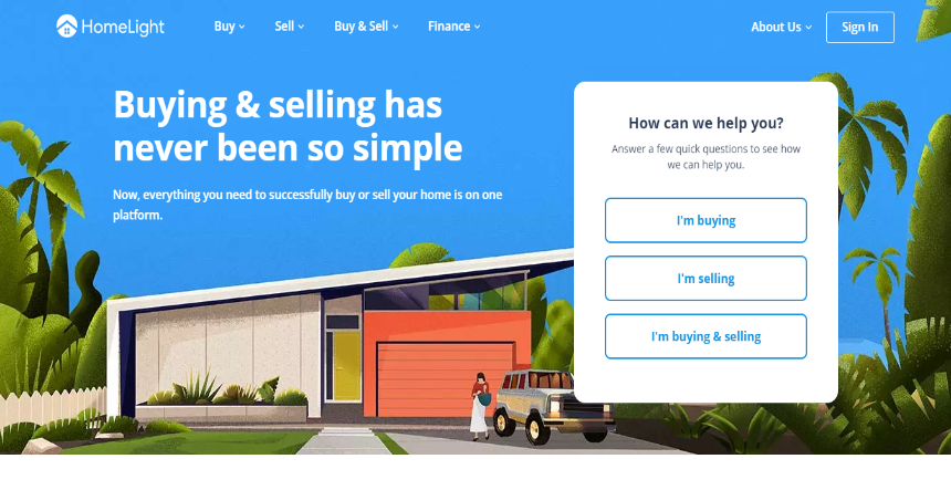
The key feature is the “HomeLight Simple Sale” which allows homeowners to estimate the sales price and advertise their house to pre-approved cash buyers via the “SELLERS” button.
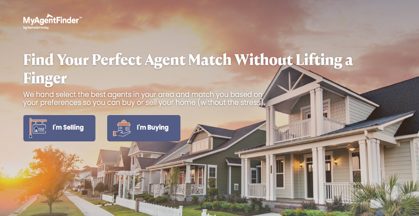
MyAgentFinder’s objective is to capture quality leads. Thus, its website contains a search field with suggestions hosted on the home page. An animated arrow prompts visitors to click the search button. Further, only a phone number is given on the top of the page for visitors to quickly call the agency. This functionality helps to convert visitors into leads.
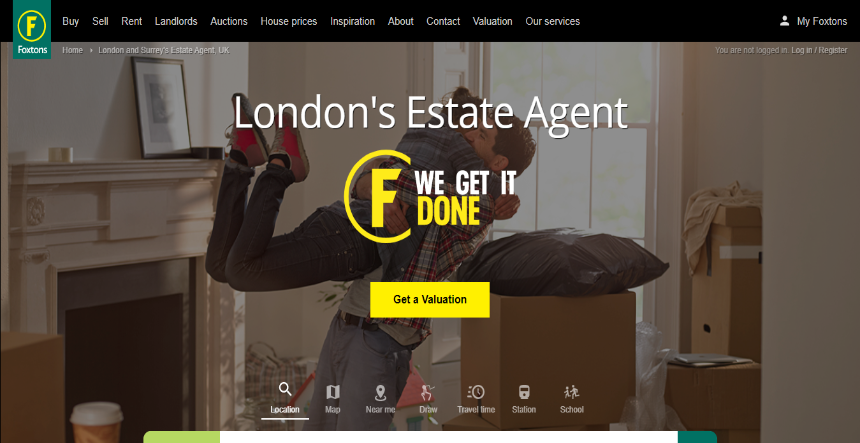
Our homes and neighbourhoods personify peace and prosperity, which this UK real estate company displays on its website with a video in the background. Their logo and CTA are designed using primary colors – green and yellow. Meanwhile, the red colored “Buy” button contains a drop-down menu allowing visitors to select their renting duration. Similarly, the search field is multi-functional because visitors can search for residences by postcode, area, station or school, and travel time. Additionally, it displays a single-line sub-head and rating according to reviews earned from five thousand renters.
Planning to purchase a house in Hawaii overlooking the green manicured fields, palm trees, open deck, and blue sky?
This picturesque image is displayed on the company’s website which generates desire and compels the audience to inquire about the region. Consequently, the website hosts vibrant buttons for live chat and the contact us section at the bottom right and top corner of the website.
The social handles and blog links are contained in a drop-down menu, along with relevant buttons such as “Find your Home,” “About Us” and “Explore By Island” which assist with the home search.
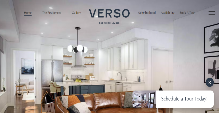
Verso’s website is a perfect combination of luxury and charm. Its website displays a warm and soft color scheme that demands immediate attention, while its seamless browsing experience captivates users.
The hero video hosted in the first fold of the layout displays the luxurious amenities offered by the company. With the seamless accordion drop downs feature offered on scrolling, users can quickly browse different rooms and nearby attractions.
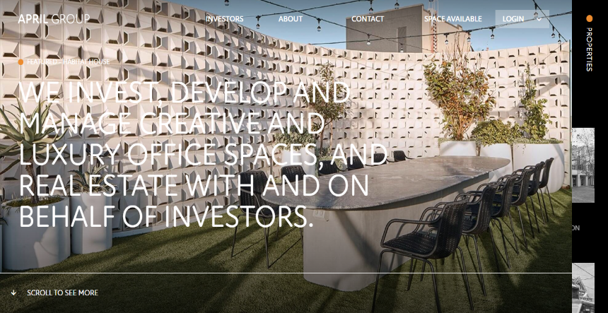
April Group is a real estate investment firm that uses technology-inspired typography and sleek layout to attract and engage with forward-thinking investors. They display their projects on the home page to prove their success.
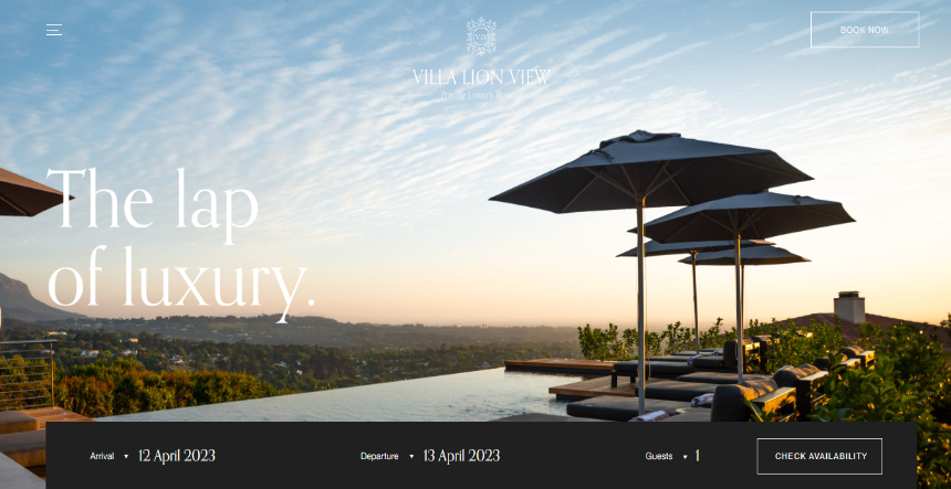
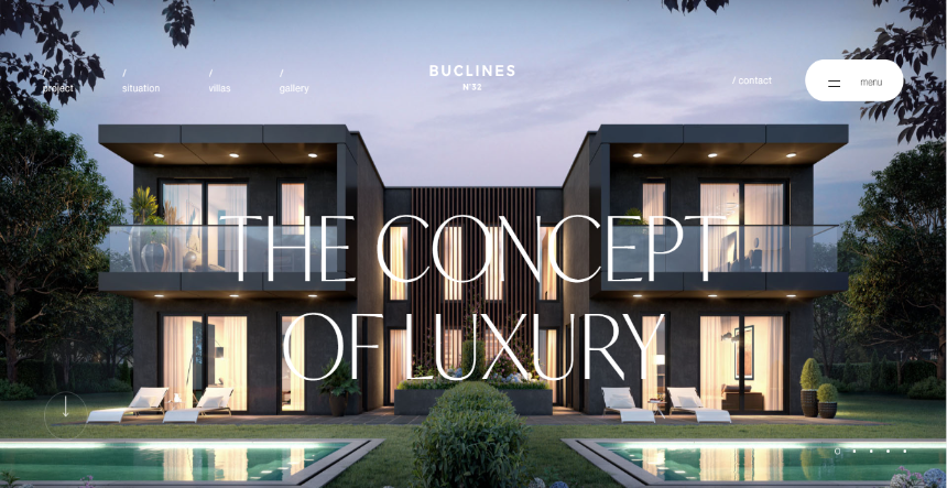
Black defines luxury, and this company’s website uses it elegantly. The design layout contains dark accents that complement the stylish typography and the concept art and photographs hosted on its page.
Buclines beautifully. Every photo and concept art they have includes that coincide perfectly. Finally, brings it all together.
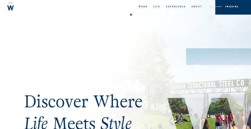
This real estate company promotes luxury apartments. Thus, its website details the harmonious land’s vibrant lifestyle with exotic photographs and concept imagery.
Conclusion
To secure more leads and improve conversion rate, websites need to contain a clean, simple yet effective design layout that makes navigation and search easy for the targeted audience. High responsive capabilities across agents’ photographs and bios enhance the brand’s credibility. Meanwhile, a search bar loaded with an option to search based on neighbourhood or convenience indicates that a realty firm understands the specific consumer needs.
Nisarg Pandya
Project Manager
Experienced Project Manager and Scrum Master at KrishaWeb, delivers expertise in Scrum methodologies, Laravel, React.js, UX design, and project management, ensuring efficient project delivery and agile implementation.