A tutoring website has to do two things simultaneously that are harder to balance than they look: communicate authority and credentials to the parent writing the cheque, and communicate approachability and confidence to the student who is nervous about asking for help. Most tutoring websites do one of these well. The ones on this list do both.
At KrishaWeb, we have designed websites for education providers and eLearning platforms since 2008. The pattern that holds across every tutoring website that converts well: clear outcomes front and centre, frictionless booking, and social proof specific enough to be credible.
KrishaWeb has designed and built tutoring websites since 2008. The pattern that holds across every high-performing example: design decisions made in service of the visitor’s actual goal, not the agency’s portfolio.
Table Of Contents
Table Of Contents
12 Best Tutoring Website Designs for Inspiration
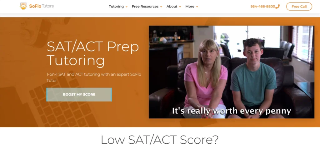
1. SoFlo Tutors
SoFlo leads with outcome data: specific score improvements, not generic promises. The homepage hero names the exact SAT and ACT score jumps students have achieved, which is the most effective trust signal a tutoring website can deploy. The layout is clean and mobile-responsive. The booking flow is prominent and requires minimal steps.
Design lesson: Outcome data outperforms credential claims on tutoring websites. Saying ‘students improve an average of 150 SAT points’ is more persuasive than a list of tutor qualifications.
2. Lingoci
Lingoci focuses on one-to-one language tutoring and the website communicates this specialization clearly from the first viewport. Vibrant colors and custom illustration create a personality that generic tutoring platforms lack. The tutor matching process is explained step by step with clear visual cues, reducing the hesitation that comes from uncertainty about how the service works.
Design lesson: Explaining your matching or booking process visually reduces drop-off on tutoring websites. Visitors who understand the process convert at higher rates than those left to figure it out.
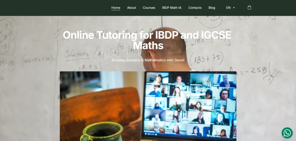
3. Skooli
Skooli uses a video background hero that creates immediate visual interest and communicates the online tutoring environment. Testimonials are displayed throughout the site rather than consolidated into a single reviews page, which means social proof appears at every stage of the consideration journey. Subject-specific landing pages are clearly accessible from the main navigation.
Design lesson: Distributing testimonials across the page rather than consolidating them creates a continuous social proof layer that reinforces trust at every scroll position.
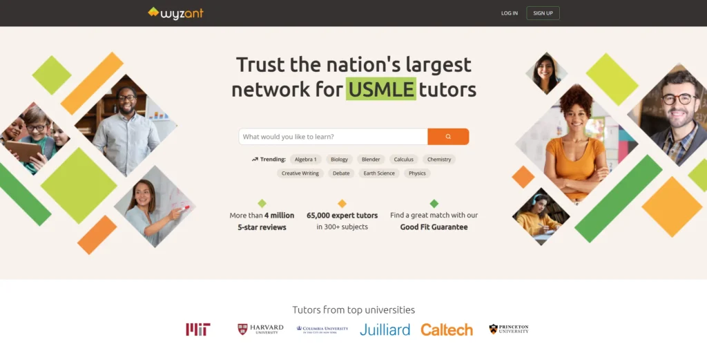
4. Wyzant
Wyzant operates at marketplace scale and the website reflects that through intelligent search functionality placed prominently on the homepage. Visitors can filter by subject, level, price, and availability without leaving the first screen. Tutor profiles are detailed with verified reviews, hourly rates, and video introductions. The transparency around pricing and qualifications removes the most common friction points in the tutoring purchase decision.
Design lesson: For tutoring marketplaces, the search and filter functionality is the primary conversion tool. Putting it in the hero section rather than behind a navigation click directly increases conversion.
5. Superprof
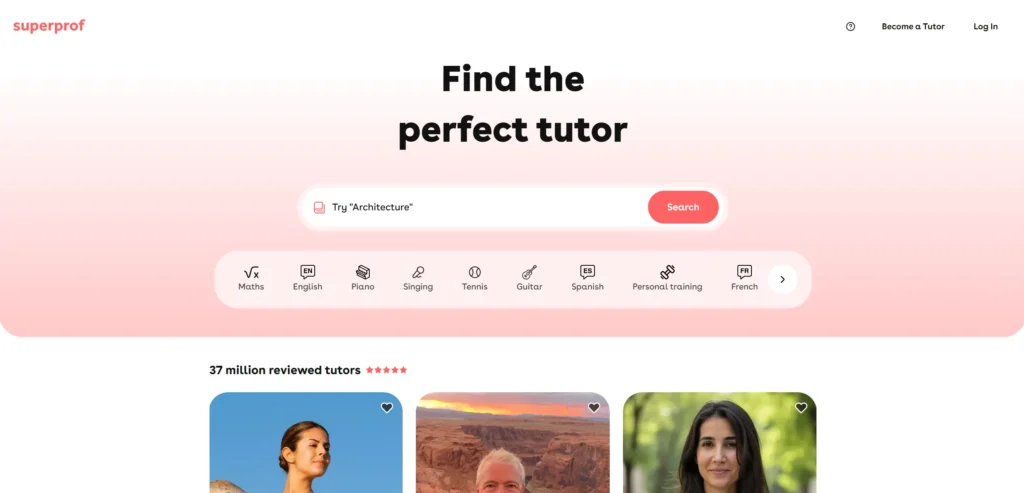
Superprof’s design handles the challenge of a large tutor directory by making the search experience feel personal rather than transactional. Location-aware search, subject categories, and price range filters appear immediately on landing. Tutor profile cards show a photo, rating, and price at a glance. The site performs well on mobile, which matters for a service where parents often search on their phones during school run hours.
Design lesson: Location-aware search is a conversion-critical feature for tutoring platforms with a local service component. Defaulting to the visitor’s area removes a step that a meaningful percentage of visitors would abandon.
6. Tutor.com
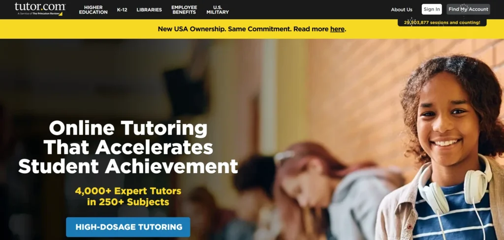
Tutor.com targets students in the middle and high school range and the design reflects this with language and imagery that addresses the student directly rather than speaking through the parent. The on-demand tutoring proposition (help available right now, not after a scheduling process) is communicated clearly in the hero section. The subject list covers the full curriculum, and each subject links to a dedicated page.
Design lesson: On-demand availability is a major differentiator in the tutoring category and should be placed in the hero section if your service offers it. Scheduling friction is one of the main reasons prospective students do not convert.
7. Revolution Prep
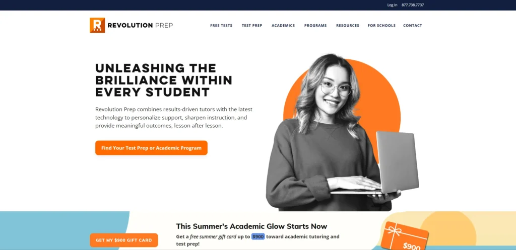
Revolution Prep focuses on test preparation, and its website communicates this specialism through specific score guarantees and structured program pages. The design is clean and authoritative without being cold. Parent and student testimonials are named and specific. The programme structure pages explain exactly what is covered in each plan, which removes the uncertainty that typically prompts a price comparison search before booking.
Design lesson: Score guarantees and specific outcome claims carry significant conversion weight on test prep websites. If your tutoring service produces measurable results, those numbers should appear in the hero section.
8. Khan Academy
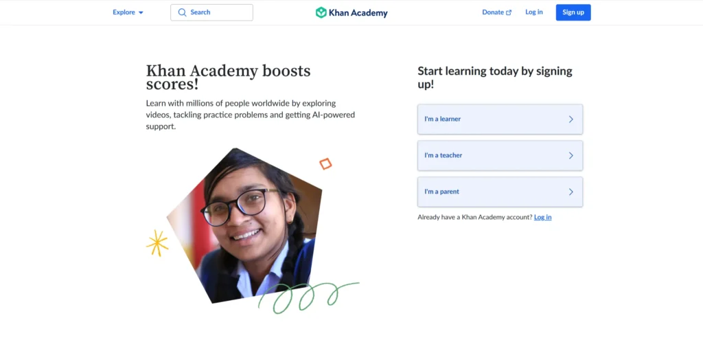
Khan Academy is a free platform which creates a different conversion goal than paid tutoring services, but the website’s design is instructive for any education provider. The personalized learning paths, progress tracking dashboards, and clear subject taxonomy create an experience that feels purposeful rather than overwhelming. The sign-up flow requires minimal commitment, lowering the barrier to first engagement.
Design lesson: For any tutoring platform with a free tier or free trial, the barrier to first engagement should be as low as possible. Khan Academy’s low-friction sign-up drives volume that converts to higher engagement over time.
9. Preply
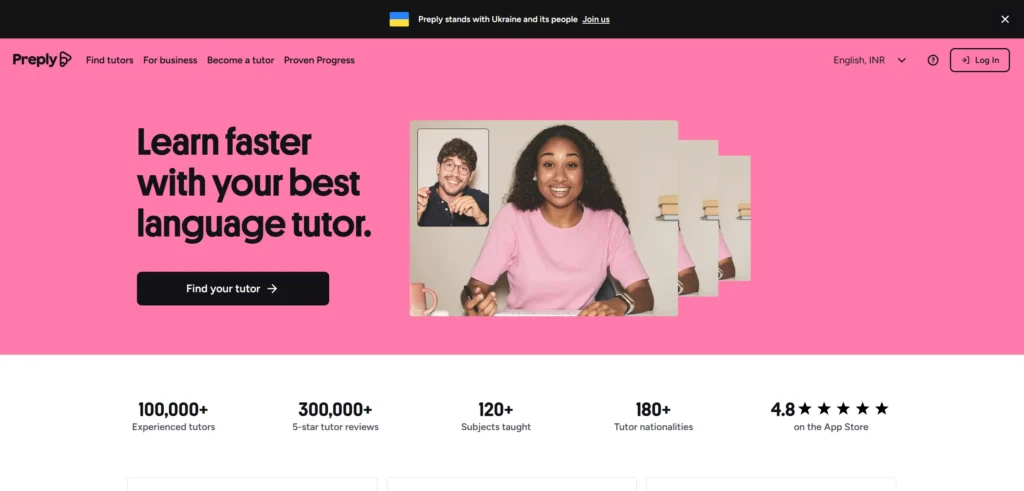
Preply is a language learning platform with a tutoring marketplace at its core. The website uses trust signals strategically: reviews are specific, prices are visible, and the tutor matching algorithm is explained clearly. The trial lesson offer is prominent and reduces the commitment risk for first-time buyers. Photography and video throughout the site show real tutor-student interactions rather than generic education stock imagery.
Design lesson: A trial lesson or first-session offer is one of the highest-converting features a paid tutoring platform can deploy. It lowers the financial risk of an unknown service and creates a conversion path for visitors who are interested but not yet ready to commit to a full package.
10. Chegg Tutors
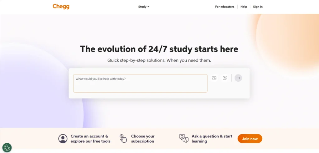
Chegg’s tutoring section benefits from the broader brand’s academic authority. The website communicates on-demand availability with specific response time claims. Subject coverage is comprehensive and each subject page is individually optimized. The pricing transparency (showing per-minute rates alongside hourly options) lets visitors self-select the commitment level that suits them.
Design lesson: Pricing transparency on tutoring websites reduces pre-purchase uncertainty and decreases the likelihood of visitors leaving to comparison shop. Showing multiple pricing tiers lets visitors self-select without requiring a sales conversation.
11. Varsity Tutors
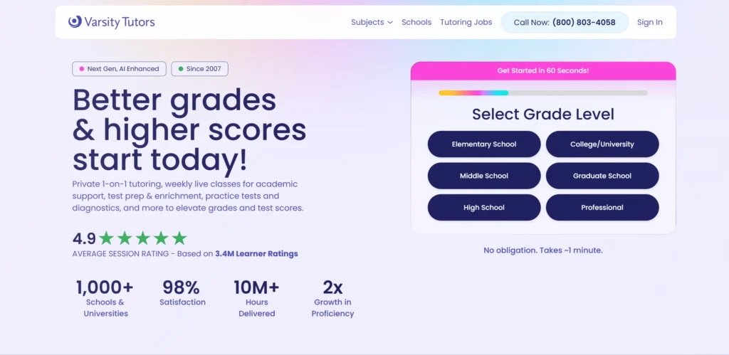
Varsity Tutors runs a full-service tutoring network and the website reflects both the scale and the personalized nature of the service. The intake process is detailed enough to feel considered rather than generic. Subject-specific pages each carry relevant social proof, pricing guidance, and a direct booking path. Live learning options are promoted alongside traditional one-to-one sessions.
Design lesson: When your tutoring service covers both live group sessions and individual tutoring, separating these into clearly differentiated navigation paths prevents confusion and routes each visitor to the right conversion path.
12. Tutor Hunt
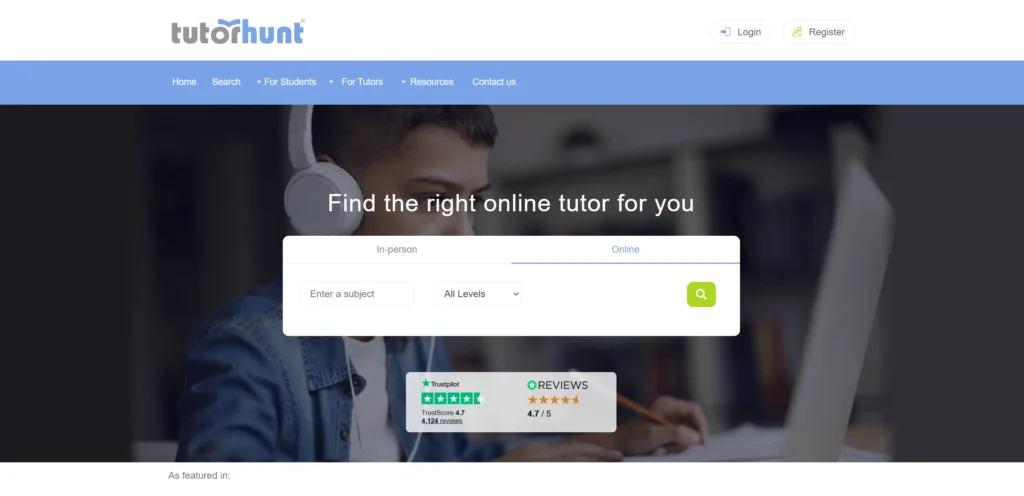
Tutor Hunt is a UK-based platform with a directory-driven design. The search interface is functional and fast, with clear filters for subject, level, location, and price. Tutor profiles are standardized in a way that makes comparison easy. The platform’s long-standing presence in the UK market is communicated through the volume of tutors listed and the depth of subject coverage.
Design lesson: For directory-style tutoring platforms, the consistency and comparability of tutor profiles is a conversion factor. Visitors comparing multiple tutors make faster decisions when the information they need is presented in the same format across every profile.
What These Tutoring Website Designs Have in Common
Looking across all 12 examples, these patterns appear consistently in the ones that work best commercially, not just aesthetically.
Outcome data displayed in the hero section rather than in a dedicated results page
Booking or matching process explained visually before visitors are asked to commit
Social proof distributed across the page rather than consolidated into a single reviews section
Subject navigation accessible from the homepage without requiring a search
Mobile-first layouts with touch-friendly booking flows
5 Design Elements Every Tutoring Website Needs
Whether you are building from scratch or redesigning an existing site, these five elements consistently separate high-performing examples from functional but forgettable ones.
1. Clear outcome data in the hero section: specific score improvements or grade outcomes, not generic promises. Outcome data outperforms credential claims at every stage of the tutoring purchase decision. A parent who sees “average 150-point SAT improvement” immediately understands the value proposition. A list of tutor qualifications does not deliver the same conversion signal.
Clear outcome data in the hero section: specific score improvements or grade outcomes, not generic promises
2. Subject and level navigation accessible within one click of the homepage. Parents and students looking for a specific subject should not have to search for it. Every tutoring website on this list makes subject navigation immediately accessible. Those that bury it behind a menu or a search bar lose visitors who were ready to convert.
Subject and level navigation accessible within one click of the homepage
3. A booking or intake process that takes fewer than three minutes to complete. Every additional step in the booking flow reduces conversion. The three-minute ceiling is not arbitrary. It reflects the tolerance level of a parent fitting a booking into a busy day on a phone.
A booking or intake process that takes fewer than three minutes to complete
4. Social proof that names the student type, subject, and specific result achieved. Generic five-star testimonials produce minimal conversion lift. A testimonial that says “my Year 10 daughter improved from a C to an A in GCSE Maths after eight sessions” is specific enough to be credible and actionable.
Social proof that names the student type, subject, and specific result achieved
5. Mobile-optimized layout with thumb-reachable CTAs for parents searching on mobile during school run hours
Mobile-optimized layout with thumb-reachable CTAs for parents searching on mobile during school run hours
AI Implementation for Tutoring Websites in 2026
Most tutoring website articles cover design examples. Almost none address AI implementation, which is where the commercial gap is opening in 2026. The tutoring websites that implement these features in the next 12 months will have a measurable advantage over those that do not.
1. AI-Powered Tutor Matching
Matching a student to the right tutor is the highest-friction step in the tutoring purchase process. An AI matching system that takes subject, level, learning style, and availability as inputs and returns a ranked shortlist of suitable tutors removes the browsing burden that causes many visitors to abandon before booking. Platforms like Preply and Wyzant use algorithmic matching behind the scenes. For independent tutoring businesses, simpler quiz-based intake flows with AI-scored recommendations deliver much of the same benefit without platform-scale infrastructure.
2. AI Chat for Instant Enquiry Response
A parent who visits a tutoring website at 9pm and cannot get an immediate answer to their question about availability or programme structure will typically move on to a competitor before morning. An AI chat assistant trained on your service information, pricing, and tutor profiles can answer these inquiries instantly. Tidio, Intercom, and Botpress all support education-specific chatbot configuration that handles common pre-purchase questions without requiring human availability overnight.
3. Personalized Learning Path Recommendations
For tutoring platforms with a course or resource library alongside live tutoring, AI can analyse a student’s diagnostic assessment results and recommend the specific content sequence most likely to address their gaps. This is the model Khan Academy uses at scale. For smaller platforms, tools like Thinkific and Teachable now include AI recommendation features in their standard plans.
4. Automated Session Reminders and Follow-Up
Session no-shows are the most predictable revenue loss in the tutoring category. Automated reminder sequences (24 hours before, 1 hour before) reduce no-show rates measurably. Post-session automated follow-up asking for a review and offering the next session booking link closes the retention loop that most tutoring websites leave open. Klaviyo and ActiveCampaign handle both flows with minimal configuration.
KrishaWeb builds AI-integrated tutoring websites on WordPress and other platforms. If your current site is not using these features, our team can assess what to implement first based on your specific conversion goals.
A good tutoring website communicates outcomes before credentials, makes the booking process visible and simple, and provides social proof specific enough to be credible. Visitors decide in the first few seconds whether the service looks like it produces results. That decision is made by the outcome data on the homepage, not by the list of tutor qualifications.
What platform should I use to build a tutoring website?
WordPress with a booking plugin such as Amelia or Simply Schedule Appointments is the most flexible option for independent tutors and small tutoring businesses. For platforms managing multiple tutors, a custom-built solution or a marketplace platform like Sharetribe gives you the matching and profile functionality that WordPress plugins do not provide at scale.
How important is mobile design for a tutoring website?
Very. A significant portion of tutoring website traffic comes from parents searching on mobile during school run hours or evenings. If your booking process does not work well on a phone, you are losing enquiries to competitors whose booking forms do.
Should a tutoring website show prices?
Yes. Pricing transparency reduces pre-purchase uncertainty and decreases the likelihood of visitors leaving to compare competitors. The tutoring websites on this list that show pricing clearly consistently outperform those that require a consultation to find out the cost.
How can AI improve a tutoring website?
AI can improve tutor-student matching, provide 24/7 instant responses to pre-purchase inquiries, personalize learning path recommendations based on diagnostic assessments, and automate session reminders and post-session follow-up to reduce no-shows and improve retention.
Conclusion
The 12 tutoring website designs on this list span different scales, budgets, and markets. What they share is not production budget or agency pedigree. It is a commitment to treating the website as a genuine commercial and brand tool rather than a digital brochure.
The design elements that matter most in this category are not complex or expensive to implement. Strong photography, a clear path to the primary conversion action, social proof specific enough to be credible, and mobile performance that matches desktop quality. These are achievable at almost any budget with the right priorities and the right Web design service.
If your current tutoring website is not doing these things, talk to KrishaWeb’s web design team about what a focused redesign would look like for your specific goals.
Ready to improve your website? KrishaWeb has been designing and developing conversion-focused websites since 2008. Tell us your goals, and we will tell you the right approach.
Disclaimer: This article is intended for informational and inspirational purposes only. The website examples featured are owned by their respective organizations. KrishaWeb has no affiliation with any of the websites referenced unless otherwise stated. All observations, statistics, and design notes reflect research current as of April 2026 and may change over time.
Nisarg Pandya
Project Manager
Experienced Project Manager and Scrum Master at KrishaWeb, delivers expertise in Scrum methodologies, Laravel, React.js, UX design, and project management, ensuring efficient project delivery and agile implementation.




 KrishaLabs
 KrishaStudio
 KrishaStore