A creative agency website is the most demanding brief in digital design. You are simultaneously the designer and the client, the portfolio and the sales pitch. Every decision signals your taste level and your commercial instinct to prospects who are evaluating whether you can do for their brand what you have done for your own.
At KrishaWeb, we have built agency websites for design studios, digital agencies, and creative consultancies across 42 countries. The creative agency websites that win new business consistently share one characteristic: they demonstrate point of view, not just capability.
KrishaWeb has designed and built creative agency websites since 2008. The pattern that holds across every high-performing example: design decisions made in service of the visitor’s actual goal, not the agency’s portfolio.
Table Of Contents
Table Of Contents
12 Best Creative Agency Website Designs for Inspiration in 2026
1. Huge Inc
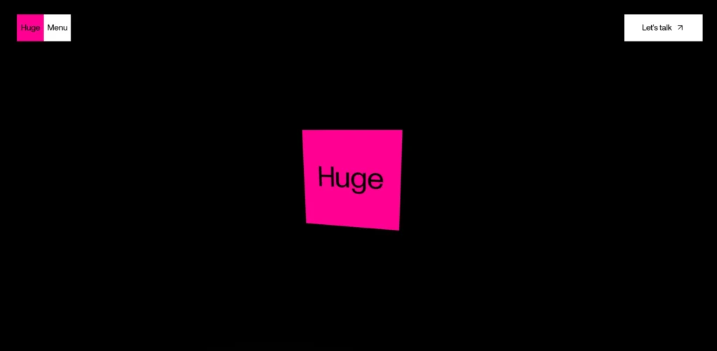
Huge leads with provocative positioning rather than a services list. The homepage opens with a statement of what they believe about digital experiences, not a list of what they do. Case studies are prominent and framed around business outcomes, not deliverables. The visual design is restrained and confident: dark palette, considered typography, nothing decorative.
Design lesson: A creative agency homepage that leads with a point of view about the industry is more memorable than one that leads with a services list. What you believe is more differentiating than what you do.
2. Instrument
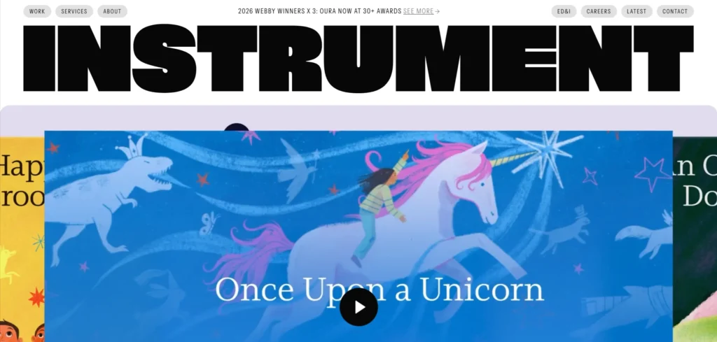
Instrument’s portfolio is the entire homepage: a scrolling stream of work that communicates creative range and client quality without requiring visitors to navigate to a separate portfolio section. Each project entry includes the client name, the output type, and a single compelling image. The effect is a continuous demonstration of capability rather than a formal credentials presentation.
Design lesson: For creative agencies with strong work, the portfolio should be the first thing visitors see. Moving case studies to a separate section reduces their impact. The work is the argument.
3. Fantasy
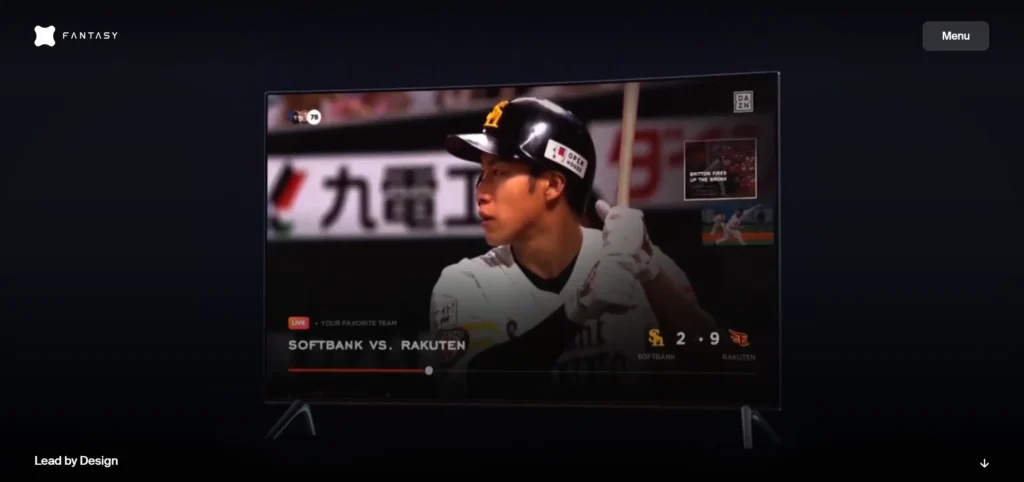
Fantasy is an experience design studio whose website is itself a demonstration of their craft. The homepage uses motion, considered typography, and spatial layout in a way that communicates their specific design capability before you read a word about it. This is the ideal outcome for a creative agency website: the design of the site proves the case for hiring them.
Design lesson: The design of a creative agency’s own website should demonstrate the specific capability they are selling. An experience design studio should have a more considered experience than a branding agency’s website.
4. Wolff Olins
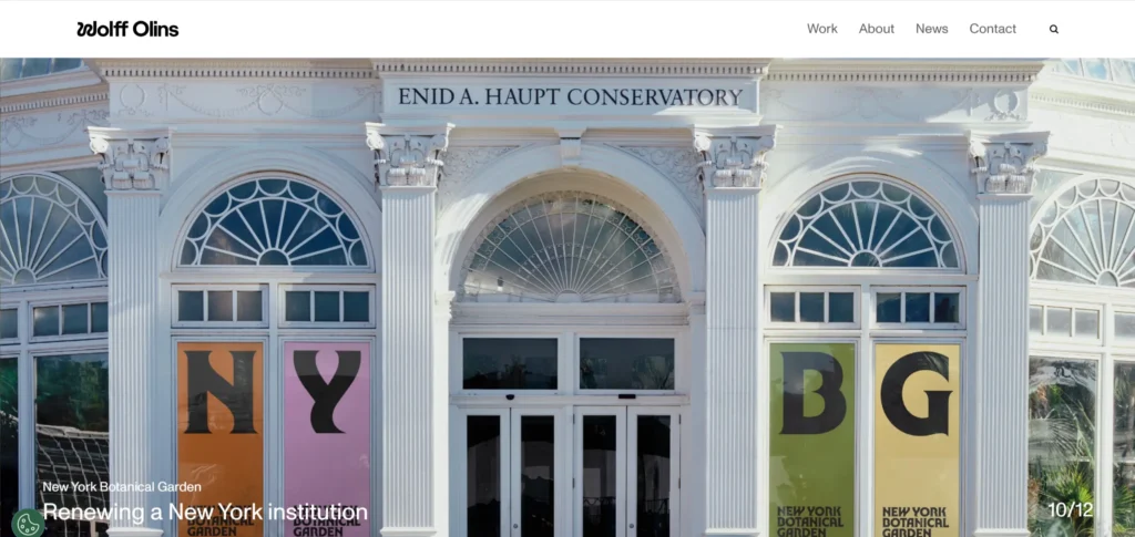
Wolff Olins is one of the most respected brand strategy firms in the world, and their website communicates this through restraint and authority rather than portfolio volume. Case studies are selective: a small number of high-profile engagements rather than a comprehensive archive. The writing throughout the site is sharp and opinionated, which demonstrates the strategic thinking capability that is their actual product.
Design lesson: For strategy-led agencies, the quality and selectivity of the portfolio matter more than its volume. Showing ten transformative projects is more persuasive than showing fifty competent ones.
5. Ueno
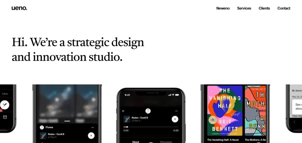
Ueno built a significant following before their acquisition by Twitter/X, and their website captured the personality of the studio in a way few agency sites manage. The tone of the copy is distinctive and human. The team page treats people as the actual product. Case studies go deeper than most agency portfolios into the thinking behind the work rather than just the finished output.
Design lesson: Agency culture and team personality are differentiators that most agency websites do not leverage. Visitors are hiring people as much as they are hiring capabilities. A team page that communicates genuine personality converts better than a roster of headshots and job titles.
6. Area 17
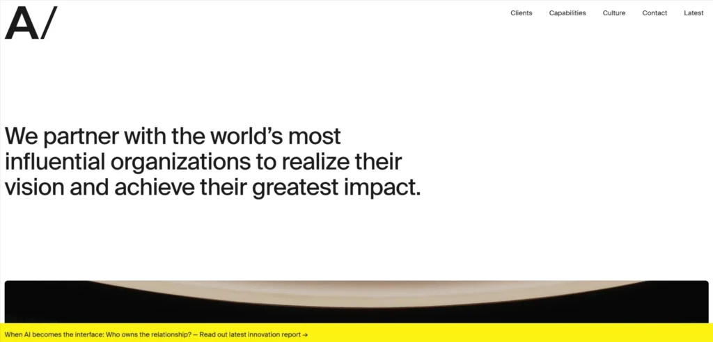
Area 17 is a digital product and brand agency whose website communicates both craft and rigour. The case studies are detailed and honest about the brief, the process, and the constraints. The thinking section functions as a content marketing hub that generates organic traffic from design and strategy searches. The visual design of the site itself is a credible representation of their digital product capability.
Design lesson: Publishing genuine thinking about design, strategy, and process creates organic search traffic and positions the agency as a point of view, not just a service provider.
7. Hello Monday
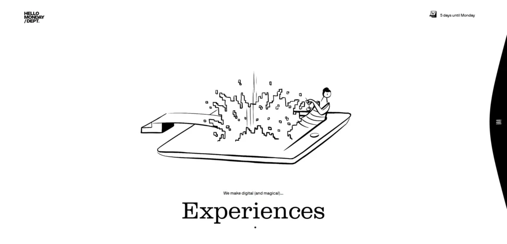
Hello Monday is a creative studio whose website uses playful motion design to create a first impression that is immediately distinctive. The homepage interactions demonstrate their specific capability in digital experience design. Client logos and project thumbnails are displayed in a grid that communicates range without overwhelming. The studio blog covers process and thinking in a way that attracts design-literate clients.
Design lesson: Motion design on an agency’s own website should be purposeful rather than decorative. Each interactive element should demonstrate a specific capability your clients want to hire.
8. Ideo
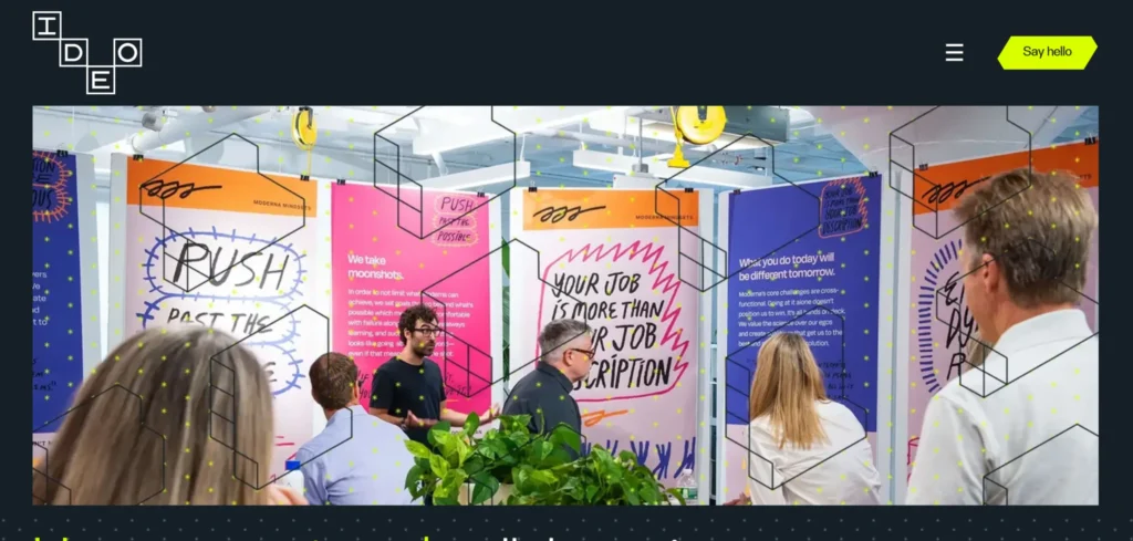
IDEO’s website reflects its position as a design thinking consultancy rather than a production studio. The emphasis is on methodology, impact stories, and thought leadership. Work is presented in terms of human outcomes rather than visual deliverables. The writing style is considered, and the case studies read more like Harvard Business School cases than portfolio entries.
Design lesson: The language you use to describe your work signals the type of client you are seeking. IDEO’s case studies are written for C-suite decision-makers, not creative directors. Your portfolio language should speak to the person who signs the brief.
9. Pentagram
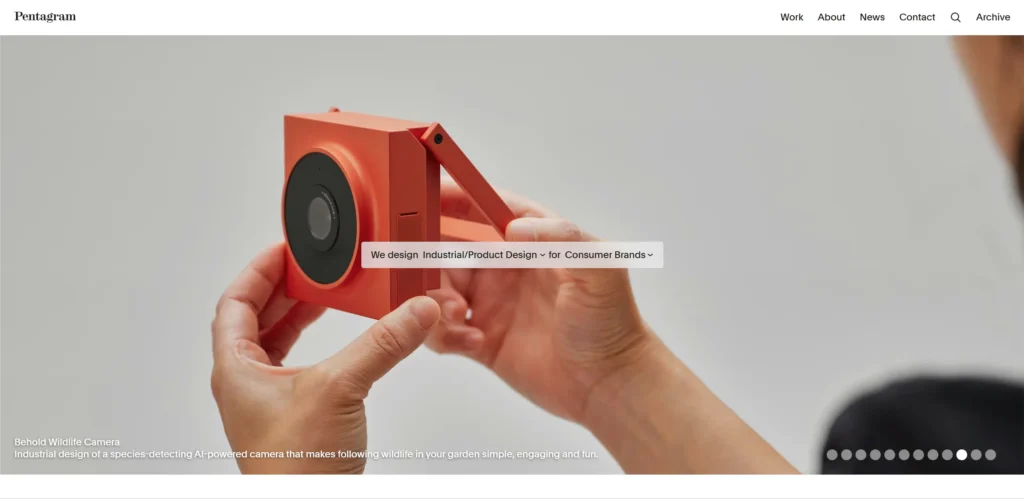
Pentagram’s website is a comprehensive archive of brand and design work spanning decades, organized by partner, discipline, and client. The breadth and depth of the portfolio is itself the argument. Navigation is structured for serious portfolio browsing rather than quick-scan evaluation. The partner model is central to the site architecture, which reinforces their positioning as a collective of named creative directors rather than an anonymous agency.
Design lesson: If your agency has genuine archive depth, organizing the portfolio by designer or creative director creates a browsing experience that sophisticated clients value and that generic agencies cannot replicate.
10. Collins
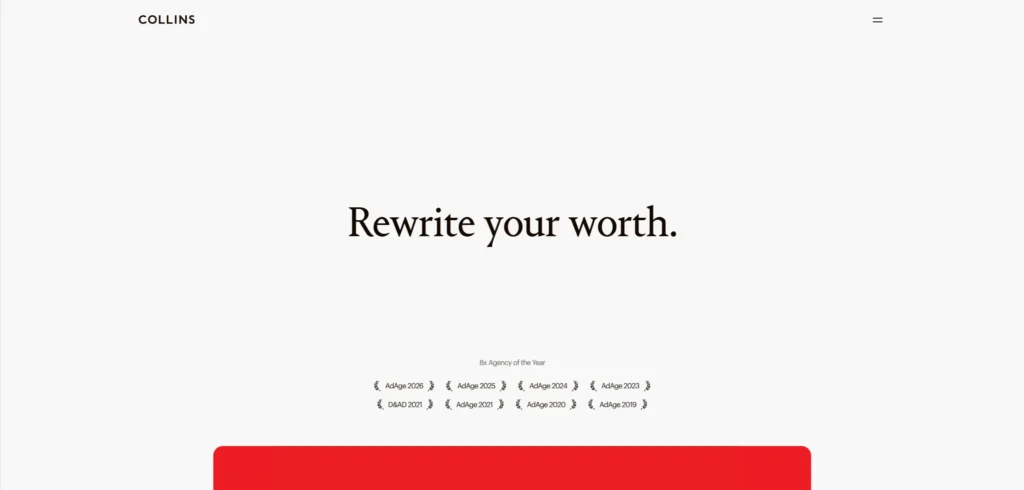
Collins is a brand and experience consultancy whose work includes some of the most recognized identity systems of the past decade. Their website presents this work with confidence and without apology for scale. Case studies are written with genuine strategic depth. The visual presentation is considered consistent across every project entry.
Design lesson: Consistency in how case studies are presented across a portfolio signals operational maturity to clients who have worked with agencies that produce inconsistent deliverables.
11. B-Reel
B-Reel is a creative production company whose website communicates cinematic quality through the production value of the assets used across the site. Video is used purposefully rather than as background decoration. The project archive demonstrates a range across commercial, interactive, and branded content categories.
Design lesson: Production value of the assets on an agency website must match the production value of the work the agency produces. A video production company with low-quality video on its website creates a credibility gap that copy cannot bridge.
12. Koto Studio
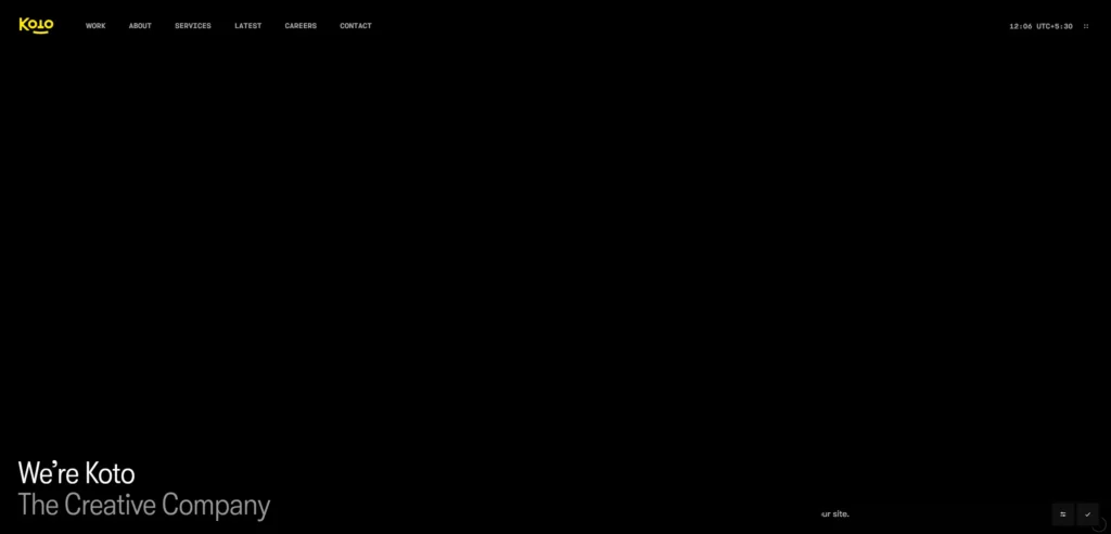
Koto is a branding studio whose website is one of the cleanest expressions of a single-discipline agency done well. The focus is sharp (identity and brand systems) and every element of the website serves that focus. Case studies are visual and specific. The process section explains their methodology without over-explaining. The tone is friendly and approachable, which reflects their positioning as a studio that is accessible to founder-led businesses as well as enterprise clients.
Design lesson: A tightly focused agency website that communicates a clear specialism converts better than a broad capability list. Clients hiring for a specific need respond to agencies that clearly understand that need.
What These Creative Agency Website Have in Common
Looking across all 12 examples, these patterns appear consistently in the ones that work best commercially, not just aesthetically.
Work is presented before credentials: the portfolio leads, the services list follows
Case studies communicate outcomes and thinking, not just deliverables
The design of the website itself demonstrates the specific capability the agency is selling
Copy is written with a point of view rather than in generic agency language
Team and culture are treated as differentiators, not as a compliance section
5 Design Elements Every Creative Agency Website Needs
Whether you are building from scratch or redesigning an existing site, these five elements consistently separate high-performing examples from functional but forgettable ones.
1. A portfolio that appears before the services list
A portfolio that appears before the services list: the work is the argument
2. Case studies written for the decision-maker who signs the brief, not for other designers
Case studies written for the decision-maker who signs the brief, not for other designers
3. Agency point of view stated clearly in the hero section or immediately below it
The agency point of view is stated clearly in the hero section or immediately below it
4. Team page that communicates personality, not just credentials
Team page that communicates personality, not just credentials
5. A contact or brief submission process that feels considered rather than like a generic inquiry form
A contact or brief submission process that feels considered rather than like a generic enquiry form
AI Implementation for Creative Agency Websites in 2026
Most creative agency website articles cover design examples. Almost none address AI implementation, which is where the commercial gap is opening in 2026. The creative agency website that implements these features in the next 12 months will have a measurable advantage over those that do not.
1. AI-Powered Portfolio Filtering and Discovery
A creative agency with 50+ projects needs intelligent portfolio filtering that goes beyond category tags. An AI-powered search that understands ‘rebrand for a healthcare startup’ or ‘motion identity for a fintech brand’ returns more relevant results than tag-based filters. Algolia’s AI search integrates with most CMS platforms and significantly improves portfolio discovery for agencies with large archives.
2. AI Chat for New Business Enquiries
New business inquiries typically arrive with incomplete briefs and vague requirements. An AI chat assistant trained on your agency’s capabilities, typical project scopes, and pricing ranges can qualify leads, help prospects articulate their brief, and schedule the first conversation, before the business development team is available. This matters most for agencies in different time zones from their primary client market.
3. Intelligent Case Study Recommendations
A visitor who has read the Wolff Olins brand strategy case study is more likely to be interested in another strategic brand case study than in an environmental graphics project. AI-powered related content recommendations increase time on site and expose prospects to work that is relevant to their specific interest, increasing the likelihood of an enquiry.
4. AI-Assisted RFI and Brief Response
Responding to RFIs and creative briefs is one of the most time-consuming activities in agency new business. AI tools trained on previous winning proposals can generate first-draft responses that the team edits and personalises, reducing the time-to-submission and allowing the agency to respond to more opportunities without increasing headcount.
KrishaWeb builds AI-integrated creative agency websites on WordPress and other platforms. If your current site is not using these features, our team can assess what to implement first based on your specific conversion goals.
A creative agency website should include a portfolio that leads with the strongest work, case studies that communicate outcomes and thinking rather than just deliverables, a clear positioning statement that differentiates the agency from competitors, team information that communicates culture and personality, and a contact process that reflects the quality of the agency’s work.
How important is the design of a creative agency’s own website?
It is the most important portfolio piece the agency has. Prospects evaluate whether an agency can do for their brand what the agency has done for its own. A creative agency whose website looks generic or dated is signalling that their own business does not benefit from their services, which raises obvious questions about client outcomes.
How many case studies should a creative agency website have?
Quality matters significantly more than quantity. Ten case studies that each demonstrate genuine strategic thinking and creative rigour are more persuasive than forty portfolio entries that show finished work without context. The agencies on this list that win the most interesting briefs all have selective, deeply written portfolios.
Should a creative agency show pricing on its website?
Most creative agencies do not show project pricing, and that is generally the right decision for bespoke project work where the scope varies significantly. The exception is agencies with a standardized service offering (a fixed-price brand identity package, for example) where pricing transparency removes a friction point for the client segment those packages target.
How can AI improve a creative agency website?
AI can improve portfolio discovery, qualify and route new business inquiries outside business hours, recommend relevant case studies based on visitor behavior, and assist with first-draft responses to RFIs and briefs. None of these replaces the creative and strategic thinking that is the agency’s actual product.
Conclusion
The 12 creative agency websites on this list span different scales, budgets, and markets. What they share is not production budget or agency pedigree. It is a commitment to treating the website as a genuine commercial and brand tool rather than a digital brochure.
The design elements that matter most in this category are not complex or expensive to implement. Strong photography, a clear path to the primary conversion action, social proof specific enough to be credible, and mobile performance that matches desktop quality. These are achievable at almost any budget with the right priorities.
If your current creative agency website is not doing these things, talk to KrishaWeb’s web design team about what a focused redesign would look like for your specific goals with a professional web design service.
Ready to improve your website? KrishaWeb has been designing and developing conversion-focused websites since 2008. Tell us your goals, and we will tell you the right approach.
Disclaimer: This article is intended for informational and inspirational purposes only. The website examples featured are owned by their respective organizations. KrishaWeb has no affiliation with any of the websites referenced unless otherwise stated. All observations, statistics, and design notes reflect research current as of April 2026 and may change over time.
Nisarg Pandya
Project Manager
Experienced Project Manager and Scrum Master at KrishaWeb, delivers expertise in Scrum methodologies, Laravel, React.js, UX design, and project management, ensuring efficient project delivery and agile implementation.




 KrishaLabs
 KrishaStudio
 KrishaStore