In 2026, the best Webflow sites are not only aesthetically appealing but also provide a user-friendly experience, communicate clear stories, and load quickly over busy mobile connections. In reviewing the strongest sites created in Webflow, you will see commonalities, including intentional design decisions related to user experience (UX), purposeful animation, and content that prioritises the user’s time.
Here is a practical walk-through of 18 Webflow sites worth studying, plus how you can apply the same thinking to your own website and where KrishaWeb can help if you want expert support.
Why Webflow Leads Modern UX in 2026
Webflow has become a favorite for teams that want the flexibility of a custom build without long, developer-heavy cycles. Designers can control layout, motion, and structure visually, while marketers can ship updates without waiting weeks for engineering.
When you scan top Webflow showcases and awards, a few UX themes keep showing up:
Motion with a clear purpose that guides attention rather than just “showing off.”
Content-first layouts with clear headings, short paragraphs, and obvious calls to action
Mobile responsiveness and performance baked in from the start
Keep these in mind as you go through the examples. These examples are great ways to look at sites without just thinking about them in terms of theoretical ideas.
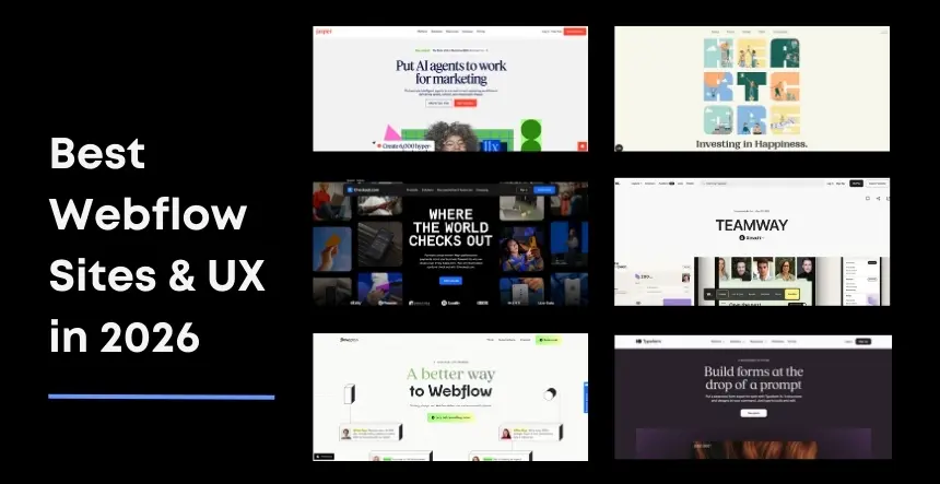
18 Best Webflow Examples To Elevate Your UX In 2026
Note: The sites featured are for inspiration only. They are owned by their respective companies, and we use their sites as examples of good Webflow UX in the “real world.”
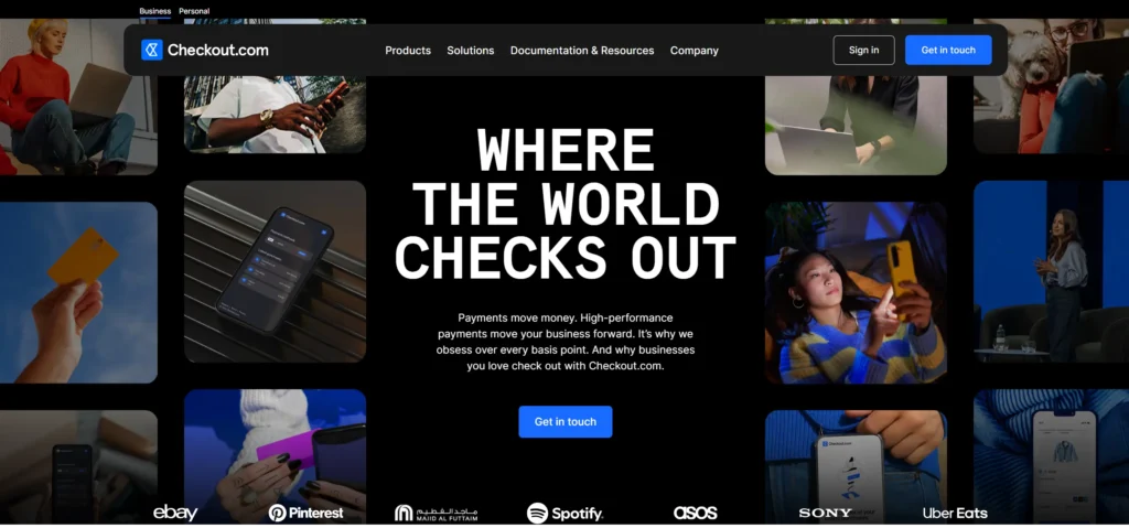
1. Checkout.com – Enterprise-Class UX With No Bloat
Checkout is doing an excellent job of providing a clean, simple site that serves as a robust example of a B2B site.
Why It Works:
Seamless navigation is integral to the buyer’s journey, with easy access to solutions, resources, and documentation.
Long pages are broken into easily identifiable sections (i.e., with distinct headings), allowing the user to know where they are at any given time (rather than wandering around for hours).
Across the site’s many pages, there is a high degree of consistency in the design system and layout. This helps build trust in the information presented.
Key Takeaway: If you are selling to enterprises or mid-market customers, review how Checkout balances content depth with simple navigation paths to demonstrate its products and/or services.
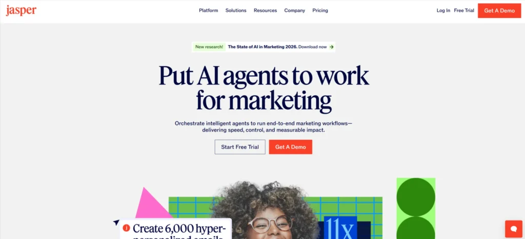
2. Jasper – Bold Brand, Controlled Motion
How Jasper demonstrated bold design and dynamic movement in an organised, easy-to-navigate format:
Key Aspects of Jasper™
Strong imagery that sticks with you, along with big, easy-to-read headlines
Storytelling through scrolling (you get to uncover each part of the story one at a time, rather than getting all the information at once)
Highlights Key Moments with Animation, Rather Than Taking Away from Your Content
Takeaway: Use a highlighter type of animation (movement) to draw attention to something that matters.
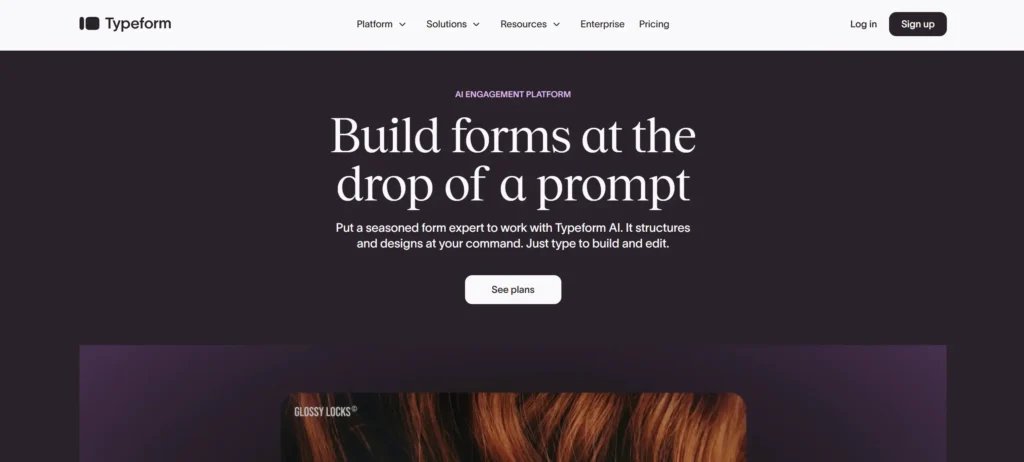
3. Typeform – Marketing Site That Can Keep Up
Typeform’s move to Webflow gave its marketing team room to experiment and iterate quickly, and you can feel that in the site.
Why it feels good to use:
Clear sections quickly explain what Typeform does best and who it is for
The structure works well for campaigns and product updates without feeling patched together
The layout is familiar yet polished, so users never need to guess where to go next
Takeaway: Your website’s ability to change quickly is part of the user experience. Webflow supports this when it is set up well.
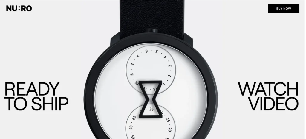
4. Nuro – Complex Tech, Simple Story
Nuro works in autonomous delivery, a complex field. Their Webflow site makes that world easy to understand.
What Makes It Successful:
Copywritten in plain language rather than technical jargon
Storytelling begins with a generalised overview of your problem/solution and then narrows as the user scrolls down the page to more specific details
Images illustrating the product being used in real-world scenarios
Key Learning: For technical products, begin with real-world benefits and imagery, then provide detailed technical information for interested users.
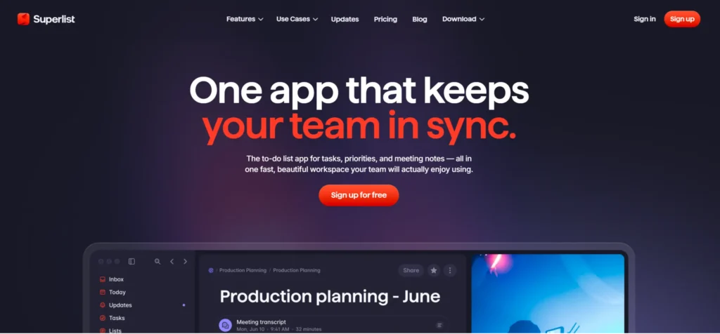
5. Superlist – A Browser-Based Version of an App
The Superlist website is similar to its productivity app in that it has an easy-to-understand, high-contrast design, provides an instant sense of how users would interact with the app through micro-interactions, and focuses on giving users opportunities to try the service rather than just browsing it.
Key Learning: Consider how your website gives visitors a sense of being a product user, rather than relying on text to describe what it would be like.
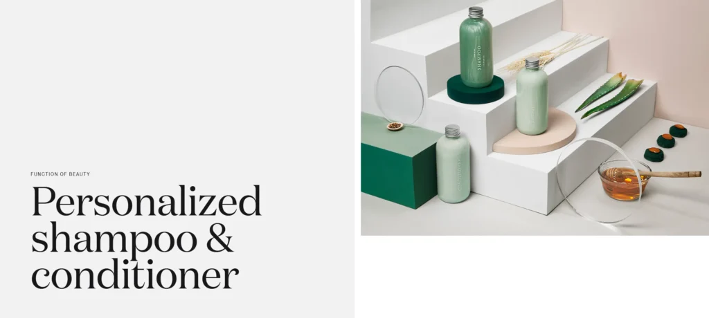
6. Function of Beauty—Simple Personalisation Process
Function of Beauty provides a very effective way to guide someone through a multi-step personalisation process without overwhelming them.
Why It Works:
Each step in their quiz is short, easy to understand, and visually appealing.
Users will see how far they have progressed throughout the quiz and feel that the personalisation experience is tailored to them, rather than just going through a series of generic questions.
Takeaway: For questionnaires and multi-step forms, design each step as a clear, simple interaction rather than a long list of decisions.
7. The Furrow—Serene and Clear Editorial UX
When it comes to the design of longer-form content, The Furrow is an excellent example of how to create a welcoming environment for reading.
Why it works:
Ample use of white space allows for a strong typography treatment to help define sections
Less clutter while you read; smooth transitions from section-to-section
A layout that encourages scrolling while not feeling overwhelmed
Takeaway: Articles, guides, and case studies should all include readability features; do not include them as an afterthought.
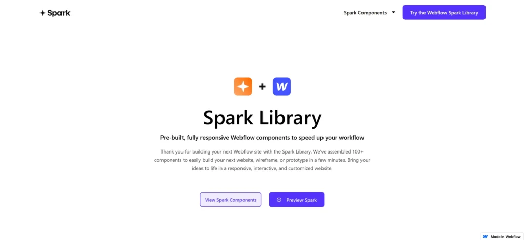
8. Spark Library – Focused Navigation
Spark Library does a nice job of making a catalog of items feel easy to browse.
UX Highlights:
Filtering and categorisation that are intuitive enough that no explanation is needed
Cards that provide for fast and intuitive scanning
Takeaway: If you have repeatable items (e.g., resources, components, or products), invest in layouts that are easy to scan and use clear filtering.
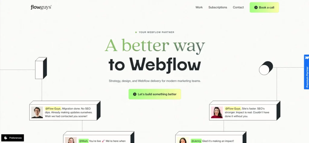
9. Flow Guys—One-Page Site That Still Breathes
Flow Guys packs a lot of information into one page, yet the site still feels light and easy to navigate.
What makes this project great:
Each subdivision feels like a distinct and separate idea.
The visual variety provided has been offset by a consistent grid structure and rhythm.
Content blocks remain short and focused on one topic so that you never feel like you are reading a wall of text.
Takeaway: As you scroll down long pages, each subdivision can be treated as a separate slide in a presentation, with one organised concept and one unified action.
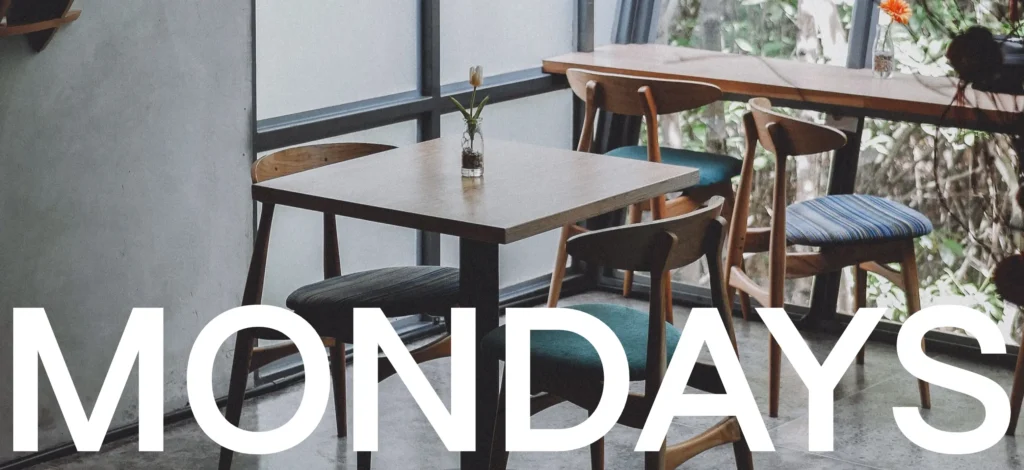
10 – Mondays Coffee – Digital Experience
Mondays Coffee has taken a simple idea and created it into a digitally engaging brand experience.
What is happening here?
The hero image immediately conveys the brand’s mood and expression.
When you scroll through the product categories, they develop naturally into a story, much like a conversation.
Both the text and imagery create an emotional connection to what the brand represents.
Takeaway: Hospitality and lifestyle brands should strive to create a visual representation of what the experience feels like in reality, using visuals and the pace of their digital experience.
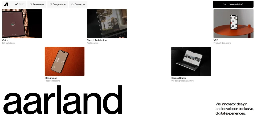
11. Aarland’s Portfolio: Personality & Clarity
Aarland uses his portfolio to create expressive design while keeping the navigation simple.
Reason to explore:
Playful interaction still allows for easy access to important links.
Large headings and clearly labeled projects/sections.
Takeaway: A successful portfolio will feel like “you” and clearly indicate where to find your work and how to contact you.
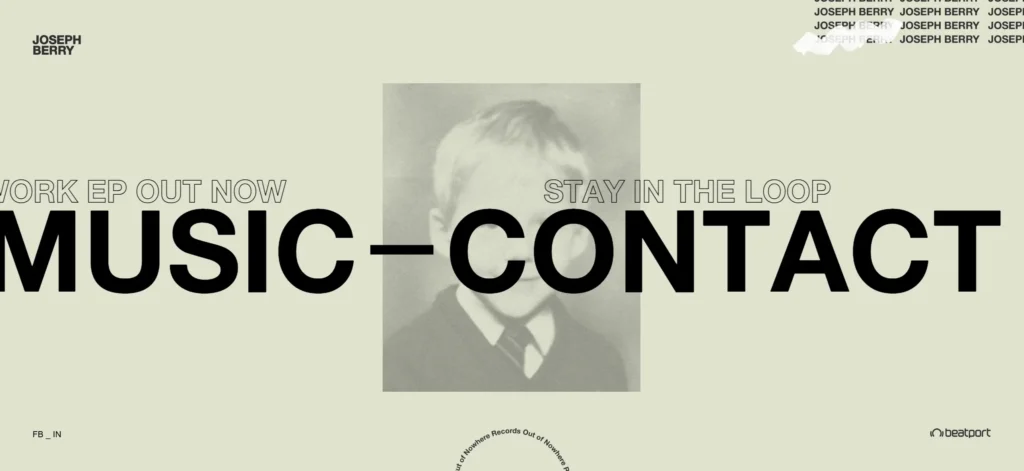
12. Joseph Berry’s Portfolio: Advanced Motion In Control
Joseph Berry has an excellent example of using motion design to push the usability envelope without compromising usability.
Key strengths:
Transitions are smooth & logical, with a purposeful feel rather than feeling “gimmicky.”
There are clear & logical paths through your work, services offered, and contact methods.
Takeaway: Complex animation should enhance your narrative; when it becomes the narrative, it typically obstructs the user.
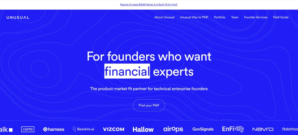
13. Unusual Ventures – A Clear Approach to a Complicated Service
Unusual Ventures has created a more human touch to the experience of starting a venture.
Why it’s different:
The messaging is written in simple, directive, and conversational language, specifically for founders.
Each section (portfolio, team page, resources) has well-defined and organised content.
Key Takeaway: With longer decision cycles for a service, clarity and comfort are more important than effects or other types of visuals.
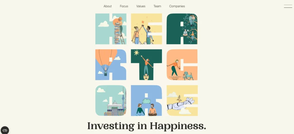
14. Heartcore—Emotion and Conversion Combined
Heartcore combines the brand’s emotional story with relevant, practical ways to take action.
Highlights:
Great visuals that capture the brand’s lifestyle, community, and energy.
Easy to navigate to classes, locations, and membership.
Key Takeaway: If your brand is driven by community or experience, ensure that your emotional narrative and key action points are next to each other on your website.
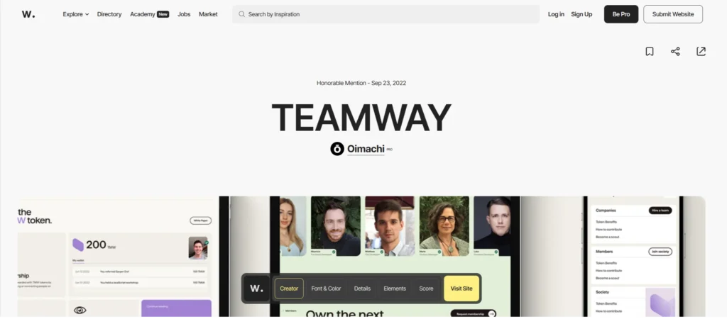
15. Teamway—Two Audiences on a Single Website
Teamway’s websiteprovides information to both talent and companies without confusing either audience.
Where Teamway succeeds:
Segmentation of audiences is clear throughout the sites’ navigation and written content.
Tons of support through testimonials, logos, and case studies, leading the reader to take action.
Key Takeaway: When you have more than one audience, create distinct, specific paths for each rather than relying on a single default path to carry them all.
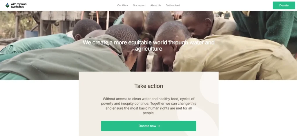
16. With My Own Two Hands Foundation—Emotion That Drives Action
The With My Own Two Hands Foundation was created by former basketball player Lindsey Pluimer after witnessing the suffering caused by poverty and lack of basic human needs firsthand in South Africa.
Use this organisation as an example of how to implement your own ideas for helping those in need globally.
Include a true story in your hero’s section for a nonprofit or cause issue.
Use solid imagery with concise, emotional content about the organisation rather than lengthy paragraphs, which some may miss.
Document every significant aspect of giving, sponsoring, and volunteering on every primary content page.
Takeaway: The My Own Two Hands Foundation is an example of how to incorporate storytelling, visual content, and an easy-to-understand call to action into a single website.
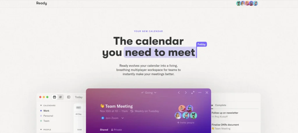
17. Ready—Single-Page Product Story That Flows
Ready is a great example of how much you can achieve with a single-page layout when every section is thoughtfully designed. The site opens with a bold title that uses a text highlight effect to grab attention right away, followed by a clear, simple explanation of what Ready actually does. Instead of stopping at words, the page quickly moves into a live, engaging demonstration of the calendar in action, helping visitors understand the value in seconds, not minutes.
Using Ready as Inspiration:
Create an Attention-Grabbing Headline and Visual Above the Fold to Create Curiosity
Follow the Introduction with a Product Demo or Visual Walkthrough to Show How the Product Works
Continue Adding Small Engaging Sections of Content Down the Page That Address Various Features or Use Cases Without Compromising the Overall Feel of the Page
Takeaway: Ready demonstrates that you can quickly capture users’ attention and convey value through a well-designed one-page site that incorporates smooth animation and a clear product demonstration; in fact, it is likely impossible to impress certain users who may be difficult to impress.
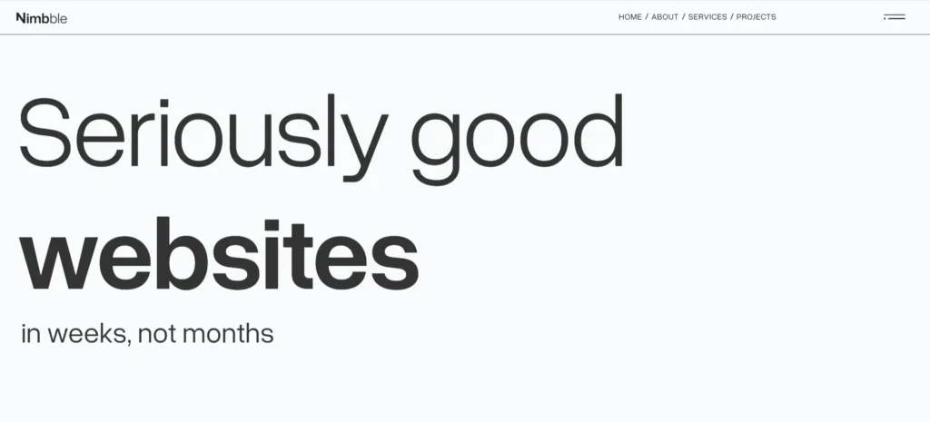
18. Nimbble – Dark Mode Done Right
The Nimbble website illustrates how a dark design can have a high-end and premium look with a smooth and welcoming presence rather than a heavy one. One of the first things you notice when you land on the home page is the large animated whale that immediately captures your attention, and the bold and outlined type (which holds its own against the dark background) is so visually appealing that you can’t help but want to keep scrolling.
Design inspiration:
Dark vs Light Theme: If most of your competitors use white/light backgrounds, try a dark theme to help your site stand out and provide ample contrast and legibility.
Use a single element (animated): Instead of multiple effects, use a single memorable animated element to establish your company’s tone and overall “feel”.
Miniaturised projects/products with visuals and minimal supporting copy: Instead of just posting your project/work samples and/or product samples for potential customers to see, create an informational overview (mini-story) of each project or product with clear visuals and very little supporting copy.
Takeaway: This site is a great example of how a dark-themed Webflow design can give your website a modern, sophisticated appearance. In addition, promoting a cohesive and polished brand image that utilises clear typography along with thoughtful motion and animation elements will quickly differentiate your site from others’ sites and give your brand a sense of professionalism.
Conclusion: Inspiration Is the Starting Line, Not the Finish Line
Spending time with the best Webflow site examples is one of the fastest ways to improve your own sense of what great UX looks like in 2026. Transforming the inspiration behind a great website into a fully functional business requires much more than simply choosing a good design/layout.
You will need to:
Take time to map out the different user journeys and what is most important to each page.
Develop your content so users can easily understand the message and take action.
Create a Webflow configuration that is both efficient and secure, giving your team an easily manageable site.
The proper combination of strategy, UX, and implementation is where a specialist partner can offer tremendous assistance.
At KrishaWeb, we partner with businesses, startups, and B2B brands to design and build high-quality Webflow sites that are not only visually similar to those showcased but are also customised to their specific goals and needs. Through our UX, UI, and Webflow development, we focus on building smart systems that prioritise performance, scalability, and long-term sustainability rather than a pattern of one-off redesigns. If you are looking for Webflow development solutions that not only look contemporary but also deliver real results for your business, the KrishaWeb Team can help by guiding the planning, design, and build of your site in a clear, collaborative manner.
Frequently Asked Questions
Where can I find more examples of the top Webflow sites?
You should check out the official Webflow award & showcase pages, which feature regularly updated real-world Webflow projects to learn from, along with independent design/inspiration blogs that have curated lists of excellent Webflow designs.
What are some things that successful Webflow websites have in common?
The most successful Webflow sites are typically fast, well-structured, and easy to navigate. They often structure their content to reflect how users read online, have clearly defined calls to action, promote without being aggressive, and do so with seamless interaction rather than disruption.
Do I need a completely custom design to reach this level of quality?
Not always. Some teams start with a solid template and then heavily evolve it. The sites that make “best of” lists usually involve thoughtful UX work, strong content, and careful Webflow implementation, whether or not a template was involved at the start.
Can large and/or complex websites, like these, be built on Webflow?
Yes. Many of the example sites shared above are complex, multi-page sites that are full of content and/or complicated layouts/design systems. If you have a solid team to build and manage your website, a good site layout will help create a sustainable, cohesive web presence.
How can I use these examples without copying other people’s designs?
Focus on the principles behind what you like. Look at how information is grouped, how navigation works, how motion is used, and how content is written. Then ask how those principles apply to your audience and goals, rather than copying layouts.
Disclaimer
The names (and websites) used in this article are meant for inspiration and educational purposes only.
We are not associated with Webflow and are not claiming any rights to their designs, trademarks, or any other content.
As a rule, URLs, features, and visual aspects of these sites may change over time. Be sure to check out the live version of these sites or their respective galleries (for example, My Codeless Website or Webflow’s Made in Webflow, Awwards, Webflow Awards, and Colorlib)—for the latest version of the website.
Nisarg Pandya
Project Manager
Experienced Project Manager and Scrum Master at KrishaWeb, delivers expertise in Scrum methodologies, Laravel, React.js, UX design, and project management, ensuring efficient project delivery and agile implementation.