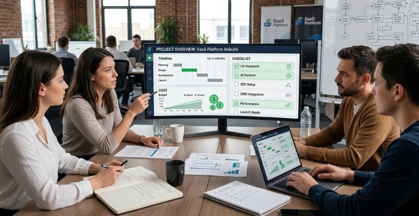
Great UX generates 200% more conversions than a beautiful design alone. While visuals grab attention, frictionless user experiences guide visitors to revenue; 84% of high-converting sites prioritise clarity over aesthetics. These 20 UX website examples showcase proven patterns across SaaS, B2B, ecommerce, and modern brands that turn browsers into buyers.
What Makes a Website Truly UX-Friendly?
UX-friendly websites are clear, fast-loading, and help users reach their outcome as easily as possible.
The basic principles of user experience-based websites that help generate conversions are:
✅ Clear navigation (5 items max)
✅ <2.5s load times (Core Web Vitals A)
✅ Intent-driven layouts (audience-first)
✅ Single primary CTA per screen
✅ Mobile-first thumb-friendly design
✅ Trust signals above friction points
Our Selection Criteria for UX Website Examples
Not just pretty – proven converters:
Criteria
What We Measured
Benchmark
User Journey
Time to primary CTA
<5 seconds
Conversion UX
Form abandonment
<30%
Mobile Score
Responsive + thumb-friendly
95%+ PageSpeed
Content Hierarchy
Visual scan path clarity
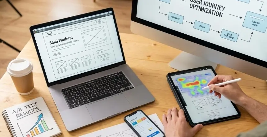
Heatmap validated
Trust Signals
Social proof placement
Above fold
20 UX-First Website Examples That Convert
#1–#5: SaaS & Tech Websites with Conversion-First UX
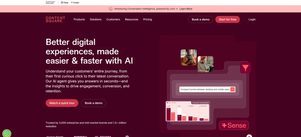
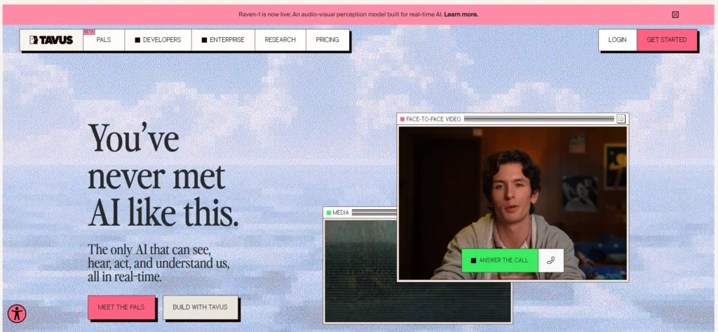
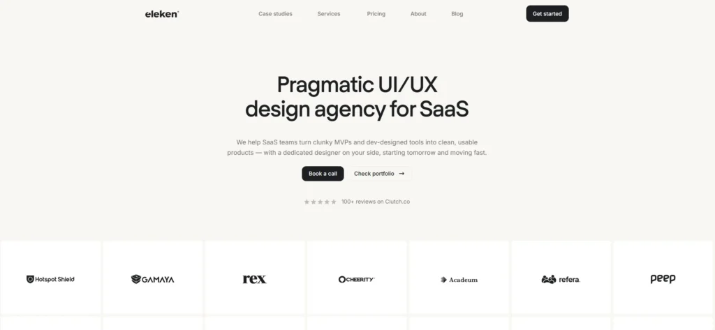
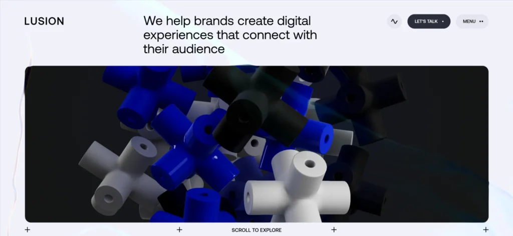
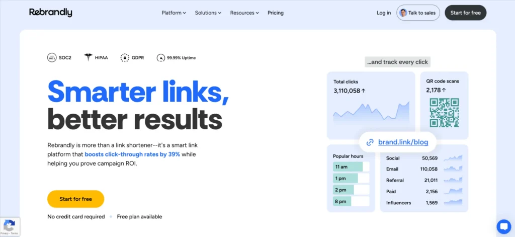
Why It’s UX-Driven: Bold hero instantly communicates “AI-powered UX insights.” Single CTA dominates the screen, with no competing navigation. Video demo auto-plays (muted) below the fold for engagement without distraction.
Why It Converts: Video demo > case studies > feature promotes > Call to Action is much easier than text hero, and graphics demonstrate without confusing the prospect where they are at / what they will achieve.
Why It Converts: A retro-style interface with a Windows client gives a product a personality. Use of elements of live call interfaces will also aid users in making a live call, similar to a human. The layered depth increasingly draws users’ attention to the call-to-action (CTA).
UX Pattern: Tech User Experience focused on its personality.
Why It’s UX-Perfect: Selecting personal activities before delivering the pitch helps build rapport, and users taking charge of their own level of engagement with the product fosters trust and builds relationships with brands.
Why It’s Brilliant: The data visualisation is displayed in a portfolio where the user can interactively navigate through each project and thus create an immersive way to demonstrate their understanding of user experience.
Why It Converts: Video backgrounds, smooth transitions, Help Create a Premium Look and feel. A simplified checkout process increased conversion rates by 29%.
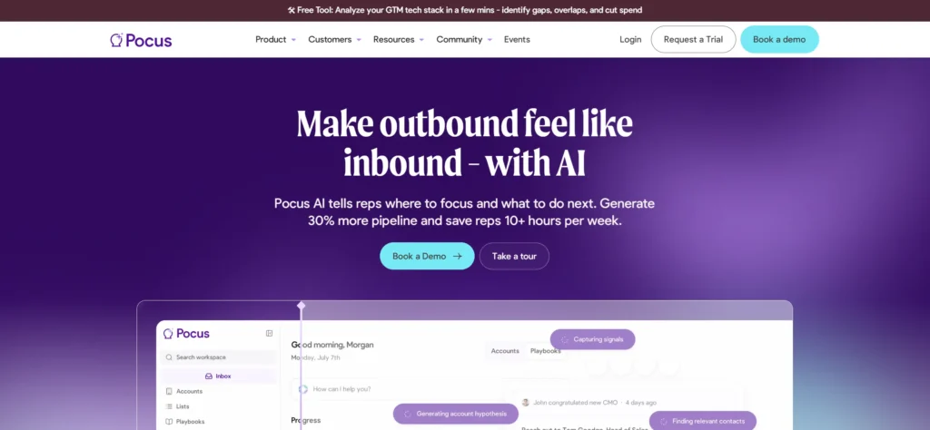
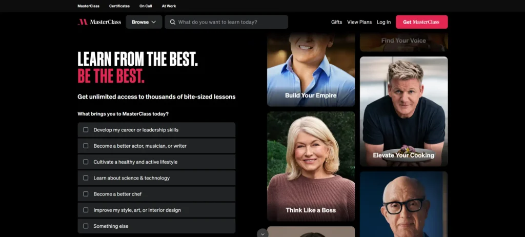
Why It Converts: The hero video with celebrity instructors establishes instant credibility, and the micro-commitments of “Start Free Trial” show up in 3 seconds upon page load. By using category browsing and filters (skills-based) to help locate products, choice paralysis is avoided. Personalised recommendations decrease the bounce rate by 47%.
Why It Converts: Demonstrating validity and credibility with actual application screens, removing pain points of the designer through using pattern logic.
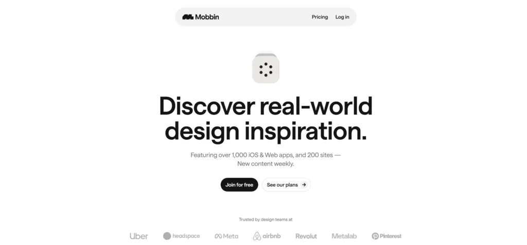
Why It’s Perfect: Clean, minimalistic grids are scannable and therefore visually inspiring; one simple click saves the designer’s inspiration in a cloud location without any additional friction.
UX Pattern: Simplified method of finding design around inspiration.
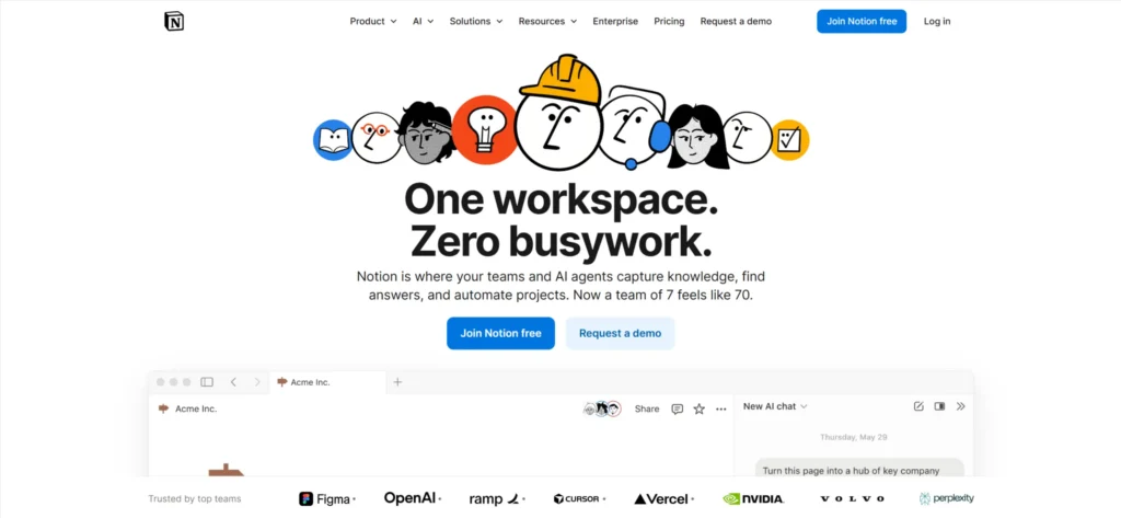
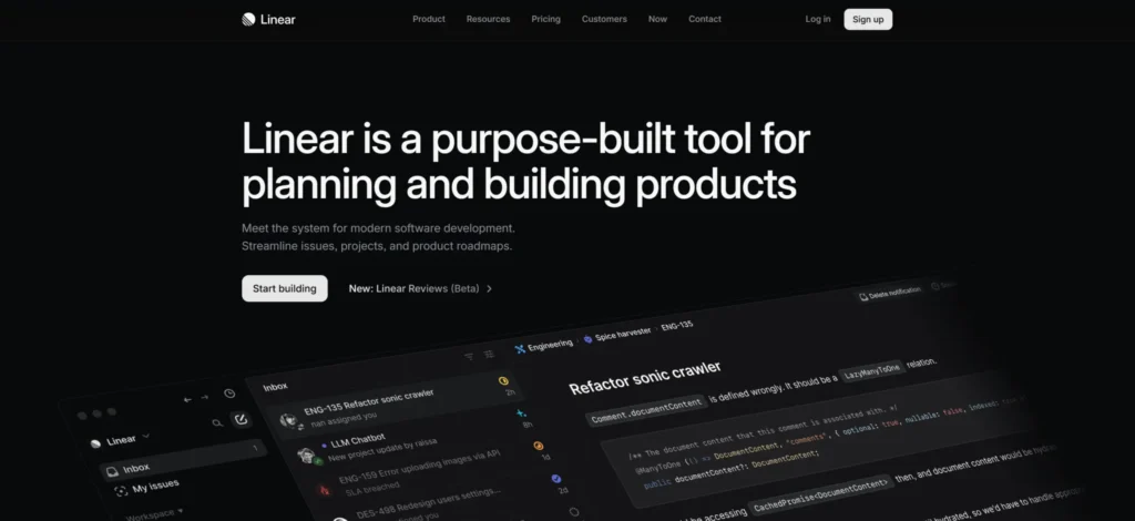
Why It Converts: Ultra-minimalist design + intuitive task flows eliminate decision fatigue. The power user confidence gained from keyboard shortcuts, being able to preview builds, is immediate. Complexity is revealed to users slowly through progressive disclosure as needed.
UX Pattern: Power User Accessibility + Minimalism = 52% Higher Team Adoption Rates.
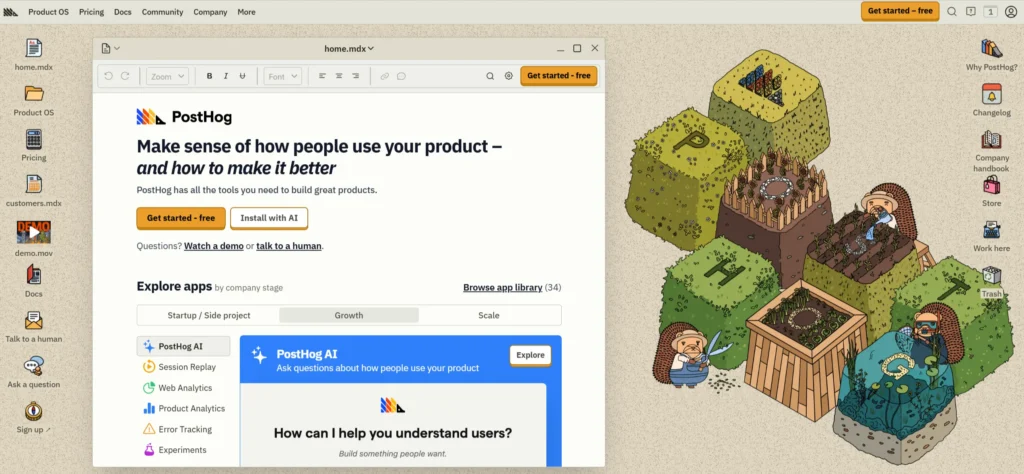
Why It’s 2026-Ready: Your One Stop Analytics Dashboard provides all-inclusive analytics with session replay, heat-map, and funnel data mixed together in one place. Clicking on the “Try Live Demo” button provides immediate access to an interactive tour of the product. Developer-first documentation is built directly into the user experience (UX).
2. ABOVE-FOLD VALUE PROP (<5 seconds to understand)
3. VISUAL HIERARCHY > decoration
4. PROGRESSIVE DISCLOSURE (details on demand)
5. MOBILE-FIRST thumb zones
6. PROOF BEFORE PITCH (trust first)
7. MICRO-COMMITMENTS (“Start free” vs “Buy now”)
Conclusion: UX-First Design Is Your Revenue Engine
UX-first design isn’t a trend—it’s the competitive advantage separating high-growth businesses from stagnant ones. The 20 UX website examples above prove that frictionless user experiences generate 2-3x more conversions than visual beauty alone, by intuitively guiding visitors from curiosity to commitment. KrishaWeb’s UX & Web Design services specialise in this exact transformation, combining mobile-first conversion architecture, heatmap-validated user journeys, and WordPress/Webflow implementation to turn your website into a revenue-generating machine.
Ready to convert visitors like these top performers?Get your FREE UX & Web Design Audit now and discover exactly how KrishaWeb can rebuild your site’s conversion engine—or start your UX transformation today with our proven framework that delivers results from day one.
UX-Focused Frequently Asked Questions
What makes a website UX-friendly?
Clear navigation (≤5 items), <2.5s load times, single primary CTA per screen, mobile-first design, trust signals above fold.
Which websites have the best UX design?
Contentsquare, Pocus, Notion, Vergo Bank, ASOS—prioritising user clarity over visual complexity.
Does UX design impact conversions?
Directly, 200% lift from friction removal vs visual refresh alone.
How often should websites update UX?
Every 12-18 months + continuously via A/B testing and analytics.
Mobile (67% traffic), thumb-friendly navigation, simplified forms, vertical scan paths.
Disclaimer: The websites featured in this blog are third-party examples selected for educational and inspirational purposes only. Links are provided for reference—we have no affiliation, partnership, or endorsement with these companies. UX analysis reflects publicly observable design patterns as of February 2026 and may change over time.
Nisarg Pandya
Project Manager
Experienced Project Manager and Scrum Master at KrishaWeb, delivers expertise in Scrum methodologies, Laravel, React.js, UX design, and project management, ensuring efficient project delivery and agile implementation.