The majority of SaaS business owners believe that their main challenge is low website traffic. However, after reviewing their data and working with many SaaS businesses, we have found that many SaaS companies struggle to convert visitors into paying customers. The root cause is often ineffective UX/UI design rather than website traffic.
The reality is that while you can drive traffic through SEO, paid search advertising, and CONTENT FUNNELS, if your website is not designed to deliver users a positive experience and trust in your brand, every click is wasted.
With the rapid rise of SaaS companies in recent years, KrishaWeb has provided user experience (UX) and user interface (UI)/web design services to a number of rapidly growing SaaS companies on both the B2B and B2C sides, as well as to Enterprise businesses. What is most evident from our work with these businesses is that UI/UX design is an exciting way to increase revenue by improving user activation and retention.
As we approach the end of 2025, AI-driven search engines are becoming more influential. These algorithms evaluate the quality of user experience on your website. They will compare user interaction with your website against other sites that show up in organic and SERP (Search Engine Results) or through sponsored ads.
In 2026, UI/UX best practices will increasingly be shaped by advancements in AI-powered search algorithms.
This article provides examples of UI/UX best practices to help transform SaaS business websites into high-performing growth channels. The article will explore how to identify which types of SaaS business websites convert well, what constitutes a high-converting SaaS website, and why UX/UI will be the primary growth lever for SaaS business owners in 2026.
Defining a High-Converting SaaS Website
A high-converting SaaS website offers an optimised user experience. It helps qualified visitors become active and paying users. This is achieved through clear and concise messaging, an intuitive design, and the ability to perform actions without obstacles or barriers.
Unlike eCommerce or marketing websites, SaaS UX/UI design has a different goal. SaaS designers must explain complex value propositions in a simple and clear way. The website should make it easy for trial users to understand the product. It should also simplify every interaction during the trial experience.
Throughout the journey, the user should be guided step by step with minimal friction.
Key Performance Indicators for SaaS (Software as a Service) can be significantly affected by UI and UX. Activation rates are greatly improved by a guided onboarding experience. The transition from trial user to paid customer is improved by reducing cognitive load. Churn is reduced through habit-forming interaction design. Additional revenue is generated through UX-focused designs that clearly demonstrate the product’s value.
UI/UX Best Practices That Drive High Conversion Rates
Value Proposition Placement and Messaging
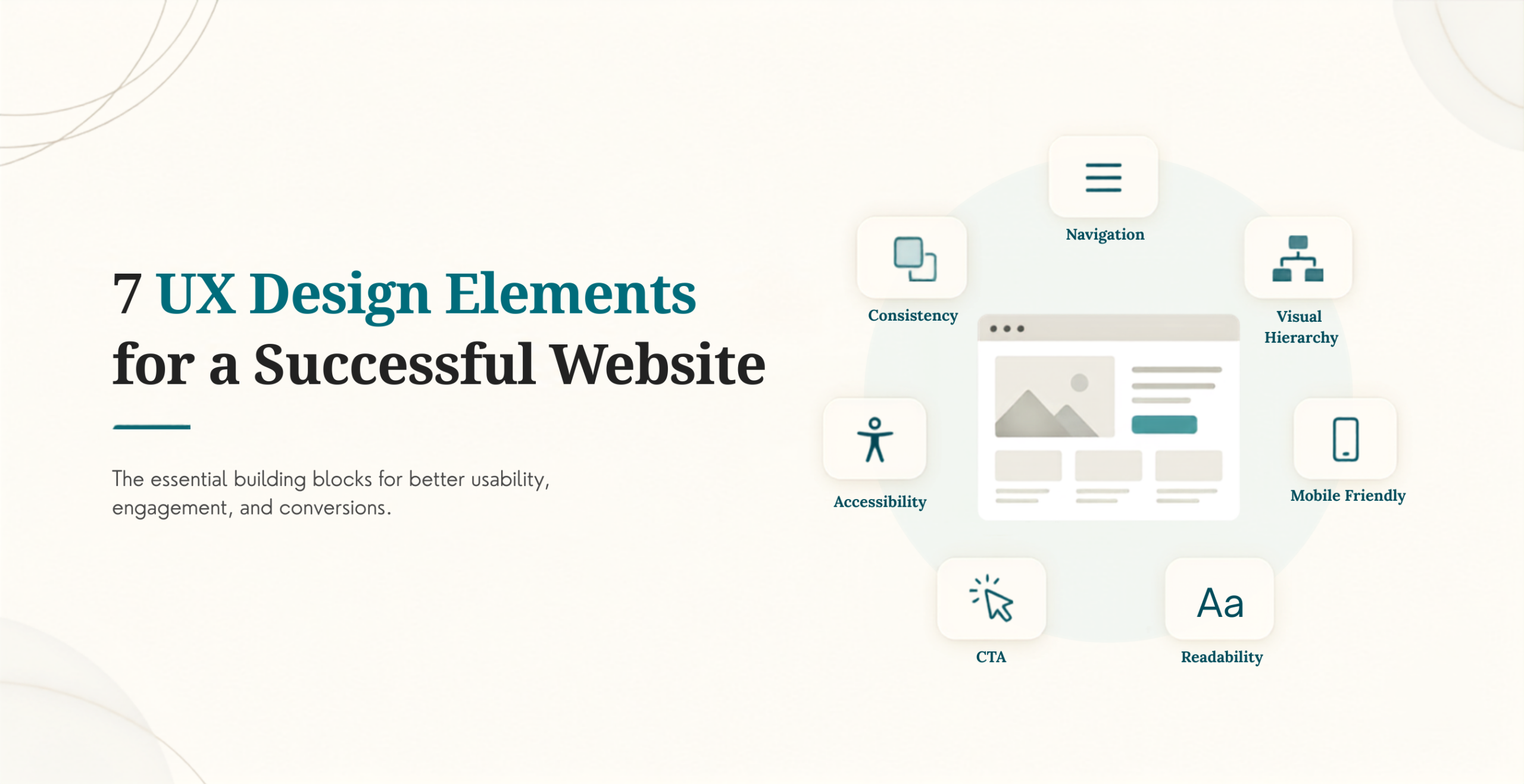
The value proposition should be clearly visible in the top fold of the page. First impressions are critical in a conversion process. A highly outcome-based headline should be the first thing seen. An accompanying subhead that describes the main value of the product in one sentence should be utilized. Logical layout of CTA, benefit, and trust badge should always be adhered to. It is critical not to provide too much information on the home page and to avoid the feature dump.
Structuring Information Architecture for User Experience
Information empathy is the principle KrishaWeb uses when designing a logical, usable navigational structure. The user journey through the application landscape should be guided by role. Navigation should remain shallow and consistent, aligned with user context.
UX Optimization for a Frictionless Onboarding Process
Onboarding is the point in time where the majority of users become paid users of the SaaS application. Progressive disclosure should be used to allow for a smooth onboarding process. Onboarding should be defined with goal-based workflows. Empty states should be created in the application to let users know what their next action should be.
UI Patterns Designed for Conversion
The CTA button should be easily identifiable and always visible. Button color and contrast should have meaning within the microcopy associated with the buttons. Visual continuity should be maintained while streamlining the process from form completion through conversion.
User Experience Focused on Trust and Credibility
Advisors rely on other advisors to help determine which products are credible, and so they should be able to find verification of advisors via hyperlinks or icons. Security icons should represent secure and trustworthy sources. Price transparency fosters trust, thereby improving the user experience. Regulatory compliance, such as GDPR, ISO, and SOC 2, should be easily identifiable by site visitors.
SaaS Mobile UX Best Practices
The first impression potential customers will have of your mobile app will come from your mobile demo. Therefore, ensure all primary Call to Action (CTA) buttons are always visible. Create registration pages that are easy to navigate and dashboards that are simplified to facilitate user navigation. Limit user interruptions caused by excessive modal pop-ups (i.e., modal windows).
Core Web Vitals – Performance/Speed – UX
Without speed, UX fails. All marketing and in-app experiences must validate the 3 Core Web Vitals: Largest Contentful Paint, First Input Delay and Cumulative Layout Shift. Lazy load components to help the customer perception of speed. Create visual load skeletons to increase perceived speed.
Best Advanced UI/UX Practices from High-Performing SaaS
UX Personalisation – When creating a dashboard, use a user-role-based approach. Use a user’s behaviour to trigger dynamic Call to Action (CTA) buttons.
Behavioural Design Best Practice for UX – Create nudges to encourage users to take action by having them symbolically report progress toward completing a goal or horizon. Use habit-forming micro-interactions and activities to keep users engaged and returning regularly.
AI-Enhanced User Experience – Identify user behaviours to enhance their experience with the application. To maximise conversion rates, SaaS companies must implement AI-driven contextual recommendations and assistance.
Typical SaaS UI/UX Roadblocks to Conversion
The site design directly impacts conversion rates because users do not convert based on an interest in the product; they convert based on the website’s ability to communicate its value through a clean user experience (UX) and clear calls to action. Many sites have over-complicated pricing structures, confusing sign-up processes, and UX that hinders product usage.
The SaaS Funnel UI/UX Design
The top-of-funnel UX is engaging, educates users on your value propositions, provides proof of value, and creates easy-to-follow calls to action (primary conversion points). The UX of the middle of the funnel engages trial users with clear onboarding and easy-to-follow guided flows. The UX of the bottom of the funnel provides cadence (feedback loops, value reinforcement, habit-building experiences) and creates habit-forming experiences for trial users.
Measuring the Success of SaaS UI/UX
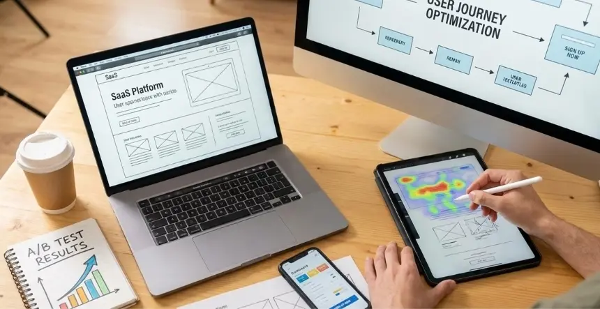
To accurately measure the success of UI/UX for your product, you will want to measure your conversions (quantitatively), time to value (how soon after you buy a product), user retention (how long do users continue to use the product), and by gathering qualitative feedback via record sessions, using heat mapping software to see where users have been using the most time, and conducting user interviews. Regular micro-testing (monthly) will reduce your customers’ aggravation and time spent using your product; quarterly UX audits (to evaluate your product’s usability); and maintaining consistency with your product roadmap.
SaaS UI vs UX
The UI of a SaaS product is the mode of transportation from point A to point B; the experience that the UI provides is user experience (UX). Founders of SaaS companies often focus on the visual appearance of their products; however, the experience design of the product is critical to SaaS growth.
Best Practices for SaaS UI/UX Framework Implementations
Use analytics and usability testing to diagnose any points of friction. Conduct research on real users’ behaviors and intents. Redesign your UI/UX with the goal of creating a more visually friendly and uncomplicated experience. Test and validate improvements based on conversion metrics before scaling.
At KrishaWeb, we are committed to leveraging user experience as the driving engine of growth. Our UX Team continuously applies human psychology principles to each design iteration, including comprehensive design systems and conversion analytics to ensure that SaaS interfaces continue to perform at scale.
Conclusion
A SaaS website serves as much more than a storefront; it serves as one of the most important systems of conversion. Effective UI/UX converts curiosity into confidence and trials into customers.
We believe that UI/UX design is the new growth engine for SaaS products, and thoughtful design decisions will provide for higher engagement, faster activation, and increased retention.
If you are looking for the next growth stage of your SaaS platform, we are ready and prepared to help you design user experiences that will deliver measurable growth. Schedule a consultation with KrishaWeb to turn your user experience into business growth.
KrishaWeb delivers UI/UX and AI-enhanced design solutionsfor high-volume converting SaaS platforms by combining human-centred design, behavioral UX principles, and conversion-focused execution across the entire product lifecycle.
Frequently Asked Questions
What best practices should I be following when designing a SaaS website for conversion?
When creating high-converting SaaS websites, follow four primary best practices: Clarity, Trust, Performance, and Frictionless Onboarding.
How does UI/UX design influence conversions of SaaS websites?
When the user experience (UX) is improved, decision friction decreases, and users will have more confidence in taking action.
Is UX more critical than UI in SaaS design?
Yes. UX defines how users experience, value, and that experience enhances both the use and look of the UI.
Nisarg Pandya
Project Manager
Experienced Project Manager and Scrum Master at KrishaWeb, delivers expertise in Scrum methodologies, Laravel, React.js, UX design, and project management, ensuring efficient project delivery and agile implementation.




 KrishaLabs
 KrishaStudio
 KrishaStore