The opt-in process is also known as permission marketing, as a marketer has to solicit a prospect’s permission in order to send promotions or other types of content to advertise a brand. This is an effective strategy for inbound marketing, and you may spend a lot of time and effort to drive online traffic toward your website in hopes of influencing the target audience to join the opt-in process. However, these efforts cannot generate revenue if your website fails to drive prospective customers toward the sales funnel or if the blog pages fail to educate the prospects and convert them into customers. That is why it is essential to create an effective landing page that is capable of converting leads.
What is Landing Page?
A landing page is a web page where you can send visitors to start a conversation and close a deal. When creating an effective landing page, it is important to focus on creating a CTA (call-to-action) button that is pointed at the target audience. It is equally important to ensure that the landing page can deliver a positive user experience, as it leads to higher conversion and the following tips can help you create an effective landing page.
“Your Landing Page is your best opportunity to get targeted website visitors to become qualified leads. It's how you'll contribute to sales and overall business success. – Annaliese Henwood”
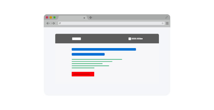
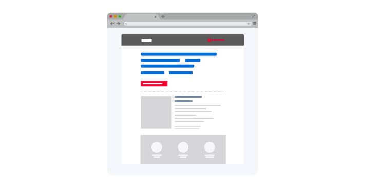
Creating an action-oriented headline may be the best way to optimize the landing page of any website.
An effective headline is supposed to accentuate the benefits offered by the page.
You may even use the landing-page headers and subheadings to promote an offer or to explain why an offer is valuable in a legible, crisp, and concise manner of writing. You may use the heading to promote an offer whilst using the subheading to give the details.
You may even use the main header to declare the value proposition in order to kindle a user’s interest and may use the subheading to discuss a product or service.
It is also essential for the headline of the landing page and the CTA to deliver the same message.
On a landing page, a heading/subheading is supposed to capture the viewers’ attention in order to drive them towards the sales funnel and you may have only a few seconds to convince them. That is why it is essential to make sure that the value propositions and the offers are presented convincingly, and that the headings/subheadings can be used to perform this task.
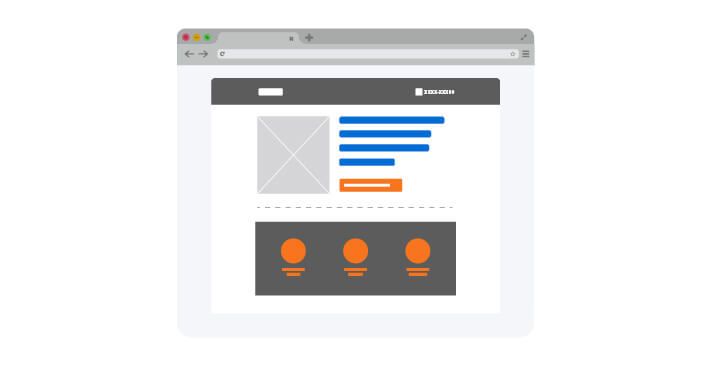
2. Clear Call to Action (Oversized Buttons to Draw Attention)
Oversized CTA Buttons to Draw Attention
The CTA (call-to-action) buttons encourage the users to take action. Therefore, it is an important feature on any landing page. The large CTA buttons in contrasting colors can readily catch the users’ attention. However, if you need to have an immediate reaction from the users, then it is equally important to keep the CTA short and to use words that encourage actions.
Examples of some successful CTA buttons are – Shop, Get, Book Now, Buy Now, Call Now, Free, or Save.
The following tips can help you create optimized landing pages with actionable CTA buttons.
Making a CTA button easily understandable and unambiguous.
Delivering what is promised.
Avoid using a few adjectives, such as Awesome or Amazing, as CTA buttons, as the users may believe that you are overselling a product/service or trying hard to get customers
Using the CTA button with whitespace is an excellent idea, as it enables a button to stand out. It is important to create a contrast between the CTA button and the surrounding elements in order to make sure that the message delivered through this button asserts dominance.
Ensuring that the CTA buttons can be easily viewed on the landing page. You may need to use the button multiple times if the landing page is lengthy or is divided into multiple pages.
Using a secondary CTA button for the users who are not interested in making an investment right away. A secondary CTA button may read ‘download a brochure’ or something else. It is supposed to encourage the users to learn about a product/service whilst saving you from losing the prospects to the competitors.
Making sure that the primary call to action is carried throughout the acquisition and conversion experience.
Paying attention to the emotions of the target audience when creating any CTA button.
“Many businesses are not taking advantage of "CTAs". Taking a look at the content layout and seeing where they can incorporate call-to-actions more often would be one of the best practices.”
Visual hierarchy is a type of web design and it can be used to represent one element of the landing page to be more important than other elements. For an optimized landing page, a web designer may make important elements or the target areas of a page stand out. They may increase the size or brightness of these images or may use shadowing in the background in order to bring an image into the focus of viewers. The visual hierarchy can be used to bring the CTA buttons into focus which is essential for an optimized landing page.
“The successful manipulation of visual hierarchy empowers the designer to lead users, quite literally, along a cleverly devised visual journey to a goal.”
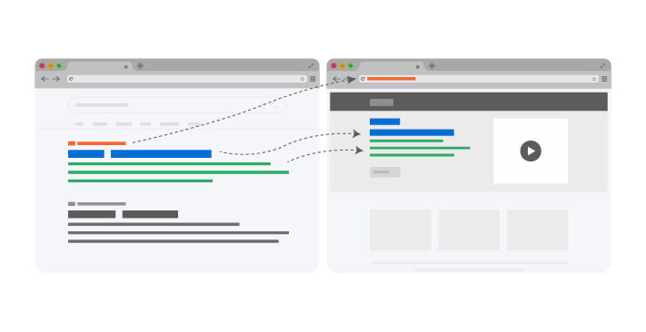
4. Maintaining Consistency between Landing Page Copy & PPC Ad
Maintaining Consistency between Landing Page Copy & PPC Ad
Maintaining consistency is essential if you want to have an effective landing page. Hence, it is important for the texts used in a landing page to maintain consistency with the texts or keywords used in PPC advertisements, as it works to reassure the users regarding the reliability of a website. Maintaining consistency between the PPC ads and landing pages is an important part of UX. The easiest way to maintain consistency is to match the copy from the headline of the landing page to the copy from the PPC advertisement.
“Your brand voice should be consistent across all of your content, particularly throughout your AdWords ad copy and landing page copy.”
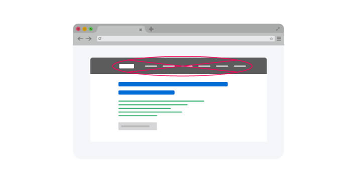
The ‘main navigation’ or ‘primary navigation’ usually represents the main pages (pages below the home page) of a website’s structure and the links in the ‘main navigation’ are expected to lead to these web pages. Hence, if there are multiple links on a landing page leading to other pages of your website, then it does not fulfill the main purpose of having a landing page.
The main objective of having a landing page is to drive the prospects or customers to the sales funnel. However, the links to other pages may distract the users and may cause lead generation friction. It is impossible to convert the users who abandon the landing page in order to move to other pages. Hence, it is prudent to remove the main navigation if you want an optimized landing page.
6. Keeping it Simple
Keeping it Simple
It is important to keep the design of a landing page as simple as possible if you want the page to fulfill its purpose. The average attention span of a human being is eight seconds according to a recent study conducted by Microsoft. Therefore, you have only a few seconds to capture the users’ attention and drive them toward the sales funnel. To utilize this time properly, it is essential to make sure that the design of the landing page remains simple. The following tips may help you in this regard.
Correctly using the whitespace.
Using a catchy and precise headline to explain the benefits of products/services.
Use bullet points when listing 3-5 main benefits of your product/service.
Keeping simple and precise texts/images on the page.
Adding a simple visual focus on the left side of the landing page.
Ensuring that the CTA button blends seamlessly with the background.
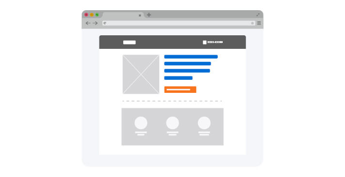
7. Highlighting the Value of Offers
Highlighting the Value of Offers
Highlighting the main benefits of your product/service on the ‘landing page’ is the most effective way to appeal to the viewers and encourage them to take action or invest in your products/services. You may highlight the benefits of the offer using a short paragraph or bulleted points. It is equally important to emphasize on the landing page how a particular offer may address a particular requirement, issue, or interest of the target audience.
“If the customer has to work for the reward, then they are more likely to appreciate and use that reward.”
It is essential to maintain consistency throughout your website. Therefore, it is important to avoid using exaggerated facts or false information on the landing page. This effort may diminish your reliability in the eyes of the prospects.
For example, you may oversell a product/service on the landing page in order to tickle the interests of the users. However, if you fail to live up to your words, then the prospects may leave your website. This inconsistency may leave a negative impression in the users’ mind.
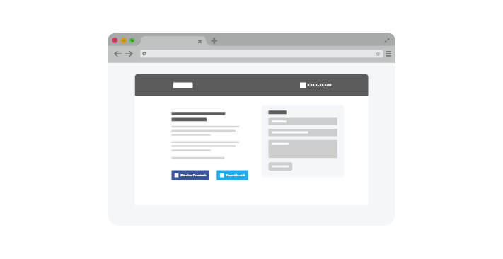
The leading search engines, such as Google, like the web pages that have been shared multiple times. Therefore, it is important to make sure that the share buttons can be easily visualized on the landing page. You may put these buttons at the top of a landing page or may put focus on the share button. The ‘share’ buttons may even be used to create a buzz regarding your product/service using the landing page. For example, you may rapidly spread any message, present on the landing page, using popular social media platforms, such as Facebook/Twitter.
The marketing of a business depends largely upon the popularity created by social media platforms. Hence, it is essential to keep the ‘share’ buttons in focus. It is equally important to remember not to clutter a landing page with ‘share’ buttons and to use the buttons that are preferred by the target customers of your business.
“Adding Social Sharing options to your Landing Page is like you create a bunch of opportunities to let your brand shout explosively.”
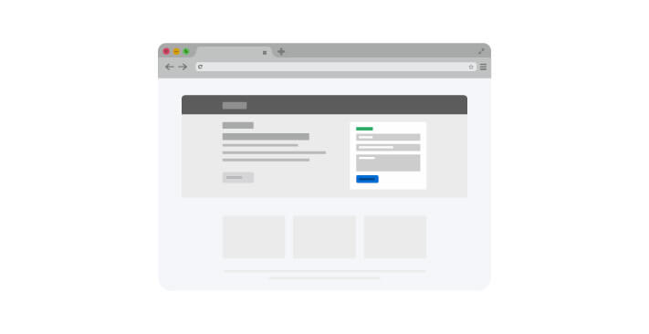
The lead-capture form is the primary focus of the landing page, as the main objective of having a landing page is to increase conversions. This form is used to collect the contact information of the users in exchange for a piece of content, such as videos, interactive articles, or eBooks.
On an optimized landing page, a lead-capture form is supposed to ask for nothing more than the necessary information in order to qualify the leads. Hence, you can have a higher conversion rate if you include fewer fields in the lead-capture form. It happens because the users need to work harder if you add more fields to the form and it can significantly reduce the conversion rate.
However, it is equally essential to remember that you may have better quality leads with longer forms, as it proves that the prospects have an interest in your products/services and did not mind filling out the longer forms. Therefore, you may test the form on yourself in order to correctly determine its length or the number of information that is supposed to be on the form.
“If your form is not optimized, and it simply exists, you will eventually hit the wall.”
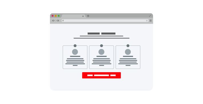
It is essential to use numerous ‘trust signals’ on the ‘landing page’ of your website if you want to instill reliability into target customers regarding your products or services. Trust signals are subliminal cues and the main objective of using these signals is to instill trust into the target consumers. The following ‘trust signals’ can greatly increase the value of your brand.
Testimonials from clients or customers
Profiting from word-of-mouth.
You may reassure the visitors with endorsements from past customers or clients.
“Trust Signals are not the substitute for good customer service, but using them is a powerful way to put your visitors at ease and hopefully increase conversion rates.”
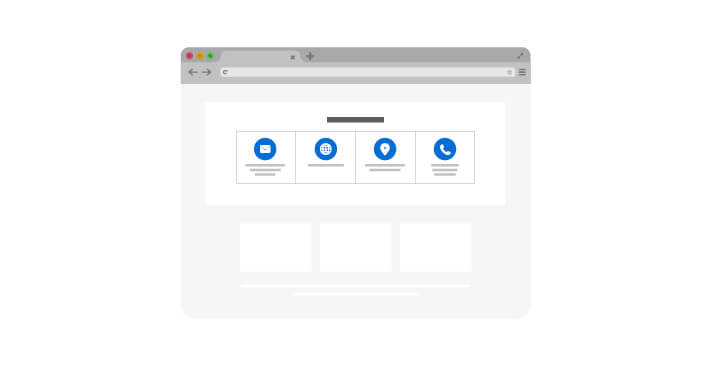
It is essential to gain the trust of the target customers if you want a loyal clientele or a constant flow of prospective customers and it is important to clearly communicate your objective, your business, and your prospects on the website due to this reason. You may publicize the following information about your business in order to gain the confidence of prospective customers.
Business phone-number
Social media links for your business
Business address and its location on Google map
You may feature the business phone number at the top of the landing page in the left-hand corner to ensure that the contact number is clearly visible to everyone visiting your website.
You may also notice an increase in the number of prospective customers after displaying the phone number on your website, as some people do not feel comfortable with online transactions. You may lose these clients despite having their interest in your products or business. These individuals may feel comfortable if they have the opportunity to talk to a company’s representative regarding their choices. Therefore, you can gain the trust of the visitors to your website whilst having more business if you display the phone number along with other business information.
“Make things as easy as possible for the audience to reach out to you through handy contact details. And don’t forget to set the right expectation for when they’ll hear back from you.”
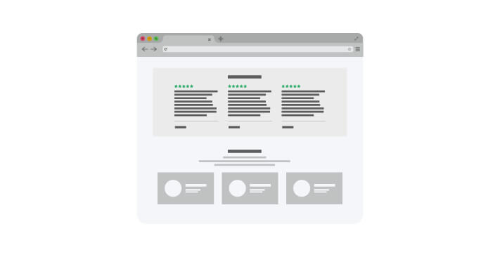
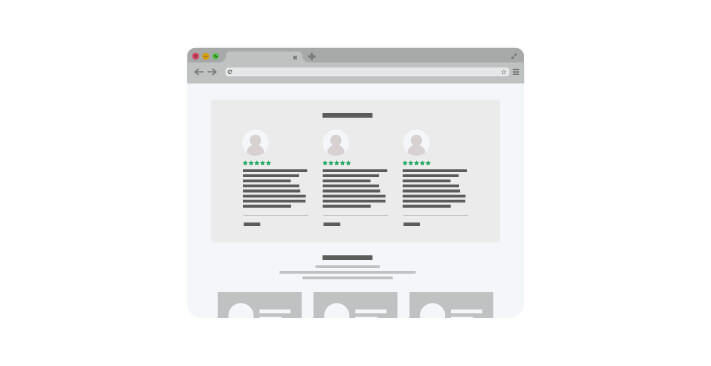
Featuring the testimonials of satisfied clients or customers increases the reliability of your business amongst the visitors to your website, as people usually have more faith in a business that is recommended by a trusted source. Hence, the testimonials of former clients may become a trusted source when someone visits your website encouraging them to invest in the products/service.
You can reinforce trust in prospective customers with social endorsements. However, it is important not to use fake testimonials featuring the names of phony clients and photographs from the gallery of stock photographs. This type of deception may ruin your reputation amongst prospects despite delivering quality service or selling first-class products.
You may ask satisfied customers to write testimonials regarding your service/product if the testimonials are not available naturally. A genuine testimonial from a real customer adds reliability to the message being featured on the landing page and shows that your service/product has left a positive effect on people’s lives.
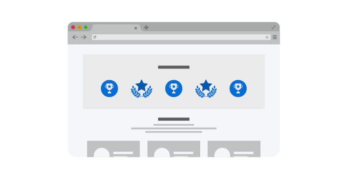
14. Offering Awards
Offering Awards
You may follow all the optimization techniques for your landing page without getting as much conversion as you want. To prevent this failure, you need to make sure that you have offered sufficient benefits to the visitors. You may even offer additional awards if the primary award seems insufficient.
15. Brand Consistency
Brand Consistency
You may lose prospective customers if you cannot maintain visual consistency on your website. Therefore, it is essential for the banner, destination site, and landing page to deliver the same feeling to the viewers. The landing page is supposed to extend the capabilities of the AdWords/banners into the real sense of the brand values without providing the whole experience of the destination site.
It is important to use the same typography and color palette on all pages in order to maintain visual consistency.
It is important to repeat the original message of your brand on the landing page in order to make sure that the visitors feel that they have reached the correct website.
“Two different brands in the same industry may have different clientele with different needs and different opinions. It's all about the created Brand Value through consistent marketing efforts.”
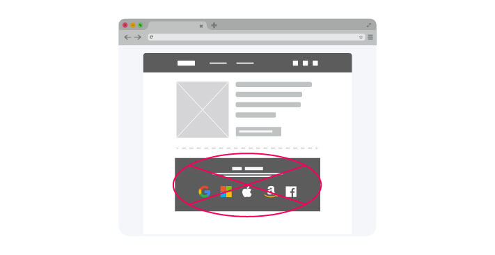
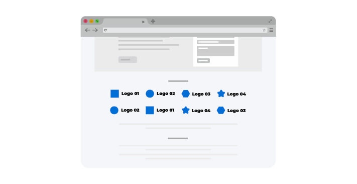
You may showcase the logos of reputed brands (logos of your former/recent clients) on the landing page of your website in order to increase the reliability of your brand. The logos of the reputed brands attest to the fact that these businesses trust your business with their money and this sign of faith may influence others to have the same trust in your brand.
There is another method of featuring the clients’ logos. If a client operates in the same industry, then you may feature the brands from a client’s portfolio for better recognition and a higher conversion rate.
17. Trust Badge
Trust Badge
Your online business may greatly benefit from the ‘trust badges’ being featured on your website. These badges attest to the reliability of your brand, the quality of the products, or your skills. The ‘trust badges’ come in the following forms and you need not skimp on featuring these symbols of reliability.
Logos of the reputed and reliable brands that you have worked with in the past
Recognitions or endorsements received by you
Groups and coalitions that you are associated with
18. Statistics Proof of Success
Statistics Proof of Success
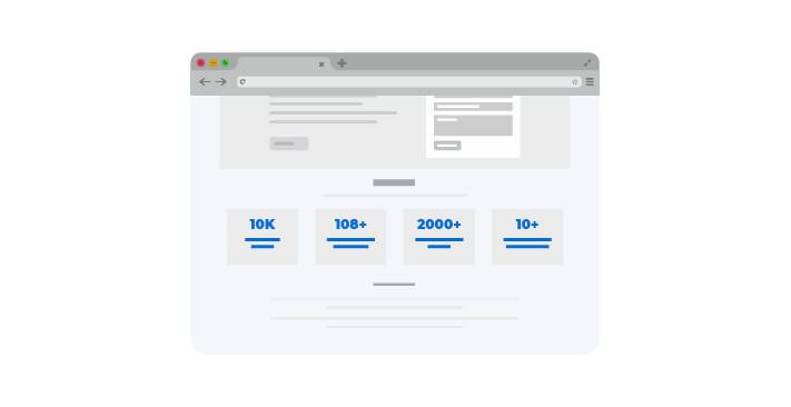
You may use the statistics of success depending on the performance of your business over the past few years in order to gain the trust of current and prospective customers. Numbers can deliver a message as efficiently as a picture. You may use the numbers to show the potential of your business alongside proving its success amongst the viewers of your website.
For example, you may claim on the landing page that you have helped 50,000 clients to increase the conversion rate of their online business by 40% (it is essential to use the facts).
This is a simple yet effective method of optimizing a website’s landing page.
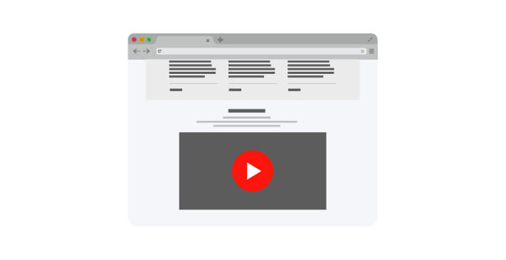
19. Use Videos
Use Videos
The videos are no longer considered to be an impediment to website optimization, as it has become possible to increase the loading speed of the optimized websites due to the advancement in Internet communication. These days, videos are considered to be useful for the optimization of a website. You may use the videos to explain the nature of your business/products/service or to educate the visitors to your website regarding new exciting offers. Videos can help you build a strong connection with present as well as future customers.
It is prudent to follow the rules of minimalism when designing a website’s landing page. For example, you are supposed to provide all the necessary information to encourage the conversion of visitors. However, it is essential to use no redundant data on the page. It may distract or overwhelm the visitors and may not fulfill the main purpose of creating a landing page which is to drive more visitors toward the sales funnel and increase the conversion rate. The following tips may help you with regard to the design of a landing page.
Making sure that the data (in the front and in the middle) are easily visible.
Using bullet points when detailing the facts.
Determining what type of information can be shown within a visitor’s direct line of vision and what type of information can be put below the fold where a user needs to scroll down. It enables you to discreetly hide the details on a subject whilst giving a visitor the opportunity to scroll down in order to view the details if they are interested in a particular topic
It is also possible to improve the conversions using Whitespace. This space is present between the text, graphics, images, columns, margins, and other elements. It is used to increase a website’s visual appeal whilst making sure to drive the viewers’ focus in the right direction. With the methodical use of Whitespace on a landing page, you can direct the prospect’s attention toward the benefits, offers, or CTA buttons by bringing these areas into focus.
“For creating an optimum landing page, incorporate the approach of using whitespace to avoid clutter, balance the elements and welcome your visitors.”
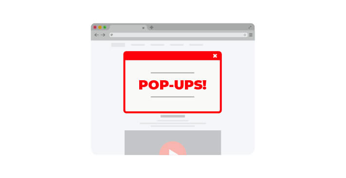
It is prudent not to use the pop-ups on a landing page, as it may annoy the visitors and may increase the abandonment rate. However, you may use the pop-ups to feature an irresistible offer, such as an immediate discount, coupons, free gift, or shipping discounts, in order to prevent the users from abandoning the carts.
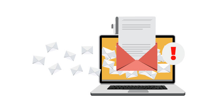
22. Avoid Doing Lead Generation for Spamming
Avoid Doing Lead Generation for Spamming
If you plan to send irrelevant and unsolicited e-mails to prospects/customers, then this action can be considered as spamming. Therefore, it is essential to make sure that the content of an e-mail stays relevant to a customer’s queries and does not give out generic information in order to avoid an e-mail from being considered spam-mail.
For example, a visitor to your website may be completing a form to get a White-paper (an authoritative guide/report regarding a topic) on interior decoration. In this scenario, if you send an e-mail with regards to exterior wall painting, then it may be considered to be a spam-mail.
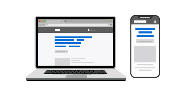
23. Design Mobile-Friendly Landing Page
Design Mobile-Friendly Landing Page
Mobile devices account for almost half of the website traffic globally. In the second quarter of 2019, mobile devices (not including e-tablets) generated 48.91% of the website traffic worldwide. This percentage has been consistently around the 50% mark since the beginning of 2017. A responsive website is believed to double the conversions. Therefore, it is essential to make sure that a landing page looks good, loads smoothly, and remains easily navigable on all types of mobile devices, as a positive user experience equals increased conversions.
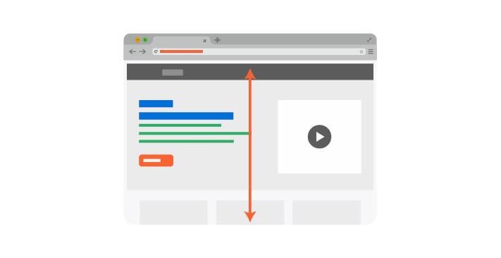
The ‘above-the-fold’ is a term that is used to describe the type of content that is printed on the top half of any newspaper. There may not be any fold in a website; however, the ‘above the fold’ content refers to the type of content that can be seen without scrolling down a web page. Hence, the above-the-fold content becomes readily visible upon visiting a website. It is prudent to make sure that the CTA buttons and the primary message of your business remain above the fold and within the direct visual line of the viewers.
It is also essential to repeat the CTA text and the main message of your website multiple times on a landing page depending upon the length of the page. It is important to make sure that the repetition happens at comfortable intervals in order not to seem redundant to the visitors of your website.
Prospective customers are more likely to convert when they develop an emotional connection with the message on a landing page. Hence, the repetition of the core message or CTA buttons does not just reinforce your objective. It makes sure that the CTA button or the message of a business stays within a reader’s direct line of vision when he/she is more than likely to develop an emotional connection with the content of a landing page.
25. Reduced Loading Time
Reduced Loading Time
A recent study on the behavior of Internet surfers revealed that more than 83% of visitors expect a web page to load within 3 seconds or less time. This research also revealed that more than 40% of visitors are likely to abandon a web page if it takes more than 3 seconds to load. Therefore, it is essential to reduce the loading time of any web page and this is one of the basic requirements if you want to create an optimized landing page.
You may minimize the size of the images present on a landing page using Photoshop or TinyJPG in order to reduce its loading speed. This is the easiest way of reducing the load time.
“A good first impression about your landing page isn't about its design only, but also how fast that design loads.”
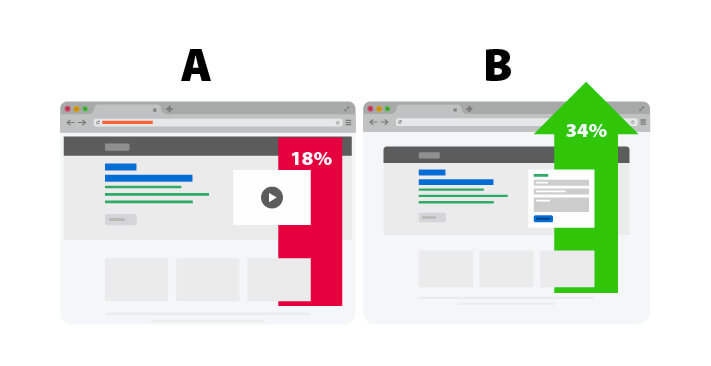
The A/B testing is also known as split testing. In this marketing strategy, two versions of a web page (A and B – control and treatment) are tested against one another in order to track the changes that are essential for a particular purpose. In this scenario, you have to conduct this test on a landing page in order to determine if every element of the page is optimized.
It is essential to have an infrastructure for A/B testing in place in order to measure the success of your website and to ensure that you are getting conversions according to your expectation. You can perform the following tasks through A/B testing.
Producing alternate designs or messages and finding out which version performs better
Performing comparative campaign studies
When conducting an A/B test on a landing page, it is essential to test the performance of the headlines, CTA buttons, and forms before moving on to the less impactful elements of the page.
Find those elements which may yield your biggest wins, and manipulate them with A/B Testing such as “Headings and call to action (CTAs)”.
Important Landing Page Statistics [Must Know]
Companies with 30 or more landing pages generate 7 times more leads than those with fewer than 10. (Source: HubSpot)
48% of marketers build a new landing page for each marketing campaign. (Source: SERPSTAT)
Improving SEO and organic presence is a top inbound marketing priority for 61% of marketers. (Source: HubSpot)
Long landing pages can generate up to 220% more leads than above-the-fold call-to-action (CTA). (Source: MarketingExperiments)
The average number of fields on lead generation forms is 11. (Source: PAGEWIZ)
61% of online marketers say generating traffic and leads is their biggest challenge. (Source: HubSpot)
Using videos on landing pages can improve conversions by 86%. (Source: Eyeview)
Companies that use well-defined middle-of-the-funnel (MoFu) engagement and lead-management strategies generate a 4 to 10 times higher response rate than generic email blasts and outreach. (Source: HubSpot)
President Obama mastered the art of testing and raised an additional $60 million dollars for his last campaign using A/B testing. (Source: Optimizely)
Targeting your pages correctly can increase the conversion up to 300%. (Source: Steelhouse)
90% of the customers who read the headline will also read the CTA. (Source: Marketing Sherpa)
You only have 8 seconds to make an impression on a landing page. (Source: Interactive Marketing Inc)
1-second loading delays can lower your site conversion by 7%. (Source: Neil Patel)
Users are 80% more likely to read content that is combined with images. (Source: Xerox)
The average landing page conversion rate across industries is 2.35%, with the top 25% converting at 5.31% or higher. (Source: WordStream)
88% of consumers trust testimonials and reviews. (Source: SearchEngineLand)
Include your contact information to increase trust and conversions. (Source: Kissmetrics)
Only half (50%) of all landing pages are mobile-optimized. (Source: Adobe)
Conclusion
The aforementioned tips can optimize a website’s landing page in order to increase conversions. These rules are not set in stone. You may use some of these tips or may use all of these tips for the optimization of a landing page based on your unique requirements. However, it is always important to test the final outcome with the help of A/B testing if you want the landing page to increase the number of leads and improve sales.
If you are thinking about promoting your brand service or product with an optimum landing page, keep these landing page best practices in mind. And still, if you find the design implementations or promotions not as your expectations, just feel free to contact team KrishaWeb.