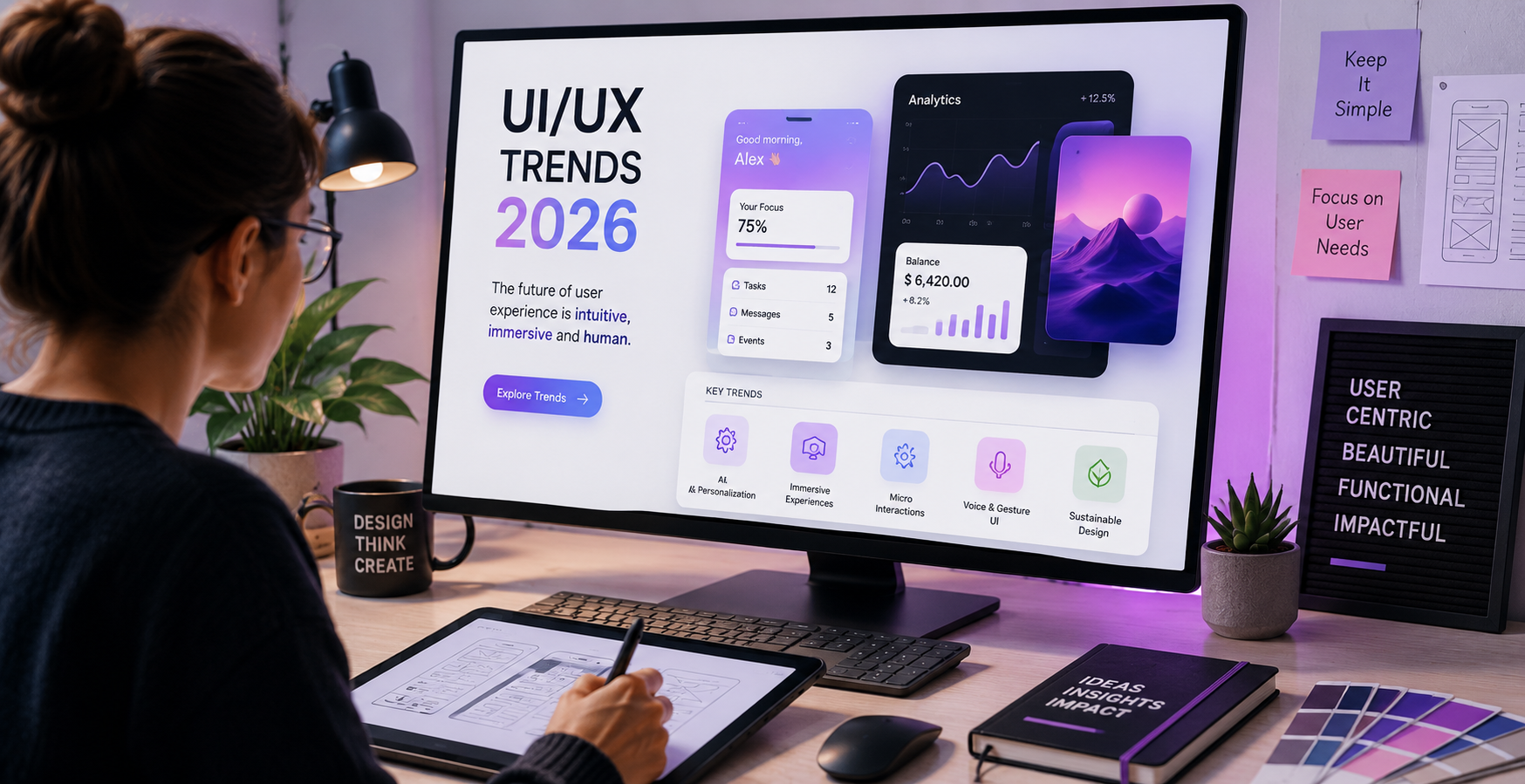
In a simple definition, responsive web designing is the process of developing adaptable websites. These websites can modify their features according to the size of a device or a visitor’s viewport. The primary goal of the mobile responsive web designing is to allow the content to render differently according to a device’s screen size. The main benefit of responsive web designing is to deliver an optimal experience to the viewers irrespective of the type of a device. The responsive websites also benefit the website owners. With one responsive website, an owner need not develop multiple sites to satisfy the unique requirements of various devices. However, it is not easy for developing responsive websites. It is essential for web developers to make sure that a website is both mobile-friendly and receptive. There are several tools that web-developers may use in order to create or test the models and to ensure the maximum performance. This article narrates the best resources that may guide the developers in making an optimally functional website with an appealing appearance.
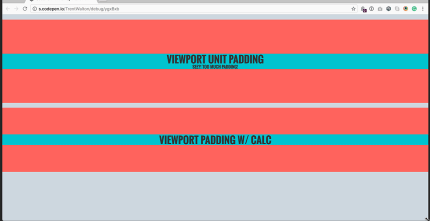
Utilization of ‘em’ Units
The web-developers may use ‘em’ units for the process of ‘text style’ measuring. They can design components on the web-page that react naturally if the dimension of the text changes. The developers can create an entire web-page that changes dynamically based on the ‘viewport-width’ of any program using an ingenious trap for the responsive text dimension. It is essential for the web-developers to determine how to use the ‘relative’ conduct of ‘em’ units in order to create versatile and responsive web designs with unique features.
Understanding the Guidelines of Responsive Web Typography
The foundation of any web design is its typography. Hence, it is essential to understand the guidelines of the responsive web typography in details. For an in-depth understanding, the web-developers require extensive knowledge in designing alongside having an extensive technical understanding. With a complete understanding of design standards, it is possible to create the best responsive websites.
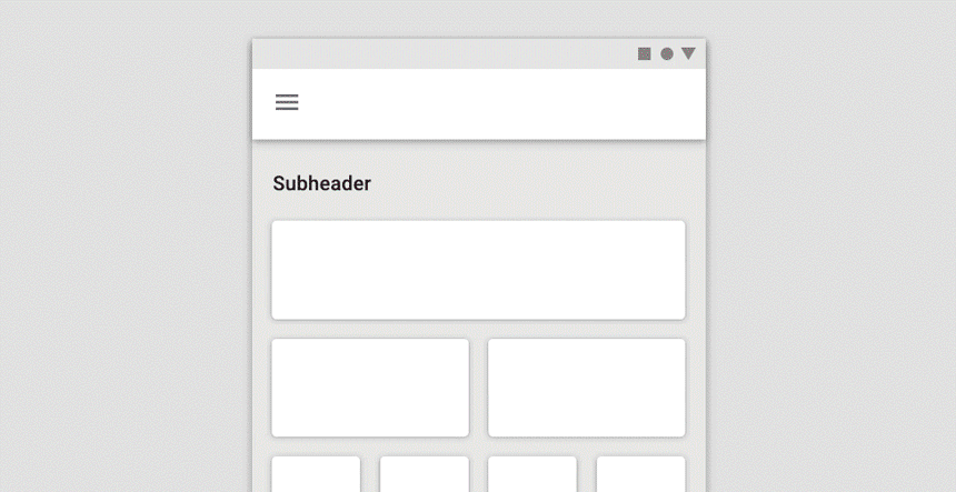
Priority Guides – An Alternative to Wireframes
Most web developers use wireframes when designing the apps, websites, dashboards or other digital interfaces. Hence, wireframes have become common tools in the process of digital designing. However, this tool can significantly undermine the user-centricity of a website. The web-developers can avoid the downside of wireframes using an alternative known as ‘Priority Guides’.
The ‘Priority Guides’ contain elements and content suitable for a mobile screen. These elements and content are sorted using the hierarchy from the top to the bottom without using any layout specification. In ‘Priority Guides’, the content that is capable of fulfilling the users’ requirements and supporting their goals remain higher in comparison to other types of content.
Flexible Layout with Breakpoint & Susy
To avoid the limitation of the framework, the web developers may use Breakpoint and Susy. The unique features of these SASS expansions enable web developers to create flexible layouts for responsive websites. These expansions concentrate on the responsive algorithm and let the web developers concentrate on a website’s design along with other essential features.
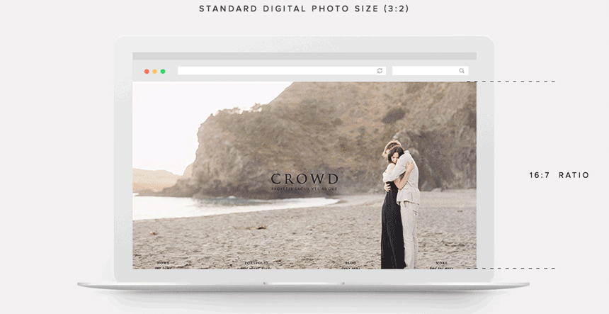
Prioritize the Images
A picture is worth a thousand words. This idiom is equally relevant in online designing. The images play an important role when designing any website, as the images have the ability to develop a psychological connection with the visitors. When looking at an image, the viewers can envision the items they are interested in availing. Therefore, it is crucial to prioritize the images.
It is essential for the web developers to save the photos in a suitable format. For example, the JPG format is ideal for photos. On the other hand, the PNG-8 format is ideal for logo designs and symbols, as there is a need for transparent history. It is equally essential for the web-developers to decrease the size of the photos using automatic JPEG optimizers, such as TinyPNG. To minimize the scaling and to resolve the problem with data-transfer, it is essential to utilize the photos which are optimized for various mobile breakpoints.
Learning the Proper Utilization of Media Queries
The ‘Media Inquiries’ became a reality after the web-browsers added assistance for them in 2012. These inquiries were mapped out in the beginning as part of the introductory proposals for CSS. If the web-developers can correctly utilize the media queries, then it becomes possible for them to optimize a website’s design for various display sizes. The material of media inquiries reacts to different problems on different devices when used aptly. The media queries look for a gadget’s the width/resolution/alignment and display the proper set of CSS regulations. These features enable a professional to develop functional responsive websites.
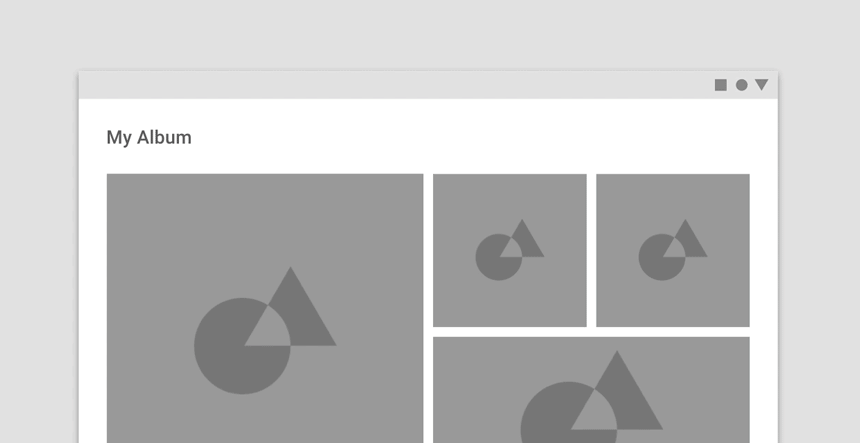
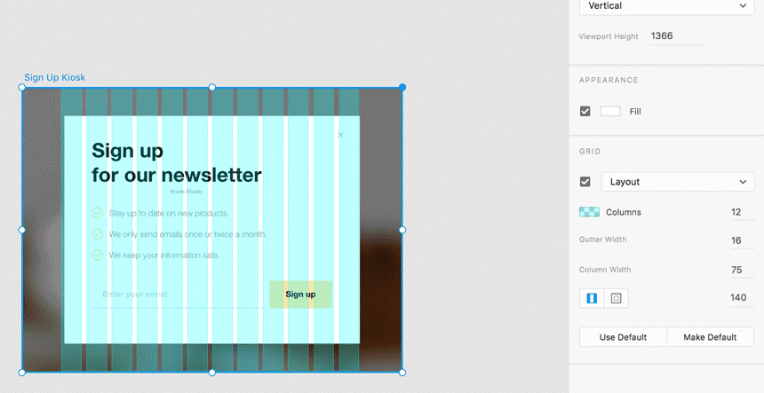
Creating Responsive Format with Grid Layout
Using the CSS Grid Layout, the web developers can easily change the placement of grid items in accordance with the size of a device’s screen. For example, the developers can easily modify the appearance of ‘My Menu’ and use it as the bottom menu, small sidebar by the banner, intermediate horizontal menu or full sidebar depending upon the screen’s size. The ‘Class-Based grid’ system does not give this flexibility to a web developer. They can even create a clean and comprehensible code when using the CSS grid layout for the mobile responsive websites.
Attention to Developing User-Friendly Buttons for Smaller Screens
Many web developers/designers focus on developing small-sized buttons for a responsive website, as they believe that the smaller buttons are easily accessible on small screens. However, the smaller size of the buttons may frustrate the users if it becomes difficult to manoeuvre these buttons. Hence, it is essential to pay attention to the manoeuvrability of the buttons. To improve the functioning of the clickable location, you may use cushioning on the switch. It is equally important to choose an easily recognizable colour/shape when designing the web page ‘buttons’.
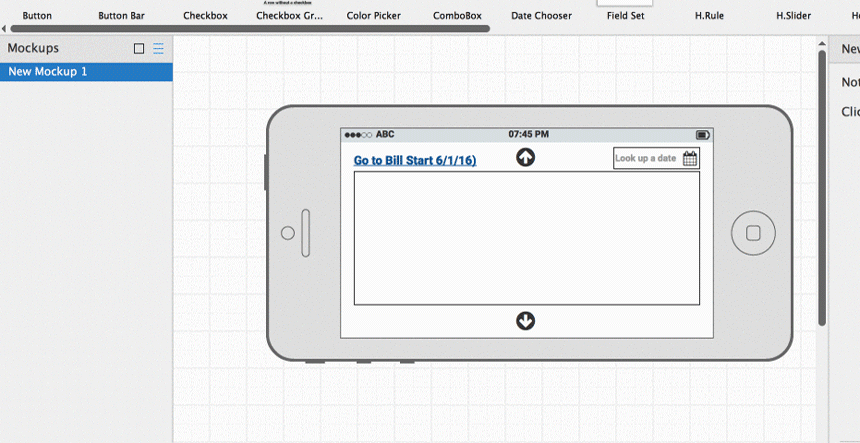
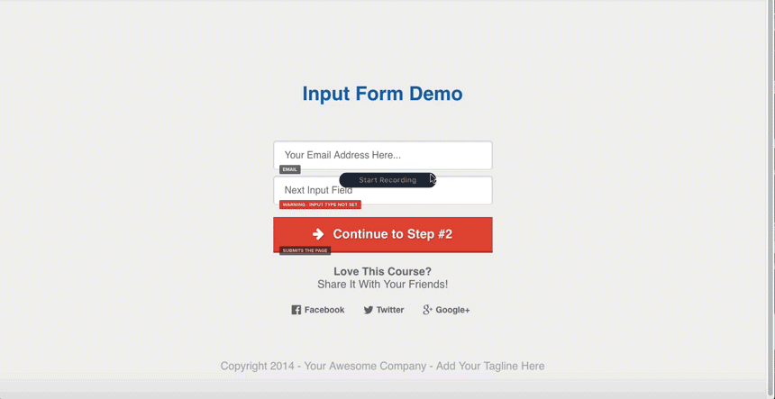
Adding Input Elements to Form Fields
It is crucial for the ‘forms’ on a website to adapt to the varying sizes or widths of various screens; however, creating adaptable forms is not enough. It is essential to make sure that the input fields can activate the correct type of keyboard. Web developers can add input elements in order to achieve this goal. This addition enables the fields that require text inputs (name/address/e-mail and others) to trigger a textual keyboard. On the other hand, it enables the ‘input fields’ that require numbers to immediately trigger the numerical keyboard. Hence, the addition of correct ‘input elements’ maximizes the user experience.
Adding Smoothness to Navigation
The visitors will not hesitate to abandon a website that does not offer smooth navigation. Hence, it is an essential feature to consider when developing a responsive website. With smooth navigation, the visitors to a website can easily access every web page. In most scenarios, the navigation on the desktop version of any website has visible links to every important page. However, many web developers use ‘Hamburger’ icons for the mobile version of the same website and hide a link behind the icon. This may not be a judicious practice, as some users may not realize that they can reveal the ‘Menu’ after clicking this icon and may leave the website after a while feeling frustrated. There it is prudent to be careful about navigation.
To resolve this problem, the web developers/designers may keep the essential items of the ‘menu’ bar visible on smaller screens. They may use the ‘Hamburger’ menu for the rest of the links. For improved navigation, it is also possible to include the links to other pages.
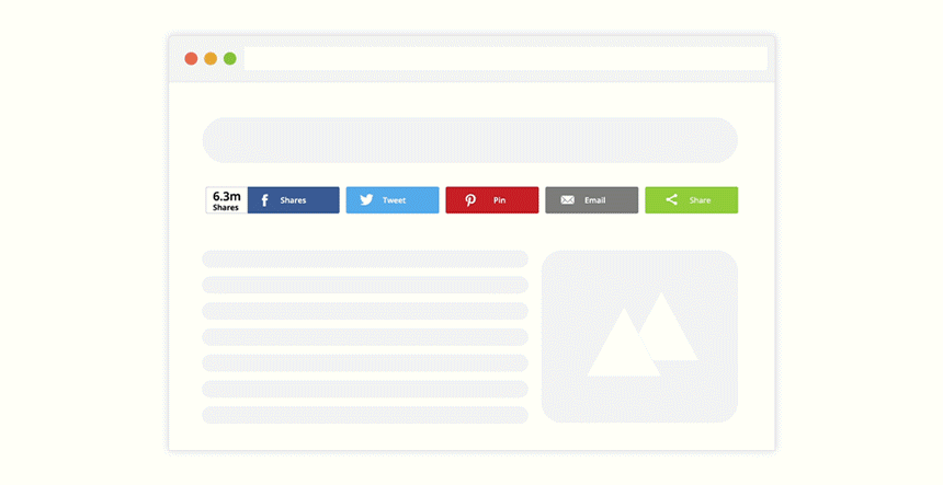
Using ‘Share’ Buttons without Blocking the Content
It is prudent to include a ‘Share’ button on a web-page, as it brings more traffic to any website. The ‘Share’ button also maximizes the visibility of a website’s content. However, it is crucial to judiciously use this button, as it may block a website’s content on smaller screens. Hence, it is prudent to make sure that the ‘Share’ button can scale nicely on the smaller screens. If a screen is smaller than 768-px, then the web developers may even consider disabling this button.

Focusing on Microinteractions for Maximum User-Experience
The addition of interactive functionality or animations is no longer considered to be an extra feature. At present, most web designers are focused on maximizing the user experience. Hence, the use of animation is considered to be an important feature when designing any website, especially responsive websites. The animations deliver quick feedback to the users. This feature is extremely useful on mobile devices. The addition of Microinteractions also saves the web-pages from reloading, as it increases the usage of bandwidth. If cleverly applied, then the Microinteractions can be used to show the sign of appreciation to the customers.
Eliminating Unnecessary Clutter with Minimalistic Design
For content-rich websites, the web developers/designers may focus on using minimalistic design. With the absence of unnecessary clutter, visitors can easily focus on the website’s content. It improves the user experience along with the conversion rate of the merchant sites.
When designing the responsive websites, the web-developers/designers may use the minimalistic design in order to highlight the important areas on a web-page or to draw visitors’ attention towards the ‘Call-to-Action’ buttons. Hence, the minimalistic design has become important for the designing of all types of websites including mobile responsive websites.
An ultimate UI/UX Checklist for Website
This website UI/UX checklist is the ultimate guide that will help you to design and develop the website that will offer conversion-focused awesome user experience. Make sure you tick most of the boxes before launching the website.
Just click on Download eBook and we will send your copy of the eBook to your mailbox. Don’t miss to share that among your fellow designers.


 KrishaLabs
 KrishaStudio
 KrishaStore