Jewellery is one of the most emotionally charged purchase categories in eCommerce. Customers are not buying a product — they are buying a feeling, a memory, or a statement about who they are. A jewellery website that does not create that emotional response in the first viewport is losing sales before the visitor reaches the product page.
At KrishaWeb, we have built eCommerce websites for luxury, lifestyle, and artisan brands since 2008. The jewellery websites that convert best in this category share one characteristic: they make the customer feel something before they present a product or a price.
KrishaWeb has designed and built jewellery website designs since 2008. The pattern that holds across every high-performing example: design decisions made in service of the visitor’s actual goal, not the agency’s portfolio.
Table Of Contents
Table Of Contents
12 Best Jewellery Website Designs to Check Out in 2026
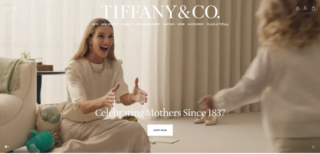
1. Tiffany and Co
Tiffany’s website is the clearest example in the category of design, serving brand positioning perfectly. The signature blue, the photography style, the typography, and the way products are presented all communicate a single coherent brand identity that is immediately recognizable. No product appears without context — every image shows the jewellery being worn or styled in a way that creates aspiration rather than just product visibility.
Design lesson: In jewellery eCommerce, the way a product is presented is as important as the product itself. Aspirational lifestyle photography consistently outperforms product-on-white photography for conversion in the premium jewellery segment.
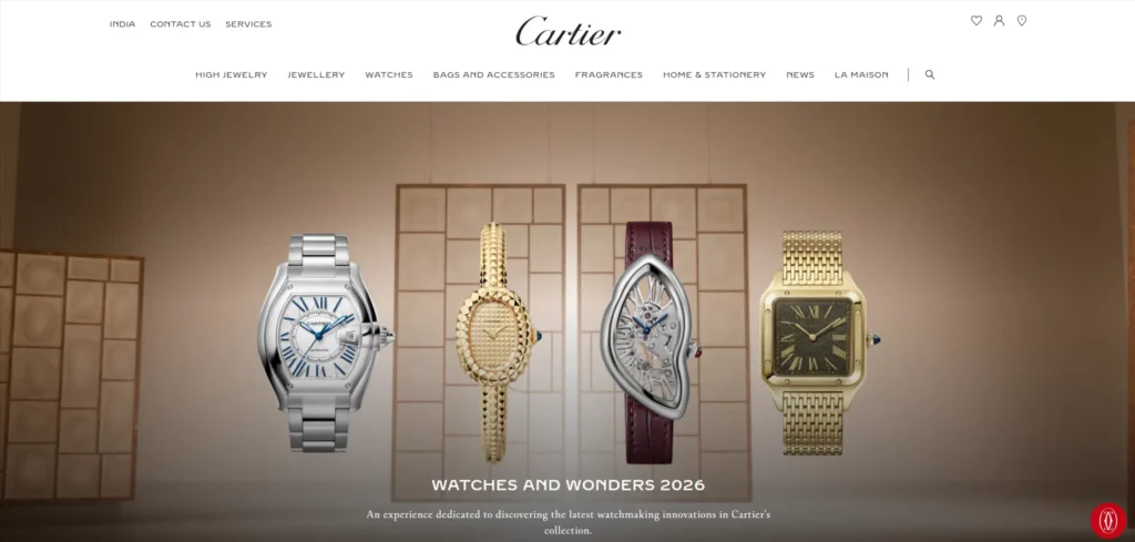
2. Cartier
Cartier uses immersive visual storytelling that makes the website feel more like an editorial magazine than an eCommerce store. Heritage, craftsmanship narratives, and campaign imagery are integrated into the shopping experience in a way that reinforces why a Cartier piece costs what it costs. The navigation is deliberately unhurried.
Design lesson: For ultra-premium jewellery brands, the website should slow the visitor down rather than speed them up. An unhurried browsing experience communicates that the brand does not need to rush you to a purchase.
3. Mejuri
Mejuri has built one of the strongest direct-to-consumer jewellery brands of the past decade, and the website reflects their positioning as everyday fine jewellery — real women, real skin tones, real occasions. The photography is deliberately unstaged. The community content — customer photos and reviews — is integrated throughout the shopping experience rather than segregated to a testimonials page.
Design lesson: DTC jewellery brands that use real customer photography throughout the shopping experience, rather than exclusively brand photography, build authenticity that mass-market competitors cannot replicate.
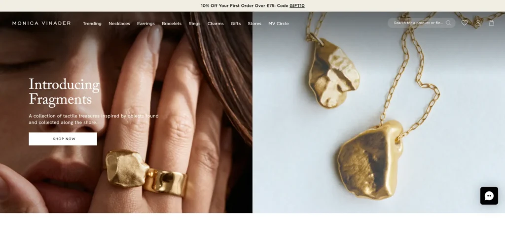
4. Monica Vinader
Monica Vinader’s website handles personalization and engraving as a core product feature rather than an add-on. The customization interface is intuitive and visible. Gift-giving occasions are featured prominently with curated gift guides that make the purchase decision easier for customers buying for someone else — a segment that represents a significant portion of fine jewellery purchases.
Design lesson: If personalization is a core product feature, it should be visible and interactive on the product page, not buried in a dropdown. Making the customisation experience prominent increases both conversion and average order value.
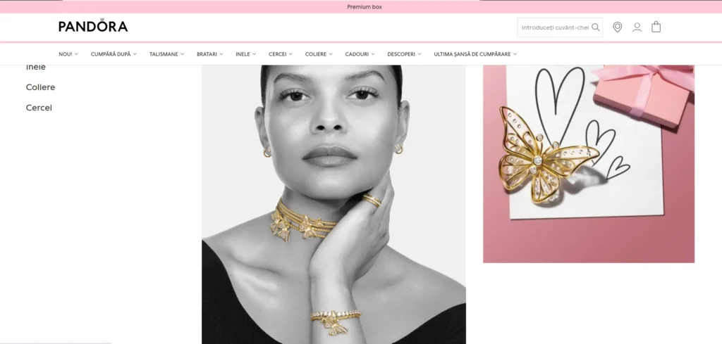
5. Pandora
Pandora’s website manages the complexity of a large charm and bracelet product catalogue through intelligent filtering and a charm combination builder that turns browsing into an active experience. The gifting section is prominently featured throughout seasonal periods. The website handles multiple geographic markets with clean localization that adapts language, currency, and product availability.
Design lesson: For jewellery brands with large catalogues, an interactive combination or styling tool turns passive browsing into an active design experience that increases time on site and average order value.
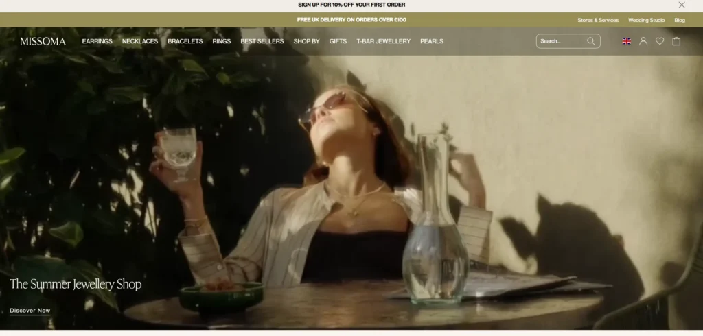
6. Missoma
Missoma has built a strong millennial and Gen Z brand identity and the website reflects this through a contemporary visual language — editorial photography, color blocking, and a social-first approach to product presentation. User-generated content from Instagram is integrated into product pages, showing the product as it actually looks when worn by real customers.
Design lesson: Instagram-integrated UGC on product pages provides the most relevant social proof for younger jewellery buyers, who want to see the product as it looks worn in real-world contexts before purchasing.
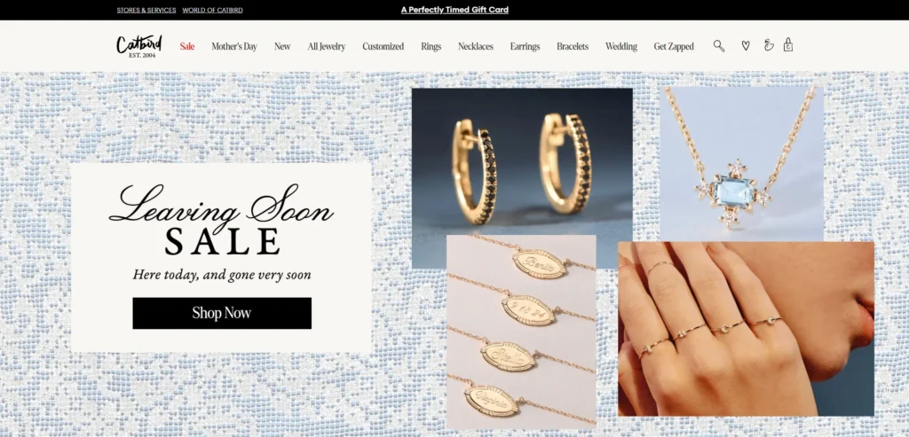
7. Catbird
Catbird is a Brooklyn-based fine jewellery brand whose website communicates the personality of the store as much as the products in it. The copywriting throughout the site is distinctive and human. The photography style is consistent and creates a visual world that makes browsing feel like visiting the shop. The product descriptions give each piece a name and a character that transforms a product into something with a story.
Design lesson: Named, characterful product descriptions that give individual pieces a story convert significantly better than functional product specifications in the fine jewellery category. The copy is part of the emotional purchase.
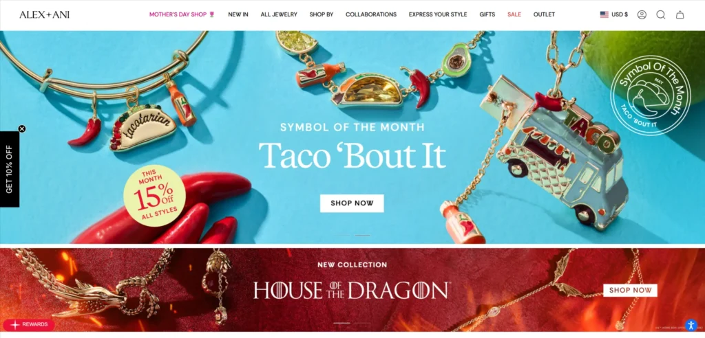
8. Alex and Ani
Alex and Ani uses meaning and symbolism as the core product narrative and the website organizes the entire catalogue around this. Products are findable by their symbolic meaning — strength, luck, love — as well as by type and material. This is an unusual and effective navigation approach for a brand whose purchase rationale is emotional rather than functional.
Design lesson: Allowing customers to navigate a jewellery catalogue by the feeling or meaning they want to give or receive is a conversion-effective approach for brands whose products carry symbolic value.
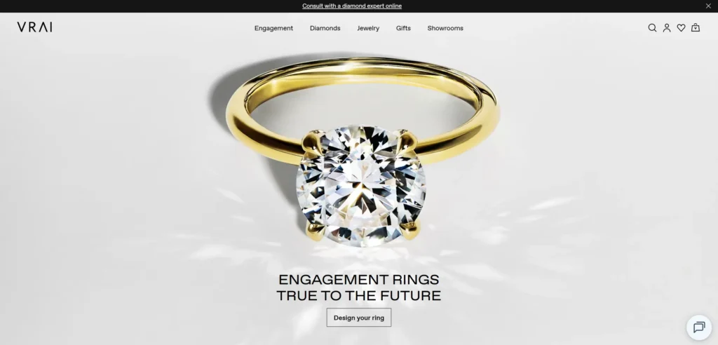
9. Vrai
Vrai is a laboratory-grown diamond brand and the website dedicates significant space to educating the customer about lab-grown diamonds — the process, the certification, the environmental comparison with mined diamonds. This education-first approach works because Vrai’s customers are making a values-based purchase decision that requires information before they can commit.
Design lesson: For jewellery brands built around a product category that requires explanation — lab-grown, ethically sourced, conflict-free — education content on the website is a conversion tool, not a distraction from selling.
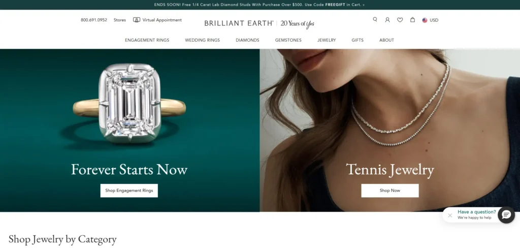
10. Brilliant Earth
Brilliant Earth handles the complexity of diamond purchasing — the 4Cs, certification, ring customization — through a design that guides the visitor through the decision rather than overwhelming them with it. The ring builder tool is one of the better implementations of this type in the category. Social proof is specific and detailed.
Design lesson: For engagement ring and diamond websites, a guided buying experience that breaks the purchase decision into manageable steps significantly outperforms a standard product catalogue. The complexity of diamond purchasing benefits from a wizard rather than a grid.
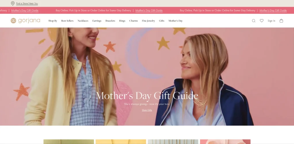
11. Gorjana
Gorjana is a California-based fine jewellery brand whose website communicates the relaxed, aspirational lifestyle their target customer wants to associate with. The photography style is consistent and distinctive. The styling content — how to layer necklaces, how to stack rings — is integrated throughout product pages and creates a reasons-to-buy layer that pure product photography cannot.
Design lesson: Styling content that shows customers how to wear and combine products increases both average order value and return purchase rate. It creates a use case for every product and for multiple products together.
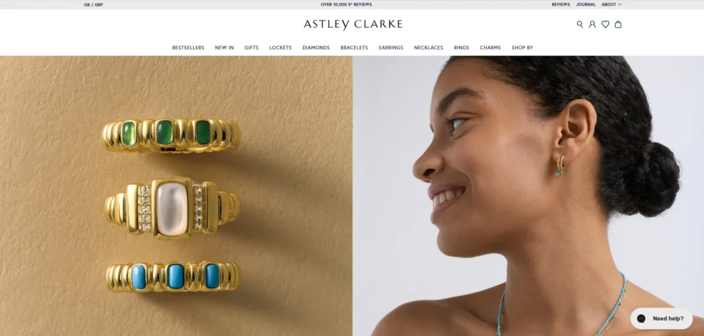
12. Astley Clarke
Astley Clarke is a British fine jewellery brand whose website positions sustainability and responsible sourcing prominently alongside product information. The content of the values is specific and detailed rather than vague, which makes it credible. The gift-giving section is well developed with specific occasion guides and a gift finder tool.
Design lesson: Values content that is specific and verifiable — named suppliers, audited practices, specific certifications — converts better than vague sustainability claims in the fine jewellery category, where provenance matters to the buyer.
What These Jewellery Website Designs Have in Common
Looking across all 12 examples, these patterns appear consistently in the ones that work best commercially, not just aesthetically.
Aspirational lifestyle photography showing jewellery worn in context, not products on white backgrounds
Clear gifting pathways with occasion-specific guides — jewellery purchases frequently involve buying for someone else
Customer photography and reviews integrated into product pages rather than segregated
Personalisation and customisation features made visible and interactive, not hidden in dropdowns
Values content — ethics, sustainability, provenance — presented with specificity
5 Design Elements Every Jewellery Website Designs to Meet Needs
Whether you are building from scratch or redesigning an existing site, these five elements consistently separate high-performing examples from functional but forgettable ones.
1. Aspirational lifestyle photography as the primary visual language, not product-on-white
Aspirational lifestyle photography as the primary visual language, not product-on-white
2. A prominent gift finder or gift guide path for the significant proportion of customers buying for someone else
A prominent gift finder or gift guide path for the significant proportion of customers buying for someone else
3. User-generated customer photography integrated into product pages, not just on a reviews tab
User-generated customer photography integrated into product pages, not just on a reviews tab
4. Customization and personalization features made visible and interactive on the product page
Customisation and personalisation features made visible and interactive on the product page
5. Values, ethics, and provenance content that is specific enough to be credible
Values, ethics, and provenance content that is specific enough to be credible
AI Implementation for Jewellery Websites in 2026
Most jewellery website designs articles cover design examples. Almost none address AI implementation, which is where the commercial gap is opening in 2026. The jewellery website designs that implement these features in the next 12 months will have a measurable advantage over those that do not.
1. AI-Powered Virtual Try-On
Virtual try-on technology for jewellery — rings, necklaces, earrings — has reached practical quality in 2026. Tools like Zakeke and Augmented.com allow customers to see how a piece looks on their own hand or against their skin tone using their phone camera. For fine jewellery, removing the uncertainty about how a piece will look when worn reduces return rates and increases conversion from customers who would not have purchased without seeing it contextually.
2. AI Gift Finder and Personalisation Assistant
A significant proportion of fine jewellery purchases are gifts. A buyer who is purchasing for someone else does not have the direct emotional connection to the product that makes browsing intuitive. An AI gift finder that asks about the recipient — their style, the occasion, the budget, and what the gift should communicate — and returns a curated shortlist of relevant pieces significantly reduces the time-to-purchase for this customer segment.
3. AI-Powered Product Recommendations Based on Purchase History
Jewellery has unusually high return purchase rates from customers who have found a brand that matches their aesthetic. AI-powered recommendations that surface complementary pieces — pendants that stack with a necklace already purchased, earrings that match a ring — based on purchase and browsing history increase average order value and repeat purchase frequency.
4. Intelligent Sizing and Customisation Guidance
Ring sizing is the most common source of returns in jewellery eCommerce. AI chat that guides customers through the ring sizing process — measuring at home, adjusting for time of day, understanding how different band widths affect fit — reduces sizing-related returns and the hesitation that prevents first-time buyers from completing a purchase without professional fitting.
KrishaWeb builds AI-integrated jewellery website designs on WordPress and other platforms. If your current site is not using these features, our team can assess what to implement first based on your specific conversion goals.
A good jewellery website creates an emotional response before it presents a product. Aspirational lifestyle photography, a visual identity that matches the brand’s positioning, and a browsing experience that makes customers feel something before they see a price are the elements that separate high-converting jewellery websites from functional but generic ones.
What platform is best for a jewellery website?
Shopify is the platform most high-performing jewellery eCommerce brands use in 2026, because of its product management capability, the quality of available themes, and the app ecosystem for features like virtual try-on, product customization, and gift finder flows. For ultra-premium brands with bespoke experience requirements, a custom-built platform gives more design control.
How important is mobile design for jewellery websites?
Very. A significant proportion of jewellery browsing happens on mobile, particularly on Instagram-influenced discovery journeys. The browsing experience needs to be as aspirational on a phone as on a desktop screen. Product zoom, lifestyle imagery, and the checkout flow all need to be tested on real mobile devices before launch.
Should a jewellery website show prices?
Yes, for most jewellery brands. Price transparency is a conversion factor because customers who cannot see a price before clicking through experience a barrier that causes a meaningful percentage to abandon without engaging. The exception is ultra-premium bespoke jewellery where price is determined by the piece and ‘price on application’ is consistent with the brand’s market positioning.
How can AI improve a jewellery website?
Virtual try-on, AI gift finders, personalized product recommendations based on purchase history, and intelligent sizing guidance are the AI features that deliver the most measurable commercial impact for jewellery eCommerce in 2026.
Conclusion
The 12 jewellery website designs on this list span different scales, budgets, and markets. What they share is not production budget or agency pedigree. It is a commitment to treating the website as a genuine commercial and brand tool rather than a digital brochure.
The design elements that matter most in this category are not complex or expensive to implement. Strong photography, a clear path to the primary conversion action, social proof specific enough to be credible, and mobile performance that matches desktop quality — these are achievable at almost any budget with the right priorities and the right web design service.
If your current jewellery website is not doing these things, talk to KrishaWeb’s web design team about what a focused redesign would look like for your specific goals.
Ready to improve your website? KrishaWeb has been designing and developing conversion-focused websites since 2008. Tell us your goals, and we will tell you the right approach.
Disclaimer: This article is intended for informational and inspirational purposes only. The website examples featured are owned by their respective organizations. KrishaWeb has no affiliation with any of the websites referenced unless otherwise stated. All observations, statistics, and design notes reflect research current as of April 2026 and may change over time.
Nisarg Pandya
Project Manager
Experienced Project Manager and Scrum Master at KrishaWeb, delivers expertise in Scrum methodologies, Laravel, React.js, UX design, and project management, ensuring efficient project delivery and agile implementation.