Most growth teams running Webflow sites are in the same situation: they know they should be testing, they have a backlog of hypotheses nobody has touched in three months, and the one test they did run last quarter took six weeks and produced inconclusive results. The fix is not a new framework. It is running the right tests, in the right order, with the right tools. This guide covers the seven tests that consistently move conversion rate on Webflow sites, how AI speeds up the cycle from hypothesis to decision, and which tools actually work in the Webflow ecosystem in 2026.
Table Of Contents
Table Of Contents
Why Webflow Is Actually Good for Testing (When You Use It Right)
Webflow has a specific advantage over most CMS platforms for CRO: the visual editor lets marketers create and launch page variants without pulling in a developer. Copy changes, layout adjustments, social proof repositioning, CTA copy swaps. All of these can be turned into test variants in minutes. That matters because the biggest bottleneck in most CRO programs is not knowing what to test. It is the delay between having a hypothesis and actually getting a variant live.
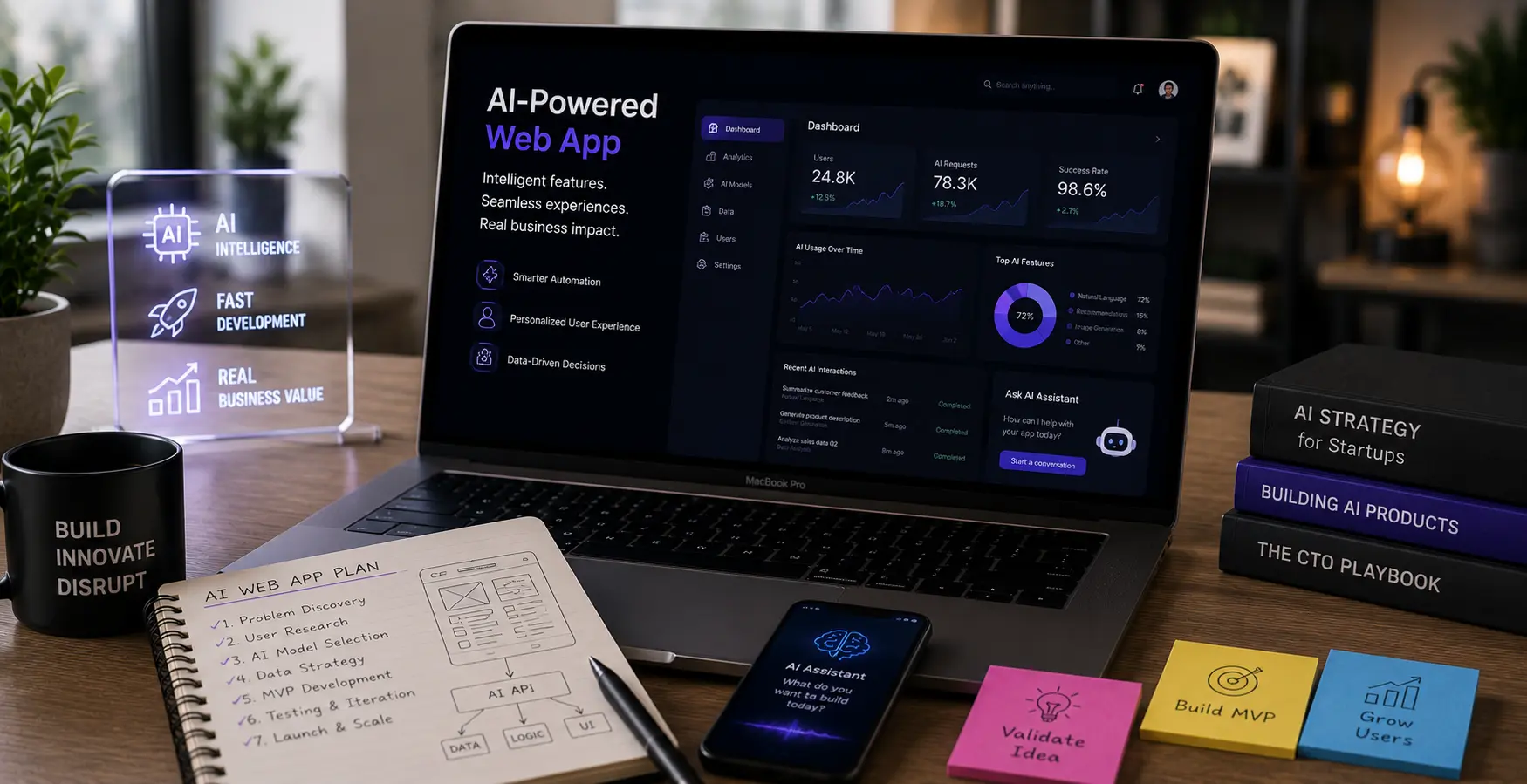
Webflow Optimize (built on the Intellimize engine, launched at Webflow Conf 2024) handles A/B testing, multivariate experiments, and AI-driven traffic routing natively inside the Webflow dashboard. It pairs with Webflow Analyze, which tracks click behavior, scroll depth, and conversion events on the same property. For teams with enough traffic and budget, it is a clean end-to-end setup. Pricing starts at $299 per month, which puts it in enterprise territory for early-stage teams.
For smaller sites and teams not ready for that commitment, Optibase is the practical alternative. It was built specifically for Webflow, integrates via the Webflow Apps marketplace without custom code, and has plans starting at $19 per month. Setup takes minutes and the interface is designed so marketing teams can own experiments without developer handoffs. For most SaaS and eCommerce teams running their first real testing program on Webflow, it is the right starting point.
Both tools now incorporate AI in ways that change the economics of testing. Traditional A/B testing splits traffic 50/50 for a fixed period and then lets you declare a winner after the fact. AI-powered multi-armed bandit testing (what Webflow Optimize uses) continuously routes more traffic toward the better-performing variant as results accumulate. You find winners faster, you waste less traffic on losing variants, and you can reach statistical confidence on pages with moderate traffic in less time than equal-split tests require.
Webflow’s built-in AI Assistant also generates headline and copy variants directly in the editor, reading the existing content on the page and suggesting alternatives aligned with your brand voice. It is not a replacement for a good copywriter, but it is a fast way to generate 5 to 10 variants for a headline test that would have previously taken a week to brief and draft.
One more thing before the test list. Teams that base experiments on behavioral data win roughly 20% to 30% of the time. Teams that run experiments on gut instinct win roughly 10% of the time. That gap is not opinion. It comes directly from Webflow’s own CRO documentation, and it holds up across every published study on experimentation win rates. Before you run a single test from this list, spend half a day in Hotjar or Microsoft Clarity watching session recordings on your highest-traffic conversion pages. You will find specific, concrete friction points. Test those. Do not test what sounds good in a team brainstorm.
The 7 Tests, in Order of Expected Revenue Impact
Test 1: Hero Headline – Outcome vs. Feature Framing
This is almost always the right first test. Your headline is what decides, in the first few seconds, whether a visitor stays or leaves. Most Webflow sites get this wrong in the same way: the headline describes what the product is rather than what the visitor gets.
“Our AI-powered project management platform” is a feature statement. “Ship projects on time without the status meetings” is an outcome statement. The second version does not require the visitor to make the connection between your product and their problem. It makes it for them.
A benefit-focused headline against a product-focused control produced a 31% lift in sign-ups in a documented test (Source: Gostellar). That is not unusual. Headline framing tests are among the highest-variance experiments in CRO because the headline affects every visitor, on every visit, before any other element has a chance to work.
How to run it on Webflow: Use Webflow Optimize or Optibase to create a variant with the reframed headline. Keep everything else identical: same image, same CTA, same layout. Run the test until you hit 95% statistical confidence or a minimum of two weeks, whichever comes later. Webflow’s AI Assistant can generate five to ten alternative headlines if you need a starting point. Feed it your ICP job title and primary pain point, and it will give you usable options to edit down.
What to watch: Not just CTA click rate, but scroll depth and time on page. If variant B has a higher click rate but shorter time on page, it may be attracting the wrong visitors. Track downstream quality where possible.
Test 2: CTA Copy – Specific vs. Generic
Most CTAs are generic because nobody wanted to be wrong. “Get Started,” “Learn More,” “Submit”. These exist because they feel safe. They are also weak. The visitor is at the moment of decision, and the page is asking them to take an action with no specificity about what happens next or what they receive.
First-person, benefit-specific CTA copy consistently outperforms generic alternatives. “Start My Free Trial” outperforms “Start Your Free Trial.” “Get My Free CRO Audit” outperforms “Contact Us.” “See It In Action” outperforms “Learn More” for product-led growth companies where the demo is the conversion.
The specific lift depends on how weak your current CTA is. If you are currently running “Submit” on your primary form, the improvement from switching to “Get My Free Demo” will be large and fast. If you are already at “Book a Free Strategy Call,” the incremental gain will be smaller, but testing second-option phrasing is still worth doing.
How to run it on Webflow: This is the fastest test to set up. Create a variant that changes only the button label and any CTA text in the surrounding copy. No layout change, no image change. Run it. This test reaches significance quickly on most pages because the change is isolated to a single high-frequency element.
One thing teams get wrong: testing CTA copy while simultaneously changing the button color or size. That contaminates the results. If you want to test color separately, do it in its own experiment after the copy test.
Test 3: Social Proof Placement – Near the CTA vs. Bottom of Page
Social proof works when it appears where the visitor is deciding whether to trust you. Most Webflow sites put testimonials in a dedicated section at the bottom of the page, below the fold, after the majority of visitors have already left. That is testimonials working for the visitors who were already convinced, not the ones who needed convincing.
Moving your strongest, most specific social proof element (a named client result, not a five-star rating) to within one scroll of your primary CTA is consistently one of the highest-ROI changes a Webflow site can make. It does not require a layout redesign. In Webflow, it is a component repositioning that takes twenty minutes.
The specificity of the proof is as important as the placement. “We increased demo bookings by 40% in 60 days using this” does more work than “Great product, highly recommend.” Your test variant should include the most results-specific testimonial you have, placed within view of the form or primary CTA.
How to run it on Webflow: Create a variant where a single high-quality testimonial or case study result moves to a position immediately above or beside the form. Keep the full testimonials section where it is. You are not removing anything. You are duplicating the best proof to an earlier position in the visual hierarchy.
Test 4: Form Field Reduction
Forms are where most lead generation funnels break. The ask is too large relative to the offer. Visitors who are ready to engage abandon when they see a form asking for company size, phone number, team headcount, annual revenue, and a description of their current problem, before you have proven you are worth their time.
Forms with 5 or fewer fields achieve around 120% higher completion rates than longer alternatives. Each field you add beyond five creates compounding friction (Source: Landbase). For most B2B SaaS demo request forms, the right initial fields are name, business email, company, and one qualifying question. Everything else you need, you can get in the discovery call.
How to run it on Webflow: Build a variant with the shortened form. This requires a Webflow form edit, which is straightforward in the designer. If you are worried about lead quality dropping when you reduce fields, add a single qualifying question that screens for ICP fit: “How many people are on your team?” or “What is your primary challenge right now?” Track both completion rate and downstream lead quality in your CRM.
The progressive disclosure pattern (showing two fields first, then revealing the rest) is worth testing once you have the field count right. It is more complex to build in Webflow, but it routinely lifts completions by 15% to 25% compared to a static shortened form.
Test 5: Hero Image – Product Screenshot vs. Outcome Imagery
The visual above the fold works harder than most teams realize, and it is one of the most commonly misjudged elements on SaaS pages. The default choice for most SaaS companies is a product screenshot. It seems logical: show the product. The problem is that a product screenshot requires the visitor to mentally translate what they are seeing into a benefit they care about. Outcome imagery, a person doing the thing your product enables faster or better, removes that translation step.
That said, this test does not always go the expected way. Some SaaS products with complex UI benefit from showing the interface because it reduces uncertainty about what the buyer is purchasing. Some audiences are feature-focused and respond better to the screenshot. This is exactly why you test rather than assume.
An abstract gradient background with subtle animation improved LCP by 1.1 seconds versus a static high-resolution product image, with equivalent conversion rate in one documented test. The speed improvement alone justified the visual change for that team.
How to run it on Webflow: Use Webflow Optimize to test the current hero image against an alternative. Webflow’s image handling is clean enough that this test does not require custom code. Watch both conversion rate and page speed. If the variant loads faster, that is a compounding benefit worth measuring.
Test 6: AI-Personalized CTAs by Traffic Source
This is where the AI layer starts doing things that are impossible in traditional A/B testing. Instead of showing every visitor the same CTA, you show visitors from different sources different CTAs matched to their context and intent level.
A visitor arriving from a LinkedIn ad targeting SaaS marketing managers sees “Get My SaaS CRO Audit.” A visitor landing from a Google search for “Webflow agency pricing” sees “See Our Webflow Packages.” A visitor who has been to the pricing page twice in the past week sees “Talk to Someone on Our Team.” These are fundamentally different levels of intent, and addressing them with a single generic CTA treats all three as identical. They are not.
Personalized CTAs convert 202% better than generic versions. Even basic source-level personalization, showing a different headline or CTA to visitors from paid vs. organic traffic, delivers meaningful lift without requiring deep behavioral modeling.
How to run it on Webflow: Webflow Optimize handles this natively via audience segmentation. You can target by traffic source, device type, geographic location, or CRM data if your HubSpot or Salesforce integration is configured. For simpler source-level personalization without Optimize’s price tag, Optibase supports condition-based variants that can be triggered by UTM parameters at the URL level. This requires creating separate variant pages with UTM-matched content, which is manageable for a focused campaign setup.
Test 7: Navigation Removal on Campaign Landing Pages
This one is simple, often produces fast results, and consistently gets skipped because it feels too obvious to be worth testing. It is worth testing.
Every navigation link on a campaign landing page is an exit point. A visitor who arrived with the intent to evaluate your product or book a demo gets pulled away to your blog, your about page, or your careers section, and never comes back to the form. Removing navigation from dedicated campaign landing pages (leaving only the form, the CTA, and the trust elements needed to earn the conversion) removes those exits.
The lift is not dramatic on every page. On pages where the current exit rate is high and the navigation is prominent, it can be substantial. The test is fast to build, fast to run, and easy to interpret.
How to run it on Webflow: Create a variant of your landing page with the navigation hidden via Webflow’s visibility controls. You do not need to rebuild the page. Publish the variant, run the test against the page with navigation, and check both conversion rate and time on page. If time on page drops but conversion rate rises, that is the test working: people are making the decision faster rather than wandering.
If you have one page and one testing slot open right now, the priority order is: hero headline first, CTA copy second, form field reduction third. Those three tests address the highest-frequency decision points on any page: the hook, the ask, and the commit. Run them sequentially, implement winners, then move to social proof placement and personalization as the site’s baseline conversion rate improves.
Do not run multiple tests simultaneously on the same page. The results contaminate each other and you end up unable to attribute the change to any single variable. One test per page, one variable per test.
If you are running multiple landing pages for multiple campaigns, you can run parallel tests across different pages as long as they are separate traffic pools. Running hero headline test on your demand gen landing page while running form reduction on your pricing page trial form is fine. Running both on the same page at the same time is not.
The Traffic Problem and What to Do About It
There is a test that many Webflow teams want to run but cannot: anything on a page getting fewer than 500 sessions per week. At that volume, traditional A/B tests take months to reach statistical significance, and by the time you have a result, the business has moved on.
For low-traffic pages, the approach is different. Do not test. Implement. Take the highest-confidence best practices from the tests above and apply them without a test. Reduce form fields. Move social proof up. Rewrite the headline to be outcome-focused. Rewrite the CTA to be specific and first-person. These changes have such strong directional evidence behind them that the risk of implementing without a test is lower than the opportunity cost of waiting.
Save testing for your highest-traffic pages where a test can reach significance in two to four weeks. That is where the learning compounds and where winning variants produce meaningful pipeline impact.
Key Takeaways
Most Webflow CRO programs stall because teams run one test every quarter, wait too long for results, and then do not implement learnings because the business has moved on. The way to get value from testing is velocity: short cycles, isolated variables, clear hypotheses rooted in behavioral data.
The seven tests above are sequenced by expected impact, not by complexity. The hero headline test is the highest-variance, highest-reward experiment most Webflow sites have available. The navigation removal test is the fastest to run and the easiest to read. Work through them in order, implement winners, and let the baseline rise before adding AI personalization on top.
AI tools change the economics in two specific ways. Faster traffic routing to winning variants means lower-traffic pages reach confidence sooner. Source-level personalization means visitors with different intent levels get different experiences without requiring you to build separate pages for every audience segment. Neither of those was practically accessible to most growth teams two years ago. They are now.
Frequently Asked Questions
What is the best A/B testing tool for Webflow in 2026?
It depends on your traffic volume and budget. Webflow Optimize (from $299 per month) is the native solution with AI traffic routing, built-in personalization, and Webflow Analyze integration. It is built for teams running continuous optimization programs at scale. Optibase (from $19 per month) is purpose-built for Webflow, integrates via the Apps marketplace without custom code, and is the right starting point for most SaaS and eCommerce growth teams. VWO is a strong option if you want heatmaps, session recordings, funnels, and testing in one platform and are comfortable with a third-party script.
How much traffic do I need to run A/B tests on Webflow?
As a practical floor, you need at least 500 sessions per week on the page you want to test to reach significance within a reasonable timeframe with a meaningful conversion rate difference. Below that, implement proven best practices without testing. AI-powered traffic routing tools like Webflow Optimize can help lower-traffic pages reach confidence faster by routing more traffic to stronger variants sooner, but there is no substitute for adequate traffic volume.
Can I run tests without a developer on Webflow?
Yes, for most CRO tests. Headline and copy changes, CTA text updates, social proof repositioning, and navigation visibility changes all live in Webflow’s visual editor and require no code. Form field changes require Webflow form edits, which are straightforward in the designer. More complex tests like multi-step forms, custom UTM-triggered personalization, or server-side experiments may require development support.
How long should a Webflow A/B test run?
Long enough to reach 95% statistical confidence, with a minimum of two full weeks, regardless of when you hit that threshold. Running fewer than two weeks risks capturing day-of-week behavior differences as a false signal. Declaring a winner before confidence thresholds are met is the most common reason CRO programs produce misleading results.
What should I test first on a Webflow site?
Start with behavioral data, not gut instinct. Install Microsoft Clarity (free) or Hotjar and watch session recordings on your highest-traffic conversion pages for one to two days before touching anything. You will find specific friction points: a form field causing drop-off, a headline getting zero engagement, a CTA that visitors scroll past. Test those specific issues. Then layer in the priority tests from this list: headline framing, CTA copy, form reduction. Those three tests address the decision points affecting every visitor.
Conclusion
If your Webflow site is getting qualified traffic and converting below where it should be, the problem is almost never that you need more traffic. It is that you have not systematically tested the elements that determine whether a visitor stays, reads, trusts, and acts.
KrishaWeb’s CRO services include Webflow-specific testing programs: hypothesis development from behavioral data, variant builds inside Webflow, and AI-powered testing tooling configured to your traffic volume and integration stack. OurWebflow development team handles the more complex implementations: multi-step forms, UTM-triggered personalization, and CRM-connected audience targeting. When the question is what to test and how to run it, ourAI consulting practice builds the full program.
The Free AI Website and CRO Audit maps your current conversion rate against benchmarks for your industry, identifies the specific test opportunities available on your site, and produces a prioritized experiment backlog within 5 business days.
Disclosure: Conversion rate benchmarks and test result data cited are drawn from third-party research and published industry studies. Results from CRO programs vary by site, traffic volume, audience, and implementation quality. All figures are for benchmarking purposes and are not a guarantee of specific outcomes.
Nisarg Pandya
Project Manager
Experienced Project Manager and Scrum Master at KrishaWeb, delivers expertise in Scrum methodologies, Laravel, React.js, UX design, and project management, ensuring efficient project delivery and agile implementation.