While creating a website, many owners focus on its design and multimedia. Little do they know that even many well-designed websites can easily lose the majority of their visitors because of poor navigation. Website navigation is considered to be one of the most important features that affect user experience to a greater extent.
So,if you want your website to flourish, you should have a solid navigation system in place. It will maintain high user retention rates and reduce your bounce rates.
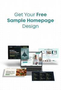
And to make your task a bit easier and faster for you, we have compiled a list of some of the best practices in this blog. All these practices will help you improve user experience through website navigation. So, keep reading!
How Does Navigation Affect the User Experience on a Website?
Navigation plays a very significant role in how your user is going to perceive your website. Yes, the designs and other advanced features do matter for sure, but if the visitors are not able to freely move from one page to another easily, then designs are of no use.
So, solid website navigation has a positive relationship with user experience. You will automatically have a better user experience if you have a solid navigation system and vice versa.
That means if the users are easily getting the solution to their problems, they are more likely to visit again which in the future results in more qualified leads leading to better sales and revenues altogether.
What Are Common Types of Website Navigation?
Types of navigation give your website the flexibility to be user-friendly and efficient. They are mostly categorized into four types:
1. Scrolling or clicking
Scrolling or clicking is one of the easiest and most comfortable ways to search for the information you are looking for on a website. Website owners are advised to map out their content in a similar manner because the visitors want the data to be scannable and easy to access.
2. Menus and Sub-Menus
Menus and submenus are yet another among the most popular ways to structure your website. They are used to provide a proper format for the navigation of content. Some of the most used menus are Top and side menus, drop-downs, carousel, side-scrolling content, thumb zone, and others. You should choose the ideal ones as per your business website requirements.
3. Icons, images, and buttons
Icons, images, and buttons are used to make your website attractive, eye-catching, and user-friendly. The various blogs include some clickable images to make them look more informative and professional.
Buttons are a way for your visitors to easily surf around the website and collect the information they need – seamlessly. A website has various advanced features and tools which can be accessed using icons that act as a CTA (Call to action) which allows users to take an action instantly.
4. Linked text
Let’s suppose you are reading a blog on a website. You liked the content and want to read more blogs like this. And then you instantly saw a relevant blog link below the article or even between the blog.
You will be more likely to the client on that particle piece of content. So, this is how linked text navigation works in favor of both website owners and visitors.
There are a variety of pages you can redirect your users to. This type of navigation also includes a table of contents and links within the primary landing page copy, service pages, blogs, and relevant resources.
10 Best Tips to Improve User Experience on Website Navigation
1. Design Navigation That Matches Your User’s likes
You should navigate your website in such a way that it can easily address the needs and wants of the user. You can use AI-powered techniques and web analytics to know what your visitors usually search for.
When you are constantly reviewing user sessions and thoroughly analyzing the analytics, the process of understanding the activities of your visitors becomes quite effortless.
When you have perfectly mapped out your website’s navigation, do not try to unnecessarily change it now and then. This may confuse the users and your website’s engagement rate may decrease (which is something you surely don’t want).
Take a quick scan of your site to see if everything is working properly or not. If there are any issues, fix them before any user complaints about the same to offer a consistent, better user experience.
Ask people to give a review of their experience on your website. By doing this, you will be able to see through your mistakes and drawbacks and make changes accordingly.
2. Design for good discoverability
All your navigation options must be easily discoverable because hiding them will negatively affect your user’s experience. Every page on your website should be easily accessible to your visitors because hiding them will affect your website’s discoverability.
Menu – Your menu should be distinctive and eye-catching with some amazing visuals. Additionally, we also recommend you to use much white space and color contrast so that the menu stands out from the rest of the page – which helps in increasing page viewability, and as a result, visitors spend more time on your website.
Icons – Use icons to amplify the meaning of the labels so that the users can know what to opt for without even reading the texts. This will save time and make the website design more interesting.
Do use icons but never replace them for text labels because there is a slight possibility that some users may not understand the icon and may need text help. So both icons and text work in tandem to offer a comparatively better experience.
Menu bar – Situate your menu bar in a place where they already expect it to be. It can either be at the top of the page or on the left side of the panel – plus add it in the footer as well.
3. Incorporate enticing Calls-To-Action
Call to action (CTAs) is an amazing trick to amaze your visitors and appeal to them to take action. The action could be buying a product, subscribing to a newsletter, booking a free call, downloading an eBook, downloading an application, or anything else.
CTAs are an efficient way to increase conversion rates and boost the website’s overall performance.
CTAs are nothing but some catchy phrases through which the visitors feel either inspired or entertained. Whatever be the reason, it’s valid until and unless you are getting more sales, building a brand, having more email sign-ups, or getting lots of shares on your online content.
But, to get there you need some amazing CTAs in place which make the user click on it.
4. Limit the number of menu options
We all know that complexity is the enemy of comfort. Yet we somehow make our websites so complex that it becomes difficult for the users to understand.
So, make all the efforts to make your website navigation and UI/UX as simple as you can.
Here are a few tips from our side –
The menu options on your website should not exceed the limit of 7-8 categories.
The content has to be simple & limited so that you don’t get the visitors all confused and irritated.
Don’t make it cluttered, use white spaces and make it visually appealing
The complexity will make the user feel like they have to put a lot of effort into figuring out the website and knowing it. Due to this, they will simply skip and never visit again, which may result in a great loss for you.
5. Make Hypertext obvious
The hyperlinks on your websites should be distinctive and attention-grabbing so that designs do not get in the way of usability.
People should know a hyperlink just by looking at it and if that’s not happening, then there is aproblem with both your design and navigation (which you need to solve for sure)
Making your hyperlinks visible is not rocket science. All you have to do is either make the link bold, italic, change the color or simply underline it and you will be good to go. Links can also be converted into buttons if you want. This will simply make the header navigation more fun and visible.
The sidebars should stand out for the website to blend in. Yes, that’s right! If you want to improve user experience, you must keep things simple yet classy.
Sidebars must be separated for the overall enhancement of the website. Some developers do it by coloring it differently, whereas some may want a different body copy. Nobody has their demands, all of them are working according to the needs and wants of their users (and you should also do the same).
You should not miss the sidebars with elements, spaces, and other unnecessary items. Everything should be neat and there should be a proper space between the elements and sidebar.
7. Streamline your navigation bar
Effectively organizing your navigation bar is the key to making your website look more professional and efficient.
Many websites have been making this mistake of either having way too many links or very few links in their header navigation bar. The owners put the links according to their convenience, completely ignoring what their users want.
It is advised to declutter the bar and use proper analytics to know the requirements of the user and then make the web improvements.
8. Design for fast Scalability
The labels should be short, crisp, and shouldn’t include many words because the users avoid reading bigger and boring sentences. The words written in the list should not be repeated because it does not look good and also affects scalability to a greater extent.
Try to write the list items in the left-to-right format.
You should not write menu items in the list in all-caps if the words are 3 or more than that.
Navigation options should be limited because too many elements make the bar cluttered.
The order in which we put the items in the bar should be considered because the serial-position effect says that the person remembers the first and last item pretty well as compared to others.
9. Create a sticky navigation bar or a back-to-top button
Sticky navigation bars or back-to-top buttons are ways to return to the key content that was at the beginning of the page.
In simple words, it can be said that when a website page becomes way too long, then it is recommended to use a sticky navigation bar that will be visible even after we have scrolled down.
The same goes with the back-to-top button. While scrolling down the page, if you click on this button, you will be automatically sent back to the start of the page.
10. Don’t underestimate the footer navigation bar
We should place the footer navigation bar at the end of the website page. Owners tend to ignore this bar because they don’t think it’s important enough to be considered. But little do they know that the footer bar can retain customers and get conversions, just like the navigation bar.
If someone has scrolled down the footer bar, they need more information about your business. So, you should add some extra information and links to the footer for the same which hooks your customers, and then wait for a while.
So, that’s a wrap on some of the most crucial things you should keep in mind for designing a stellar website that considers user experience and navigation of a website as a whole.
We hope you found this blog helpful and it will guide you a bit in nurturing your website, which results in favorable outcomes as per your business requirements.
If you still have any queries, you can reach out to us and we would be more than happy to help.
Nisarg Pandya
Project Manager
Experienced Project Manager and Scrum Master at KrishaWeb, delivers expertise in Scrum methodologies, Laravel, React.js, UX design, and project management, ensuring efficient project delivery and agile implementation.


 KrishaLabs
 KrishaStudio
 KrishaStore
